Ledger - Powerful Document Management Landing Page Template
Ledger is a dashboard-style landing page template built for home service document management platforms. It features a live-feeling tab switcher, data-rich comparison panels, and a sticky secondary call to action. The Acid Digital color system and Directory & Discovery theme make it feel like a command center, not a brochure.
by Rocket studio
Quick summary
Ledger is a single-page landing page template designed for home service document management platforms. It pairs a Feature Tab Switcher header with scrolling Industry Report data cards and side-by-side comparison panels. The Acid Digital palette, void black backgrounds, and electric chartreuse highlights give every section the feel of a live document terminal.
Who this template is for
This template is built for founders and product teams launching a home services document management platform. It speaks directly to the frustrations of people who lose paperwork and need a better system.
- First-time homeowners buried in closing documents and warranty booklets
- Serial renovators managing multiple contractor bids and permit records at once
- Property managers tracking maintenance receipts and inspection reports across many units
What problem this template solves
Most homeowners have no reliable system for storing service documents. Warranties expire unfound, permit renewals get missed, and contractor invoices disappear into email threads. This template makes the cost of that chaos visible and positions your platform as the obvious fix.
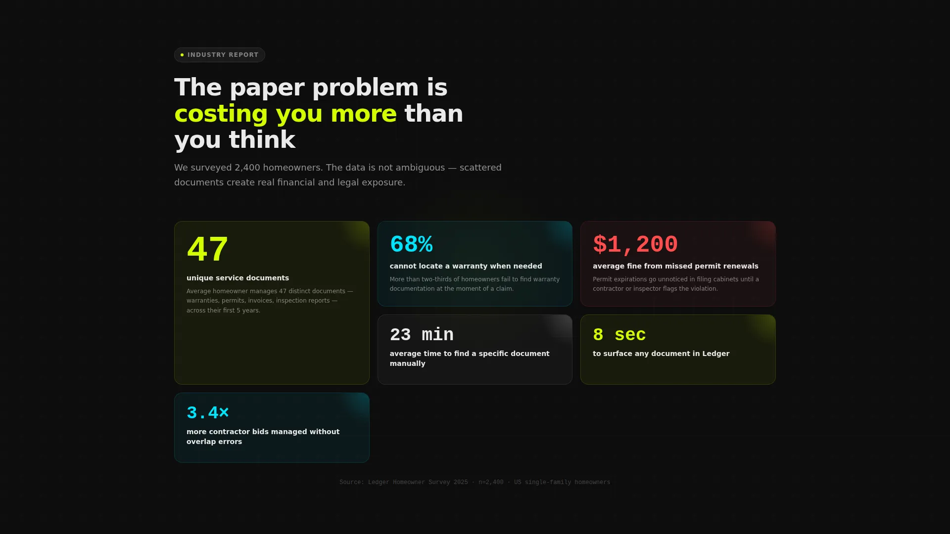
- The average homeowner manages 47 unique service documents with no organized system
- 68% of homeowners cannot locate a warranty when they actually need it
- Missed permit renewals cost an average of $1,200 in fines
What you get with this template
You get a complete, production-ready landing page that demonstrates real product value before a visitor ever signs up. Every section is designed to build trust and reduce hesitation.
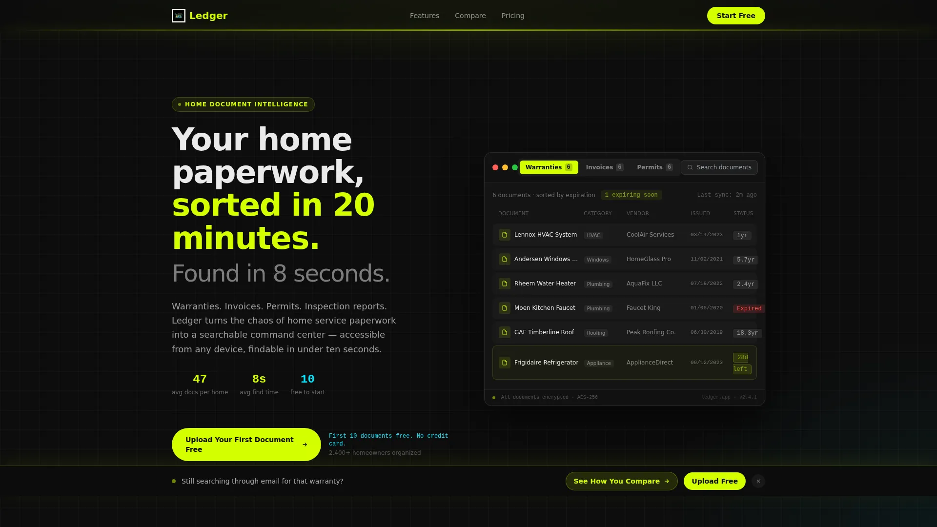
- A Feature Tab Switcher header with three pre-populated dashboard views: Warranties, Invoices, and Permits
- Scrolling Industry Report data cards that present hard statistics as a visual case for change
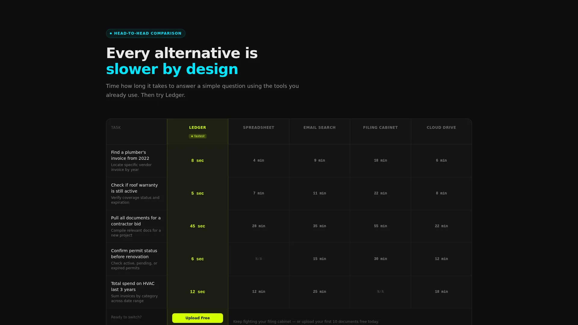
- Side-by-side Comparison panels with time-to-completion rows and a glowing chartreuse Ledger column
- A sticky secondary bar with a three-question quiz funnel that outputs a personalized chaos score
- Clear no-commitment calls to action with free-tier messaging placed directly beneath every action point
Feature list
This template is built around components that show, not just tell. Every feature below comes directly from the template structure described in the source brief.
Interactive Tab Switcher Header
Three clickable tabs sit above a realistic, populated document grid. Selecting "Warranties," "Invoices," or "Permits" instantly reshuffles the visible cards, filters, and metadata columns. The interaction demonstrates real product functionality before any signup is required.
Warranty Expiration Countdown Badges
Inside the Warranties tab view, each document card displays an expiration countdown rendered in electric chartreuse. Visitors can immediately see how the platform surfaces urgency that a filing cabinet or email folder never could.
Invoice Sparkline View
The Invoices tab surfaces a cost-over-time sparkline for each service category. This compact chart makes financial patterns visible at a glance and gives the dashboard a genuinely data-rich feel.
Permit Status Pills
The Permits tab displays color-coded status pills: approved in scanner-line cyan, pending in interface white, and expired in a muted red. The visual contrast makes document status readable in under one second.
Industry Report Data Cards
Scrolling past the header, visitors encounter hard statistics rendered as floating data cards on a dark grid. Each card builds the case that scattered PDFs and paper folders are a costly failure mode.
Comparison Versus Panels
Each panel places Ledger side-by-side against spreadsheets, filing cabinets, email search, and generic cloud storage. Every row tests a specific real-world task and shows time-to-completion per system, with Ledger's column highlighted in chartreuse.
Page sections overview
| Section | Purpose |
|---|---|
| Tab Switcher Header | Demonstrates live dashboard filtering across document categories |
| Warranty Dashboard View | Shows expiration countdown badges in the Warranties tab |
| Invoice Sparkline View | Displays cost-over-time chart inside the Invoices tab |
| Permit Status Pills | Shows color-coded approval states in the Permits tab |
| Industry Report Cards | Presents statistics as visual data cards to frame the problem |
| Versus Comparison Panels | Compares Ledger to alternatives row by row with task timing |
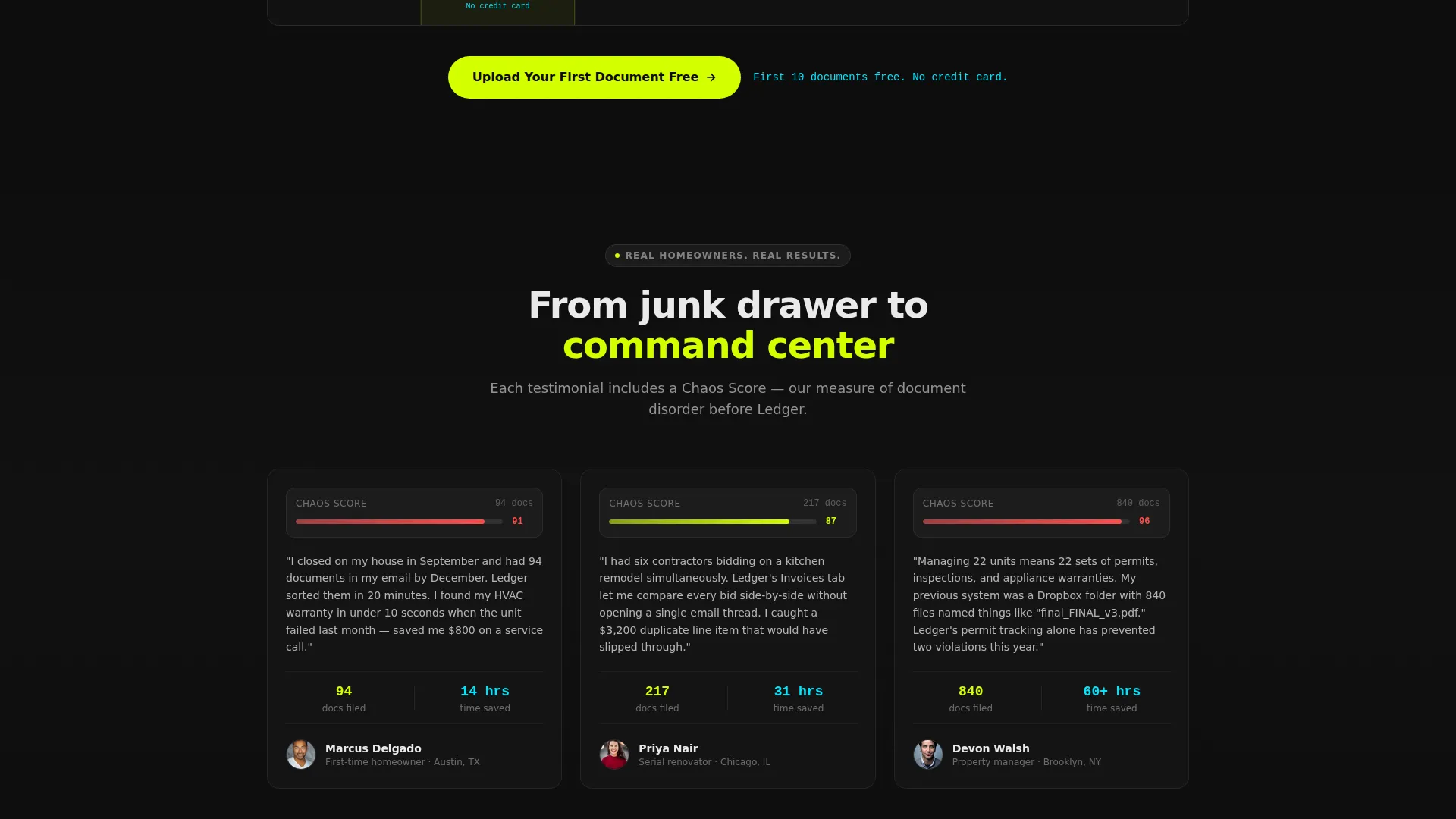
| Primary call to action Blocks | Places "Upload Your First Document Free" after each versus panel |
| Sticky Secondary Bar | Appears after second scroll with quiz link and chaos score funnel |
| Quiz Funnel Entry | Three questions output a personalized score and lead to signup |
| Free Tier Callout | States the ten-document free offer in scanner-cyan under every call to action |
Design & branding system
The template uses the Acid Digital color system, built around four core values that give every element a document-scanner-at-midnight feel. Backgrounds stay in void black with subtle grid lines so cards and data cells appear to float on a live terminal.
- Electric chartreuse (#D4FF00) dominates interactive hotspots, toggle states, progress indicators, and the Ledger comparison column
- Scanner-line cyan (#00E5FF) marks active filters, comparison highlights, approved status pills, and free-tier callout text
- Interface white (#EAEAEA) handles readable body text and pending status labels against the dark backgrounds
Mobile & speed optimization
The template is structured for clean rendering across screen sizes. Dashboard components and data cards are laid out so they reflow naturally on smaller viewports without losing visual hierarchy.
- Tab switcher and document grid adapt to touch interaction on mobile screens
- Comparison panels stack vertically on narrow viewports so every row stays readable
- Sticky secondary bar is positioned to remain visible without obscuring primary content on any device
How this template helps you convert
Every layout decision in this template is tied to a specific moment in the visitor's decision process. The page is engineered to convert at the point of peak frustration.
- The tab switcher header delivers a product demo before any commitment, replacing doubt with direct experience of the dashboard's value.
- The Industry Report data cards quantify the problem in hard numbers, making the cost of inaction feel concrete and personal rather than abstract.
- The versus comparison panels place a primary call to action at the exact moment a visitor finishes comparing Ledger to their current chaotic system, and the sticky quiz bar keeps a low-friction path to signup visible throughout the full scroll.
Other information about this template
This template is built for the home services software category within the broader technology sector. It suits any team positioning a searchable, sortable document command center for residential or property management use cases.
- Template style is Dashboard and Data Grid, making it well suited for platforms with data-dense interfaces
- The Directory & Discovery theme and Industry Report creative direction work together to give the page editorial authority
- The Comparison and Versus landing page direction is particularly effective for markets where users have an existing habit (paper folders, email, spreadsheets) that needs replacing
- The free-tier hook ("first ten documents free, no credit card") is built into the layout and reinforced at multiple scroll depths
Theme
Directory & Discovery
Creative direction
Industry Report
Color system
Acid Digital
Style
Dashboard/Data Grid
Direction
Comparison/Versus
Page Sections
Interactive Feature Tab Switcher
Expiration Countdown Badges
Cost-over-time Invoice Sparkline
Color-coded Permit Status Pills
Industry Report Problem Cards
Versus Comparison Panels with Call to Action Placement
Related questions
Can I edit the tab switcher content to match my own document categories?
Is the quiz funnel section included in the template?
Does the comparison panel support more than four alternatives?
Who is the primary audience this landing page targets?
What does the free-tier callout look like on the page?



