Decentralized EAM Comparison Landing Page Template
Ledger is a single-page landing page template built for a decentralized enterprise asset management platform. It combines a Feature Tab Switcher header, an interactive TCO calculator, and a full feature comparison table into one high-trust, conversion-focused layout. The dark Dashboard Pro design feels like a live operations center, purpose-built for reliability engineers, public-works directors, and industrial maintenance planners.
by Rocket studio
Quick summary
Ledger is a comparison-focused landing page template for a blockchain-based enterprise asset management platform. It opens with a Feature Tab Switcher dashboard, drops the visitor straight into a TCO calculator, and builds the case with a structured feature comparison table. Every design choice serves one goal: show serious industrial operators exactly why they should replace legacy systems.
Who this template is for
This template is built for teams selling complex, high-stakes software to industrial and municipal operators. It speaks the language of reliability, compliance, and operational continuity.
- Plant reliability engineers tracking mean-time-between-failure across multiple facilities
- Municipal public-works directors managing aging infrastructure under federal compliance mandates
- Offshore oil and gas maintenance planners coordinating turnaround schedules with multiple contractors
What problem this template solves
Enterprise asset management (EAM) teams often struggle to make a compelling case against entrenched legacy tools. The visitor arrives skeptical, time-pressed, and already using something that mostly works. This template solves the trust gap by leading with the visitor's own numbers.
- Legacy spreadsheets and siloed enterprise resource planning systems create fragmented audit trails that slow compliance work
- Multi-contractor turnaround schedules have no shared source of truth, causing costly coordination failures
- Procurement teams need a concrete cost and risk comparison before they can justify a platform switch internally
What you get with this template
This template delivers a fully structured, single-page layout that moves a technical buyer from curiosity to conversion. Every section builds on the one before it, anchored by an interactive tool that makes the value personal before any copy is read.
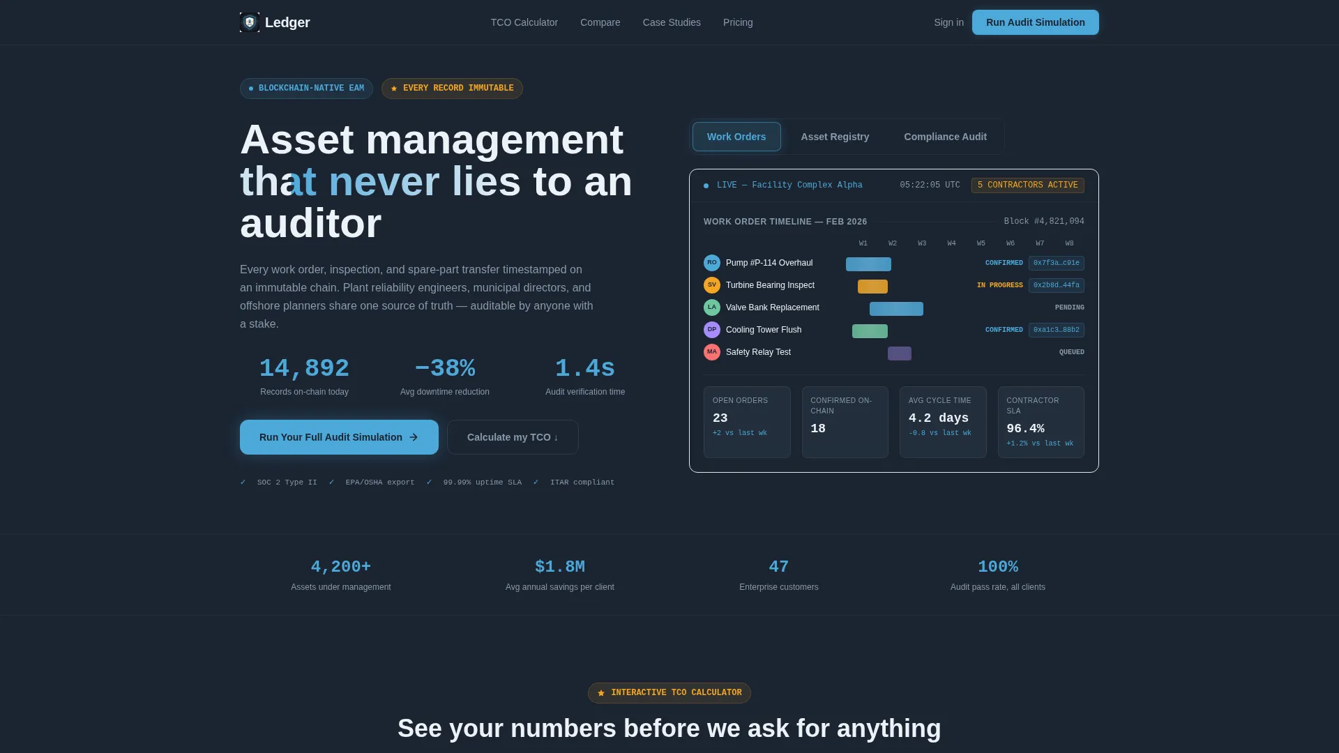
- A Feature Tab Switcher header with three live-style dashboard panels showing work orders, asset registry, and compliance audit views
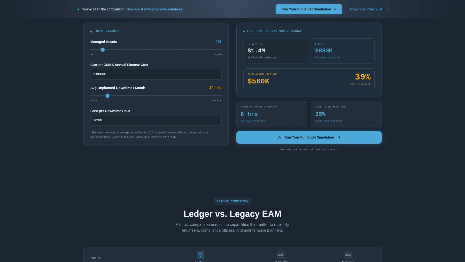
- An interactive TCO calculator capturing asset count, current license cost, and downtime hours to render a side-by-side cost comparison
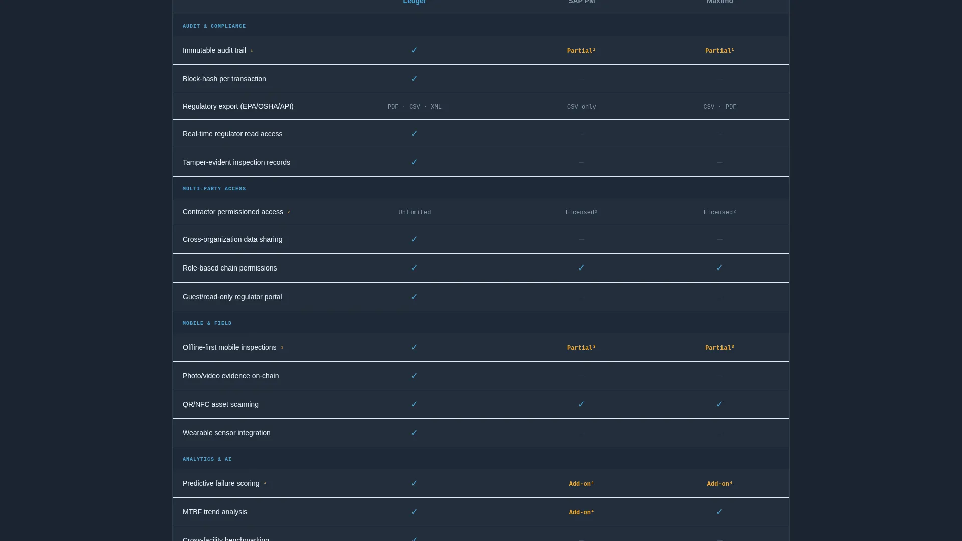
- A full feature comparison table with rows for audit trail immutability, multi-party access control, offline-first mobile inspections, and regulatory export formats
- A two-step conversion form and a secondary gated PDF download path for visitors at different stages of buying intent
- A sticky call-to-action bar that appears after the comparison table to keep the primary conversion action visible at all times
Feature list
This template packages several high-impact components that work together to earn the conversion from a skeptical industrial buyer.
Feature Tab Switcher Header
Three clickable tabs labeled "Work Orders," "Asset Registry," and "Compliance Audit" each reveal a live-style dashboard panel. The active tab glows in sky-blue. Inactive tabs sit in slate. The default panel shows a Gantt-style work-order timeline with contractor avatars, blockchain-hash confirmations beside completed tasks, and a real-time asset-health donut chart.
Interactive TCO Calculator
Positioned just below the fold, the calculator asks for three inputs: number of managed assets, current CMMS (computerized maintenance management system) annual license cost, and average unplanned-downtime hours per month. It instantly renders a side-by-side cost and risk comparison between legacy EAM and the platform, with delta percentages highlighted in sky-blue.
Full Feature Comparison Table
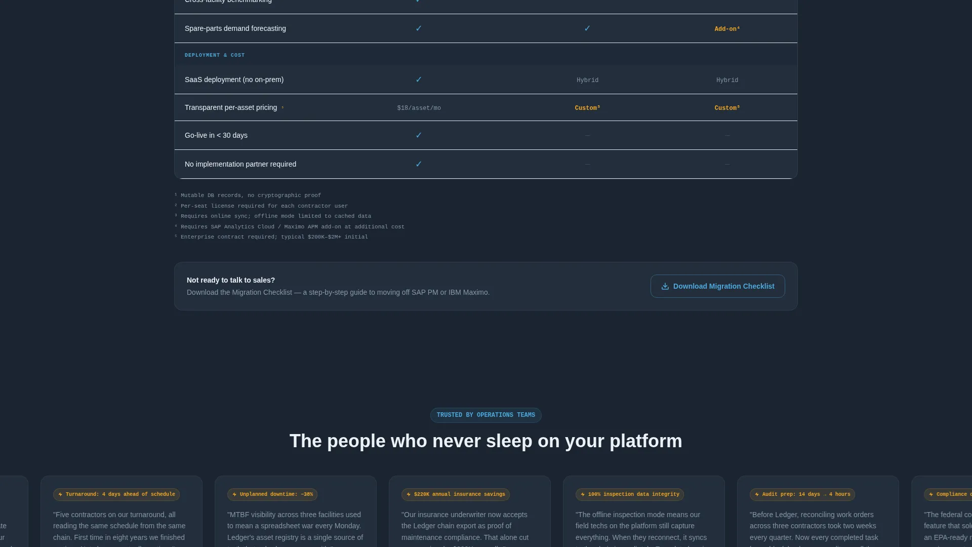
A structured table breaks platform capabilities into clear rows. Columns represent the platform alongside two incumbent competitors. Checkmarks appear in sky-blue for supported features. Dashes appear in slate for gaps. Footnotes link to documentation for each row.
Two-Step Conversion Form
Clicking the primary call-to-action opens a two-step form. Step one captures work email and current system name from a dropdown. Step two asks for asset count range and the visitor's biggest compliance pain point as a free-text field. This staged approach reduces friction while collecting high-quality lead context.
Gated PDF Secondary Path
Visitors not yet ready to engage sales can download a Migration Checklist as a gated PDF. The gate captures only email address and industry vertical, offering a lower-commitment conversion option that still qualifies the lead.
Sticky Call-to-Action Bar
After the visitor scrolls past the comparison table, a sticky bar appears at the bottom of the viewport. It keeps the primary "Run Your Full Audit Simulation" action accessible throughout the rest of the page without interrupting the reading flow.
Page sections overview
| Section | Purpose |
|---|---|
| Tab Switcher Header | Introduces platform via three live dashboard panels |
| TCO Calculator | Anchors value with visitor's own cost and risk numbers |
| Calculator Output Panel | Displays legacy-versus-platform comparison with delta highlights |
| Feature Comparison Table | Rows platform capabilities against two incumbent systems |
| Primary call to action Placement | Drives audit simulation sign-up from inside calculator output |
| Two-Step Lead Form | Captures work email, system name, asset count, and compliance pain point |
| Gated PDF Download | Offers Migration Checklist for lower-intent visitors |
| Sticky call to action Bar | Keeps primary conversion action visible after comparison table |
Design & branding system
The visual identity follows a Dashboard Pro theme built around a Slate and Sky color system. Every color choice is functional, not decorative. The palette feels like a cockpit at cruising altitude: dark where attention is not needed, bright exactly where it is.
- Deep operations-center charcoal (#1B2431) for page backgrounds, instrument-panel slate (#394B61) for inactive user interface elements, clear-altitude sky (#4DA8DA) for active states and data highlights, and horizon white (#EDF2F7) for card surfaces and table headers
- A single signal-amber (#F5A623) reserved for warnings and key differentiator callouts, ensuring it never loses its urgency through overuse
- No stock imagery anywhere on the page; every visual element resembles production software a reliability engineer would actually log into
Mobile & speed optimization
The layout is designed to translate naturally from a wide operations-center monitor to a field technician's tablet or phone. Every interactive component is structured for touch-friendly use without losing the dashboard density that desktop users expect.
- The Feature Tab Switcher collapses cleanly on smaller screens, keeping each dashboard panel readable without horizontal scrolling
- The TCO calculator and comparison table reflow into single-column layouts on mobile viewports, preserving usability for on-site reviewers
How this template helps you convert
The conversion strategy is built around a simple principle: show the visitor their own numbers before asking for anything. Each section deepens the case the calculator already made personal.
- The TCO calculator creates an immediate, personalized cost anchor that makes the comparison table feel like evidence rather than marketing copy, lowering resistance before the first call-to-action appears.
- The two-path conversion structure, combining a high-intent audit simulation form with a low-commitment gated PDF, ensures that buyers at every stage of the decision process have a relevant next step available.
Other information about this template
This template is designed specifically for the decentralized enterprise asset management niche. It is production-ready for teams positioning a blockchain-based platform against established incumbent systems in the industrial software market.
- The comparison table is structured to position the platform against recognized incumbent enterprise asset management systems, giving procurement teams the side-by-side reference they need for internal justification
- The template style is Comparison Table, the creative direction is Calculator and Tool First, and the landing page direction is Comparison and Versus, all of which align with the high-consideration, multi-stakeholder buying cycle common in decentralized enterprise software
- The template is suited for technology vendors in the decentralized EAM space who need to educate a technically literate audience while simultaneously driving qualified lead capture
Theme
Dashboard Pro
Creative direction
Calculator/Tool First
Color system
Slate & Sky
Style
Comparison Table
Direction
Comparison/Versus
Page Sections
Feature Tab Switcher with Live Dashboard Panels
Interactive TCO Calculator
Structured Feature Comparison Table
Two-step Lead Capture Form
Gated PDF Secondary Conversion Path
Sticky Call-to-action Bar
Related questions
Who is the primary audience for this landing page template?
Can I customize the TCO calculator inputs and comparison table rows?
Does the template include both a high-intent and a low-intent conversion path?
What does the Feature Tab Switcher show by default?
Is this template suitable for a team selling to multiple industries?



