Ledger - Powerful EducationPOS Landing Page Template
Ledger is a bold brutalist education point-of-sale landing page template built for high-volume school and campus environments. It presents a raw, data-grid comparison layout with a live dashboard header, spec-sheet scroll structure, and a district-size calculator call to action. Designed for operations directors and auxiliary services managers who need proof, not promises.
by Rocket studio
Quick summary
Ledger is a single-page, dashboard-style landing page template for an education point-of-sale system. It opens with a pixel-sharp product screenshot mid-rush, scrolls through a spec-sheet comparison grid, and closes with a district cost calculator. The design is bold brutalist with an iridescent color system built for credibility and conversion.
Who this template is for
This template is built for education technology companies and software vendors selling point-of-sale systems to institutional buyers. It speaks directly to the people who actually sign procurement contracts and defend those decisions to finance committees.
- K-12 district operations directors managing multi-site cafeteria and payment workflows
- University auxiliary services managers balancing revenue, meal plans, and financial aid reconciliation
- Private school business officers running the full back office from a single desk
What problem this template solves
Most software landing pages try to charm their audience. Education operations buyers do not want charm. They want a side-by-side comparison that survives a CFO's scrutiny and gives them ammunition for the next board meeting. Generic marketing layouts fail these buyers entirely.
- No existing template structure mirrors the spec-sheet format that institutional buyers trust
- Comparison grids are missing from most SaaS templates, leaving critical decision data buried in prose
- The call to action on most templates is vague; district buyers need a cost calculator tied to their actual enrollment size
What you get with this template
You get a fully structured single landing page that functions like a procurement document dressed as a product page. Every section is built to escalate credibility from top to bottom.
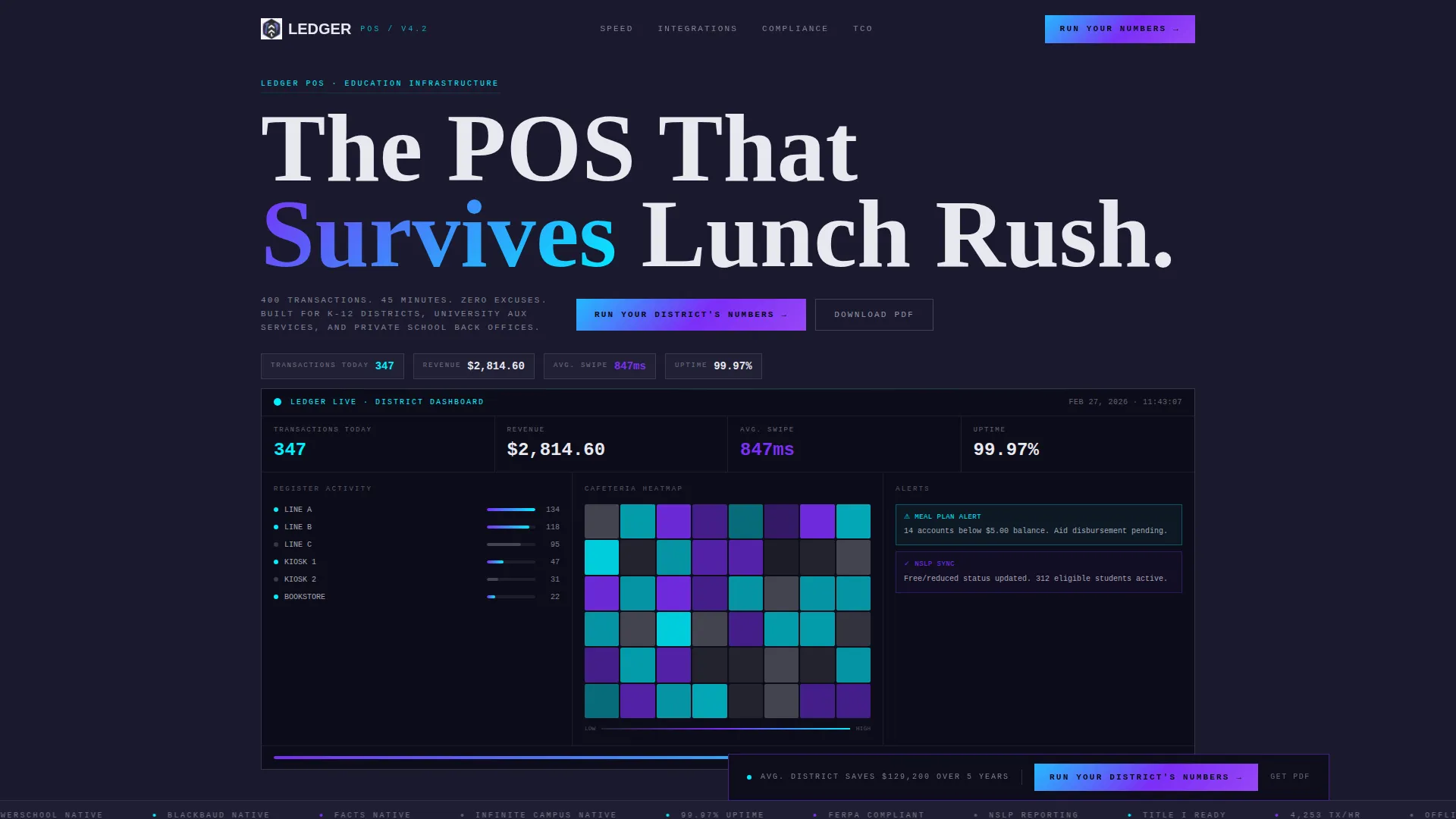
- A full-width product screenshot header showing live transaction data, revenue totals, and a meal plan alert
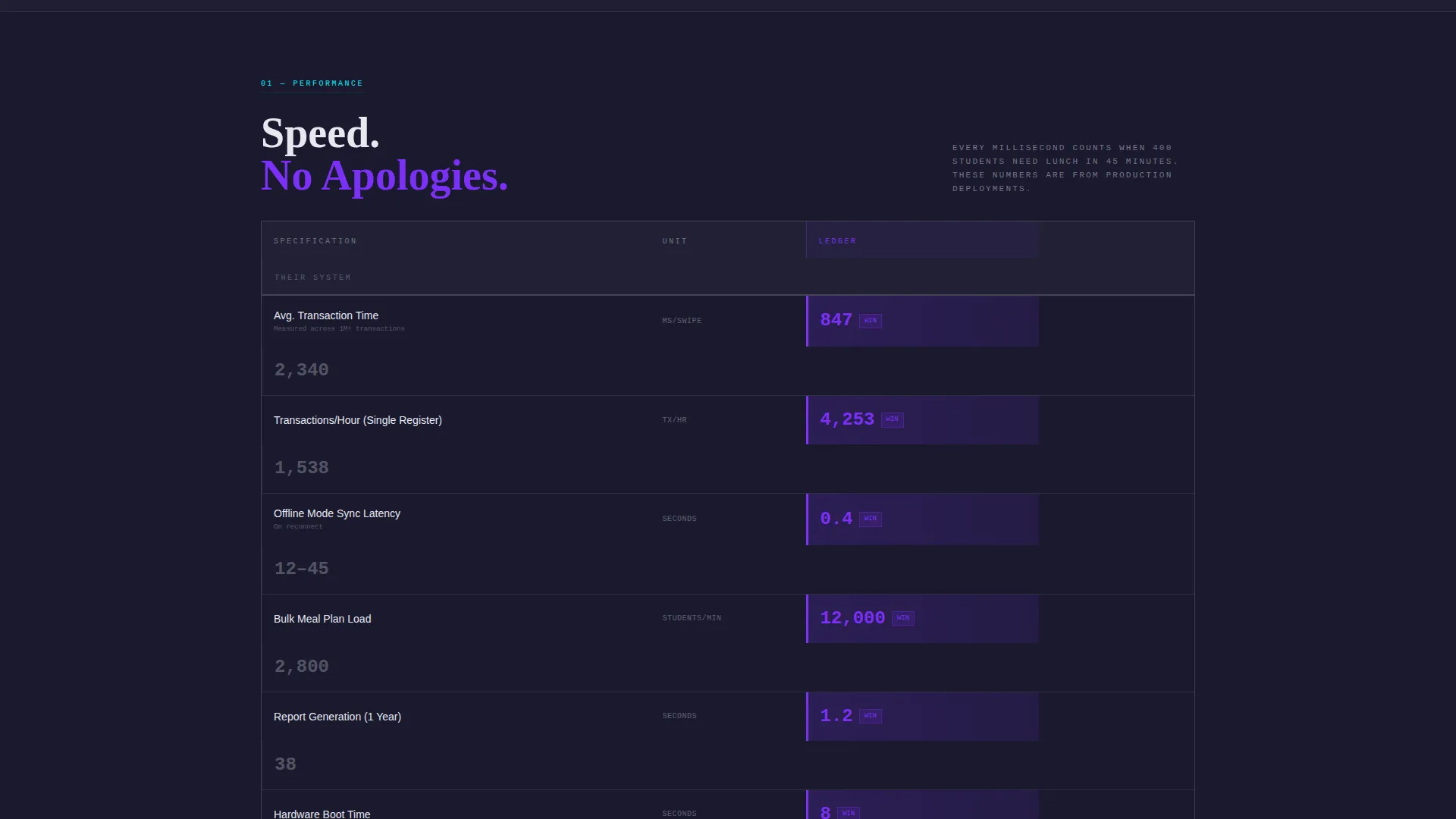
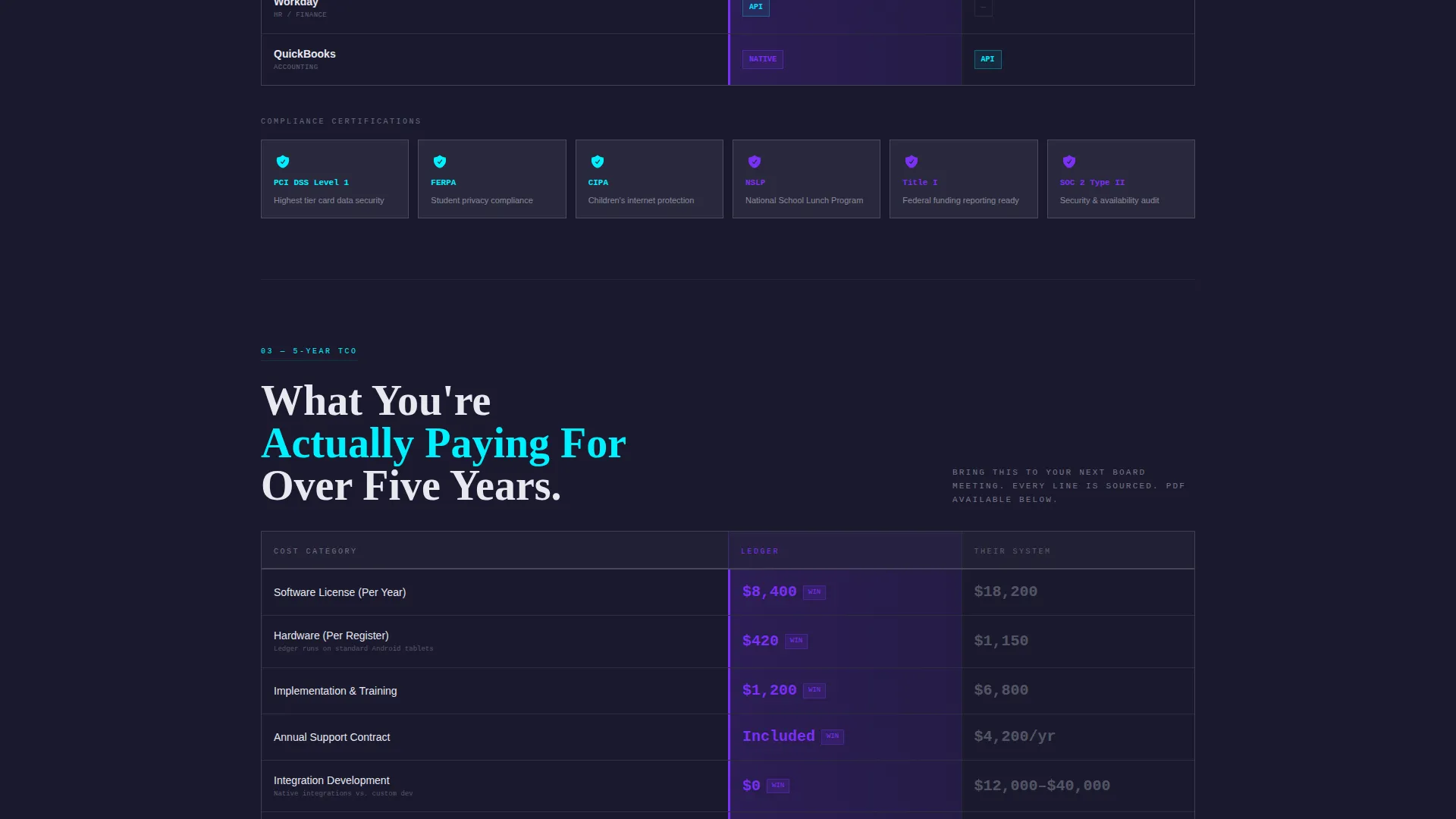
- A scrolling comparison data grid with two labeled columns, winner highlights, and spec rows covering speed, uptime, integrations, compliance, and five-year cost
- A two-step district calculator form and a lower-friction email gate for PDF download
Feature list
This template includes purpose-built sections and components drawn directly from the source brief. Each one serves a specific role in moving a skeptical operations buyer from scroll to submission.
Full-Width Dashboard Header
The header displays a pixel-sharp product screenshot mid-transaction rush. It shows 347 processed transactions, $2,814.60 in daily revenue, a live register heatmap across three cafeteria lines, and a cyan-flagged meal plan balance alert. No mockup frame, no drop shadow. The interface sits raw against the charcoal background as if the visitor's screen is the terminal itself.
Spec-Sheet Comparison Grid
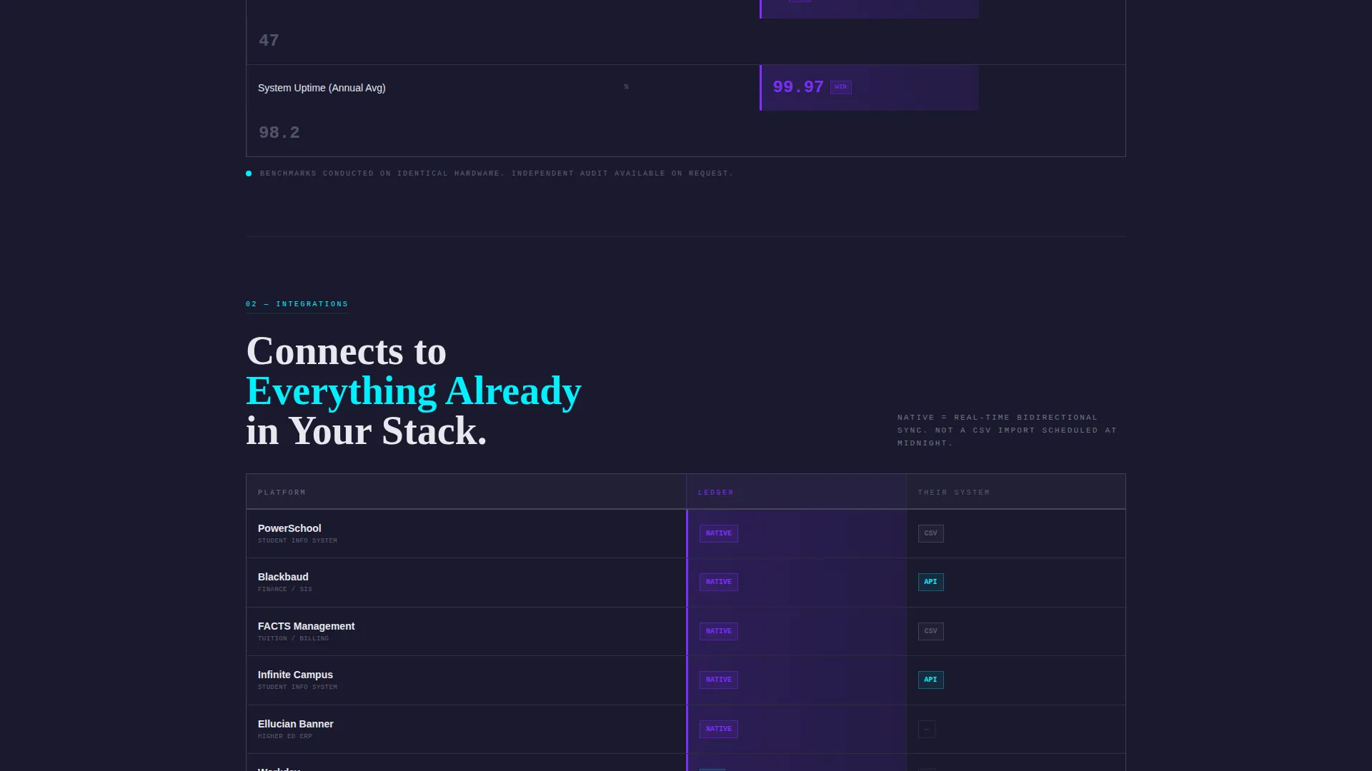
Each scroll section is a data grid row. Columns are labeled "Ledger" and "Their System." Rows escalate through transaction speed in milliseconds per swipe, uptime percentage, named integrations, compliance certifications, hardware compatibility, and five-year total cost of ownership. The winning column glows in holographic violet. Numbers are typeset in monospace and slammed left.
Floating call to action Bar
After the third scroll section, a sticky bar pins to the bottom of the viewport. It carries the primary call to action: "Run Your District's Numbers." This keeps the conversion path visible without interrupting the comparison flow.
Two-Step District Calculator Form
Clicking the primary call to action opens a two-step inline form. Step one collects district size (under 1,000 students, 1,000 to 10,000, or 10,000 and above) and current point-of-sale provider. Step two collects name, role, and district email. The form is designed for procurement-stage buyers ready to justify a switch.
PDF Download Email Gate
A secondary conversion path lets visitors unlock the full comparison document by entering only their email address. This lower-friction gate targets the spec-obsessed operations director who needs a shareable file before a board meeting.
Bold Brutalist Visual System
The iridescent color system uses deep slab charcoal as the dominant background, holographic violet for active comparison highlights, electric cyan on metric callouts, and raw titanium white for body text and grid lines. Interactive elements shimmer against the heavy dark backgrounds, creating contrast exactly where attention should land.
Page sections overview
| Section | Purpose |
|---|---|
| Dashboard Header | Opens with live transaction screenshot and headline |
| Transaction Speed Grid | Compares millisecond-level swipe performance |
| Uptime Comparison Row | Shows reliability spec side by side |
| Integrations Data Row | Lists named integrations per system |
| Compliance Certifications Row | Displays compliance credentials per column |
| Hardware Compatibility Row | Compares supported hardware by system |
| Total Cost Grid | Presents five-year cost of ownership comparison |
| Floating call to action Bar | Pins district calculator prompt after third scroll |
| District Calculator Form | Two-step form gated by size and provider |
| PDF Download Gate | Email-only form for full comparison document |
Design & branding system
The visual identity is bold brutalist with an AI iridescent color system. It is designed to feel like a concrete campus building at night with light spilling from a server room: monolithic and heavy in its base, prismatic wherever data lives.
- Deep slab charcoal (#1A1A2E) dominates all backgrounds, keeping the page visually crushing and high-contrast
- Holographic violet (#7B2FF7) activates on winning comparison columns and interactive states; electric cyan (#00F0FF) marks metric callouts and comparison winners
- Raw titanium white (#E8E8F0) handles all body text and grid lines; monospace type renders every spec number large, left-aligned, and impossible to miss
Mobile & speed optimization
The template is structured for readability across screen sizes. The data-grid layout adapts so comparison columns remain legible on smaller viewports without collapsing critical spec data.
- Comparison grid columns stack cleanly on mobile while preserving the winner-highlight logic
- The floating call-to-action bar remains anchored at the bottom of the screen on all device sizes
- Form steps are touch-friendly and logically sequenced to reduce drop-off on mobile submissions
How this template helps you convert
The Ledger template is engineered around the psychology of a skeptical institutional buyer. It does not ask for trust. It supplies evidence and then makes acting on that evidence extremely easy.
- The spec-sheet scroll builds cumulative proof across every row, so by the time a visitor reaches the call to action they have already compared seven categories of data and identified a clear winner
- The two-path conversion system captures both ready buyers through the district calculator form and research-stage buyers through the low-friction PDF email gate, widening the total addressable conversion pool
Other information about this template
This template is built within the Education Software and SaaS category and is specifically scoped to the education point-of-sale system niche. It is a strong fit for vendors whose buyers move through formal procurement cycles.
- The comparison grid references named integration compatibility rows, making the template directly relevant to districts already running student information systems
- The compliance row section supports display of certifications such as PCI DSS (Payment Card Industry Data Security Standard), FERPA (Family Educational Rights and Privacy Act), and CIPA (Children's Internet Protection Act) as listed spec items
- The template style is Dashboard and Data Grid, the creative direction is Spec Sheet, and the landing page direction is Comparison and Versus, all of which align to the procurement-stage buyer intent this page targets
Theme
Bold Brutalist
Creative direction
Spec Sheet
Color system
AI Iridescent
Style
Dashboard/Data Grid
Direction
Comparison/Versus
Page Sections
Full-width Dashboard Screenshot Header
Escalating Spec-sheet Comparison Grid
Sticky Floating Call to Action Bar
Two-step District Calculator Form
Low-friction PDF Email Gate
Bold Brutalist Iridescent Visual System
Related questions
Who is this landing page template designed for?
Can I customize the comparison grid rows for my own product specs?
What does the two-step form collect and why is it split into two steps?
Is there a lower-commitment path for visitors who are not ready to fill out the full form?
What makes this template different from a standard SaaS landing page?



