AI for Financial Privacy Policy Website Template
Ledger is a scroll-reveal landing page template built for financial services AI analytics dashboards. It uses a Tech Glass visual identity with a Carbon Fiber color system to guide CFOs, FP&A leaders, and compliance officers through a Problem-to-Solution arc. Interactive comparison panels, animated metrics, and a live benchmark call to action work together to convert serious finance buyers.
by Rocket studio
Quick summary
Ledger is a single-page, scroll-driven landing page template designed for AI-powered financial analytics products. It walks visitors through a cinematic Problem-to-Solution arc, from broken spreadsheets to illuminated dashboards. The Carbon Fiber color system and Tech Glass visual language give the page the credibility and precision that finance decision-makers expect before they trust any tool with their data.
Who this template is for
This template is built for teams launching financial analytics software, AI-driven reporting platforms, or data intelligence tools aimed at the enterprise finance market. If your buyers need to see proof before they book a demo, this layout was designed for that exact conversation.
- CFOs and finance leaders at mid-market firms who are tired of spreadsheet sprawl and conflicting reports
- Heads of financial planning and analysis (FP&A) who currently build board decks by hand and want a faster path to insight
- Compliance officers who need clean, readable audit trails without hiring a forensic accountant to decode them
What problem this template solves
Most finance software landing pages look like the software itself: dense, clinical, and hard to trust on first contact. Ledger solves the credibility gap. It leads with pain that resonates, transitions to proof, and ends with a direct comparison that makes the value case undeniable.
- Finance buyers arrive skeptical. The page earns trust progressively, section by section, before asking for any commitment.
- Manual analytics workflows are invisible to most marketing pages. This template names them directly and shows exactly what replaces them.
- Generic demo calls to action convert poorly with senior finance audiences. The benchmark-first call to action lowers friction by offering data before asking for time.
What you get with this template
You get a fully structured, single-page layout built around a three-act narrative. Every section serves a specific role in moving a skeptical finance buyer from recognition to action. The visual system is ready to carry a premium analytics brand without modification.
- A scroll-reveal structure with three distinct acts: pain, pivot, and proof, each paced to hold attention as the visitor moves down the page
- Interactive comparison panels that let visitors toggle between tool categories and watch specific metrics animate in real time
- A complete header, logo bar, sticky navigation, benchmark call to action, and low-friction email capture, all laid out and ready to customize
Feature list
The features below reflect what is built into this template based on the source brief.
Scroll-Reveal Three-Act Narrative
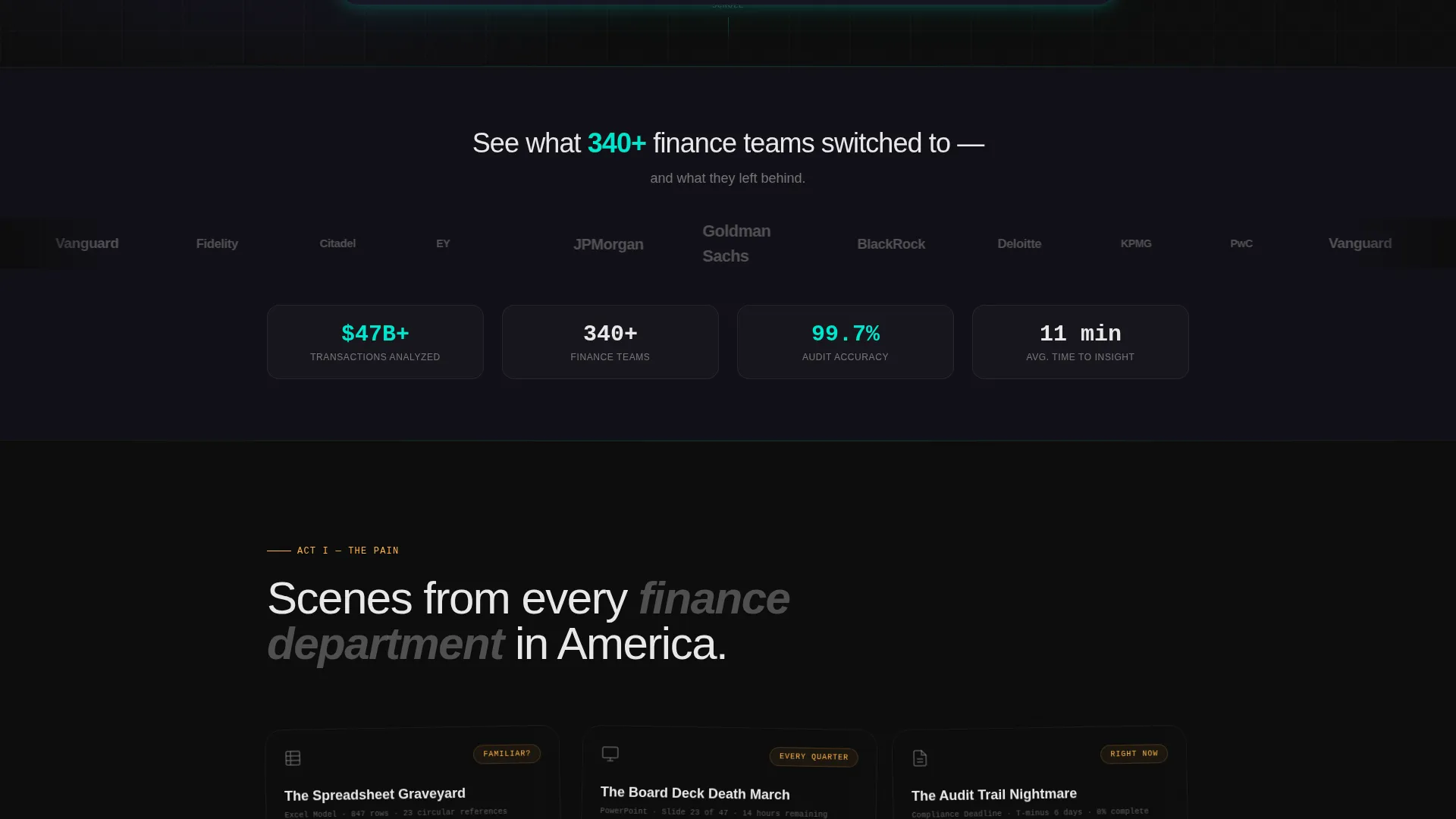
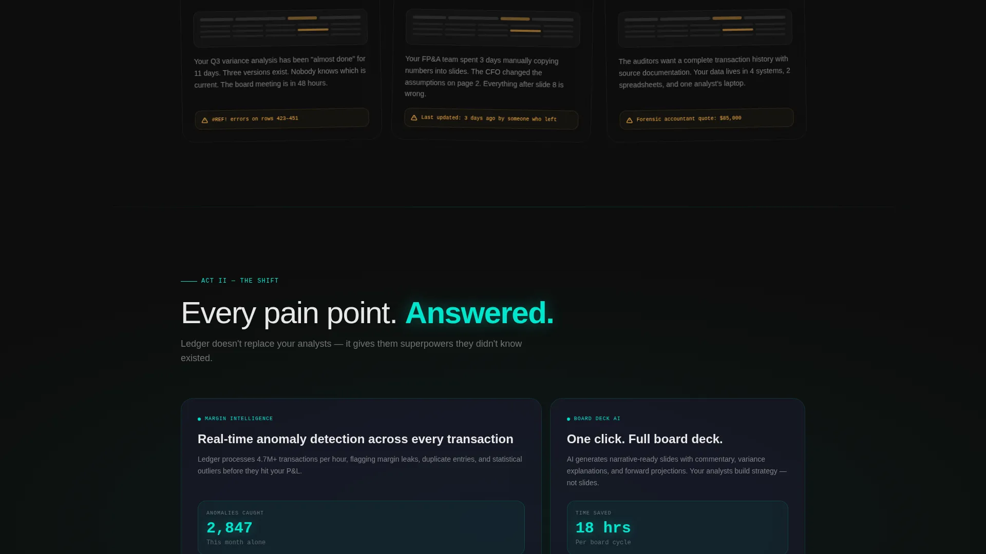
The page unfolds progressively as the visitor scrolls. Act one surfaces familiar pain points rendered as frosted glass cards that crack and dissolve on scroll. Act two introduces a teal light sweep that visually resets the page tone. Act three delivers the side-by-side proof.
Interactive Comparison Panels
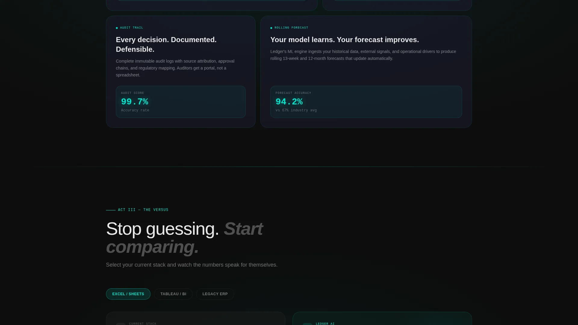
Two panels slide in from opposing edges of the viewport. The legacy tool column renders in muted gray on the left. The dashboard column glows in electric teal on the right. Specific metrics such as time-to-insight and error rate animate as counters when they enter view.
Benchmark-First call to action Architecture
The primary call to action, "Run Your Data Against Ours," sits at the climax of the versus section. It invites visitors to upload a sanitized dataset or connect a sandbox environment for a live benchmark, meeting finance buyers where they are rather than pushing them straight to a sales call.
Institutional Logo Bar Header
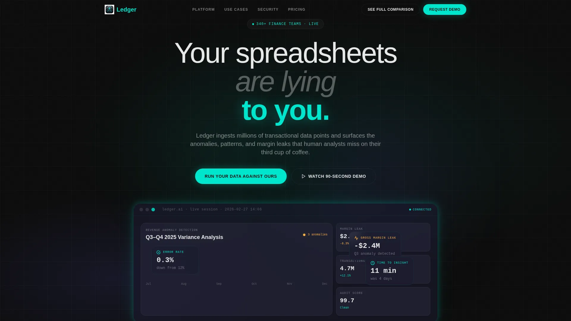
The header opens with a horizontal ribbon of financial institution and enterprise logos rendered in monochrome white. They drift in a slow infinite scroll behind a frosted glass strip, establishing social proof before a single feature is mentioned.
Sticky Navigation with Scroll call to action
A secondary sticky call to action labeled "See the Full Comparison" lives in the top navigation bar. It smooth-scrolls directly to the versus panels, giving impatient visitors a shortcut to the proof they need before engaging further.
Low-Friction Email Capture
Below the comparison table, a single-field email form with the micro-copy "Get the full benchmark report for your stack" collects leads who are not ready to demo. It captures the CFO conversation before it happens, without demanding a calendar invite.
Page sections overview
| Section | Purpose |
|---|---|
| Logo Bar Header | Establishes institutional credibility before any feature claim |
| Hero Headline Block | Delivers the core tension: "Your spreadsheets are lying to you" |
| Pain Act Cards | Renders familiar finance nightmares as dissolving frosted glass cards |
| Teal Pivot Line | Visual reset sweep that separates problem from solution |
| Solution Reveal Panels | Shows the dashboard answering each previous pain point on scroll |
| Versus Comparison Table | Interactive toggle lets visitors compare their current tool against the dashboard |
| Animated Metric Counters | Specific numbers animate as counters when the comparison section enters view |
| Primary Benchmark call to action | "Run Your Data Against Ours" placed at the peak of the versus section |
| Email Capture Block | Single-field form with benchmark report offer for low-intent leads |
| Sticky Navigation Bar | Persistent nav with "See the Full Comparison" smooth-scroll shortcut |
Design & branding system
The visual identity is built on a Tech Glass theme layered over a Carbon Fiber color system. Every color in the palette has a specific, defined role. Nothing is decorative without purpose.
- Core palette: deep cockpit black (#0D0D0D) as the base, woven carbon gray (#1A1A2E) for depth, frosted glass panels (#E0E0E030 over blur) for layered surfaces, electric teal (#00E5CC) exclusively for live data points and call to action surfaces, and muted signal amber (#FFB347) only for alert indicators and comparison highlights
- Typography renders in crisp off-white (#E8E8E8) against the dark base, with the hero headline set in a thin, wide typeface and supporting copy in a lighter weight for visual hierarchy
- Glassmorphism panels float over the carbon-dark base throughout the scroll, giving the page the feel of a high-resolution trading terminal rather than a conventional marketing page
Mobile & speed optimization
The template is structured to scale cleanly across screen sizes, keeping the scroll-reveal pacing and panel layouts readable on smaller viewports without losing the cinematic quality of the desktop experience.
- Frosted glass panels and the glassmorphism layering system are designed to render clearly on mobile screens where the dark base keeps contrast high
- Scroll-triggered animations and counter reveals are structured to perform on touch-based scroll interactions, maintaining the progressive narrative on phones and tablets
How this template helps you convert
Every layout decision in Ledger serves the conversion goal of moving a skeptical, senior finance buyer from interest to action. The page does not ask for commitment until it has earned the right to.
- The Problem-to-Solution arc builds trust incrementally. Visitors recognize their own pain before they see a single product claim, which means they arrive at the call to action already convinced the problem is real.
- The interactive comparison table makes the value case self-serve. Visitors toggle between their current tool and the dashboard and watch the metrics shift, removing the need for a sales rep to explain the gap.
- The dual-call to action structure covers both high-intent and low-intent visitors. The benchmark call to action captures buyers who are ready to act, while the email capture collects leads who need one more data point before they can justify the conversation internally.
Other information about this template
Ledger is designed specifically for the financial services AI analytics dashboard category, where the sales cycle is long and the buyer is data-literate and skeptical of marketing language. The template's visual identity and narrative arc are calibrated for that audience.
- The template style is Scroll Reveal (Progressive), meaning every section enters the viewport intentionally rather than existing all at once on page load
- The header concept (Logo Bar) and the lp direction (Comparison/Versus) are matched intersection fields, meaning they are proven combinations for this niche and buyer type
- The creative direction (Problem-to-Solution Arc) and theme (Tech Glass) work together to make the page feel like a product demonstration rather than a brochure
- This template sits at the intersection of the Technology category and the AI for Financial Services subcategory, making it a strong fit for teams marketing intelligent reporting, automated audit tools, real-time margin analysis platforms, and AI-generated board deck products
Theme
Tech Glass
Creative direction
Problem→Solution Arc
Color system
Carbon Fiber
Style
Scroll Reveal (Progressive)
Direction
Comparison/Versus
Page Sections
Scroll-reveal Three-act Narrative
Interactive Comparison Panels
Benchmark-first Call to Action Architecture
Institutional Logo Bar Header
Sticky Navigation with Scroll Call to Action
Low-friction Email Capture
Related questions
Who is the intended buyer for this landing page template?
Can I customize the comparison metrics shown in the versus section?
What makes the call to action strategy different from a standard demo request page?
Does the template include the email capture form?
Is this template suitable for a product that is still in early access or beta?



