Ledger - Powerful Financialservices Landing Page Template
Ledger is a financial services ERP landing page template built for firms that need to turn operational chaos into clarity. It uses a modular card grid layout, a Void & Violet color system, and a Problem-to-Solution scroll arc to show CFOs, operations directors, and compliance officers exactly what a unified ledger platform can do for their month-end close.
by Rocket studio
Quick summary
Ledger is a single-page, card grid landing page template designed for financial services ERP platforms. It guides visitors through a Problem-to-Solution scroll arc, mirrors operational pain points with resolved equivalents, and drives conversion through a built-in comparison tool and two distinct call-to-action paths. The design feels like a Bloomberg terminal rebuilt with precision and purpose.
Who this template is for
This template is built for teams marketing enterprise or mid-market financial operations software. It speaks directly to the buyers inside those firms who carry the weight of broken workflows every month-end.
- Chief Financial Officers at mid-market broker-dealers managing slow, manual close cycles
- Operations directors at registered investment advisers (RIAs) holding legacy systems together with workarounds
- Compliance officers at insurance carriers who cross-reference audit trails by hand every week
What problem this template solves
Financial services software is a hard sell. Buyers are skeptical, switching costs feel enormous, and generic SaaS landing pages do nothing to earn trust. This template solves the credibility gap by showing the visitor their own pain before asking for anything.
- Month-end close processes that stretch to 14 days due to disconnected systems and manual reconciliation
- Compliance reporting that relies on manual cross-referencing instead of a live, connected audit trail
- The integration burden of running multiple legacy platforms side by side with no unified data layer
What you get with this template
You get a complete, production-ready landing page layout structured around a clear narrative arc. Every section has a job, and the visual design reinforces that job at every scroll depth.
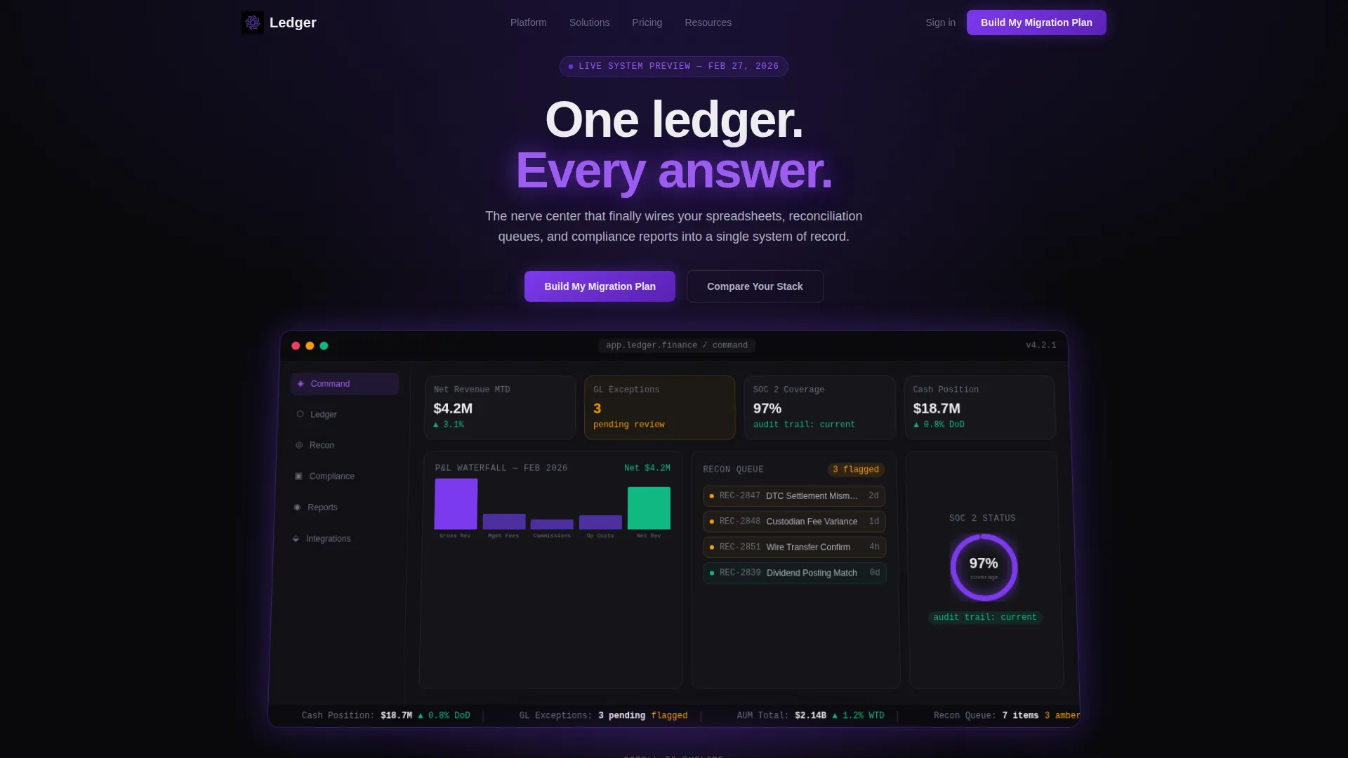
- A living Dashboard Preview header with authentic ERP data rendered against a void black background
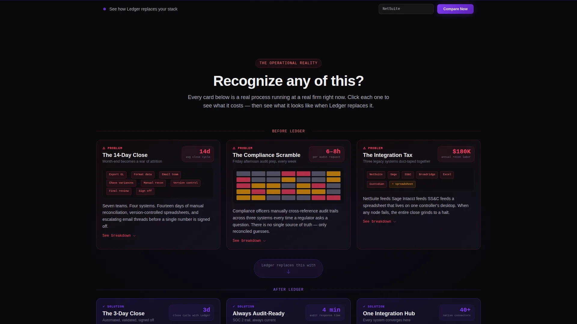
- A modular problem-and-solution card grid where each pain card has a matching resolution card in the same visual format
- A sticky comparison bar, a guided feature matrix tool, and two conversion paths with distinct capture forms
Feature list
This template includes the following built-in sections and components, all drawn directly from the design brief.
Living Dashboard Preview Header
The header renders a pixel-specific ERP command screen with a real-time profit and loss (P&L) waterfall, an open reconciliation queue showing three amber-flagged items, a compliance status ring at 97 percent, and a cash position ticker scrolling across the bottom. Data points such as "Net Revenue $4.2M, up 3.1% month-to-date" and "GL Exceptions: 3 pending" make the interface feel authentic and earned rather than decorative.
Problem-to-Solution Card Grid
The modular grid opens with three problem cards: "The 14-Day Close" with a manual step timeline, "The Compliance Scramble" with a red risk heat map, and "The Integration Tax" showing disconnected legacy tool logos. As the visitor scrolls, each card transforms into its resolution equivalent using the same visual structure but rendered in violet and phosphor white. Each card is clickable and expands into a detail panel.
Sticky Comparison Bar
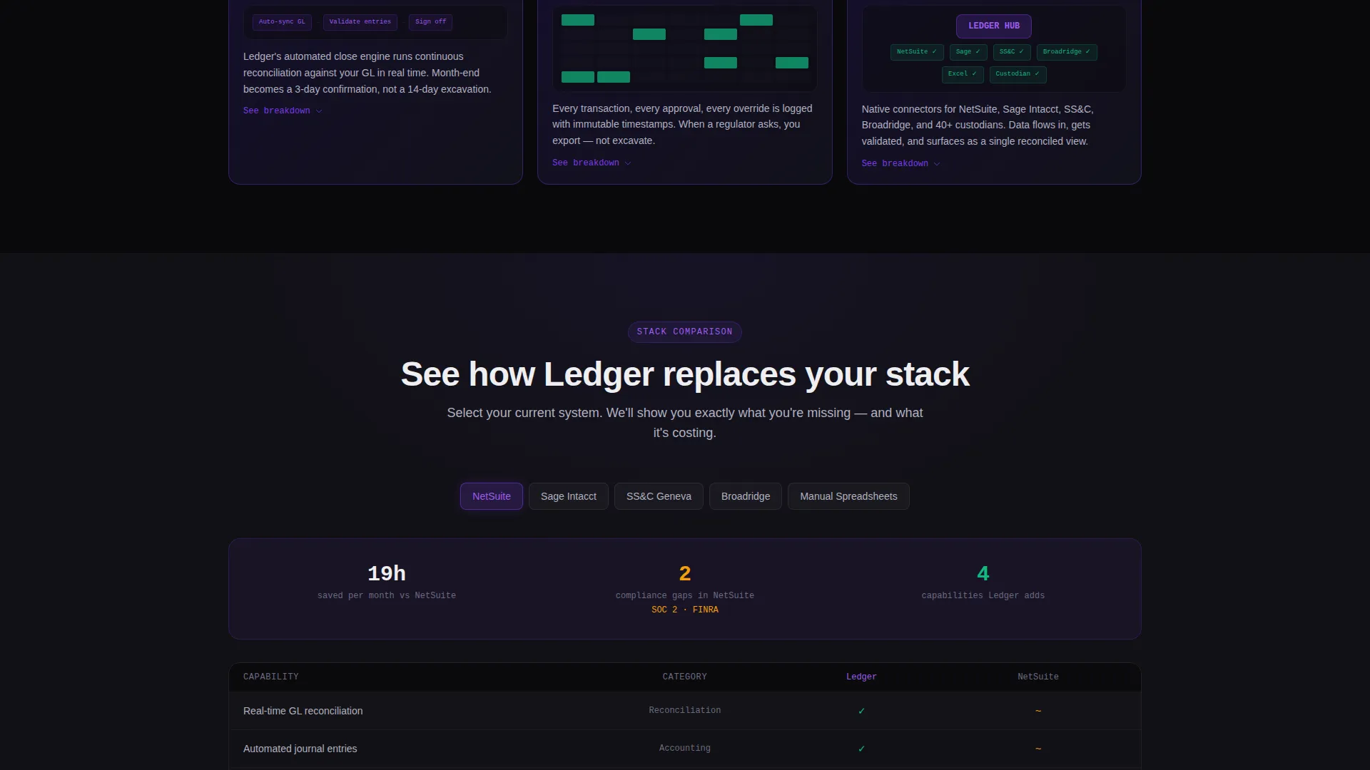
A persistent bar fixed to the top of the viewport reads "See How Ledger Replaces Your Stack." It opens a guided comparison tool where visitors select their current systems from a dropdown. The resulting side-by-side feature matrix auto-populates with checkmarks, time-savings estimates, and compliance coverage gaps.
Dual Conversion Path System
The primary call to action, "Build My Migration Plan," captures company name, assets under management (AUM) range or revenue band, current system selection pre-filled from the comparison tool, and one open-ended question: "What breaks first at month-end?" The secondary path offers "Download the Switching Cost Calculator" as a gated portable document format (PDF), capturing only a work email address.
Void & Violet Visual Identity
The entire template uses a four-tone color system: absolute void black (#09090B) as the base, deep interstellar violet (#2D1B69) for structural depth, electric iris (#7C3AED) for interactive highlights and hover states, and cool phosphor white (#EEEEF0) for card surfaces and body text. There is no stock photography or illustration. The product itself is the visual.
Page sections overview
| Section | Purpose |
|---|---|
| Dashboard Preview Header | Opens with live ERP data to establish product credibility immediately |
| Problem Card Grid | Exposes month-end close, compliance, and integration pain points visually |
| Solution Card Grid | Mirrors each problem card with a resolved equivalent in violet and white |
| Sticky Comparison Bar | Persists across scroll to invite stack comparison at any point |
| Guided Comparison Tool | Lets visitors select current systems and view a populated feature matrix |
| Primary call to action Form | Captures migration plan leads with pre-filled context from the comparator |
| Gated PDF Download | Captures email-only leads not yet ready for a sales conversation |
Design & branding system
The design language is rooted in a Directory and Discovery theme. It treats the page like a catalog of operational states, dark on the left side of the arc and precise and lit on the right.
- Color system: void black (#09090B) base, deep interstellar violet (#2D1B69) structure, electric iris (#7C3AED) for interactive elements, and cool phosphor white (#EEEEF0) for readable surfaces
- No stock photography or illustration assets; all visual weight comes from the rendered product dashboard and the card grid transitions
- The card grid breathes between problem and solution states, with visual continuity maintained through consistent card dimensions, data display formats, and icon treatment
Mobile & speed optimization
The card grid layout is modular by design, which means it adapts naturally across viewport sizes without breaking the Problem-to-Solution narrative arc. The sticky comparison bar and expandable card panels are structured to remain functional at smaller screen widths.
- The modular grid reflows gracefully so that problem and solution card pairings remain visually connected on narrower screens
- The Dashboard Preview header is designed to render the ERP interface at appropriate scale on mobile without losing the specific data labels that give it credibility
- The two-path conversion system keeps both the primary form and the PDF download reachable without requiring the visitor to scroll back to the top
How this template helps you convert
This template is engineered around a single conversion principle: show the visitor their own pain in data before asking for their name. Every structural decision supports that principle.
- The Problem-to-Solution arc creates a scroll experience where each resolved card feels like direct relief. Visitors arrive skeptical and leave with a mental model of what the platform fixes for them specifically.
- The sticky comparison bar and guided matrix tool keep the conversion invitation visible without being intrusive. A visitor who reaches mid-page has already done comparison work inside the tool, which means the "Build My Migration Plan" form arrives pre-loaded with context rather than cold.
- The dual call to action system respects buyer readiness. Not every CFO is ready to talk to sales. The gated calculator captures that audience with minimal friction while keeping the sales-ready path prominent for those who are.
Other information about this template
This template is part of a broader card grid template system suited to enterprise software marketing pages. It is a strong fit for any financial operations platform that needs to earn trust with a technically literate, time-pressured buyer before making an ask.
- The template is categorized under Technology, specifically within the Financial Services Software and SaaS subcategory, with a niche focus on financial services enterprise resource planning (ERP)
- The intersection match score for this template's design system, theme, and landing page direction is 13, indicating a high degree of alignment between the visual and structural choices
- The comparison tool within the template is designed to reference buyer familiarity with platforms such as NetSuite, Sage Intacct, SS&C, and manual spreadsheet workflows, allowing the feature matrix to feel personally relevant rather than generic
- The template ships as a single-page layout and does not include a multi-page site structure

Theme
Directory & Discovery
Creative direction
Problem→Solution Arc
Color system
Void & Violet
Style
Card Grid (Modular)
Direction
Comparison/Versus
Page Sections
Dashboard Preview Header with Live ERP Data
Problem-to-solution Modular Card Grid
Sticky Comparison Bar and Feature Matrix
Dual Call-to-action Conversion System
Void and Violet Four-tone Color System
Related questions
Who is this landing page template designed for?
Does the template include the comparison tool layout?
What are the two conversion paths built into this template?
Can this template work for a financial platform that is not a full ERP?
Is the Dashboard Preview header section customizable?



