Financial Services Software & SaaS Professional Website Template
Ledger is a dark-themed, card grid landing page built for financial training platforms. It combines a dramatic Dark Glass Panels header, stats-first content rhythm, and a modular course card layout to turn first-time visitors into active learners. The design speaks fluent finance from the first scroll, and two clear conversion paths move visitors toward a free simulation or a gated resource download.
by Rocket studio
Quick summary
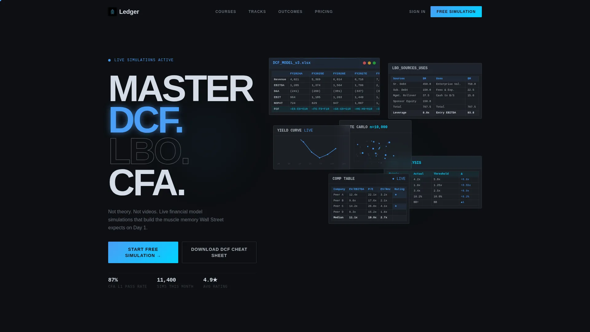
Ledger is a single-page, card grid landing page template designed for financial services training platforms. It opens with a six-panel Dark Glass header loaded with live-looking financial data fragments, then drives visitors through a stats-first scroll rhythm toward a freemium trial signup. Every design choice reflects the weight and precision of professional finance work.
Who this template is for
This template is built for teams running serious financial skills training. It suits platforms that need to earn trust quickly with a technically literate audience.
- Financial training platforms targeting aspiring Chartered Financial Analysts (CFA), junior analysts, and career changers
- SaaS companies offering simulation-based learning for valuation, credit, mergers and acquisitions, or quantitative finance
- Educators and course creators who need a credibility-first landing page that leads with proof before asking for a signup
What problem this template solves
Most training landing pages look like marketing brochures. A financially literate visitor sees through generic stock-photo hero sections instantly. Ledger solves the credibility problem by making the product itself the visual.
- Visitors see real-looking financial content (Discounted Cash Flow models, Leveraged Buyout waterfalls, credit matrices) before any marketing copy asks for trust
- The stats-first scroll rhythm delivers hard numbers ahead of explanations, so the platform proves competence before the visitor ever reads a headline
- Two distinct conversion paths serve visitors at different commitment levels, reducing drop-off from audiences who are curious but not yet ready to sign up
What you get with this template
Ledger gives you a fully structured, single-page layout with every section pre-built and ready to customize. The visual system, content rhythm, and conversion flow are all designed to work together.
- A staggered six-panel Dark Glass header displaying data fragments including a partially built DCF, an LBO waterfall, a credit rating matrix, a yield curve, a Monte Carlo scatter plot, and a comparable companies table
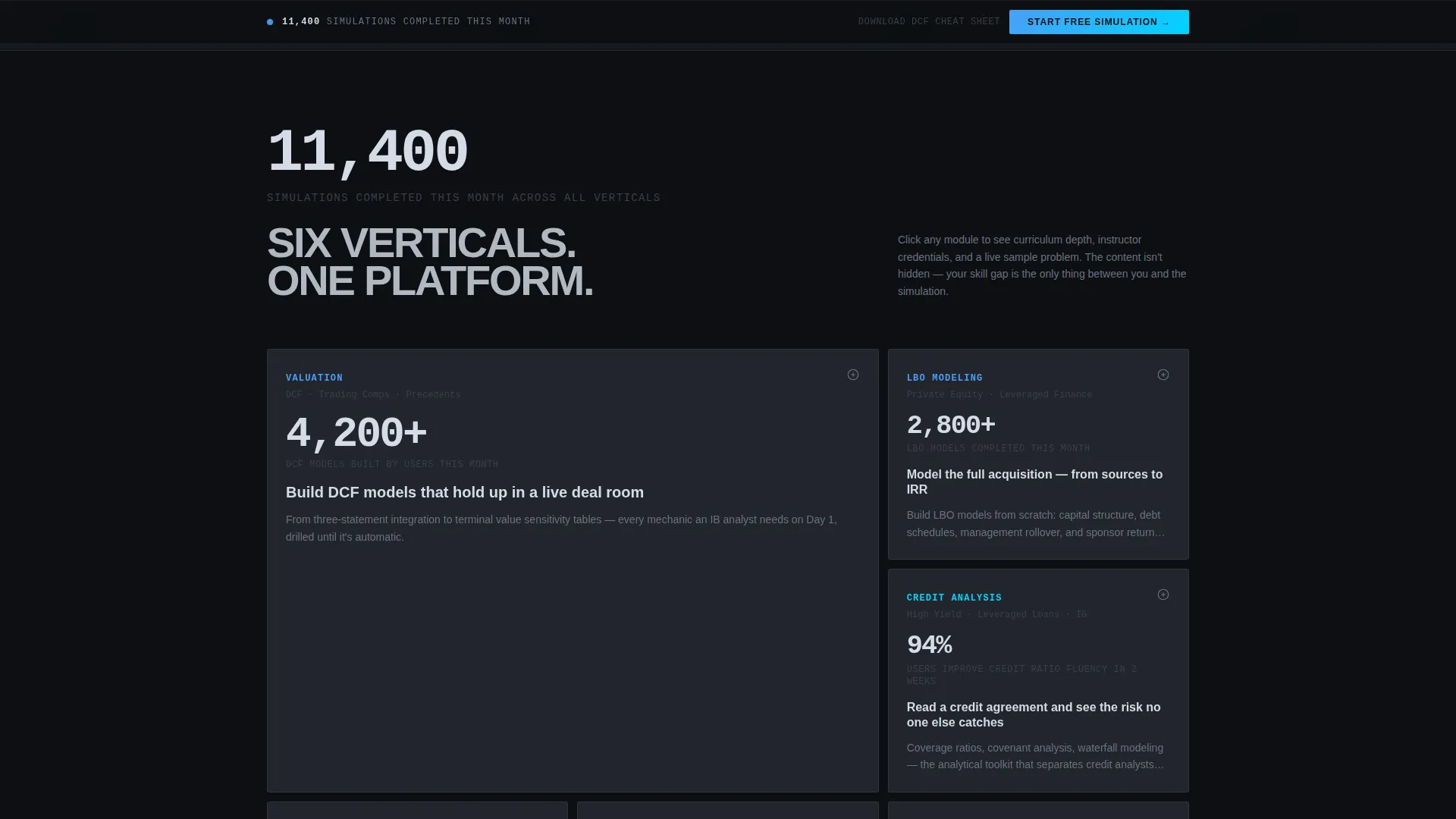
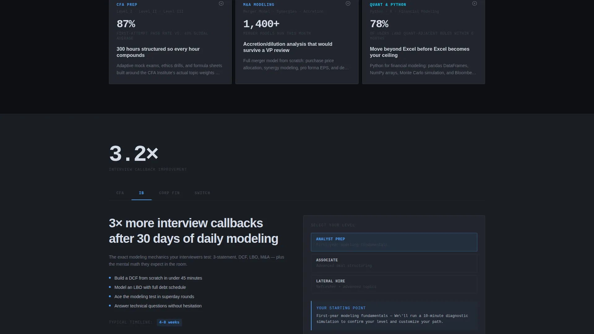
- A modular card grid for course verticals (Valuation, Credit, Mergers and Acquisitions, Quantitative Finance) where each card front-loads a completion stat or hiring outcome, then expands to reveal curriculum depth and a sample problem
- A primary freemium call-to-action flow with two steps (track and experience level selection via toggle, then email and first name only), plus a secondary gated PDF download path for visitors not yet ready to commit
Feature list
This section describes the core built-in capabilities that define the Ledger template experience.
Six-Panel Dark Glass Header
The header arranges six frosted glass panels in a staggered grid against a pure black background. Each panel displays a different live-looking financial data fragment. A subtle parallax drift on mouse movement adds depth without distracting from the financial content.
Stats-First Scroll Architecture
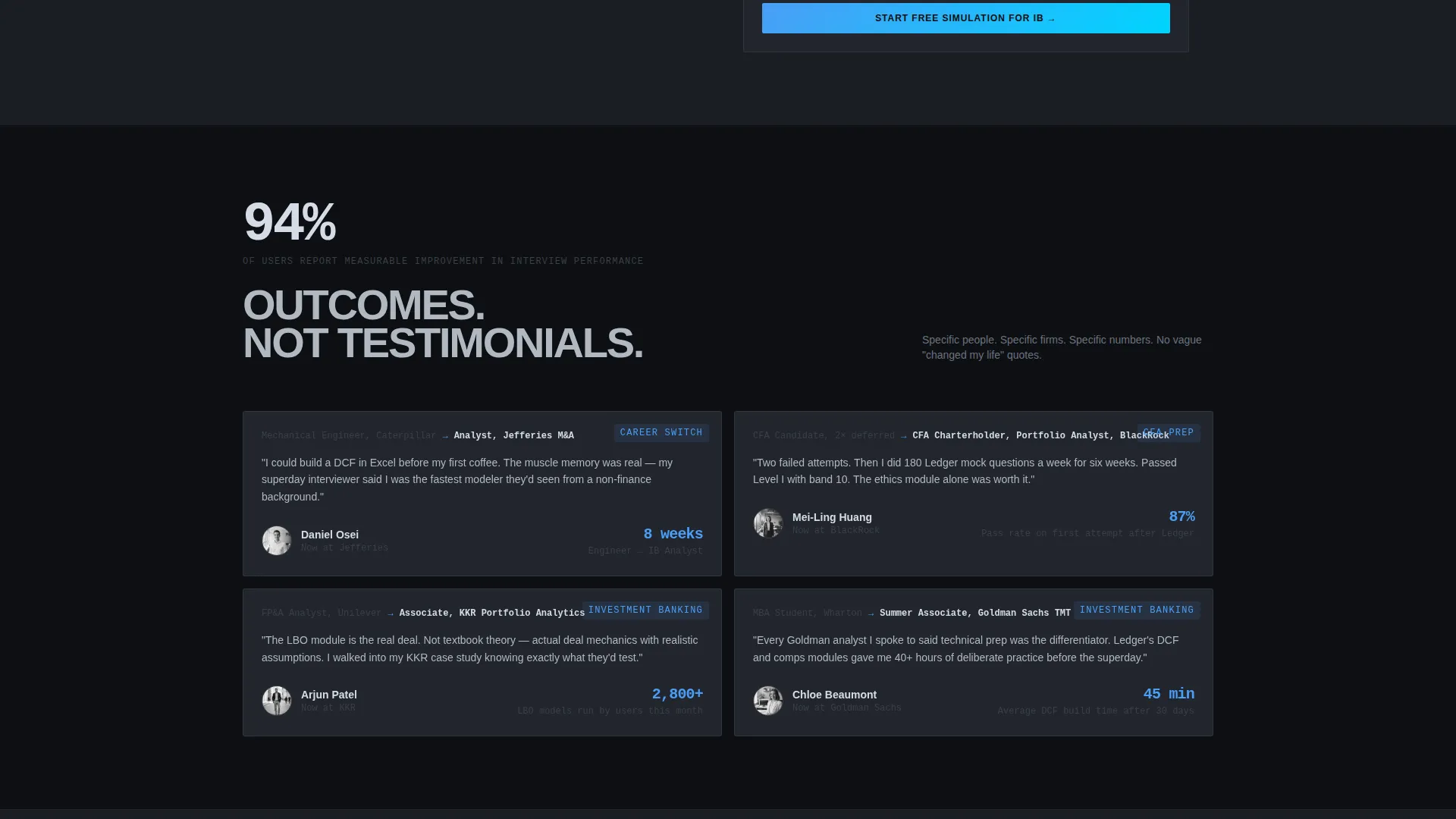
Every scroll transition opens with a hard number in oversized chrome typography before any explanation appears. This structure primes curiosity and establishes platform credibility with measurable outcomes before the visitor reads a single marketing claim.
Modular Course Card Grid
Each card in the grid represents a course vertical. Cards front-load a completion stat or hiring outcome on the visible face, then flip or expand on click to reveal curriculum detail, instructor credentials, and a sample problem. The layout is modular, so verticals can be added or rearranged without restructuring the page.
Two-Step Freemium Signup Flow
The primary conversion path uses a two-step modal. Step one lets the visitor select their learning track and experience level using clean toggles (no dropdowns). Step two collects only an email address and first name. No credit card is required.
Persistent Secondary Call-to-Action Bar
After the second scroll fold, a sticky bottom bar keeps the primary call-to-action visible throughout the rest of the page. This ensures the signup prompt stays accessible without interrupting the content experience above it.
Gated PDF Download Path
A secondary conversion option offers a downloadable resource (such as a DCF Cheat Sheet) in exchange for an email address. This path captures visitors who are not yet ready to start a simulation, turning passive browsers into leads through value exchange.
Page sections overview
| Section | Purpose |
|---|---|
| Dark Glass Header | Opens with six data panels and the primary call-to-action |
| Stats Impact Row | Delivers hard numbers before any explanatory copy |
| Course Card Grid | Displays verticals with front-loaded outcomes and expandable depth |
| Simulation call to action Panel | Reinforces the free simulation offer mid-page |
| Persistent call to action Bar | Keeps the signup prompt visible after the second scroll fold |
| PDF Download Section | Captures emails via a gated resource for undecided visitors |
Design & branding system
The Ledger visual identity is built on a Monochrome Steel palette that references the tactile feel of professional trading terminals. Every color decision is functional and intentional.
- Backgrounds range from deep terminal black (#0D0F12) to near-black (#1A1D23); card surfaces sit at #22262E with subtle 1-pixel chrome borders; body text renders in polished chrome (#B0B8C1)
- Cold electric blue (#4A9EF7) appears only on hover states, progress bars, and calls-to-action, keeping its presence scarce enough to carry real visual weight each time
- Typography uses oversized chrome numerals for stats, clean body text for descriptions, and a consistent dark-glass card surface treatment that gives every element the feeling of an illuminated terminal panel
Mobile & speed optimization
The card grid layout is built to reflow cleanly across screen sizes. Modular sections stack and resize without losing the visual hierarchy that makes the stats-first rhythm effective.
- The staggered six-panel header adapts to narrower viewports by collapsing the parallax depth effect while preserving the dark glass panel aesthetic
- Card grid modules reflow from multi-column desktop layouts to single-column mobile stacks, keeping course vertical content readable and the expand-on-click interaction accessible on touch screens
How this template helps you convert
Ledger is designed so that every section moves the visitor one step closer to clicking the primary call-to-action. The page earns the click before it asks for it.
- The stats-first scroll structure builds platform credibility with real numbers early, so by the time the visitor reaches the signup prompt they have already absorbed multiple proof points rather than a single marketing pitch
- The two-step freemium flow removes friction by asking only for a track selection and an email address, while the secondary PDF download path ensures that even hesitant visitors leave a contact detail in exchange for something immediately useful
Other information about this template
Ledger is a strong fit for any financial services training platform that needs to signal professional-grade quality from the first second of a visit. The Directory and Discovery theme means the page feels more like a professional resource hub than a sales page.
- The template style is Card Grid (Modular), which makes it straightforward to add, remove, or reorder course verticals as a curriculum grows
- The freemium and trial conversion direction is baked into the page structure, so the call to action logic does not need to be rebuilt from scratch
- Ledger's visual identity draws a clear parallel to the experience of working at a Bloomberg terminal: dark surfaces, chrome text, and a single blue accent that fires only when it matters
Theme
Directory & Discovery
Creative direction
Stats-First Impact
Color system
Monochrome Steel
Style
Card Grid (Modular)
Direction
Freemium/Trial
Page Sections
Six-panel Dark Glass Header
Stats-first Scroll Architecture
Modular Course Card Grid
Two-step Freemium Signup Flow
Persistent Bottom Call to Action Bar
Gated PDF Download Path
Related questions
Who is the Ledger template designed for?
Can I change the course verticals in the card grid?
Does the template include the two-step signup flow?
What does the secondary PDF download section do?
Can the color system be adjusted to match a different brand?



