Ledger - Powerful Government Landing Page Template
Ledger is a government asset management landing page template built for procurement officers and agency administrators who need real, operational clarity. It opens with a live-styled terminal header, moves into an interactive savings calculator, and walks visitors through filterable data grid demos, all designed to turn skeptical public-sector buyers into qualified pilot requests.
by Rocket studio
Quick summary
Ledger is a single-page template for a government inventory management platform. It leads with a terminal-style code snippet header, an interactive savings calculator, and layered data grid demonstrations. The visual identity draws from a mission-control color system. Every section is designed to move procurement officers and agency administrators toward a pilot request or a compliance checklist download.
Who this template is for
This template is built for government software and SaaS platforms targeting public-sector buyers. It speaks directly to the people who run asset inventories across large, distributed organizations.
- State agency directors reconciling warehouse inventories before audit season
- County administrators tracking federally funded equipment through compliance lifecycles
- Municipal IT managers trying to account for hundreds of unlocated devices across departments
What problem this template solves
Government agencies lose millions each fiscal year to duplicate purchases, misplaced assets, and audit prep that takes weeks instead of hours. The people responsible for fixing this are working from spreadsheets and filing cabinets that were never built for the scale of the problem.
- No single view of assets across departments, locations, or lifecycle stages
- Audit preparation is slow, manual, and still produces gaps in compliance records
- Procurement decisions get made without knowing what equipment already exists
What you get with this template
This landing page template gives you a structured, conversion-focused layout that matches the expectations of public-sector decision-makers. Every component is chosen to demonstrate platform credibility before asking for a commitment.
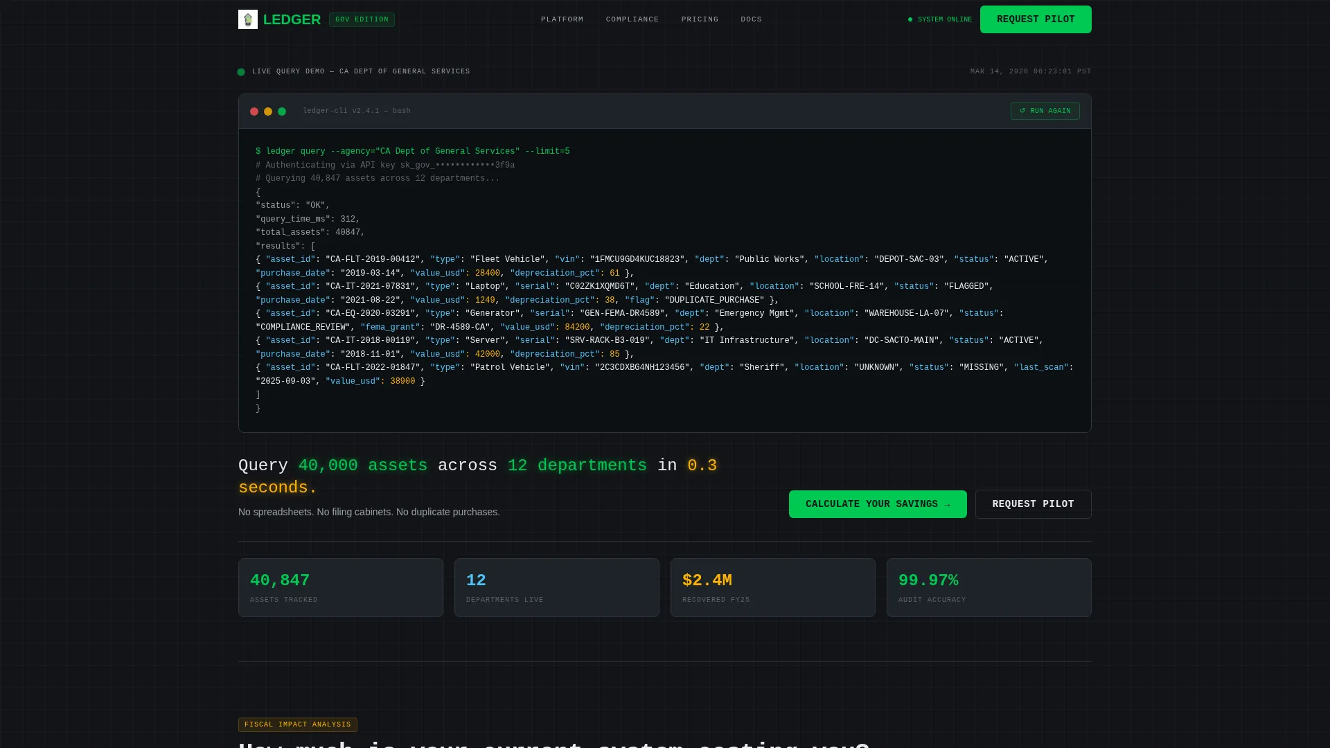
- A terminal-style code snippet header showing a live API call with realistic asset records including vehicle identification numbers, purchase dates, and depreciation values
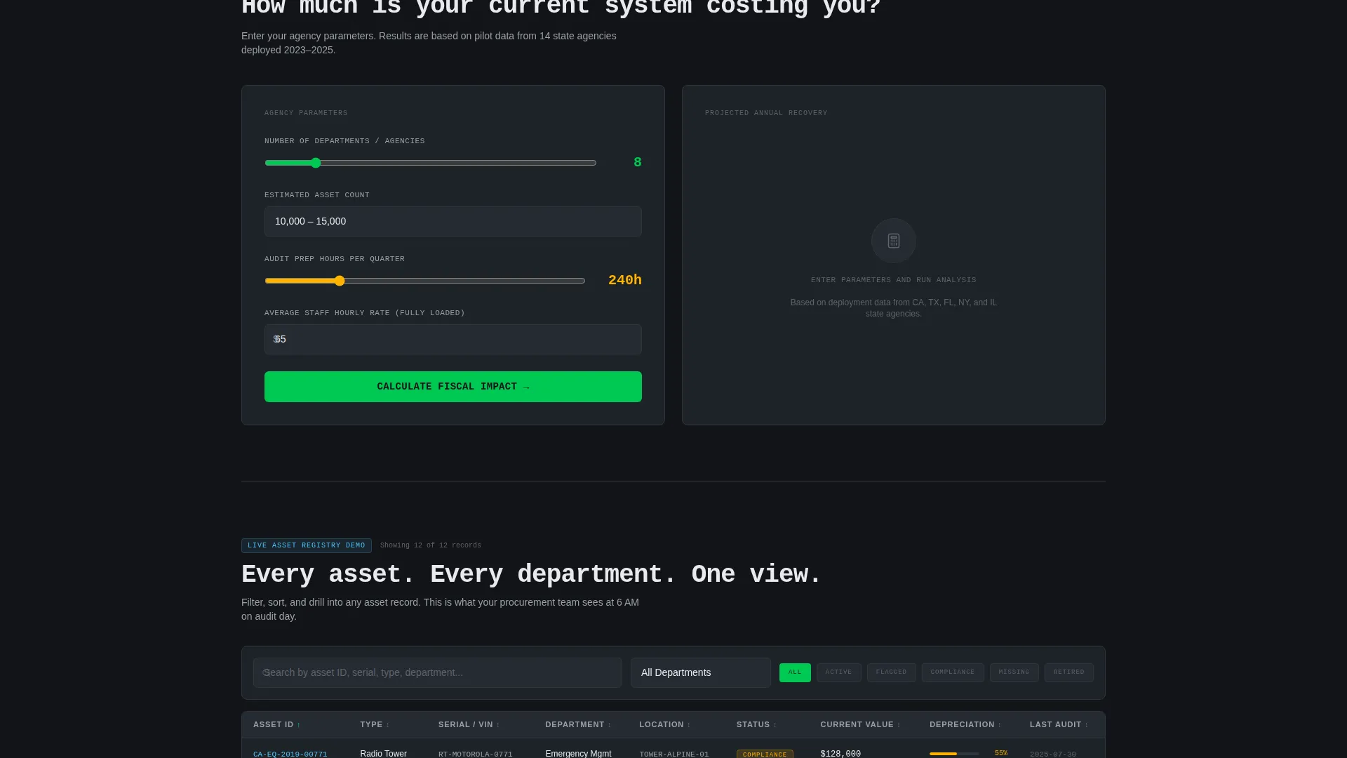
- An interactive savings calculator that takes department count, asset volume, and quarterly audit hours as inputs, then returns projected cost recovery figures
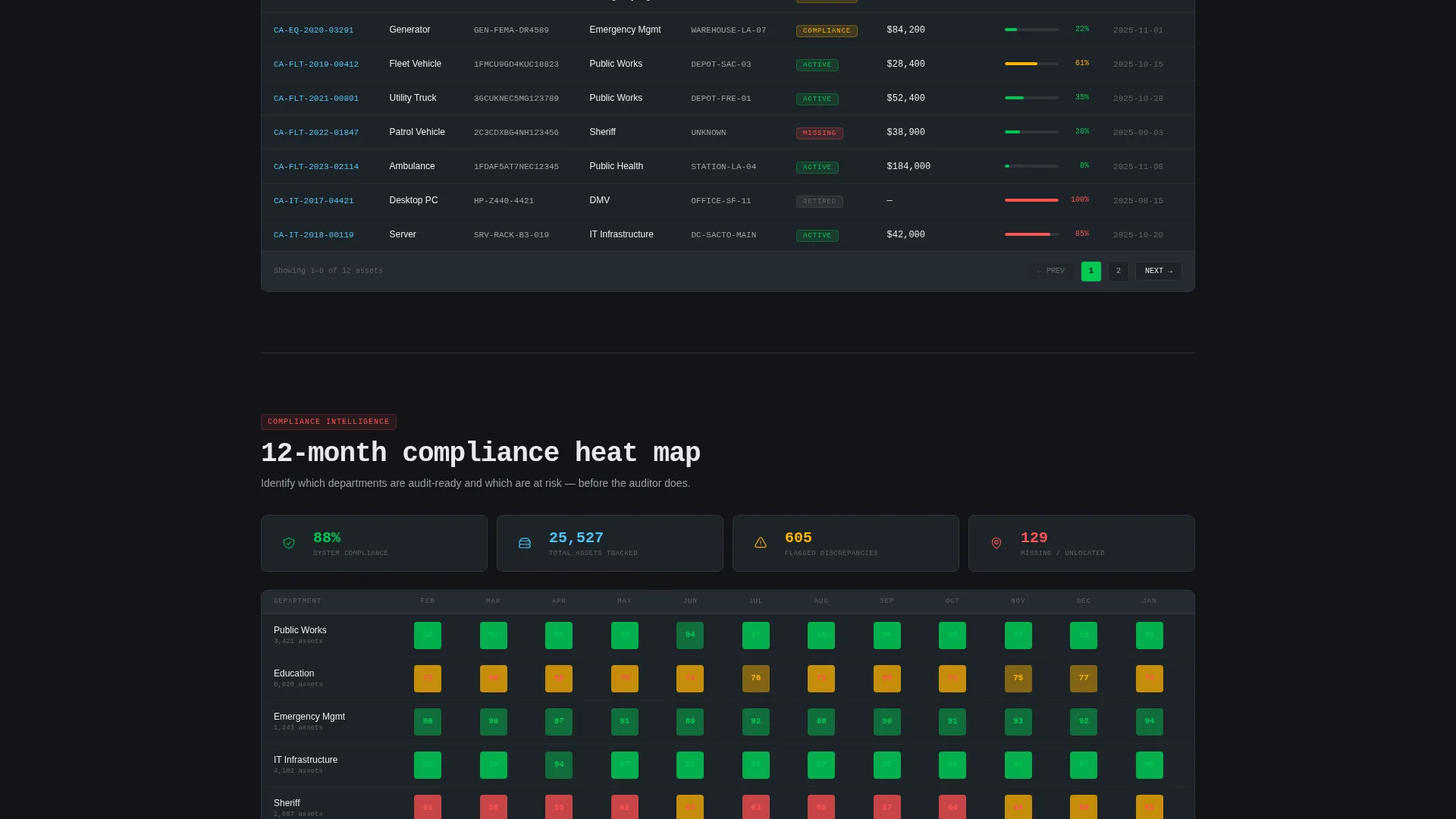
- Filterable data grid demonstrations with asset lifecycle stages, compliance status heat maps, and depreciation curves
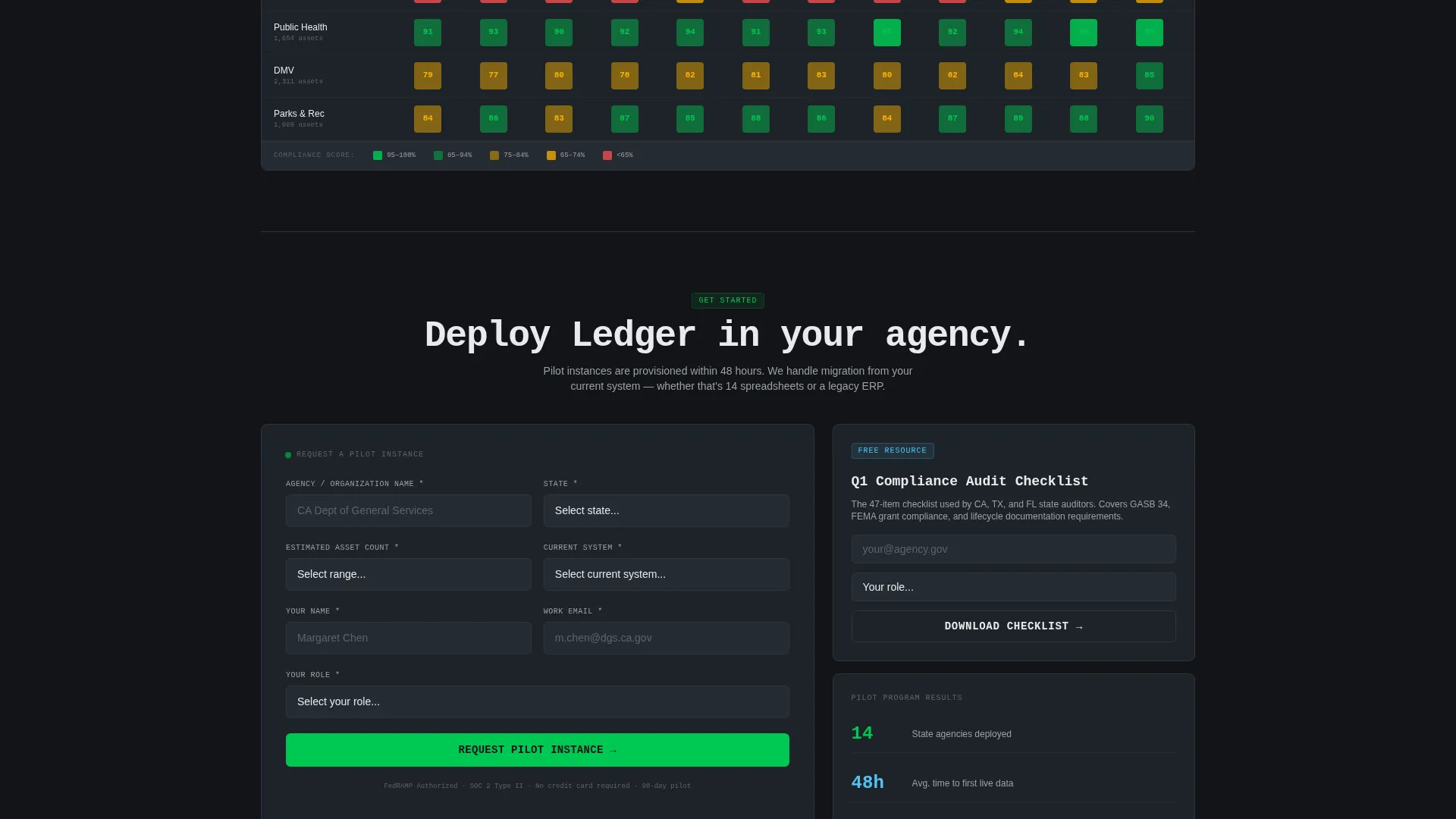
- Two lead capture paths: a pilot request form collecting agency name, state, asset count range, and current system type, plus a secondary checklist download gated by email and role title
Feature list
This template is built around functional demonstration rather than marketing copy. Each component earns visitor trust by showing capability before asking for contact information.
Terminal-Style Code Snippet Header
The header opens with a live-styled terminal block displaying a realistic API call and a JSON response populated with actual-format asset records. Vehicle identification numbers, purchase dates, depreciation values, and location codes render in monospaced type with a faint green glow against carbon black. A single fade-in line below reads: "Query 40,000 assets across 12 departments in 0.3 seconds."
Interactive Savings Calculator
Before any marketing copy, visitors encounter a calculator that accepts their department count, estimated asset volume, and current audit hours per quarter. The tool returns projected cost recovery from eliminated duplicate purchases and reduced audit preparation time. This positions the platform's value in the visitor's own numbers before they reach the demo sections.
Layered Data Grid Demonstrations
Scrolling past the calculator reveals filterable tables showing asset lifecycle stages, compliance status heat maps, and depreciation curves. Each section adds a deeper layer of platform intelligence. The scroll experience is designed to feel like drilling down through nested data, growing more granular and more persuasive with each level.
Dual Lead Capture Paths
The primary call to action is "Request a Pilot Instance," placed immediately after the calculator output and repeated after the final data grid demonstration. The pilot form collects agency name, state, estimated asset count from a dropdown, and current system from a dropdown that includes spreadsheets, legacy enterprise resource planning software, and no system. A secondary path offers a compliance audit checklist download gated behind just an email address and role title.
Dashboard Pro Visual System
The Carbon Fiber color system uses deep carbon black for backgrounds, gunmetal panel gray for surface panels, status-green for active assets, and alert amber for flagged discrepancies. Cool interface white handles primary text. The palette is entirely operational in intent, every color carries meaning, nothing is decorative.
Page sections overview
| Section | Purpose |
|---|---|
| Terminal Header Block | Opens with a live-styled API code snippet and a single proof-of-capability line |
| Savings Calculator Tool | Lets visitors input their own figures and receive projected cost recovery estimates |
| Pilot Request Form | Primary lead capture placed directly after the calculator output |
| Data Grid Demos | Filterable tables demonstrating asset lifecycle stages, compliance heat maps, and depreciation curves |
| Compliance Checklist Gate | Secondary lead capture offering a downloadable audit checklist for earlier-stage visitors |
| Repeat Pilot call to action | Final call to action placed after the last data grid demonstration |
Design & branding system
The visual identity is built around the Dashboard Pro theme and the Carbon Fiber color system. The palette draws from mission control aesthetics, matte dark surfaces where every pixel of color carries operational meaning.
- Deep carbon black (#121417) for backgrounds, gunmetal panel gray (#1E2328) for surface panels, status-green (#00C853) for active asset indicators, and alert amber (#FFB300) for flagged discrepancy states
- Cool interface white (#E8EAED) for primary text, with monospaced type in the header glowing faintly green against carbon black
- No stock photography and no lifestyle imagery, the design relies entirely on code, data grids, and color-coded status indicators to communicate credibility
Mobile & speed optimization
The layout is structured as a single-page flow with a clear vertical hierarchy. Section ordering follows a logical drill-down, which keeps the experience coherent on smaller screens where users scroll rather than skim across a wide viewport.
- The terminal header, calculator, and data grid sections are each self-contained blocks that translate well to a stacked mobile layout
- The dual lead capture paths are positioned at logical scroll depths, reducing the chance that a mobile visitor misses both conversion opportunities
How this template helps you convert
This template is built around a Calculator/Tool First creative direction, which means visitors experience value before they see a sales pitch. That approach works particularly well with public-sector buyers who are skeptical of vendor claims.
- The savings calculator delivers a personalized cost recovery figure using the visitor's own inputs, making the platform's value concrete before any form appears.
- The "Request a Pilot Instance" call to action is placed at the highest-intent moment, right after the calculator returns results, then repeated after the deepest data demonstration on the page.
- The compliance checklist download creates a second conversion path for visitors who are early in their evaluation, capturing their contact details without requiring a demo commitment.
Other information about this template
This template is designed specifically for the government inventory management niche, where trust and proof of capability matter more than aesthetic polish. A few additional details are worth noting for teams evaluating this layout.
- The template style is Dashboard/Data Grid, making it a natural fit for platforms that need to demonstrate data density and operational intelligence rather than brand storytelling
- The header concept is a Code Snippet, which signals technical credibility immediately to procurement officers and IT administrators who are the actual decision-makers
- The lead generation direction is reflected in every structural choice: the calculator, the dual form paths, and the call to action repetition all serve qualification before sales
- The template works well for platforms replacing legacy tools such as spreadsheets or older enterprise resource planning systems, because the design language itself communicates a generational step forward
- Teams customizing this template should populate the calculator with realistic default ranges and ensure the data grid demo rows use plausible asset records to maintain the operational credibility the design establishes
Theme
Dashboard Pro
Creative direction
Calculator/Tool First
Color system
Carbon Fiber
Style
Dashboard/Data Grid
Direction
Lead Generation
Page Sections
Terminal-style Code Snippet Header
Interactive Savings Calculator
Layered Data Grid Demonstrations
Dual Lead Capture Paths
Carbon Fiber Dashboard Visual System
Related questions
Who is this landing page template designed for?
What lead capture options does this template include?
Can I customize the savings calculator inputs and outputs?
Does the template use any photography or lifestyle imagery?
What makes this template suitable for government software marketing?



