Healthcare Software Cost Calculator Website Template
Ledger is a healthcare asset management landing page built on a dark dashboard layout with electric indigo data visuals. It shows hospital operations teams exactly how to position a real-time tracking platform, using animated metrics, a comparison grid, and a facility ROI calculator to turn visitor curiosity into qualified pipeline.
by Rocket studio
Quick summary
Ledger is a single-page, dashboard-style landing page template for healthcare asset management platforms. It opens with a live-stats header, walks visitors through an industry-report narrative, and closes with a side-by-side comparison grid and a personalized ROI calculator. The result is a page that builds authority fast and converts researchers into leads.
Who this template is for
This template is designed for teams selling or marketing healthcare asset tracking software to hospital decision-makers. The content framing and visual system speak directly to the people who lose sleep over missing equipment.
- Biomedical engineering directors who need a clear case for replacing manual audits
- Supply chain and capital planning leaders justifying large equipment budgets to finance teams
- Nurse managers and operations staff who need faster, more reliable device location tools
What problem this template solves
Hospital floors lose thousands of dollars per bed every year to misplaced and untracked equipment. A generic software landing page cannot communicate that cost or build the institutional credibility needed to earn a discovery call. Ledger solves the persuasion problem.
- It quantifies the cost of inaction before a visitor reaches the first call to action
- It replaces vague feature lists with a structured, data-backed comparison that makes manual tracking look visibly inferior
- It gives high-intent visitors two conversion paths so that both ready buyers and active researchers are captured
What you get with this template
Ledger delivers a complete, conversion-focused landing page structured as a proprietary industry report. Every section has a job, and every visual is purpose-built data content rather than stock photography.
- A full-width animated stats header showing tracked assets, utilization rate, locate time, and annual recovery value
- An interactive three-way comparison grid covering twelve evaluation dimensions with scroll-triggered row reveals
- A sequential ROI calculator that personalizes a savings estimate based on bed count, asset volume, and replacement budget
Feature list
A brief overview of what makes this template function well as a high-converting healthcare software page.
Animated Stats Header Wall
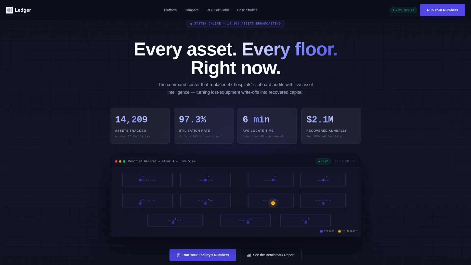
The header displays four live metrics: 14,209 assets tracked, 97.3% utilization rate, 6-minute average locate time, and $2.1 million recovered annually. Each number counts upward from zero on page load, simulating a system coming online. Below the counters, a miniature hospital floor map pulses with indigo dots showing real-time device positions, including one dot visibly moving between rooms.
Industry Report Narrative Flow
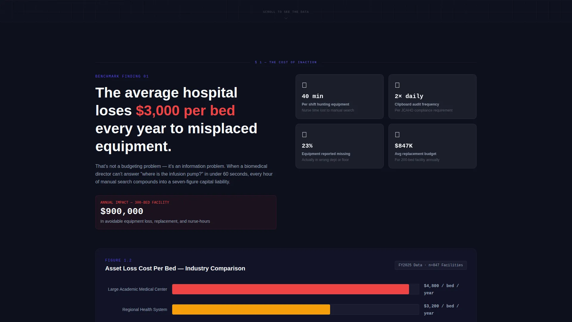
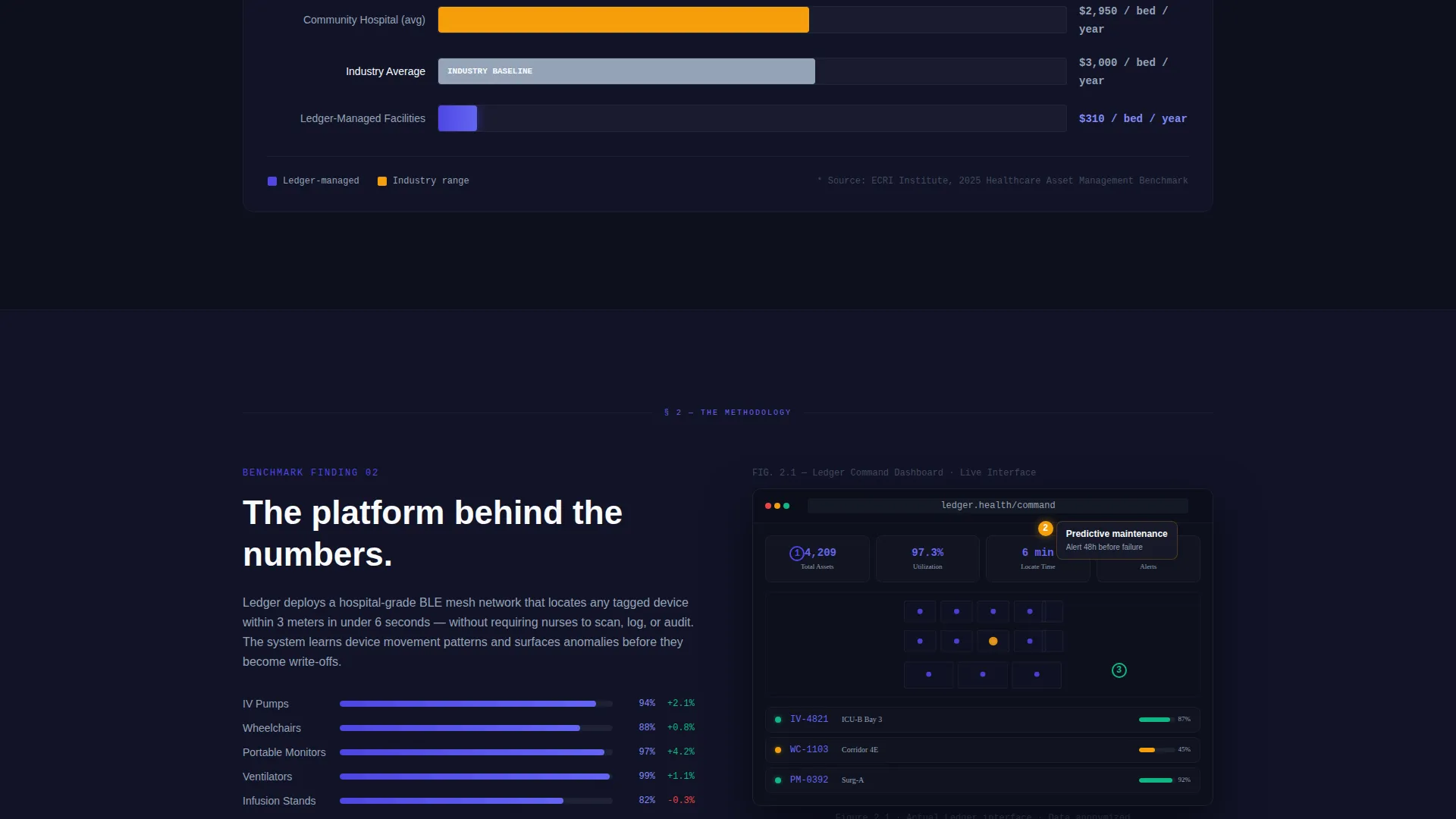
The page scrolls like a confidential benchmark study. Section one presents the problem with an animated bar chart comparing industry-wide equipment waste. Section two introduces the platform using annotated dashboard screenshots as visual evidence. The cadence builds authority with each scroll, making every new section feel more granular and more persuasive than the last.
Twelve-Dimension Comparison Grid
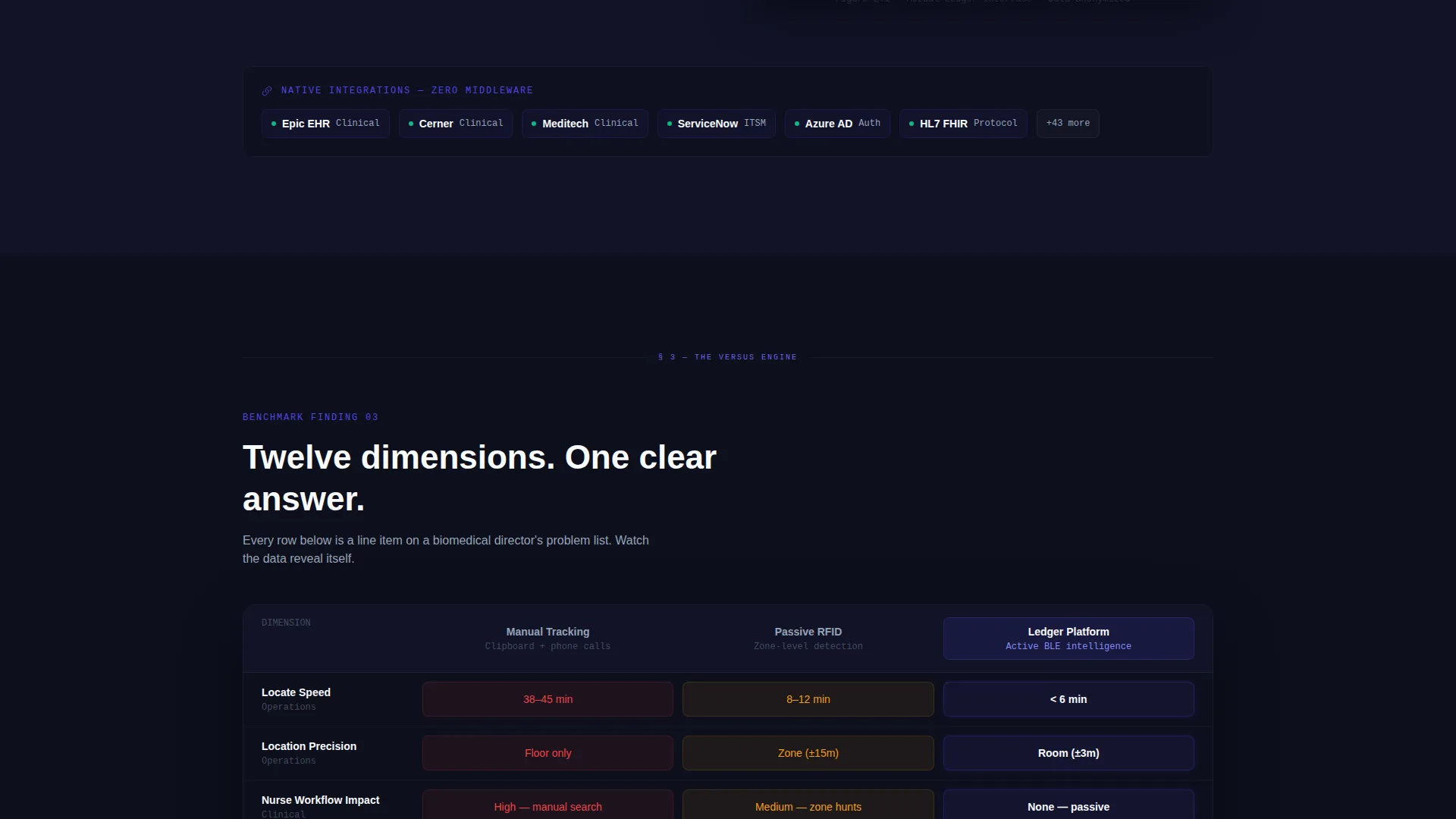
A side-by-side data grid compares manual tracking, passive RFID systems, and the platform across twelve evaluation criteria. Rows include locate speed, integration depth, battery life, and nurse workflow impact. Each row reveals with a subtle indigo fill as it enters the viewport, keeping the reader engaged through the full comparison.
Dual Conversion Path Design
The primary call to action, "Run Your Facility's Numbers," opens a three-field ROI calculator asking for bed count, asset volume, and annual replacement budget before generating a personalized savings estimate. A secondary path, "Download the Full Benchmark Report," sits directly below the comparison grid and captures email addresses from visitors still in research mode.
Dashboard Pro Visual System
The template uses a dark console layout with electric indigo chart highlights, cool slate grid borders, and clinical white metric cards. The visual system feels like a hospital command room at midnight. Every interactive element, including hover states, toggle switches, and live-count badges, is driven by the indigo accent.
Page sections overview
| Section | Purpose |
|---|---|
| Animated Stats Header | Opens with four key metrics and a live floor map to immediately establish platform credibility |
| Problem Quantified | Presents the $3,000-per-bed annual loss with an animated bar chart comparing industry waste data |
| Platform Introduction | Uses annotated dashboard screenshots as report figures to introduce the solution methodology |
| Comparison Data Grid | Benchmarks manual tracking, passive RFID, and the platform across twelve evaluation dimensions |
| ROI Calculator call to action | Converts high-intent visitors with a personalized savings estimate based on facility inputs |
| Benchmark Report Gate | Captures research-stage visitors with an email gate placed below the comparison grid |
Design & branding system
The visual identity follows a Dashboard Pro theme built entirely around an Electric Indigo color system. The palette communicates precision and urgency without relying on clinical stock imagery.
- Deep console black (#0D0F1C) forms the base canvas, cool slate (#94A3B8) handles secondary text and grid borders, and clinical white (#F8FAFC) floats card surfaces above the dark background
- Electric indigo (#4F46E5) carries all interactive weight including hover states, active data indicators, chart fills, and toggle switches
- The overall effect resembles a hospital operations room at midnight: every number is sharp, every alert is unmistakable, and the indigo glow signals live system activity
Mobile & speed optimization
The Ledger template is structured for clean rendering across screen sizes, so the dashboard experience holds together whether viewed on a desktop control room monitor or a mobile device between rounds.
- The stats header, comparison grid, and calculator sections are built to reflow gracefully on smaller viewports without losing visual hierarchy
- Data-heavy sections use card surfaces and bordered grid cells that remain scannable at reduced widths
- Scroll-triggered row reveals in the comparison grid are designed to fire reliably as content enters the viewport on both desktop and mobile browsers
How this template helps you convert
Ledger is built around a deliberate persuasion sequence. Each section prepares the visitor to take action at the next stage, so the call to action feels earned rather than forced.
- The animated metrics header creates immediate credibility by showing real platform output numbers before any marketing copy appears, anchoring the visitor's frame of reference in measurable outcomes
- The comparison grid makes the cost of alternatives visible across twelve dimensions, so by the time a visitor reaches the calculator, they already understand what doing nothing costs
- The dual-path conversion design captures both decision-ready buyers through the ROI calculator and research-stage evaluators through the benchmark report email gate, maximizing the leads generated from a single page visit
Other information about this template
Ledger sits at the intersection of healthcare software marketing and data-driven demand generation. A few additional details worth knowing before you build with it.
- The template style is classified as Dashboard and Data Grid, making it well suited for any SaaS platform that leads with operational intelligence
- The creative direction follows an Industry Report format, which works especially well for enterprise healthcare software where trust and authority matter as much as features
- The header concept is a Stats and Metrics wall, a pattern proven effective in B2B software marketing where quantified outcomes outperform feature headlines
- The comparison versus grid approach is the primary conversion driver, making this template a strong fit for competitive categories where buyers are actively evaluating alternatives
- This template is part of the Dashboard Pro theme family and uses the Electric Indigo color system throughout
Theme
Dashboard Pro
Creative direction
Industry Report
Color system
Electric Indigo
Style
Dashboard/Data Grid
Direction
Comparison/Versus
Page Sections
Animated Stats Header Wall
Industry Report Narrative Flow
Twelve-dimension Comparison Grid
Dual Conversion Path Design
Dashboard Pro Visual System
Related questions
Who is this landing page template built for?
Does this template include the ROI calculator functionality?
Can I use this template for a product outside healthcare?
How does the comparison grid work?
What makes this template different from a standard software landing page?



