Financial Services Software Specialist Cost Calculator Website Template
Ledger is a scroll-reveal landing page template built for healthcare billing and revenue cycle platforms. It combines a Feature Tab Switcher header, an animated Problem-to-Solution Arc, and a Comparison table with an interactive savings calculator. The Data Command visual identity uses deep slate, sky blue, and signal cyan to make every billing metric feel sharp and actionable.
by Rocket studio
Quick summary
Ledger is a single-page, scroll-reveal landing page template designed for healthcare billing and financial services patient management platforms. It opens with a three-tab dashboard header, walks visitors through an animated problem-and-solution arc, and closes the argument with a side-by-side comparison table and a personalized revenue gap calculator.
Who this template is for
This template is built for teams that sell revenue cycle management and patient billing software to clinical and administrative buyers. If your platform helps practices recover denied claims or reduce days in accounts receivable, Ledger is structured around exactly that conversation.
- Practice managers who deal with aging reports and manual insurance follow-ups
- Chief financial officers at multi-location health systems monitoring revenue leakage
- Independent physicians and small practice owners who want to spend less time chasing payers
What problem this template solves
Healthcare billing platforms are genuinely complex products. A generic landing page cannot carry the weight of that complexity, and it fails to earn the trust of financially literate buyers who will scrutinize every claim. Ledger solves the presentation problem by mirroring the diagnostic, data-driven language that practice managers and CFOs already use.
- Visitors arrive skeptical and leave convinced because the page speaks in billing metrics, not marketing language
- The problem-and-solution structure removes ambiguity by mapping each pain point to a specific platform capability
- The built-in calculator makes the cost of inaction concrete and personal before asking for any contact information
What you get with this template
You get a fully structured, scroll-reveal landing page template with pre-built sections, interactive components, and a cohesive visual system ready for a healthcare billing or revenue cycle platform. Every section has a defined purpose and a conversion role.
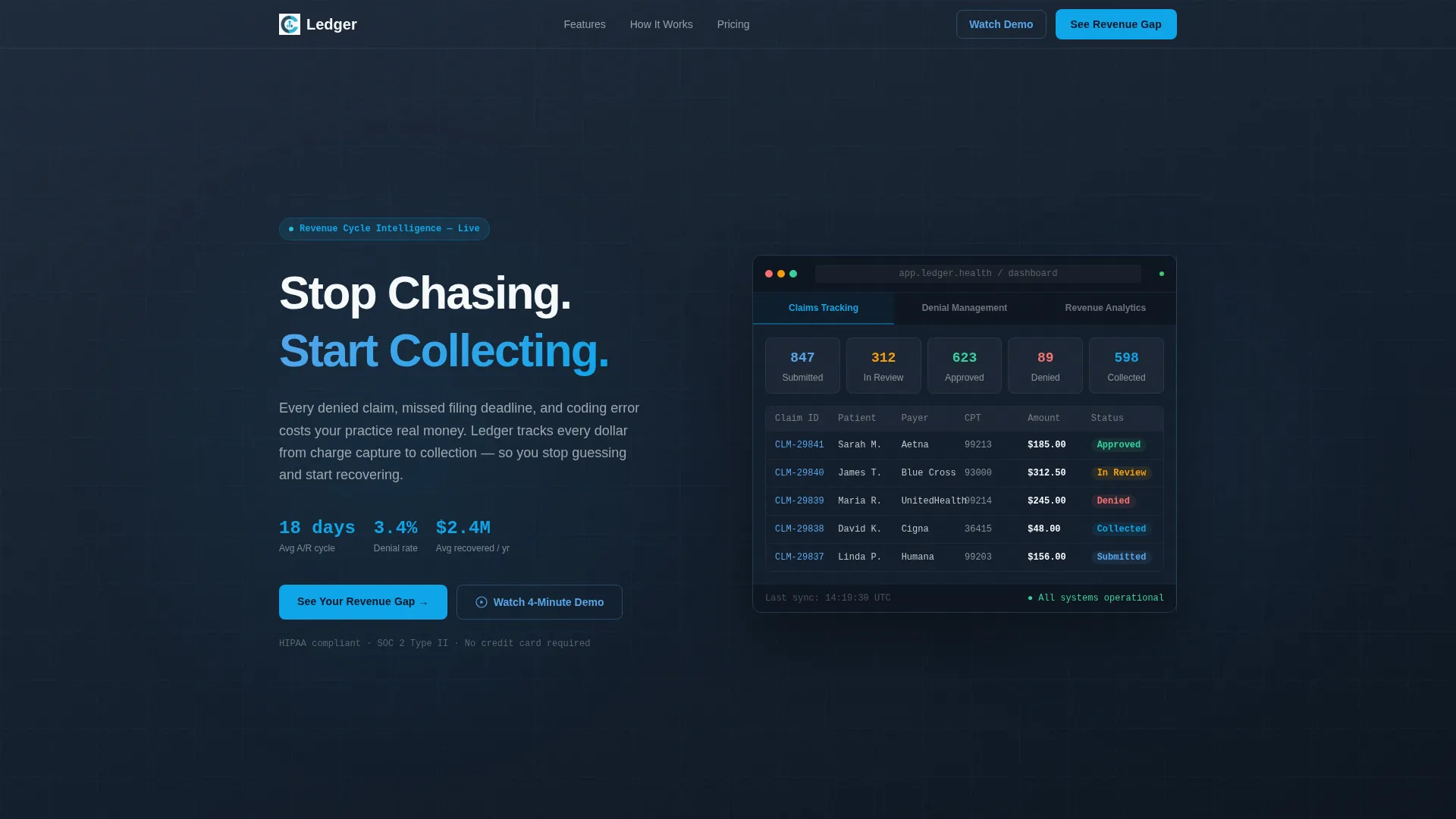
- A three-tab Feature Tab Switcher header with a live-rendered dashboard frame showing Claims Tracking, Denial Management, and Revenue Analytics views
- An animated Problem-to-Solution Arc with counter animations, root cause cards, and mirrored solution cards
- A sticky Comparison table, a personalized savings calculator with a form, and dual call-to-action paths
Feature list
This template is built around six functional components that each serve a distinct role in moving a skeptical buyer toward action.
Three-Tab Feature Switcher Header
The header places three labeled tabs above a dashboard frame. Each tab click swaps the visible interface: Claims Tracking shows a color-coded pipeline view, Denial Management reveals a waterfall recovery chart, and Revenue Analytics displays a rolling 12-month collection curve with benchmark overlays. Sample data includes specific dollar amounts, payer names, and partially visible CPT codes to make the interface feel real and credible.
Animated Problem-to-Solution Arc
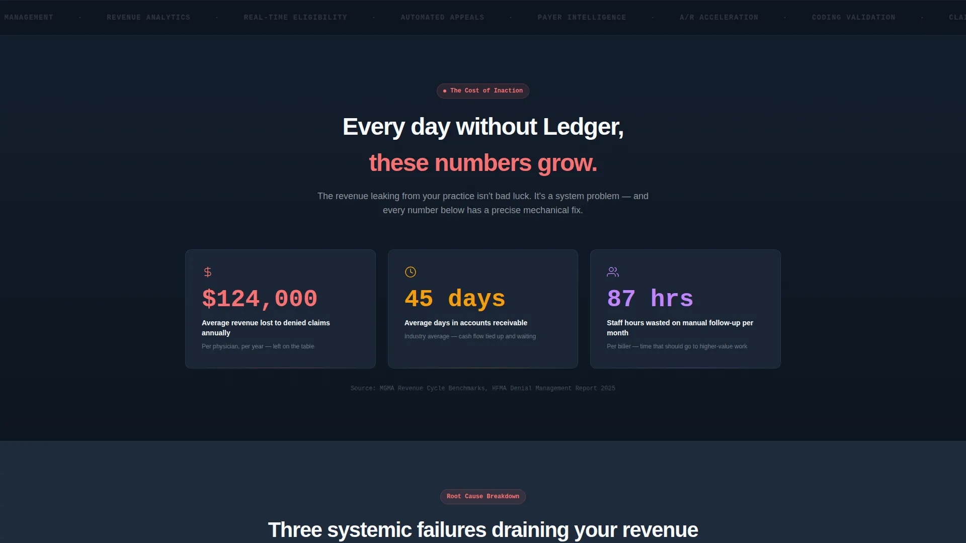
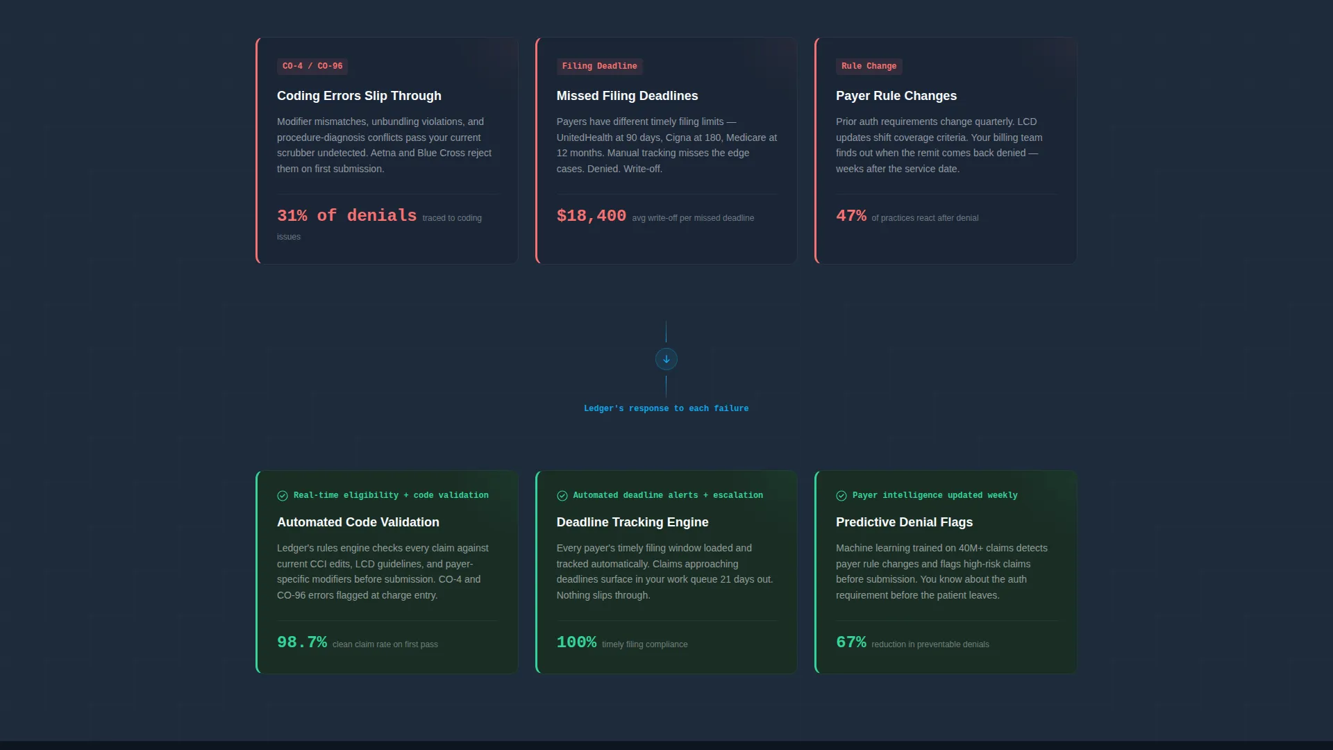
The scroll sequence unfolds in three paired reveals. First, animated counters tick upward to show average revenue lost to denied claims, days in accounts receivable, and staff hours spent on manual follow-up. Then three cards expose root causes using real denial reason codes. A mirrored set of three cards follows, each replacing a problem with its specific mechanical solution, including automated workflows, real-time eligibility checks, and predictive denial flags.
Sticky Comparison Table
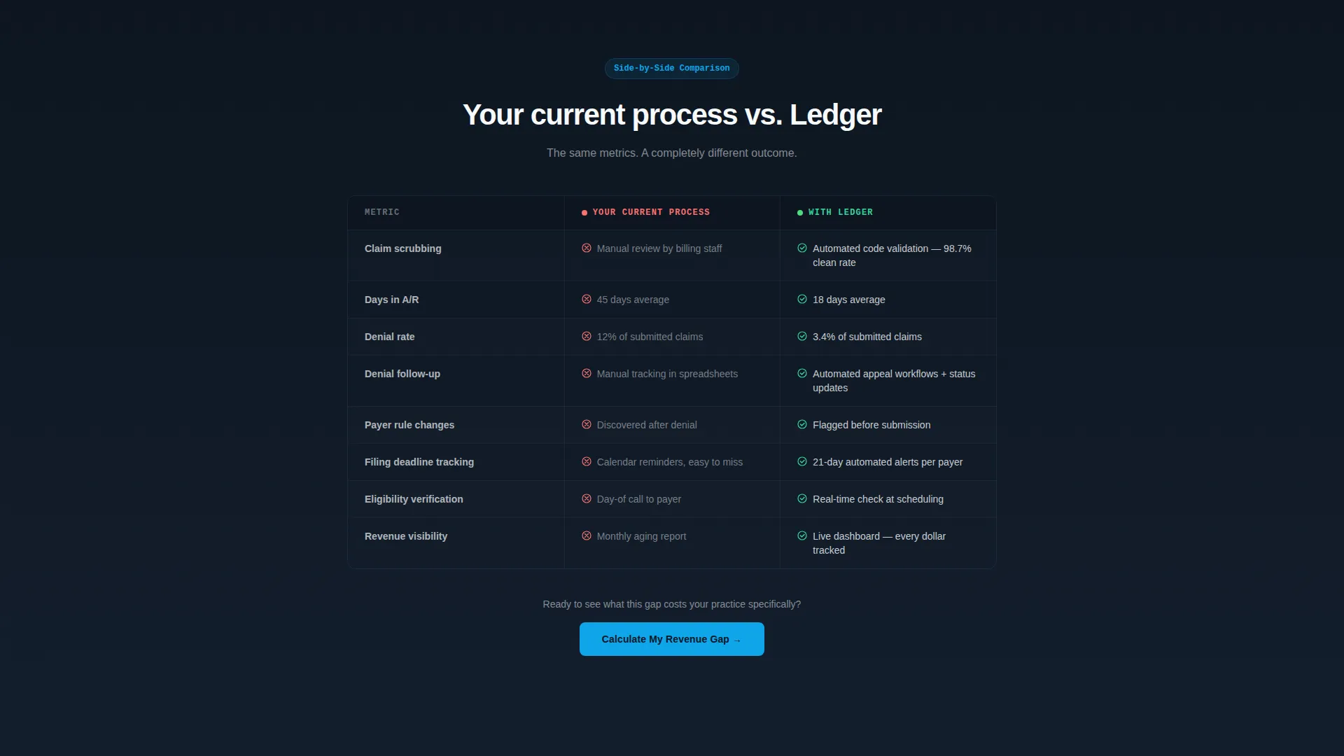
A two-column table anchors the mid-page section and holds the visitor's attention through a direct contrast. "Your Current Process" sits against "With Ledger" across rows covering claim scrubbing, days in accounts receivable, and denial rates. The specific figures shown, including 45-day versus 18-day accounts receivable and 12 percent versus 3.4 percent denial rates, give financially literate readers a measurable reason to act.
Revenue Gap Calculator
The primary call-to-action triggers a short calculator form. Visitors enter their monthly claim volume, current denial percentage, and average days in accounts receivable. The form returns a personalized savings estimate before requesting an email address and practice name. This sequence earns the lead by delivering value first.
Scroll Reveal Progressive Layout
Every section enters the viewport with a progressive reveal animation. The scroll pacing is designed to mirror a diagnostic report, building tension with the problem sections and releasing it with the solution sections. The motion guides attention without distracting from the data.
Dual Call-to-Action Path
Two conversion options run in parallel throughout the page. The primary path, "See Your Revenue Gap," leads to the calculator. The secondary path, "Watch the 4-Minute Demo," serves visitors who are not ready to input numbers. Offering both paths reduces drop-off from undecided visitors.
Page sections overview
| Section | Purpose |
|---|---|
| Tab Switcher Header | Introduces platform capabilities through three swappable dashboard views |
| Hero Headline Block | Anchors the value proposition with "Stop Chasing. Start Collecting." |
| Cost of Inaction | Animated counters show denied claim losses, days in accounts receivable, and staff hours |
| Root Cause Cards | Three progressive cards reveal systemic billing failures with denial reason codes |
| Solution Mirror Cards | Three matching cards show the platform's answer to each identified failure |
| Comparison Table | Side-by-side contrast of current process versus platform outcomes |
| Revenue Gap Calculator | Interactive form returns a personalized savings estimate |
| Dual call to action Section | Primary calculator path and secondary demo video path |
Design & branding system
The visual identity follows a Data Command theme that feels like a well-organized operations control room at early morning. The palette is calm, authoritative, and intentionally free of visual noise.
- Deep operations slate (#1E2A3A) dominates backgrounds and navigation chrome; mid-tone instrument gray (#4A5568) handles secondary text and borders; clinical sky blue (#56A5EC) highlights active states and key metrics
- Alert white (#F7FAFC) breathes across card surfaces and table rows to keep data readable; signal cyan (#0EA5E9) fires only on interactive accents and calls-to-action to draw the eye exactly where action is needed
- Typography uses a medium-weight sans-serif for headlines, keeping every number sharp and every column aligned against the dark slate backgrounds
Mobile & speed optimization
The scroll-reveal layout is structured to deliver a clean, readable experience across screen sizes. The progressive section reveals and the tab switcher are built to adapt to narrower viewports without losing the data-forward visual hierarchy.
- The sticky comparison table reflows cleanly on smaller screens so the side-by-side contrast remains legible
- The calculator form is designed with a minimal field count, three inputs, to reduce friction on mobile and keep the conversion path short
How this template helps you convert
Ledger is engineered around a single conversion insight: financially literate buyers need to feel the cost of their current process before they will consider switching. Every structural decision on the page supports that goal.
- The animated counters in the Cost of Inaction section create an uncomfortable and specific picture of revenue loss, making the problem visceral before the solution is introduced.
- The Revenue Gap Calculator personalizes the savings estimate using the visitor's own numbers, so the call-to-action is backed by a figure the visitor computed themselves rather than a generic marketing claim.
Other information about this template
Ledger is categorized under Technology and Financial Services Software, with a niche focus on financial services patient management. It is designed as a single-page scroll-reveal template and is well-suited for platforms serving the revenue cycle management market.
- The template style is Scroll Reveal (Progressive), meaning each section animates into view as the visitor scrolls, reinforcing the diagnostic narrative pacing
- The header concept is a Feature Tab Switcher, a pattern that works especially well when a platform has multiple distinct modules to showcase without requiring separate pages
- The creative direction follows a Problem-to-Solution Arc, and the landing page direction is Comparison/Versus, both of which are proven structural choices for financial services software that competes against manual or legacy processes
Theme
Data Command
Creative direction
Problem→Solution Arc
Color system
Slate & Sky
Style
Scroll Reveal (Progressive)
Direction
Comparison/Versus
Page Sections
Three-tab Feature Switcher Header
Animated Problem-to-solution Arc
Sticky Comparison Table
Revenue Gap Calculator
Dual Call-to-action Path
Scroll Reveal Progressive Layout
Related questions
Who is the Ledger template designed for?
Can I customize the sample dashboard data in the header?
What are the two conversion paths on this landing page?
Does the template include the calculator logic or just the form layout?
How does the comparison table section work?



