Ledger - Powerful Inventory Landing Page Template
Ledger is a hub-and-spoke landing page template built for wedding rental businesses that need to show exactly what their inventory platform can do. It pairs a Bold Brutalist visual identity with an AI Iridescent color system to present warehouse data, barcode scanning, kit bundling, and damage tracking as clear, confident product specifications that move serious buyers toward a demo.
by Rocket studio
Quick summary
Ledger is a single-page, anchor-nav landing page template designed for wedding inventory management platforms. It presents core product capabilities as a series of technical specification sections, each grounded in hard data and dark-mode user interface visuals. The design is Bold Brutalist with an AI Iridescent color system, making a complex operations product feel precise, trustworthy, and ready to use.
Who this template is for
This template is built for teams selling or showcasing software that manages wedding rental inventory at scale. If your buyers are operations-focused and they need to be convinced with clarity rather than lifestyle imagery, this layout speaks their language.
- Rental company owners who manage hundreds of items across simultaneous events
- Wedding planners and operations managers who have outgrown spreadsheets
- SaaS founders building tools for the wedding and events rental industry
What problem this template solves
Managing wedding rental inventory across dozens of active events creates real operational chaos. Items go missing at teardowns, arbors get double-booked, and chair counts are done by hand on Sunday nights. This template gives your platform a page that mirrors the weight of that problem and then resolves it visually.
- No clear way to show technical inventory features without overwhelming visitors
- Lifestyle-heavy templates that do not fit an operations and logistics product
- Long product pages with no structure, making it hard for buyers to navigate
What you get with this template
You get a fully structured, single-page landing page with a persistent anchor navigation bar and a series of spoke sections, each dedicated to a specific platform capability. The layout does not rely on hero photography. It opens with a data-forward header and builds its case section by section.
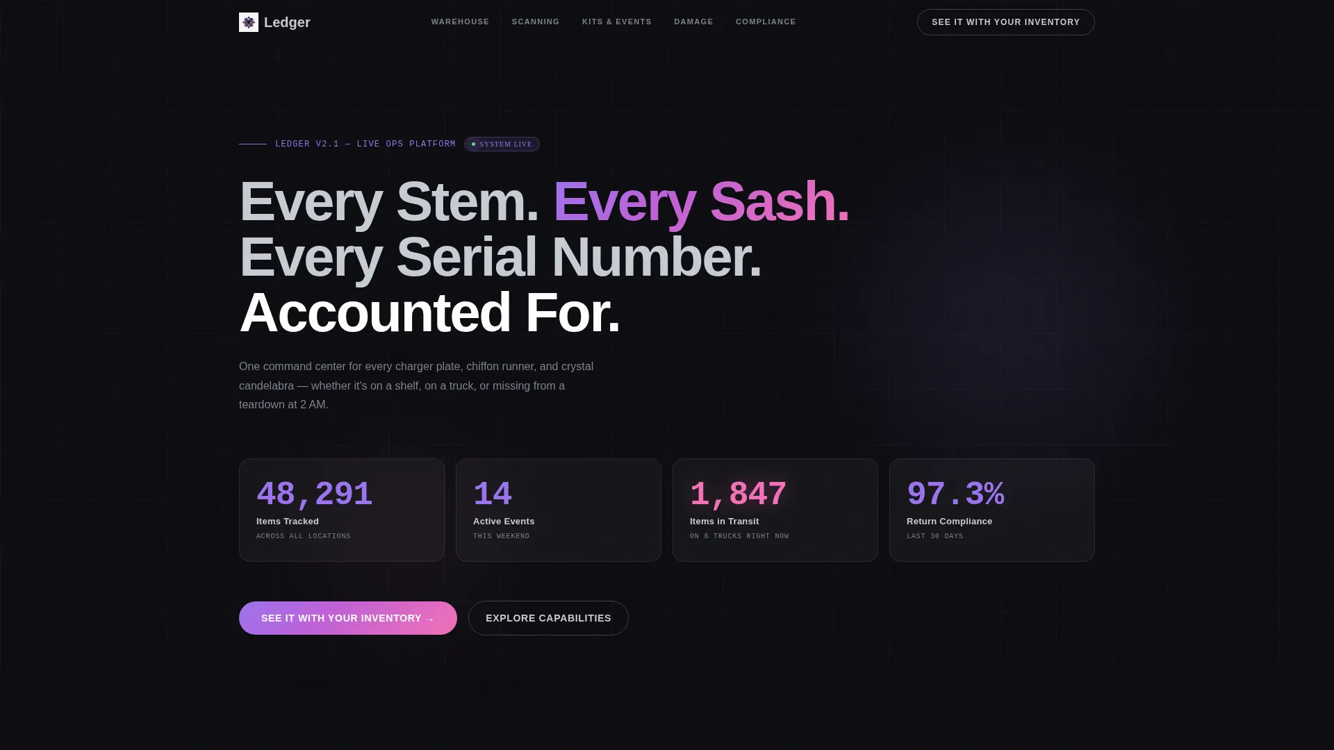
- A dark-glass header panel block showing four live-style metrics at a glance
- Six spoke sections covering warehouse mapping, barcode scanning, kit bundling, damage tracking, multi-event allocation, and return compliance
- Two conversion touchpoints: a primary demo call-to-action and a secondary email capture for a downloadable comparison sheet
Feature list
This template is built around a set of specific design and structural capabilities drawn directly from its source brief.
Dark Glass Panel Header
Four translucent frosted-glass cards float over a near-black background, each displaying a different live-style metric. Numbers are set in a heavy grotesque typeface with a faint violet glow. There is no hero image, only raw operational data presented like a control room display.
Persistent Anchor Navigation Bar
A fixed navigation bar stays visible as the visitor scrolls through each spoke section. It keeps the visitor oriented on a long page and turns the layout into a reference document they can control rather than a passive scroll experience.
Spec Sheet Spoke Sections
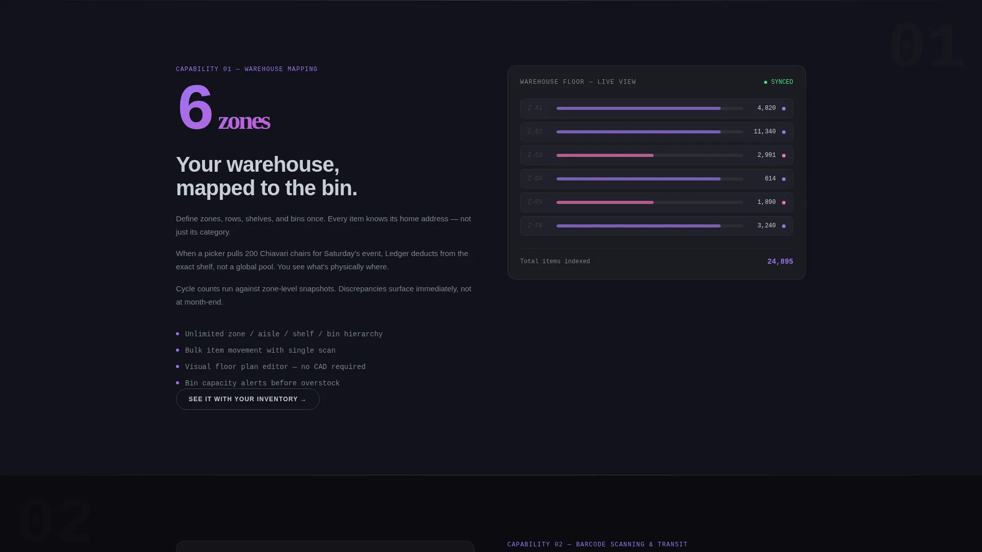
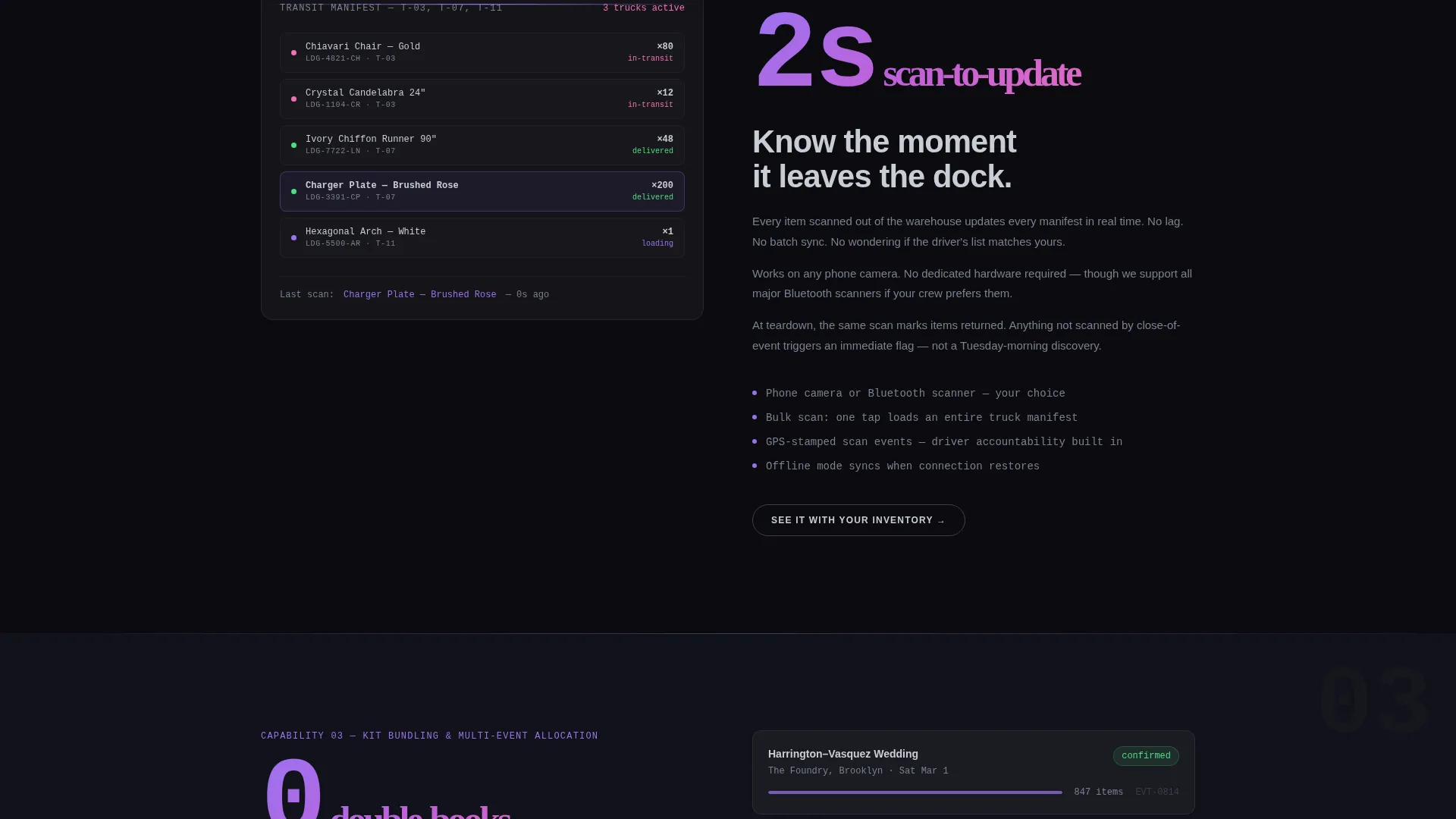
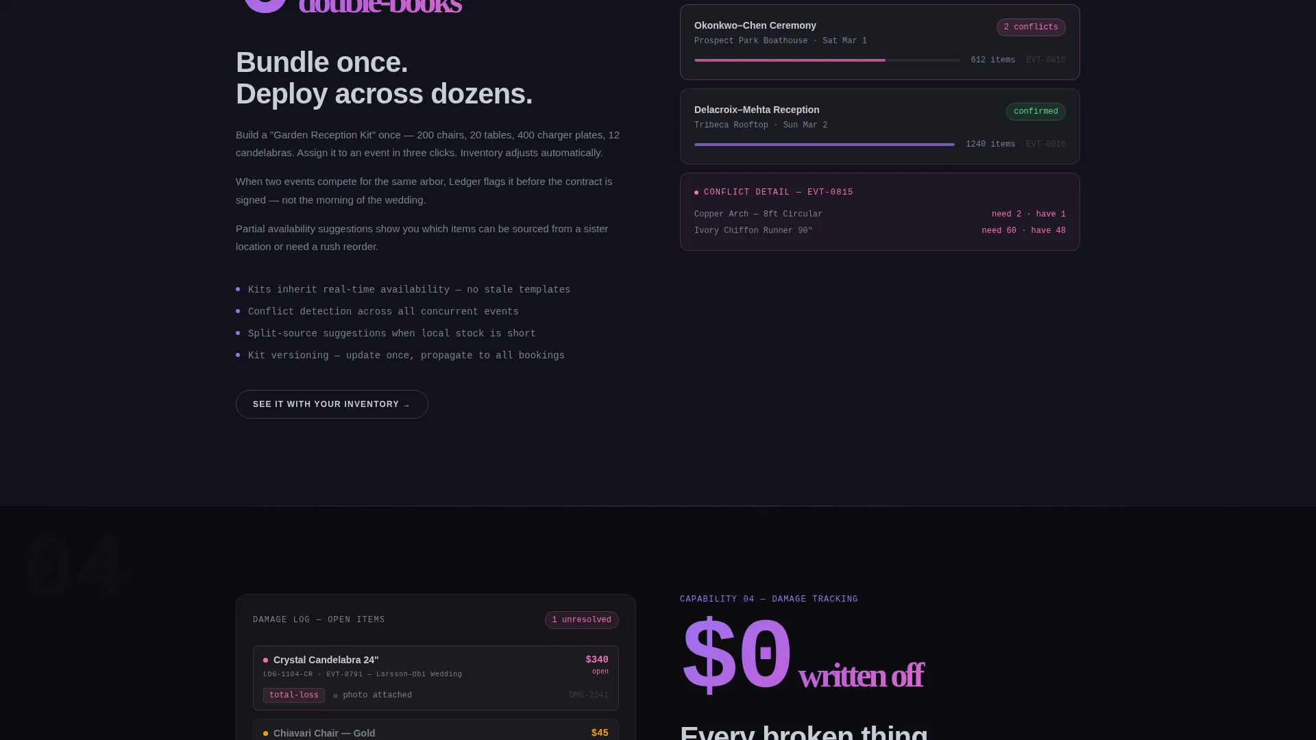
Each spoke section opens with an oversized bold stat or metric, then unpacks a single platform capability in short declarative sentences. Sections are paired with dark-mode user interface screenshots or diagrams, reading like pages torn from a product manual.
Progressive Call-to-Action Behavior
The primary call-to-action button, labeled "See It With Your Inventory," appears in the anchor nav and at the close of each spoke section. After the visitor scrolls past the third spoke, the button shifts from a chrome outline to a full iridescent gradient fill.
Secondary Email Capture
A text link labeled "Download the Ops Comparison Sheet" sits alongside a single email field. It targets high-intent visitors who are not yet ready to book a demo, giving them a lower-commitment next step that still captures contact information.
AI Iridescent Interaction System
Interactive surfaces use void black and liquid chrome as resting states. On engagement, violet-to-pink gradients appear only on hover, click, or active navigation indicators. The result is a page that feels monolithic at rest and visually alive the moment a visitor interacts with it.
Page sections overview
| Section | Purpose |
|---|---|
| Header Metric Panels | Establish credibility with four key operational stats displayed as glowing dark-glass cards |
| Anchor Navigation Bar | Give visitors persistent orientation and direct access to any spoke section |
| Warehouse Mapping Spoke | Explain how the platform maps and labels physical warehouse locations |
| Barcode Scanning Spoke | Show how items are tracked in transit and at teardown using scan-based workflows |
| Kit Bundling Spoke | Describe how grouped rental sets are assembled, tracked, and allocated per event |
| Damage Tracking Spoke | Detail how damage is logged, attributed, and reported across events |
| Multi-Event Allocation Spoke | Illustrate how the same inventory pool is managed across simultaneous bookings |
| Return Compliance Spoke | Present how return rates and missing items are monitored after each event |
| Demo Call-to-Action | Direct high-intent visitors into a guided demo pre-loaded with sample data |
| Email Capture Section | Collect contacts from visitors who want the downloadable ops comparison sheet |
Design & branding system
The visual identity is Bold Brutalist, built on an AI Iridescent color system that stays dark and structural at rest but rewards interaction with unexpected color. The palette reads like polished obsidian catching a projection light.
- Core colors: void black (#0B0B0F) for backgrounds, liquid chrome (#C8CDD5) for typography, and holographic violet (#9B72F0) for glowing user interface surfaces
- Shift-pink (#F470B8) is reserved exclusively for hover states and active navigation indicators
- Typography uses a heavy grotesque typeface throughout, keeping the layout dense, readable, and industrial
Mobile & speed optimization
The template is structured for a clean single-column reading experience on smaller screens. The persistent anchor nav and spoke sections adapt to narrower viewports without breaking the spec sheet rhythm.
- Spoke sections reflow to stack vertically, preserving the stat-first content hierarchy on mobile
- Dark-mode user interface screenshot blocks are sized to remain legible without horizontal scrolling
- The fixed anchor nav remains accessible on mobile, keeping navigation control in reach at all times
How this template helps you convert
Every structural choice in Ledger is aimed at moving a serious buyer from skepticism to action. The page does not seduce with imagery. It builds a case with evidence.
- The dark-glass header panels establish instant credibility by leading with operational metrics rather than aspirational copy, setting a tone that matches the buyer's mindset.
- The progressive call-to-action shift from chrome outline to iridescent fill creates a visual reward that increases urgency without being intrusive, nudging visitors who have engaged deeply with the content.
- The secondary email capture gives hesitant buyers a named, low-commitment exit that still moves them into a contact flow, reducing lost high-intent traffic.
Other information about this template
Ledger is designed as a standalone landing page within a hub-and-spoke structure, meaning the anchor nav functions as an internal table of contents rather than a link to external pages. All spoke sections live on a single scrollable page.
- The template style is Hub and Spoke with Anchor Navigation, suited for platforms with multiple distinct features to present
- The creative direction is Spec Sheet, meaning every section reads as a technical product brief rather than marketing narrative
- The color system is classified as AI Iridescent, a design language that uses controlled iridescence only on interactive states
- The header concept is Dark Glass Panels, a motif that prioritizes data density over decorative visuals
- The landing page direction is Click-Through, optimized to route visitors into a guided demo environment pre-loaded with sample wedding rental data
- This template sits in the Wedding Software and Software as a Service subcategory within the Technology category
Theme
Bold Brutalist
Creative direction
Spec Sheet
Color system
AI Iridescent
Style
Hub & Spoke (Anchor Nav)
Direction
Click-Through
Page Sections
Dark Glass Panel Header Block
Persistent Anchor Navigation
Spec Sheet Spoke Sections
Progressive Call to Action State Change
Secondary Email Capture Module
AI Iridescent Interaction States
Related questions
What kind of business is this template designed for?
Does this template include multiple pages?
Can I customize the metric panels in the header?
How does the call-to-action behavior work in this template?
Is this template suitable for a product outside the wedding industry?



