Nonprofit Software Cost Calculator Website Template
Ledger is a dashboard-style nonprofit accounting landing page template built for finance directors who need clarity, not chaos. It features a live cost-and-time estimator, a running comparison grid, and a mid-page interactive feature matrix. The design uses the Teal Catalyst color system on a Tech Glass visual theme to make complex fund accounting data feel clean and confident.
by Rocket studio
Quick summary
Ledger is a single-page, data-grid landing page template built for nonprofit accounting software. It leads with a functional cost-and-time estimator, then walks visitors through a scrolling comparison of old workflows versus the platform's approach. Every section opens with an oversized data point before any explanation, making the case through numbers before words.
Who this template is for
This template is built for teams marketing nonprofit financial software to decision-makers who live inside spreadsheets and close requests. It speaks directly to people who feel the weight of audit season before it arrives.
- Nonprofit CFOs managing restricted and unrestricted funds across multiple programs
- Operations managers at mid-size foundations reconciling donor-advised fund disbursements
- Executive directors at community organizations navigating chart-of-accounts feedback from auditors
What problem this template solves
Nonprofit finance teams often struggle to communicate the real cost of manual accounting workflows to software buyers. Generic software landing pages fail to show a realistic picture of time lost to reconciliation, grant tracking, and Form 990 preparation. This template closes that gap by giving the visitor their own numbers first.
- Visitors arrive with skepticism and leave without converting because they never see their situation reflected
- Static feature lists do not answer "how much time will this actually save me"
- Comparison pages that hide data behind forms create friction before trust is established
What you get with this template
You get a fully structured, single-page layout built around a data-grid visual style and a Stats-First creative direction. Every section is designed to let the data lead and the copy follow.
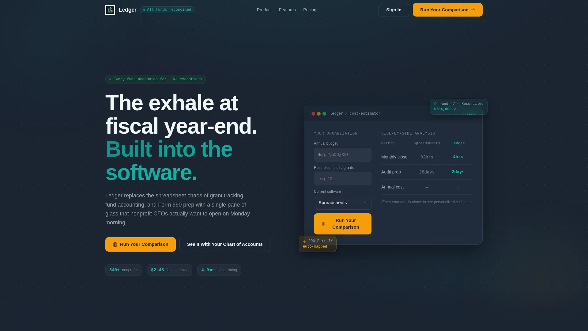
- A live header estimator that calculates cost and time savings before any form submission
- A scrolling side-by-side comparison grid contrasting manual nonprofit accounting with the platform approach
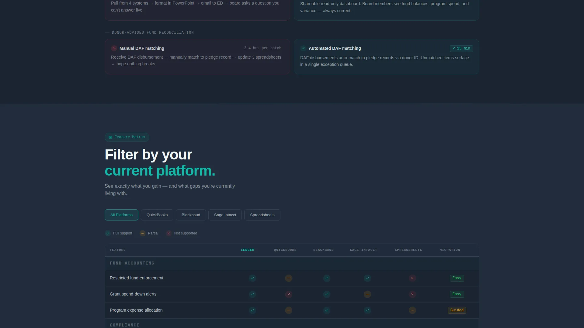
- A mid-page interactive feature matrix that lets visitors filter by their current platform
Feature list
This template includes purpose-built components designed specifically for nonprofit accounting software conversion.
Live Cost-and-Time Estimator
The header contains a functional calculator. Visitors enter their annual budget, number of restricted funds, and current software from a dropdown. The tool instantly renders a side-by-side comparison showing hours saved on monthly close, audit prep reduction, and projected annual cost difference. Numbers animate in teal as they calculate.
Stats-First Section Architecture
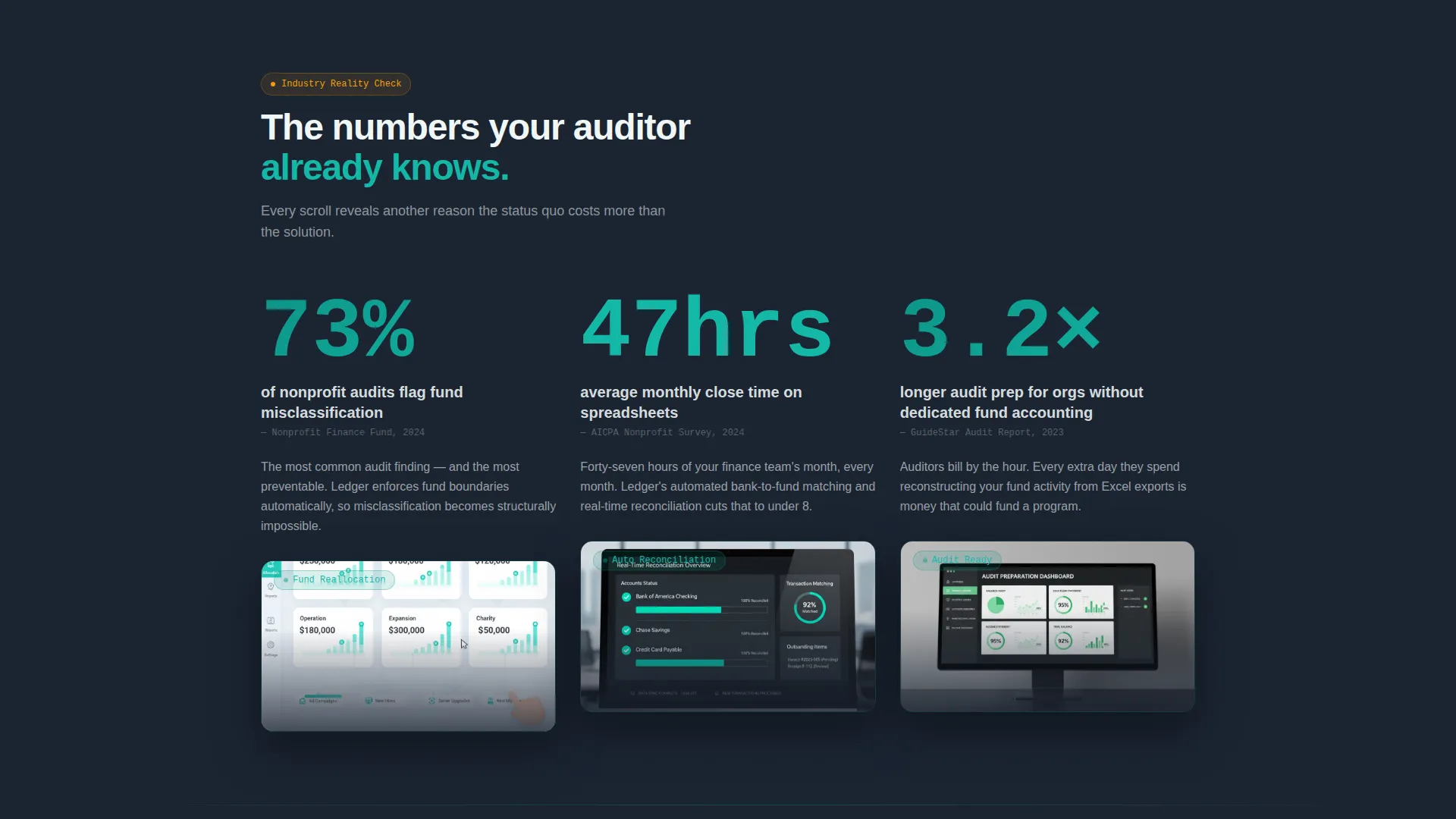
Every section opens with a single oversized data point before any supporting text appears. Industry pain statistics alternate with product capability grids throughout the page scroll. This pacing builds a cumulative case without relying on promotional language.
Running Comparison Grid
The page is structured as a continuous left-versus-right grid. The left column shows manual workflows such as journal entries, export-to-Excel reconciliation, and paper audit trails. The right column shows the platform approach for each row. Each comparison row is a discrete data card, and the overall effect compounds as the visitor scrolls.
Interactive Platform Feature Matrix
A mid-page filterable table lets visitors select their current accounting platform and see a head-to-head feature comparison. The table displays checkmarks, capability gaps, and migration complexity scores for each row, giving prospects a direct and honest comparison view.
Sticky Comparison call to action Bar
After the visitor scrolls past the first data section, a sticky bottom bar activates with the primary call to action. The bar stays available throughout the rest of the page scroll without interrupting the reading experience.
Guided Demo Request Flow
The secondary conversion path opens a structured demo request. It asks for organization type, number of active grants, and current accounting platform. This gives the sales team qualified context before any follow-up conversation begins.
Page sections overview
| Section | Purpose |
|---|---|
| Header Estimator Tool | Let visitors calculate their own savings before reading any copy |
| Opening Stat Block | Lead with an industry data point to establish credibility immediately |
| Comparison Grid | Show old workflow versus platform approach row by row |
| Platform Feature Matrix | Give visitors a filterable head-to-head capability table |
| Mid-Page Stat Cards | Reinforce the cost of inaction with additional data points |
| Demo Request Form | Capture qualified leads with organization-specific context |
| Sticky call to action Bar | Keep the primary action visible after the first scroll threshold |
Design & branding system
The visual identity follows the Tech Glass theme using the Teal Catalyst color system. The palette is built to feel like a well-run control room where every fund is accounted for and no alerts are firing.
- Deep dashboard charcoal (#1B2432) forms the base background, frosted glass white (#EFF6F5) surfaces card panels and data grids, and primary teal (#0D9488) marks active, reconciled, and confirmed states
- Catalyst amber (#F59E0B) is reserved exclusively for interactive elements, hover states, and call-to-action moments
- The overall tone is cool and precise with enough warmth to keep the human stakes visible
Mobile & speed optimization
The layout is structured as a data-grid page, which means the comparison cards and matrix table are designed to reflow cleanly at smaller screen widths.
- Comparison grid cards stack vertically on mobile so each row remains readable without horizontal scrolling
- The sticky call to action bar is sized for thumb-friendly interaction on small screens
- The estimator inputs are form elements that work naturally on touch devices without layout breakage
How this template helps you convert
This template is built around a Comparison/Versus conversion strategy. It earns the click by delivering real value before asking for anything in return.
- The header estimator gives every visitor a personalized output using their own numbers, so they arrive at the call to action having already seen the case for switching
- The scrolling comparison grid makes the cost of the status quo visible and concrete, reducing the mental effort required to justify a decision
- The secondary demo path captures organization-specific context upfront, which means follow-up conversations start with shared understanding rather than qualification questions
Other information about this template
This template is a strong fit for any nonprofit accounting software product that competes on clarity, audit readiness, and fund management transparency. It is also well suited to fiscal sponsors, community foundations, and grant-making organizations that want to move prospects from awareness to demo request in a single scroll session.
- The estimator dropdown includes options for common accounting platforms used across the nonprofit sector, making the comparison feel immediately relevant to a wide range of visitors
- The amber accent color is used with restraint throughout the design, appearing only where the page asks the visitor to take action, which keeps those moments visually distinct
- The template style is Dashboard/Data Grid, making it a practical choice for any software product that handles financial data, reporting workflows, or multi-fund accounting
- The page is built on a single-page flow with no navigation away from the conversion path until the visitor chooses to engage

Theme
Tech Glass
Creative direction
Stats-First Impact
Color system
Teal Catalyst
Style
Dashboard/Data Grid
Direction
Comparison/Versus
Page Sections
Live Cost-and-time Estimator Header
Stats-first Section Pacing
Running Comparison Data Grid
Interactive Platform Feature Matrix
Sticky Comparison Call to Action Bar
Guided Demo Request Path
Related questions
Who is this landing page template designed for?
Does the estimator tool require visitors to submit a form to see results?
Can I customize the platform options in the comparison dropdown?
What makes this template different from a standard software landing page?
Is this template suitable for a product that targets smaller nonprofits?



