Nonprofit Software Privacy Policy Website Template
Ledger is a dashboard-style nonprofit contract management landing page template built for organizations drowning in grant agreements, vendor contracts, and compliance deadlines. It presents a dark-glass command-center aesthetic with live-data panels, a side-by-side comparison layout, and a progressive sign-up form, making the cost of your current process impossible to ignore.
by Rocket studio
Quick summary
Ledger is a single-page, dashboard-driven template for nonprofit contract management platforms. It opens with three frosted-glass data panels floating over a deep navy background, then walks visitors through a structured "before versus. after" comparison that builds toward a clear call to action. Every scroll section adds evidence. By the time visitors reach the bottom, they have already diagnosed their own workflow gaps.
Who this template is for
This template is designed for teams who manage high volumes of contracts, awards, and compliance obligations inside nonprofit organizations. It speaks the language of people who know what a missed renewal date actually costs.
- Grants managers at mid-size foundations tracking forty or more active awards simultaneously
- Operations directors at community health organizations managing Medicaid subcontracts and renegotiation cycles
- Fiscal sponsors who need airtight pass-through language reviewed before an audit letter arrives
What problem this template solves
Nonprofit contract work is buried in spreadsheets, email chains, and disconnected documents. Teams spend hours reconciling deliverables against funding restrictions, often past midnight, with no reliable system surfacing what needs attention and when.
- Renewal dates get missed because no single view shows contract status, compliance progress, and calendar risk together
- Audit preparation is slow and stressful when clause libraries, checklists, and vendor terms live in separate files
- Communicating the value of a better system is hard when leadership cannot see the hidden cost of the current process
What you get with this template
You get a fully structured, single-page template that functions as both a product showcase and a conversion engine. Every visual element has a job. Nothing is decorative.
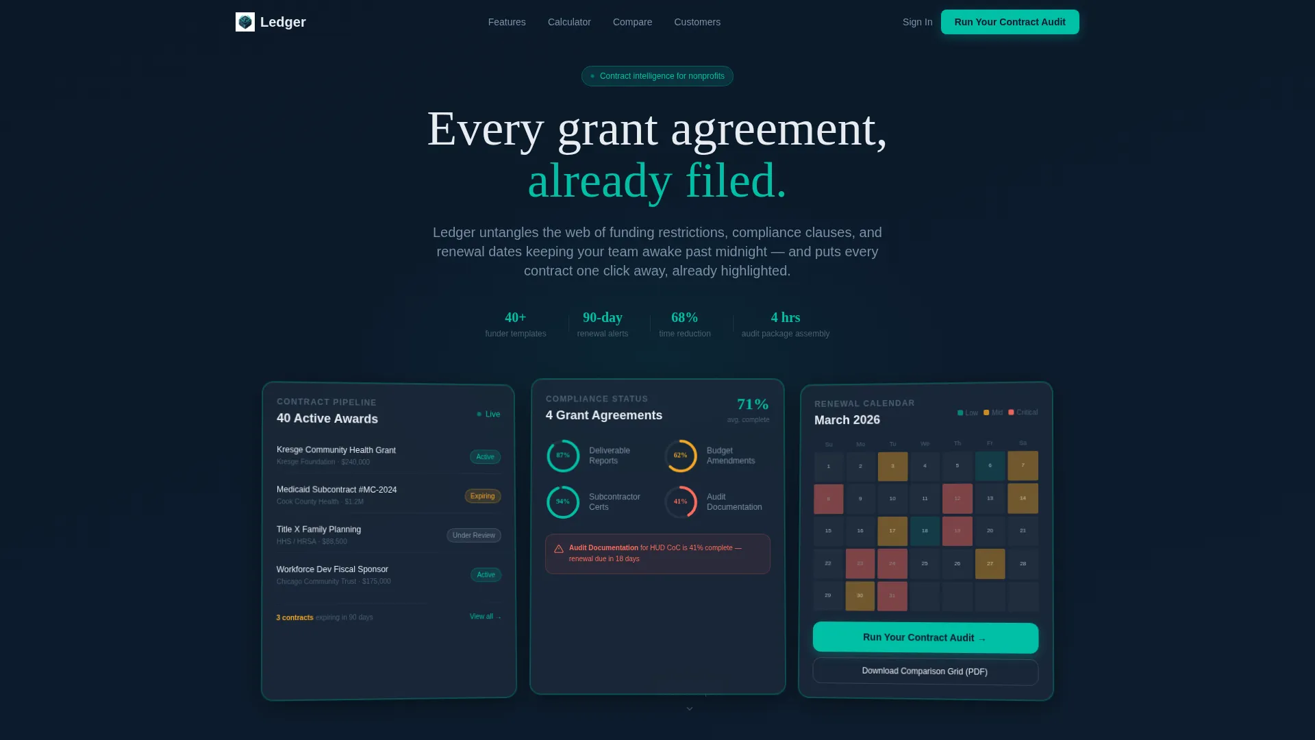
- A header with three dark-glass data panels showing a contract pipeline, a compliance checklist, and a renewal calendar heat map
- A sticky comparison toggle bar, a scrollable feature matrix, and a live hours-saved calculator with a teal progress bar
- A three-step progressive sign-up form plus a secondary gated PDF path for visitors who need more time before committing
Feature list
This template packages several purpose-built components into one coherent layout.
Dark Glass Panel Header
Three translucent, frosted-glass rectangles float over the midnight navy background. Each panel displays a distinct live-data snapshot: contract pipeline with status pills, a compliance checklist with progress rings, and a calendar heat map showing upcoming renewal dates in amber and red. A one-pixel luminous teal border frames each panel, and the trio is angled slightly in perspective to suggest a command-console view.
Sticky Comparison Toggle Bar
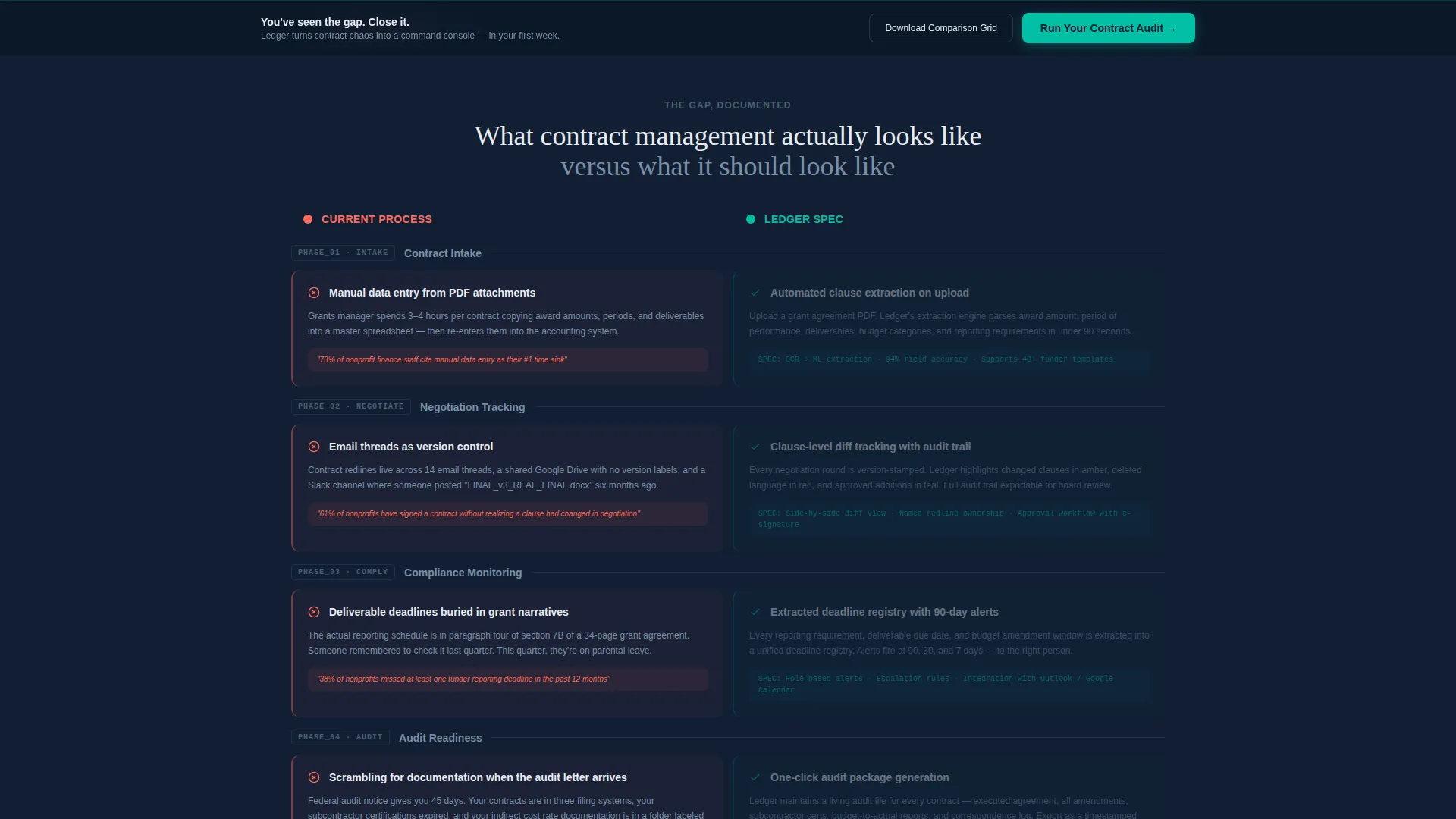
A persistent toggle bar reading "Your Current Process versus. Ledger" anchors the comparison experience. Every scroll section below it splits into a two-column data grid. The left column presents the pain, spreadsheet screenshots, email chains, missed renewal statistics. The right column presents the platform specification in direct response.
Scrollable Feature Matrix
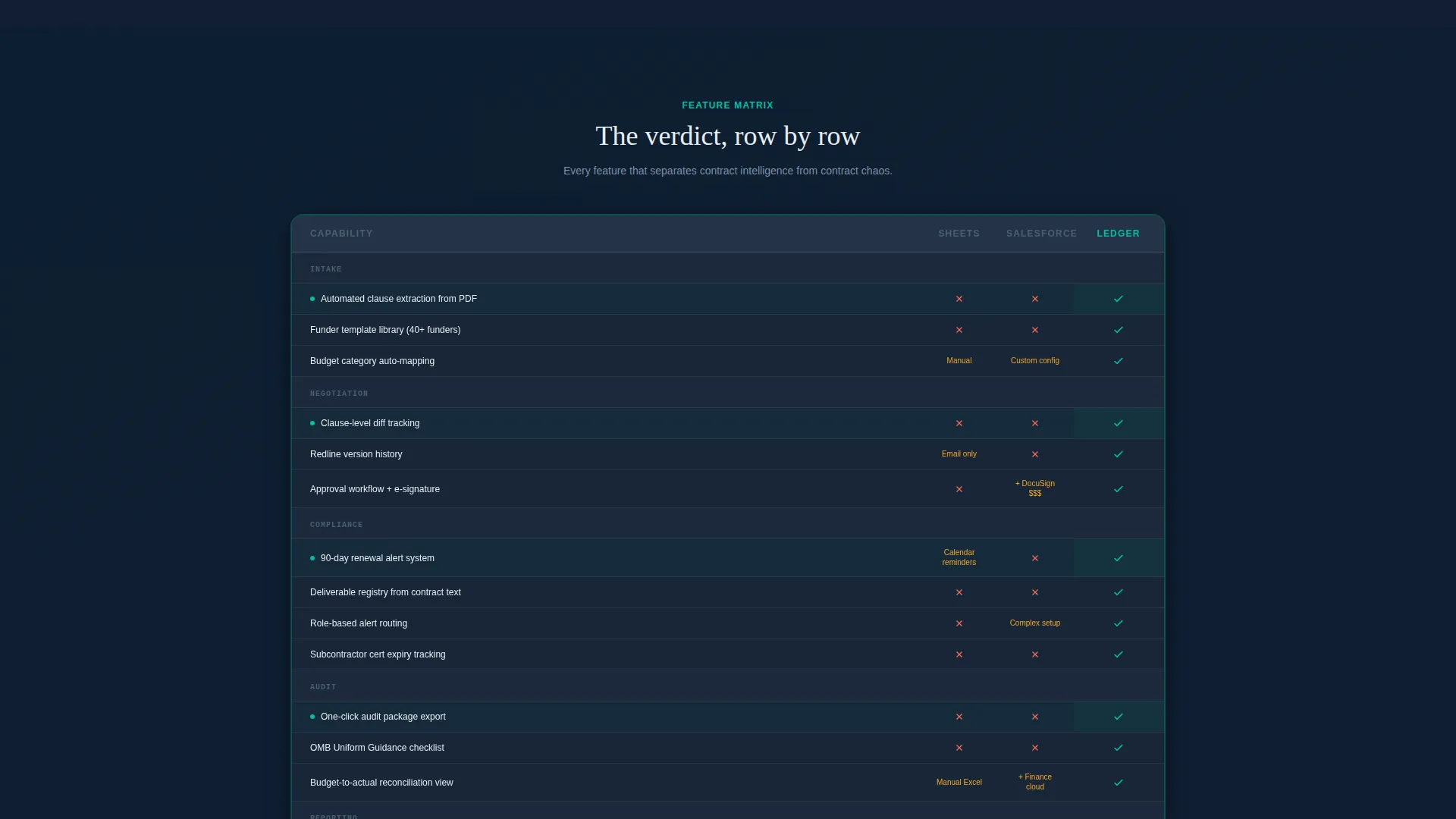
As visitors move down the page, each section contributes a new row to a running feature matrix. The matrix accumulates like a verdict, covering contract intake, negotiation tracking, compliance monitoring, and audit readiness in sequence. By the bottom, visitors have a complete side-by-side summary without having to scroll back.
Live Hours-Saved Calculator
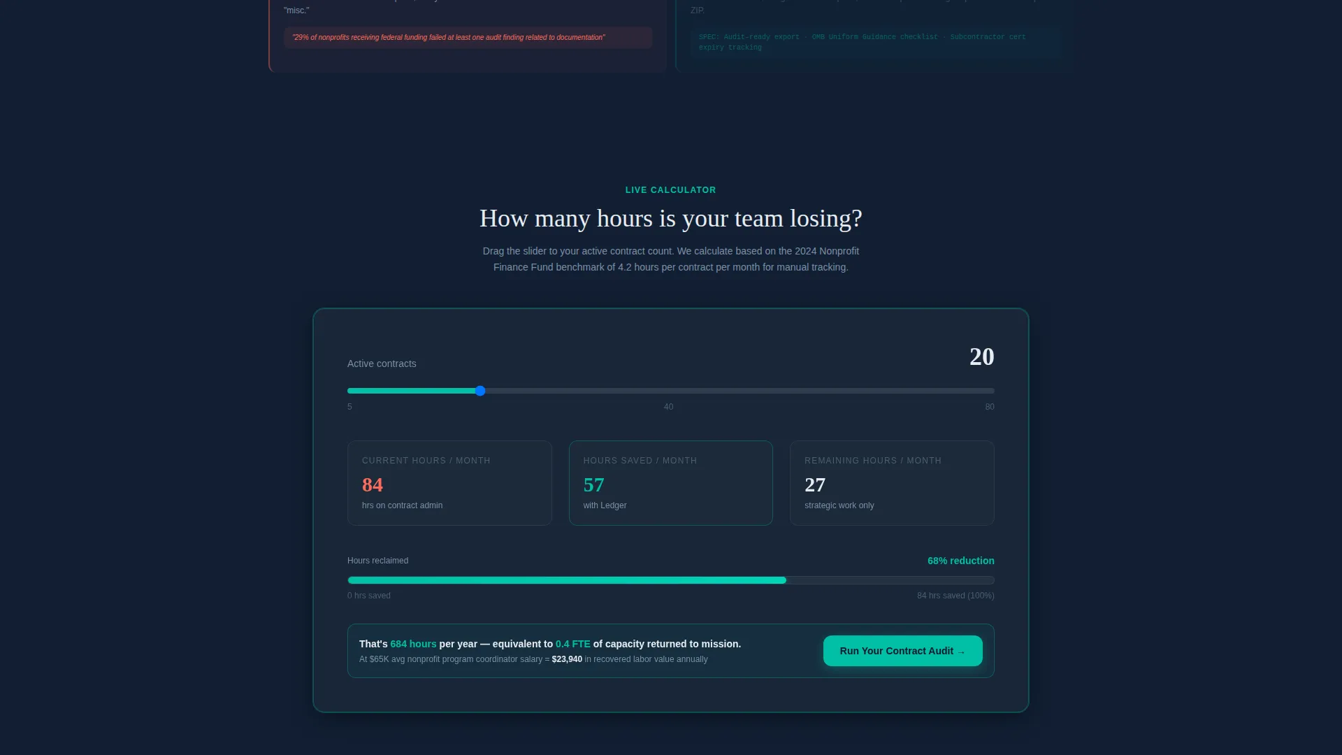
A midpage interactive calculator lets visitors enter their number of active contracts. The tool renders estimated hours saved per month as a teal progress bar that fills in real time. This makes the efficiency argument tangible before the visitor reaches the call to action.
Three-Step Progressive Sign-Up Form
The primary call to action, "Run Your Contract Audit," opens a three-step form. Step one captures organization type and active contract count. Step two asks about current tools via a dropdown. Step three collects name and work email. The progressive structure lowers friction while qualifying the lead.
Gated Comparison Grid Download
A secondary conversion path offers a downloadable comparison grid as a portable document format file. Visitors who are not ready to sign up can access this resource by entering only their email address. It extends the reach of the comparison argument beyond the page itself.
Page sections overview
| Section | Purpose |
|---|---|
| Dark Glass Header | Displays live contract pipeline, compliance rings, and renewal heat map |
| Sticky Toggle Bar | Anchors the before-versus-after comparison experience across all scroll sections |
| Comparison Data Grid | Shows pain-point evidence alongside platform specs in a two-column layout |
| Hours-Saved Calculator | Lets visitors calculate monthly time savings based on their contract volume |
| Feature Matrix Summary | Accumulates all comparison rows into a single bottom-of-page verdict grid |
| Progressive Sign-Up Form | Qualifies and converts visitors through a three-step intake sequence |
| Gated PDF Path | Captures email-only leads via a downloadable comparison grid offer |
| Sticky call to action Bottom Bar | Resurfaces the primary call to action after the visitor passes the feature matrix |
Design & branding system
The visual identity follows a Directory and Discovery theme built entirely around a Midnight Blue color system. The palette reads like the bridge of a ship at night, every indicator legible, nothing purely ornamental.
- Core colors: deep command-center navy (#0B1929) for the primary background, steel-panel charcoal (#1C2A3A) for card surfaces and data rows, and cool-white (#E8ECF1) for body text
- Accent and interaction: signal teal (#00BFA6) is reserved exclusively for active states, hover effects, selected filters, and the comparison toggle so the eye is trained toward action
- Depth and texture: background gradients shift subtly from #0B1929 to #111F33, and glass panels use a glassmorphism blur treatment with a luminous one-pixel teal border
Mobile & speed optimization
The template layout is built with a data-dense desktop command-center as its primary context, but its structure supports responsive adaptation for smaller screens.
- The glass panels, comparison grid columns, and calculator component are designed to reflow cleanly so core content remains accessible at any viewport width
- The sticky toggle bar and sticky call to action bottom bar are built to remain functional on mobile, keeping the comparison experience and primary call to action always within reach
How this template helps you convert
The Comparison/Versus conversion strategy is embedded into the layout from the very first scroll. Visitors are not told the platform is better, they are shown, step by step, why their current process is costing them.
- The header's third glass panel places the "Run Your Contract Audit" call to action inside the data display itself, so the invitation arrives before the visitor has time to hesitate.
- The live hours-saved calculator turns an abstract efficiency claim into a personal number, making the value proposition feel specific to each visitor's situation rather than generic.
- The sticky call to action bottom bar resurfaces after the feature matrix, catching visitors at the moment they have seen all the evidence and are most ready to act.
Other information about this template
Ledger is built for a niche where trust and precision matter as much as aesthetics. The template's Spec Sheet creative direction means every design decision reinforces the idea that this platform already understands the user's workflow before a single word is read.
- The template style is Dashboard/Data Grid, making it suitable for nonprofit software platforms that need to communicate data-forward functionality at a glance
- The Directory and Discovery theme means the layout feels organized and searchable rather than promotional, which builds credibility with compliance-minded audiences
- The progressive form captures organization type, tool stack, and contact details in three low-friction steps, supporting lead qualification alongside lead generation
- The gated PDF path provides a second conversion moment for visitors evaluating multiple options before making a decision
- This template is well-suited for positioning within the nonprofit contract management software category, where buyers tend to be methodical and evidence-driven
Theme
Directory & Discovery
Creative direction
Spec Sheet
Color system
Midnight Blue
Style
Dashboard/Data Grid
Direction
Comparison/Versus
Page Sections
Dark Glass Panel Header
Sticky Comparison Toggle Bar
Two-column Comparison Data Grid
Live Hours-saved Calculator
Three-step Progressive Sign-up Form
Gated PDF Comparison Download
Related questions
Who is this landing page template designed for?
Can I customize the comparison grid and calculator for my own platform?
What is the primary call to action in this template?
Does the template include a secondary lead capture option?
What makes this template different from a generic software landing page?



