Optometry Software Cost Calculator Website Template
Ledger is a dark-terminal landing page template built for optometry payment processing platforms. It opens with a live savings calculator, reveals a scroll-driven comparison table row by row, and closes with a full-audit call to action. The design uses a Midnight Blue palette with active teal accents to make every data point feel authoritative and immediate.
by Rocket studio
Quick summary
Ledger is a single-page template designed for a B2B payment platform serving optometry practices. It leads with an interactive calculator, builds conviction through a progressive scroll comparison, and converts visitors with a contextual audit form. The dark terminal aesthetic makes financial data feel precise and trustworthy from the first scroll.
Who this template is for
This template is built for founders, product teams, and marketers who are launching or repositioning an optometry payment processing platform. If your product solves revenue cycle chaos for eye care practices, this template speaks directly to your buyers.
- Independent optometrists managing vision insurance claims across one or two locations
- Office managers reconciling frame-and-lens splits across multiple software tabs
- Private equity groups that need consolidated financial reporting across large optical chains
What problem this template solves
Selling a payment platform to eye care professionals is hard when the product complexity outpaces the pitch. Prospects do not trust generic claims. They need to see their own numbers before they believe the value.
- Practices lose hours each week chasing remittance data from vision benefit providers, and most landing pages never quantify that loss
- Static comparison tables fail to build conviction the way a row-by-row progressive reveal does
- A gated demo creates friction exactly when curiosity is highest, pushing warm prospects away before they convert
What you get with this template
You get a complete, single-page landing page structure that guides a skeptical B2B buyer from curiosity to conversion using their own data as the hook. Every section is purposeful and sequenced for maximum persuasion.
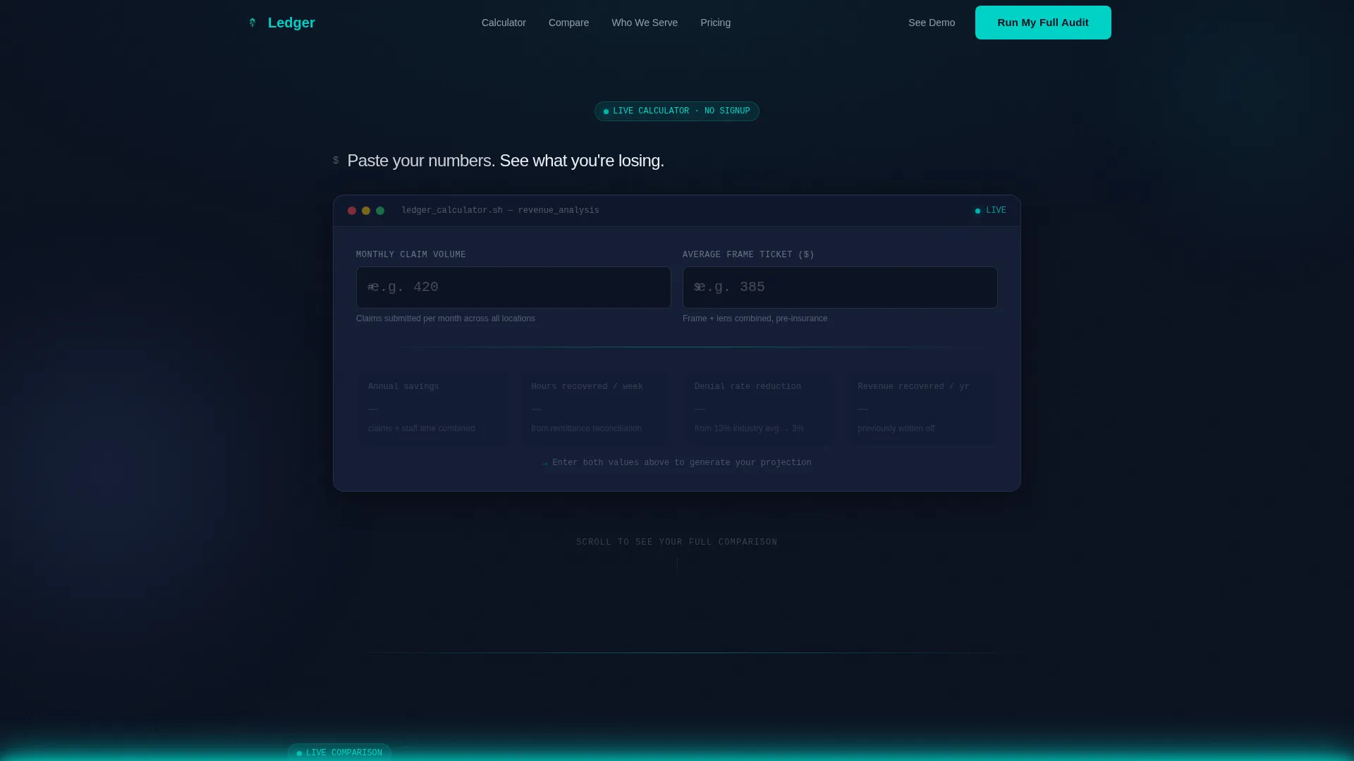
- An ungated interactive savings calculator in the hero section that animates live projections as users type
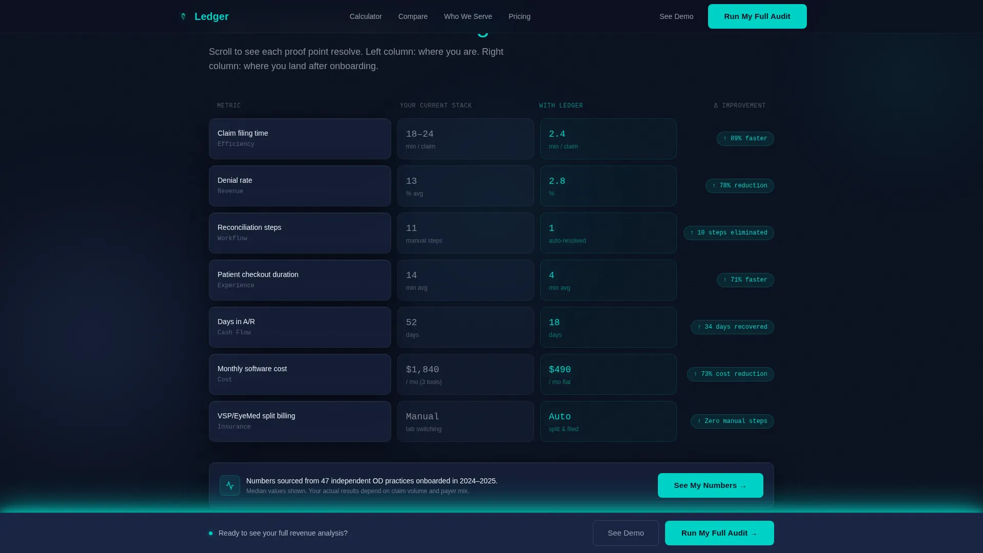
- A scroll-triggered comparison engine that populates proof points one row at a time as the visitor scrolls
- A dual call-to-action system with a fixed bar for warm leads and an expanded audit form for ready buyers
Feature list
A paragraph introduces the functional scope of this template. Each feature below is directly derived from the brief and reflects a real, built-in capability of the Ledger template.
Live Savings Calculator Hero
The hero section places a functioning calculator directly in the viewport, no signup required. Visitors enter their monthly claim volume and average frame ticket, then watch animated teal figures project annual savings, time recovered per week, and claim denial reduction in real time. The calculator IS the headline.
Scroll-Reveal Comparison Engine
Below the hero, the page splits into a persistent two-column layout contrasting a typical practice stack against the platform. Each scroll tick reveals a new row: claim filing time, denial rate, reconciliation steps, patient checkout duration, and monthly software cost. Left-column numbers land first and sit uncomfortably before the right column resolves with better figures.
Staggered Row Animation
Each comparison row uses a deliberate stagger. The "current stack" value appears first, giving the visitor a moment to feel the weight of it before the improved figure clicks into place on the right. This sequencing is built into the scroll-sync behavior of the template.
Three ICP Bento Panels
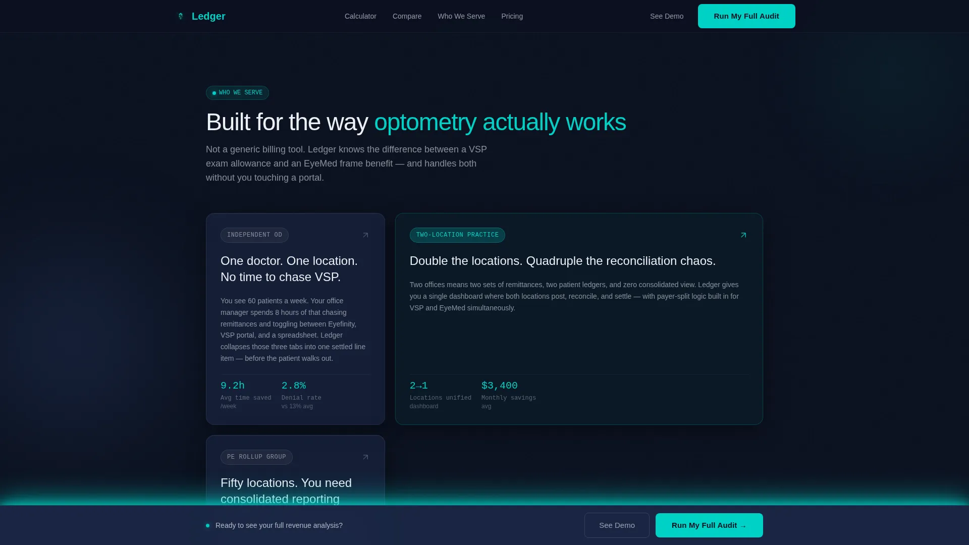
A specificity section below the comparison table presents three distinct ideal-customer-profile panels. Each panel addresses a different buyer type: the independent OD, the office manager, and the multi-location operator. This section uses a bento grid layout for visual density without clutter.
Testimonial Cards with Metrics
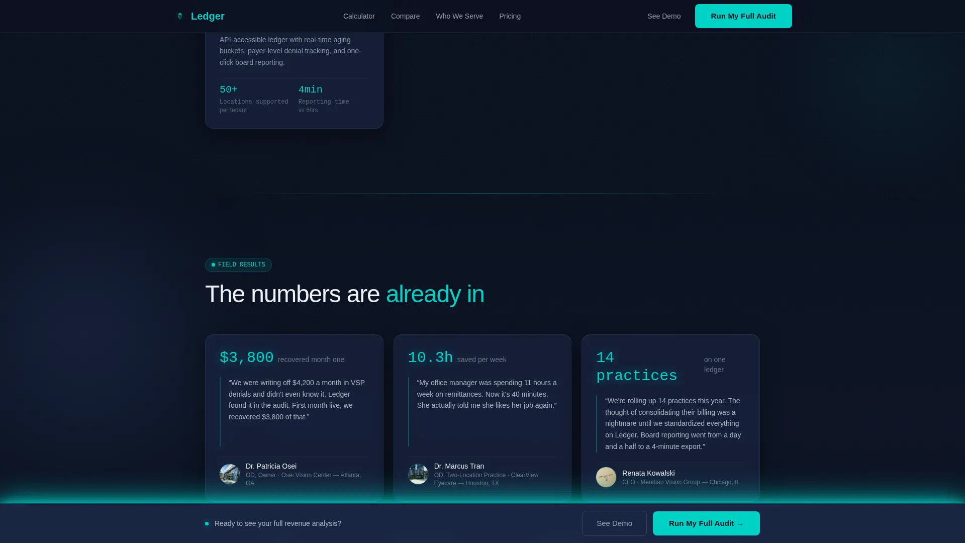
A social proof section displays named testimonial cards formatted to show practice size, dollars recovered, and time saved per week. The card format keeps credentials visible and the metrics prominent against the dark surface.
Dual Call-to-Action System
The primary call to action, "Run My Full Audit," collects practice name, EHR or practice management system, and monthly claim volume. It first appears as a subtle fixed bar after the calculator interaction, then fully expands as the final conversion section. A secondary path, "See the Live Demo," gives prospects a lower-commitment option.
Page sections overview
| Section | Purpose |
|---|---|
| Hero Calculator | Engage visitors immediately with a live savings projection |
| Comparison Table | Build conviction row by row through scroll-triggered reveals |
| ICP Bento Panels | Address three distinct buyer profiles with focused use-case copy |
| Social Proof Cards | Reinforce trust with named testimonials and specific financial metrics |
| Full Audit Form | Convert ready buyers with a contextual, low-friction audit request |
| Footer | Close with a single-row linear layout for navigation and legal links |
Design & branding system
The visual identity follows a Data Command theme. The palette is built around a dark monitor aesthetic: authoritative, awake, and precise. Every color has a specific job on the page.
- Deep terminal navy (#0B1120) dominates all backgrounds; muted panel slate (#1A2744) defines card and surface layers; active teal (#00D2C6) marks every interactive element, live figure, and hover state
- Clean lens white (#EDF0F5) handles all body text and headings, giving clinical clarity against the dark field
- Typography uses Manrope for headings, JetBrains Mono for all numerical and data displays, and DM Sans for body copy
Mobile & speed optimization
Although the template is designed desktop-first to match the back-office terminal context of its primary audience, the layout is fully responsive. Every section adapts cleanly to smaller viewports without losing structural clarity.
- The scroll-reveal comparison engine and live calculator use Client Components for interactivity while structural sections use Server Components for lighter initial rendering
- Scroll-triggered animations and ticking number effects are scoped to client-side logic to avoid blocking the static page shell
- The single-row linear footer keeps the bottom of the page clean and fast to render on any device
How this template helps you convert
Ledger is structured around a progressive conviction model. Each section earns the next one. By the time a visitor reaches the call to action, they have already seen their own projected losses on screen.
- The calculator makes the value proposition personal before any copy does; a visitor who types their own numbers has already started the sales conversation with themselves
- The row-by-row comparison table delays full disclosure deliberately, so each proof point feels earned rather than scanned, which keeps attention longer and builds cumulative trust
- The dual call-to-action path removes the binary pressure of "convert or leave" by offering a lighter demo option alongside the full audit, capturing leads at two different readiness levels
Other information about this template
This template is categorized under Technology, specifically within the Optometry Software subcategory and the Optometry Payment Processing niche. It is built for the United States market, uses USD currency formatting, and follows MM/DD/YYYY date conventions. The animation intensity is set to high, with scroll-triggered row reveals, ticking counter effects, and staggered table population built into the structure. The template style is Scroll Reveal (Progressive), the header concept is Interactive Preview, the creative direction is Calculator/Tool First, and the landing page direction is Comparison/Versus.
- The template is designed for desktop-first rendering to match the back-office environment of its target users, with full responsiveness included
- All interactive sections, including the calculator and scroll-sync comparison, are structured using a separation of Server and Client Components
- The teal accent color pulses on live data figures and hover states, reinforcing the sense that the platform is active and processing in real time
Theme
Data Command
Creative direction
Calculator/Tool First
Color system
Midnight Blue
Style
Scroll Reveal (Progressive)
Direction
Comparison/Versus
Page Sections
Live Savings Calculator Hero
Scroll-reveal Comparison Engine
Three ICP Bento Panels
Social Proof Testimonial Cards
Dual Call-to-action System
Staggered Animation Architecture
Related questions
Who is the Ledger template designed for?
Does the calculator in this template use real data from my platform?
Can I customize the comparison table rows?
Is this template suitable for a private equity group managing multiple optical locations?
What calls to action are included in this template?



