Specialist Accounting Firm Software Reviews & Social Proof Website Template
Ledger is a modular card grid landing page built for property accounting firms. It uses a glassmorphic design with a feature matrix layout that compares DIY, generic, and specialized accounting side by side. The template targets mid-market property managers, real estate investors, and HOA boards, guiding visitors toward a portfolio review through a staged, persuasive comparison flow.
by Rocket studio
Quick summary
Ledger is a single-page, card grid landing page for property accounting firms. It opens with a scrolling logo bar, moves through a staggered feature matrix comparison, and closes with a dual-path call to action. Every section is designed to build trust quickly and move mid-market property managers toward booking a portfolio review.
Who this template is for
This template is built for accounting firms that specialize in property management finances. It speaks directly to the clients those firms serve and the problems those clients carry.
- Mid-market property management companies handling forty to four hundred doors
- Real estate investors managing layered LLC structures across multiple properties
- HOA boards dealing with inherited, disorganized financial records
What problem this template solves
Property managers and investors often work with accountants who do not understand rent rolls, common area maintenance (CAM) reconciliation, or entity-level tax returns. A generic firm's website does not signal that specialized knowledge. This template solves the credibility gap before a visitor even reads the headline.
- Visitors cannot quickly tell if a generic firm understands property-specific accounting
- Pain points like trust account reconciliation and 1099 generation go unaddressed on most firm sites
- Undecided visitors leave without a low-commitment way to engage
What you get with this template
You get a fully structured, single-page layout built around a persuasion-first comparison flow. Every section has a defined job, and the visual system reinforces trust from the first scroll.
- A scrolling logo bar header that establishes instant software familiarity
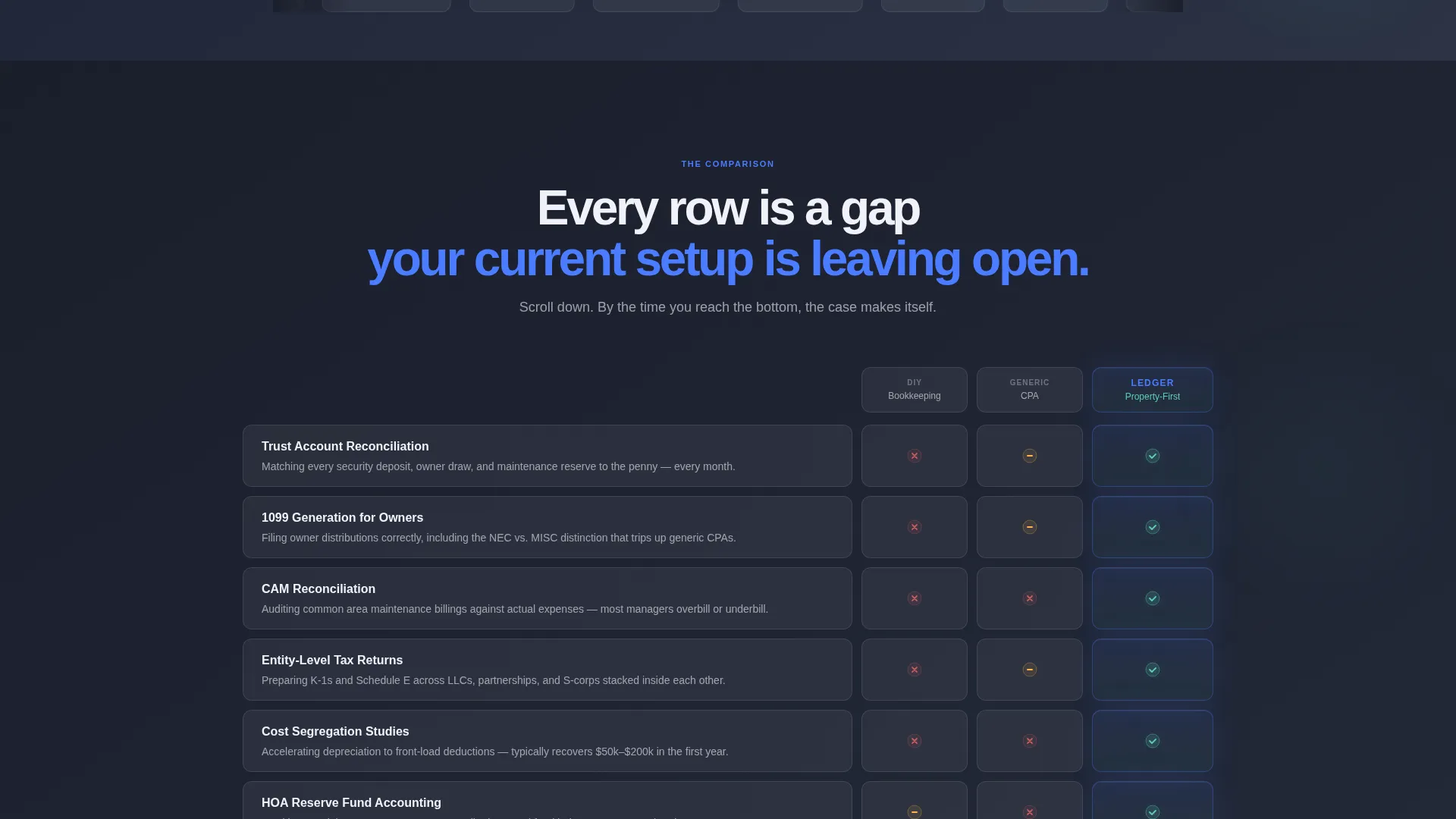
- A living feature matrix card grid contrasting three accounting approaches side by side
- A sticky call-to-action bar plus a gated PDF secondary lead path
Feature list
This template delivers a focused set of components, each designed to do real persuasion work inside a property accounting context.
Scrolling Logo Bar Header
A horizontal ribbon of property management software logos plays in a smooth, infinite loop at the top of the page. Each logo renders in frosted glass with a subtle parallax drift, and a single headline sits above the bar. The combination tells visitors immediately that this firm works inside the tools they already use.
Animated Feature Matrix Grid
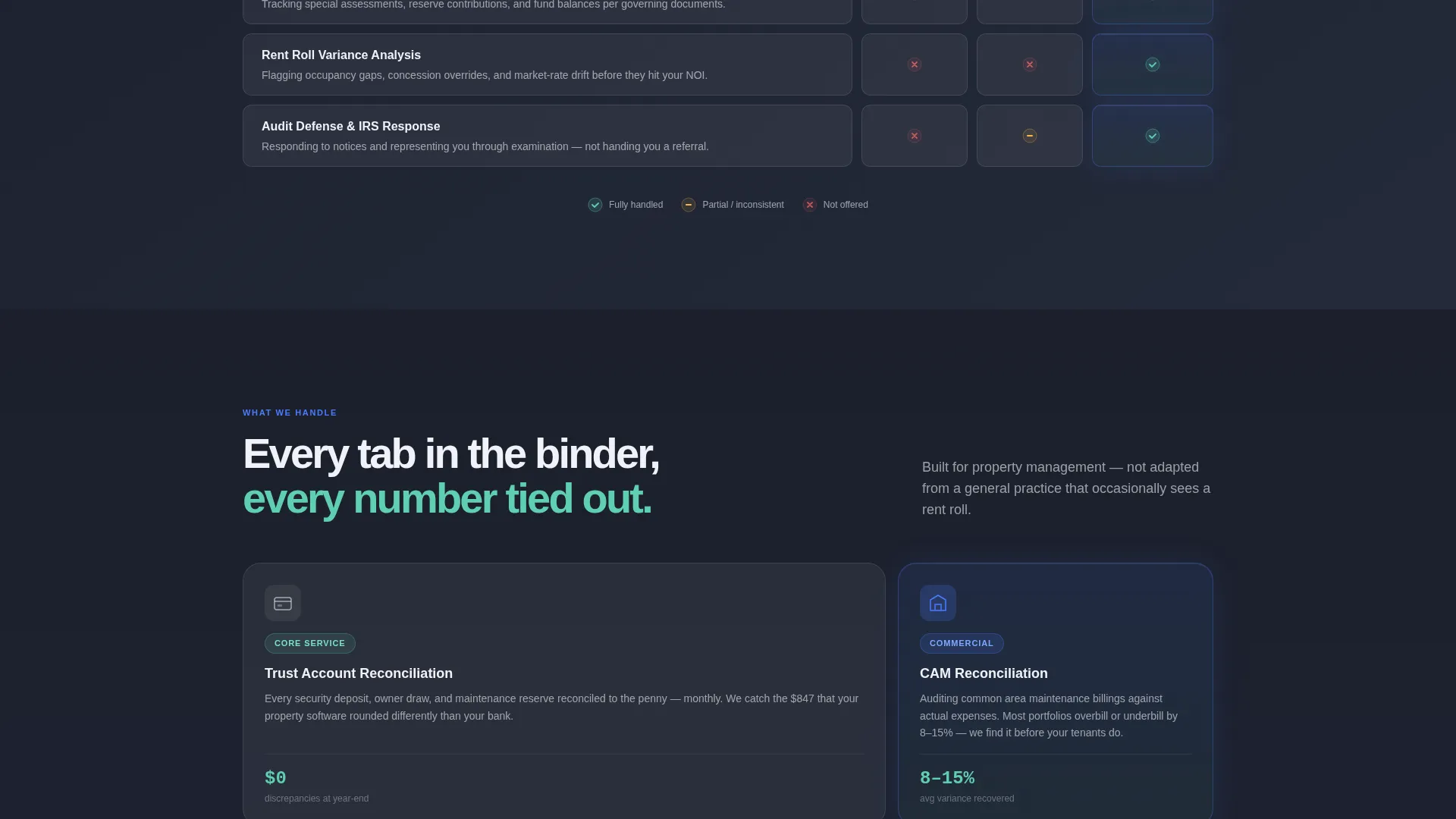
Below the header, cards arrange into a three-column comparison engine. Columns represent DIY bookkeeping, a generic accountant, and the specialized firm. Each row targets a specific property accounting pain point, and cards animate upward from a blurred state into sharp focus as the visitor scrolls. The jade checkmark column builds a mounting visual case row by row.
Dual-Path Call to Action
The primary call to action is "Get Your Portfolio Reviewed," placed both as a sticky frosted-glass bar at the bottom of the viewport and as a full-width card at the end of the grid. A secondary path offers a gated "Download the Switching Checklist" PDF for visitors who are not yet ready to speak with anyone. Both paths capture the lead.
Sliding Scale Lead Form
The portfolio review form opens with a unit-count slider ranging from 10 to 500 or more. It then asks for the visitor's current accounting method via a dropdown, followed by their email address. This sequencing qualifies the lead before asking for contact details.
Glassmorphic Card System
Every card carries a 12-pixel blur backdrop filter and a 1-pixel luminous border. On hover, each card brightens and appears to lift off the page. The effect is consistent across the entire grid, giving the layout a sense of layered depth without visual noise.
Page sections overview
| Section | Purpose |
|---|---|
| Logo bar header | Establish software credibility instantly |
| Main headline | Frame the firm's core value proposition |
| Feature matrix grid | Compare three accounting approaches row by row |
| Sticky call to action bar | Keep the primary action visible throughout scrolling |
| Lead capture form | Qualify and collect visitor contact details |
| PDF gated offer | Capture early-stage leads with immediate value |
| Full-width call to action card | Close the persuasion flow at page end |
Design & branding system
The visual identity uses a Dynamic Motion theme built on a glassmorphic color system. The palette feels like a rain-streaked glass office tower at dusk, with translucent surfaces floating over quiet, dark depth.
- Background: deep charcoal-slate gradient running from #1B1F2A to #2C3345, providing a rich dark canvas
- Cards: translucent frost white (#FFFFFFB3) with 12-pixel backdrop blur and 1-pixel luminous borders that brighten on hover
- Accents: cool sapphire (#4A7CFF) for active states and accent lines; muted jade (#5ECFB1) for checkmarks and positive indicators
Mobile & speed optimization
The card grid layout is modular by design, which means it adapts naturally to narrower viewports. Column-based comparison sections reflow gracefully so the visual argument remains clear on smaller screens.
- Modular card structure supports single-column stacking on mobile without breaking the comparison logic
- Staggered scroll animations are lightweight and tied to viewport entry, so they do not block initial page rendering
- The sticky call to action bar remains accessible at the bottom of the viewport across screen sizes
How this template helps you convert
The entire page is engineered around a Comparison/Versus conversion strategy. Visitors do not need to be persuaded by copy alone; the grid structure does the persuasion work visually and progressively.
- The feature matrix exposes gaps in a visitor's current accounting setup row by row, making the need for a specialist feel earned rather than pushed.
- The dual-path call to action meets visitors at two different levels of readiness, capturing both the decision-ready lead and the research-stage visitor with the gated PDF offer.
Other information about this template
This template is built as a single landing page using a Card Grid (Modular) template style with a Dynamic Motion theme. It is designed specifically for the property accounting and accounting firm software niche, making it a strong fit for firms that want to signal deep specialization from the first impression.
- The template style and creative direction align closely with the Accounting Firm Property Management niche intersection
- The feature matrix layout is inspired by the comparison grid formats commonly used in accounting firm software marketing
- The scrolling logo bar is pre-structured to feature property management platforms as a row of recognizable reference points for the target audience


Theme
Dynamic Motion
Creative direction
Feature Matrix
Color system
Glassmorphic
Style
Card Grid (Modular)
Direction
Comparison/Versus
Page Sections
Scrolling Logo Bar with Parallax
Animated Feature Matrix Card Grid
Dual-path Call to Action
Sliding Scale Lead Form
Glassmorphic Hover Card System
Related questions
Who is this landing page template designed for?
What makes the feature matrix layout effective for this niche?
Can this template capture leads at different stages of readiness?
What does the lead form ask visitors?
How does the glassmorphic design support the firm's credibility?



