Restaurant Software Site Maintenance Website Template
Ledger is a bento grid landing page template built for restaurant asset management platforms. It combines a live interactive dashboard header, a problem-to-solution scroll arc, and a side-by-side comparison table to show multi-unit operators exactly how real-time depreciation tracking and replacement forecasting replace chaotic spreadsheets and reactive maintenance calls.
by Rocket studio
Quick summary
Ledger is a single-page, bento grid landing page template designed for restaurant asset management software. It opens with a live interactive dashboard preview, walks visitors through a problem-to-solution narrative arc, and anchors mid-page on a powerful comparison table. The result is a page that turns a technical product into an immediately understandable financial tool.
Who this template is for
This template is built for software teams and founders selling asset tracking platforms to the restaurant industry. It speaks directly to the operators who feel the daily pain of untracked equipment across dozens of locations.
- Multi-unit restaurant operators running fifteen to two hundred locations
- Chief Financial Officers at franchise groups reconciling capital expenditure against lease obligations
- Operations directors who need instant warranty and asset status during equipment emergencies
What problem this template solves
Restaurant groups managing equipment across many locations rely on sprawling spreadsheets, gut-feel maintenance schedules, and scattered text threads. That approach leads to missed warranties, surprise capital costs, and failed inspections. This template gives your platform a page that names those problems out loud before showing the solution.
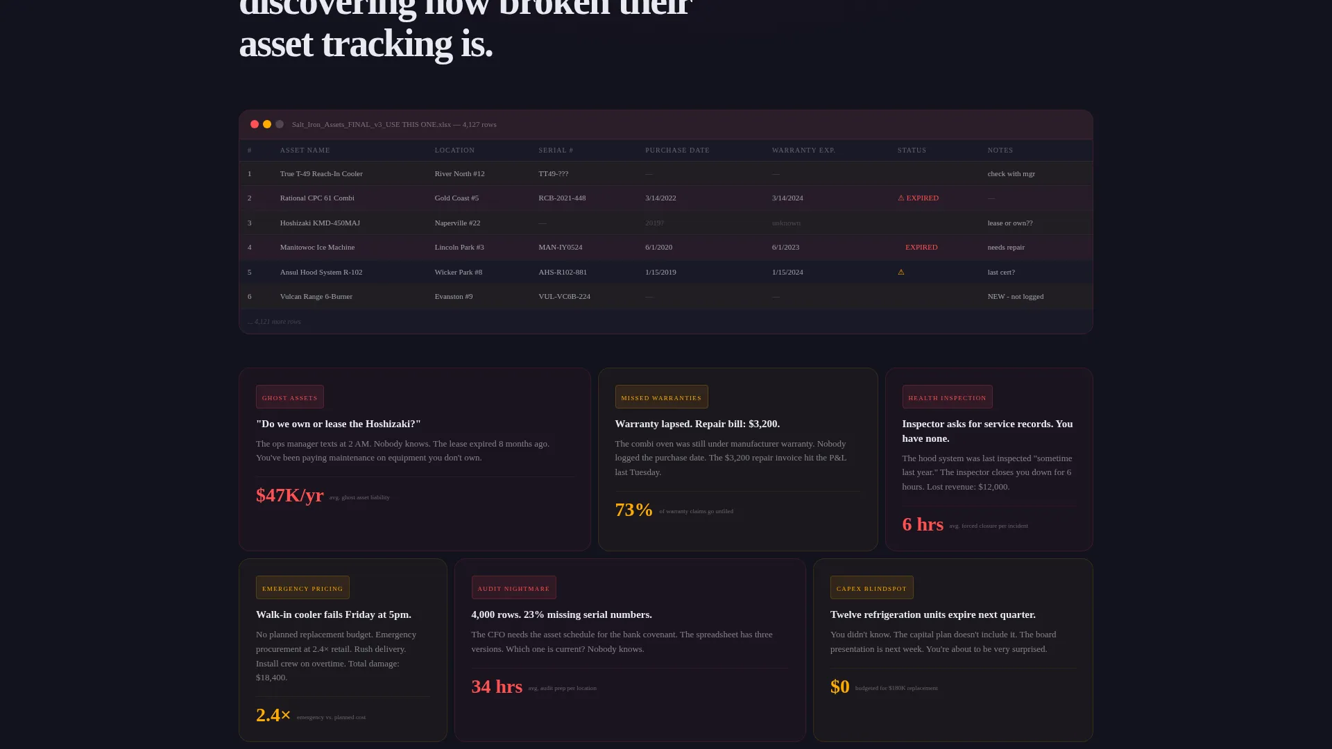
- Ghost assets sitting on the books after equipment has been replaced or removed
- Missed warranty claims and emergency replacement purchases at full retail pricing
- Undocumented equipment histories that create liability during health inspections
What you get with this template
You get a fully structured, conversion-focused landing page with motion-driven storytelling, a live-feeling dashboard header, and a mid-page comparison tool. Every section is purposefully sequenced to take a skeptical operator from "I recognize this chaos" to "I need this product."
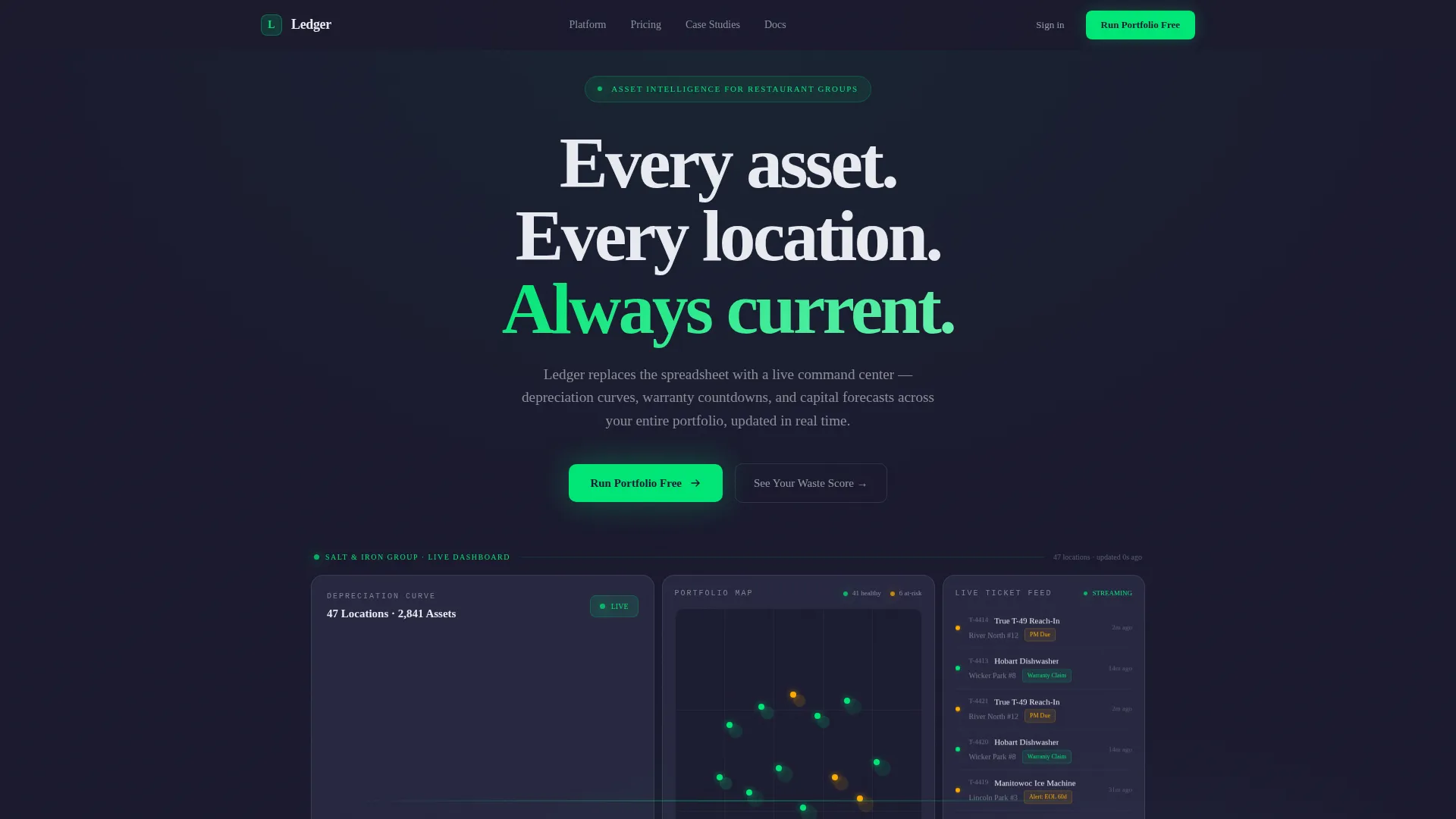
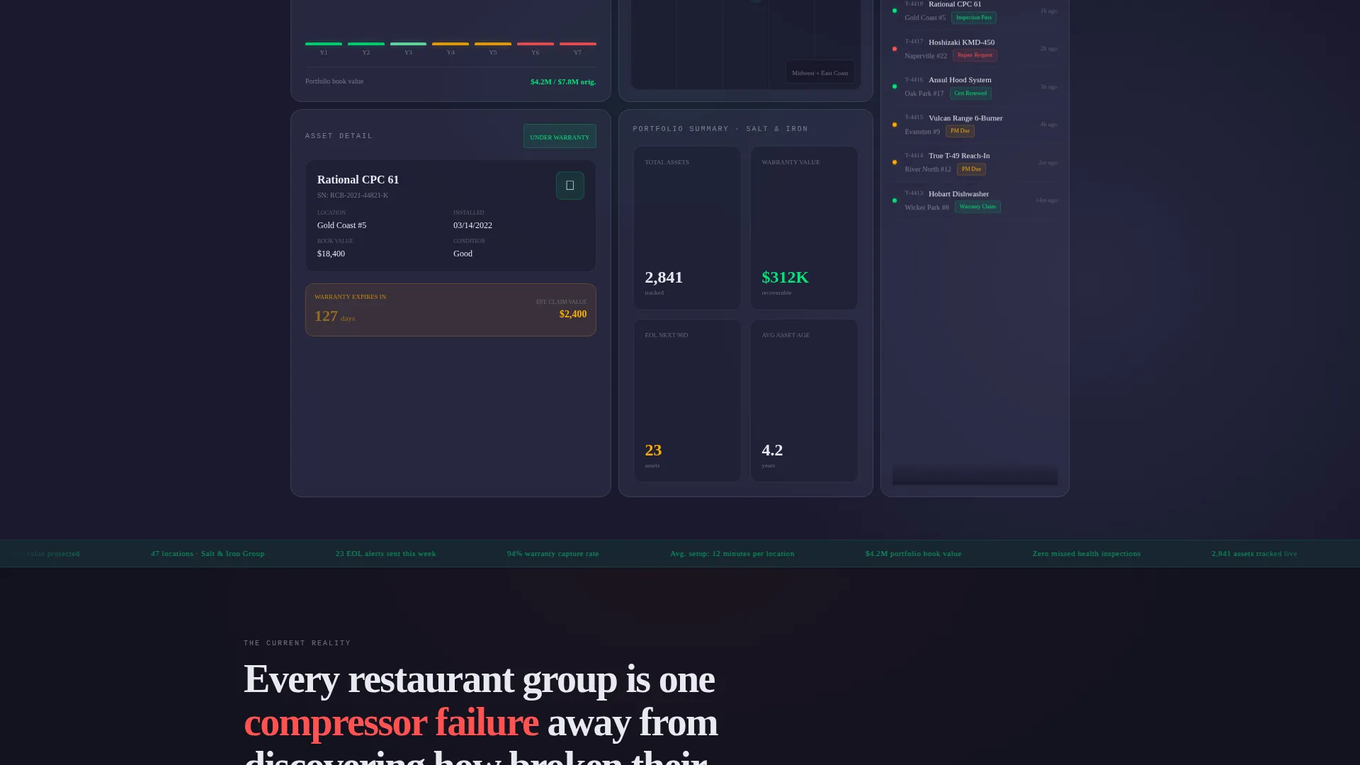
- An interactive bento grid header previewing a fictional 47-location restaurant group with live-state tiles
- A scroll-triggered problem-to-solution arc where cards animate from chaos into organized data
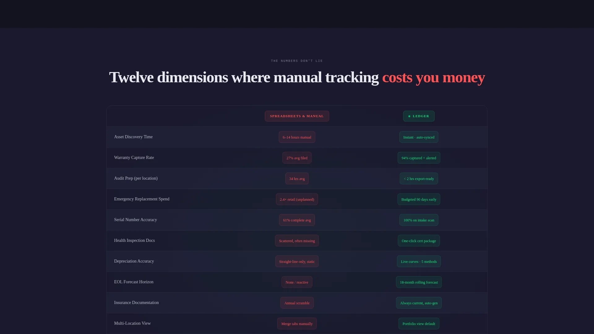
- A persistent comparison bar measuring spreadsheet tracking against the platform across twelve operational dimensions
Feature list
This template ships with purpose-built sections and interaction patterns designed specifically for a restaurant asset management use case.
Interactive Dashboard Header
The header renders a functioning bento grid dashboard for a fictional restaurant group called "Salt and Iron." Four live tiles display a depreciation waterfall chart in animation, a pulsing location map, a scrolling maintenance ticket feed, and a single asset card with a live warranty countdown. Visitors can hover any tile to expand it.
Problem-to-Solution Scroll Arc
As visitors scroll past the header, the first content section surfaces the spreadsheet nightmare: a chaotic grid with missing serial numbers, red cells, and a realistic ops manager text thread. Cards then animate and reorganize into the clean, structured solution state, making the product's value viscerally clear before a single feature is listed.
Twelve-Dimension Comparison Table
A persistent horizontal comparison bar anchors mid-page. It stacks "Spreadsheets and Manual Tracking" against the platform across twelve operational dimensions, including asset discovery time, audit preparation hours, warranty capture rate, and emergency replacement spend. Each row animates on scroll, with loss figures appearing in alert amber and platform wins in status green.
Waste Score Calculator
A secondary conversion path presents a quick calculator that estimates annual dollars lost to untracked depreciation and missed warranties. Visitors input their location count and average equipment age to receive a personalized loss figure before being asked for contact details.
Low-Friction Lead Capture Form
The primary call to action, "Run Your Portfolio Free," uses a three-step form. It opens with a single location-count slider, followed by cuisine type, then a work email field. This sequence reduces friction by starting with a non-committal data point rather than immediately requesting personal information.
Escalating Portfolio Narrative
Each content section after the comparison table scales the story upward. Single-location tracking gives way to multi-unit portfolio views, which then expand into capital planning forecasts. Bento tiles grow more data-dense as visitors scroll, visually communicating that the platform grows with the operator's business.
Page sections overview
| Section | Purpose |
|---|---|
| Interactive Dashboard Header | Live bento grid preview showing fictional restaurant group data across four animated tiles |
| Spreadsheet Nightmare Section | Pain-point cards surfacing ghost assets, missed warranties, and inspection failures |
| Solution Transition Grid | Animated card reorganization revealing the clean, automated data state |
| Comparison Table Bar | Twelve-row scroll-animated table contrasting manual tracking against the platform |
| Portfolio Escalation Sections | Progressive story scaling from single-unit to multi-unit to capital forecasting views |
| Waste Score Calculator | Self-serve calculator delivering a personalized annual loss estimate |
| Primary call to action Block | "Run Your Portfolio Free" form with location slider, cuisine type, and email fields |
| Floating call to action Footer | Persistent call-to-action anchored at the bottom of the bento grid |
Design & branding system
The visual identity follows a Dynamic Motion theme built on a Carbon Fiber color system. The palette is deliberately dark and information-dense, resembling the dashboard of a high-performance vehicle at night, where every glow carries meaning.
- Deep graphite (#1A1A2E) backgrounds and brushed titanium (#3D3D5C) card surfaces with subtle one-pixel borders
- Status green (#00E676) activates on healthy asset states; alert amber (#FFAB00) marks assets approaching end of life
- Cool white (#E8EAF0) card text and data labels maintain readability against dark surfaces throughout
Mobile & speed optimization
The bento grid layout is structured for responsive behavior, with tiles that adapt to smaller viewports without losing the data-dense visual hierarchy. Motion transitions are scoped to scroll events rather than continuous loops, keeping the page performant on lower-powered devices.
- Tile hover expansions and scroll-triggered animations are designed to degrade gracefully on touch screens
- The comparison table's row-by-row animation is sequenced for legibility on narrow screens, with each row appearing in full before the next loads
How this template helps you convert
Ledger is built around a conversion funnel that meets different buyer mindsets at different scroll depths. The page does not ask for commitment until it has already delivered proof of value.
- The interactive header creates immediate product credibility by letting visitors explore live-feeling data before reading a single marketing claim.
- The Waste Score calculator makes the purchase case personal and quantified, giving prospects a real dollar figure tied to their own operation before the lead form appears.
Other information about this template
This template is categorized under Technology and Restaurant Software, sitting at the intersection of operational tooling and capital planning for multi-unit food-service operators. It is suited for software-as-a-service platforms, asset management tools, and equipment lifecycle products targeting the restaurant industry.
- The bento grid style supports modular customization, allowing teams to reorder, resize, or swap tiles to match their platform's actual feature set
- The color system and motion theme are defined as named variables, making palette updates straightforward for teams rebranding the template
- The fictional "Salt and Iron" dataset in the header is placeholder content intended to be replaced with realistic demo data from the actual platform
Theme
Dynamic Motion
Creative direction
Problem→Solution Arc
Color system
Carbon Fiber
Style
Bento Grid
Direction
Comparison/Versus
Page Sections
Interactive Bento Grid Dashboard Header
Problem-to-solution Scroll Animation
Twelve-dimension Comparison Bar
Personalized Waste Score Calculator
Low-friction Three-step Lead Form
Escalating Portfolio Section Sequence
Related questions
Who is this landing page template designed for?
Can the bento grid tiles be rearranged or resized?
What does the Waste Score calculator actually do?
Is the fictional 'Salt and Iron' data meant to stay in the final page?
How does the comparison table work on scroll?



