Retail Accounting Software Landing Page Template
Ledger is a single-page retail accounting landing page template built for software teams targeting DTC founders, multi-store operators, and retail finance leaders. It pairs a Startup Velocity visual theme with a Spec Sheet creative direction, stacking a hero product screenshot, a capability grid, and a competitor comparison table into one click-through flow that moves visitors toward a free-trial signup.
by Rocket studio
Quick summary
Ledger is a comparison-table landing page template for retail accounting software. It opens with a full-width dashboard screenshot, moves into a scannable capability grid, and closes with a single call-to-action that pushes visitors to a free-trial signup. The design runs on a deep void-black palette accented with holographic violet and electric mint.
Who this template is for
This template is built for software companies and product teams selling retail accounting tools to operators who live inside their numbers every day. It speaks directly to buyers who already feel the pain of fragmented data.
- Direct-to-consumer founders reconciling online and wholesale channels
- Multi-store retail owners monitoring shrinkage and inventory across locations
- Retail finance leaders managing data inherited from multiple sources
What problem this template solves
Retail accounting software is genuinely hard to sell on a generic landing page. Buyers are skeptical, time-poor, and comparing several tools at once. A plain feature list rarely closes the gap between interest and action.
- Prospects leave before understanding what makes the product different from familiar alternatives
- No side-by-side comparison makes it easy for visitors to default to spreadsheets or a well-known incumbent
- Fragmented page layouts bury the specific capabilities retail operators actually care about
What you get with this template
You get a complete, single-page click-through layout ready to present retail accounting software with authority. Every section is pre-structured so your product does the persuading.
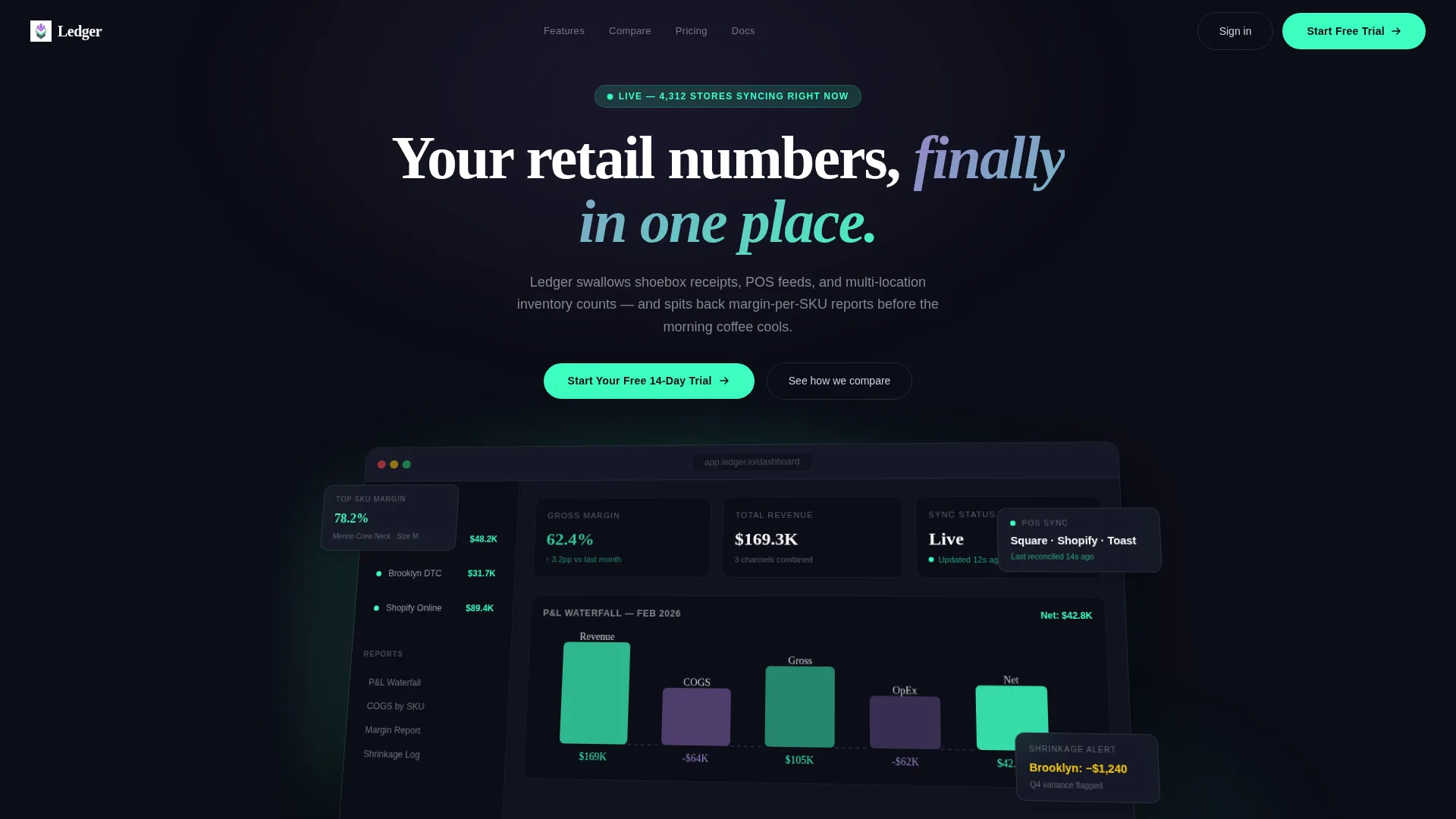
- A hero section with a 3D-tilted dashboard screenshot, headline, and micro-stat bar
- A scrollable spec sheet with inventory costing methods, feature checkmarks, and a competitor comparison table
- Three strategically placed call-to-action buttons that guide visitors toward a free-trial onboarding flow
Feature list
This template ships with purpose-built sections that serve retail accounting buyers at every scroll depth.
Hero Dashboard Screenshot Block
The header renders a pixel-perfect product screenshot on a slight 3D tilt with a soft iridescent glow behind it. A gross-margin ticker, a profit-and-loss waterfall chart, and a three-location sidebar with green health indicators make the dashboard feel live and credible from the first scroll.
Competitor Comparison Table
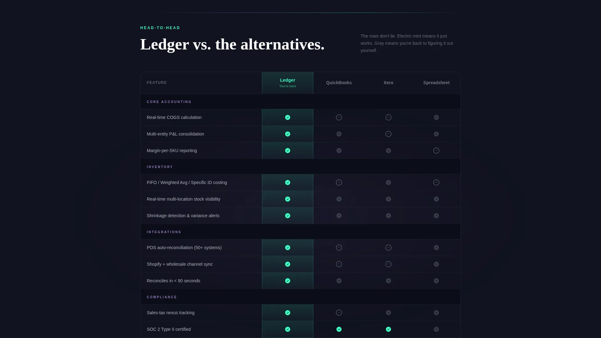
A structured table pits the software against two named alternatives and a generic spreadsheet column. Each capability row lights up in electric mint for the featured product and dims to chrome-gray for competitors, making the advantage visible at a glance without a single word of editorializing.
Inventory Costing Method Grid
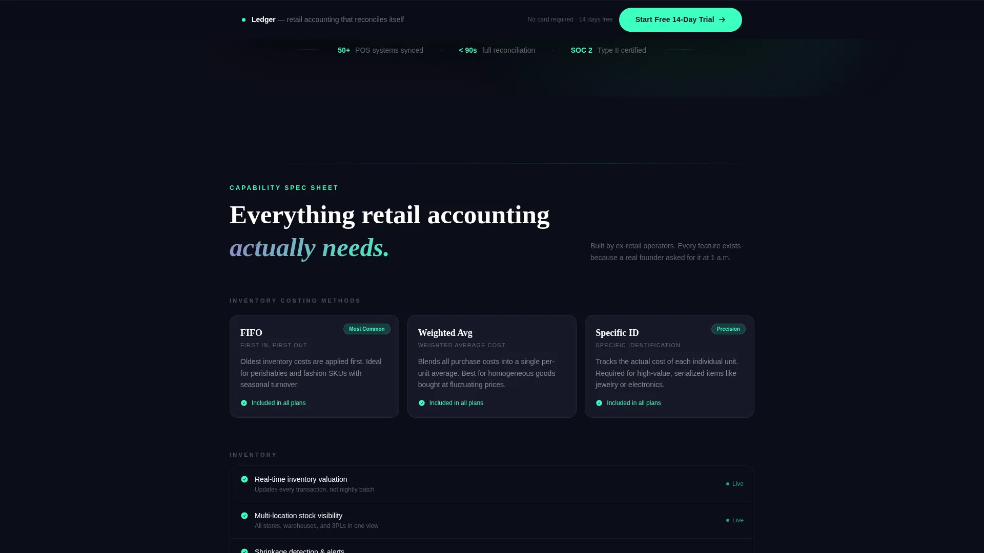
Three costing methods, including first-in-first-out, weighted average, and specific identification, are each presented with a one-line definition and a checkmark column. Retail operators can confirm compatibility without leaving the page.
Sticky Call-to-Action Bar
After the comparison table, a sticky bottom bar keeps the primary call-to-action visible as visitors scroll. This removes the need to scroll back up and maintains conversion momentum through the spec sheet.
Micro-Stat Social Proof Bar
A stat bar beneath the hero screenshot displays three concrete proof points: the number of point-of-sale systems supported, reconciliation speed, and a compliance credential. It anchors the product claim in specifics rather than adjectives.
Zero-Form Click-Through Flow
No form fields appear on this page. The single call-to-action button carries visitors to a separate onboarding page, reducing friction to one tap. The onboarding flow then collects only the three details needed to get started.
Page sections overview
| Section | Purpose |
|---|---|
| Hero Headline | Frames the core value promise above the dashboard screenshot |
| Dashboard Screenshot | Shows a live-looking product render with real margin data |
| Micro-Stat Bar | Anchors claims with three specific proof points |
| Costing Methods Grid | Confirms inventory method compatibility for retail operators |
| Comparison Table | Stacks feature rows against alternatives side by side |
| Closing call to action Section | Re-engages hesitant visitors with a final conversion nudge |
| Sticky call to action Bar | Keeps the trial button visible throughout the comparison scroll |
Design & branding system
The visual identity follows a Startup Velocity theme using an AI Iridescent color system. The overall effect is futuristic and precise without feeling excessive or decorative.
- Background surfaces stay in the deep void-black range (#0B0D17), while body text uses soft chrome (#D2D5DB) for strong contrast on dark fields
- Section dividers catch a holographic violet (#7B5EA7) to electric mint (#3DFFC0) gradient, creating a subtle oil-slick shimmer that separates content without heavy borders
- Interactive elements including toggles, hover states, and selected comparison columns pulse in electric mint so the active state is always obvious
Mobile & speed optimization
The layout is structured to remain fully readable on smaller screens, with the comparison table and spec grid designed to reflow cleanly. The single-page architecture keeps the visitor path short.
- The comparison table is built to scroll horizontally on narrow viewports without breaking the column structure
- Call-to-action buttons are sized and spaced for comfortable tap targets on touch devices
- The zero-form page structure means the critical conversion path requires only one interaction, regardless of device
How this template helps you convert
The template earns the click by stacking evidence quietly and letting the spec sheet do the persuading. There are no bold promises to evaluate; only rows of capability to confirm.
- The comparison table removes the need for visitors to research alternatives elsewhere, keeping them on the page until the decision feels obvious
- Three call-to-action placements, beneath the hero, in the sticky bar, and in the closing section, meet the visitor at every moment they feel ready to act
Other information about this template
This template is part of the Ledger product line and is designed for teams building in the retail accounting software category. It pairs naturally with tools buyers already know.
- The comparison table is pre-structured with rows covering multi-entity consolidation, real-time cost-of-goods-sold tracking, point-of-sale auto-reconciliation, and sales-tax nexus tracking
- The onboarding flow linked from the call-to-action collects only three inputs: email address, store count, and primary point-of-sale system
- The closing section headline, "Still reconciling by hand?", is written to re-engage visitors who scrolled through the full spec sheet but have not yet clicked
- This template is a strong fit for teams positioning against QuickBooks, Xero, or manual spreadsheet workflows in retail-specific sales conversations

Theme
Startup Velocity
Creative direction
Spec Sheet
Color system
AI Iridescent
Style
Comparison Table
Direction
Click-Through
Page Sections
Hero Dashboard Screenshot Block
Competitor Comparison Table
Inventory Costing Method Grid
Sticky Call-to-action Bar
Micro-stat Social Proof Bar
Zero-form Click-through Flow
Related questions
Does this template include any form fields on the landing page?
Can the comparison table rows be edited to match a different competitor set?
Who is the intended visitor for this landing page?
How many times does the call-to-action appear on the page?
How does the color system work in the comparison table?



