Local Retail Software & SaaS Professional Website Template
Ledger is a card-grid landing page template built for retail enterprise resource planning (ERP) platforms. It combines a live-data visual identity, an industry-report content structure, and a freemium conversion flow to help retail software brands turn first-time visitors into trial sign-ups. The layout guides multi-location retailers from pain-point recognition to product confidence in a single scroll.
by Rocket studio
Quick summary
Ledger is a single-page, card-grid landing page template designed for retail ERP software. It opens with a logo-bar header and unfolds like a proprietary industry report, using data-finding cards to build buyer conviction before revealing the product interface. Two conversion paths capture visitors at every stage of readiness.
Who this template is for
This template is built for retail software companies that need to earn trust before asking for a sign-up. It speaks directly to the operators those companies are trying to reach.
- Multi-location boutique owners who currently reconcile inventory across spreadsheets by hand
- Direct-to-consumer brands moving from an online storefront into their first physical warehouse
- Regional grocery operators whose legacy point-of-sale systems struggle during peak retail periods
What problem this template solves
Retail ERP platforms face a tough sales challenge. Buyers are skeptical because they have been burned by complex software before. A generic feature list does not close that gap.
- Visitors arrive without enough context to trust an unfamiliar platform
- Product screenshots shown too early feel abstract and unconvincing
- Single call-to-action pages lose visitors who are not yet ready to commit
What you get with this template
The template delivers a complete, conversion-ready landing page structure that leads with industry insight and earns the product reveal. Every section is modular, so teams can reorder or expand chapters without rebuilding the layout.
- A continuous logo-bar header with a stat headline and animated ticker for immediate social proof
- Modular data-finding cards organized into thematic chapters, each ending with a product capability statement
- Two conversion paths: a free-trial inline form and a gated PDF download for research-stage visitors
Feature list
This section covers the core interactive and structural components included in the Ledger template.
Animated Logo Bar Header
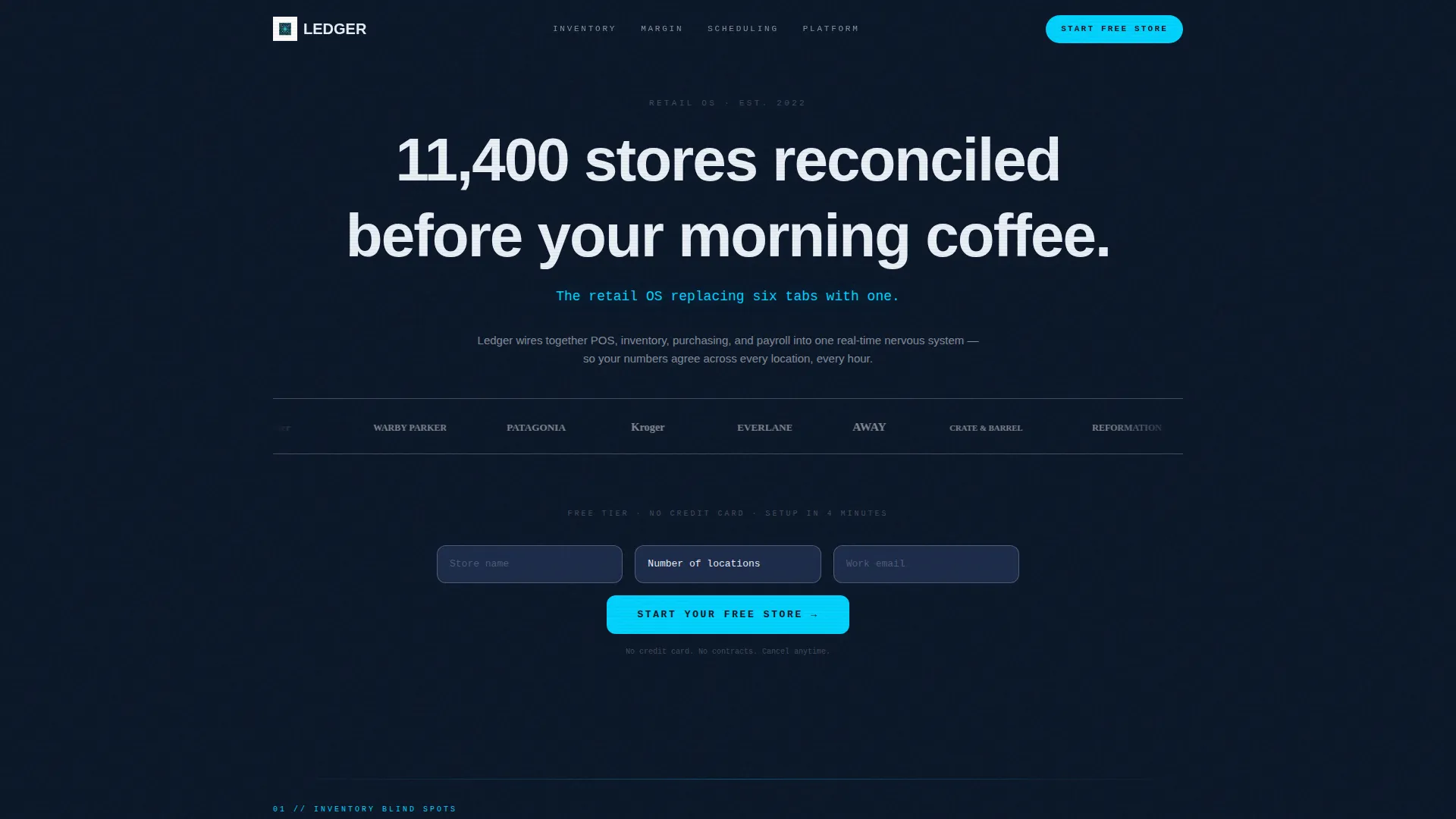
The header opens with a horizontal ticker of retail brand logos rendered in monochrome signal white against the deep navy background. A stat headline fades in above the ticker and a secondary line in electric cyan sits below it. No hero image competes for attention. The motion and social proof together create the opening energy.
Industry-Report Card Grid
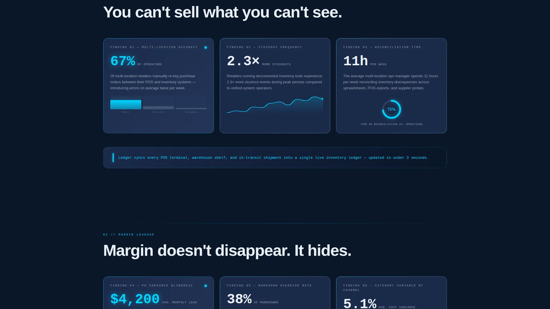
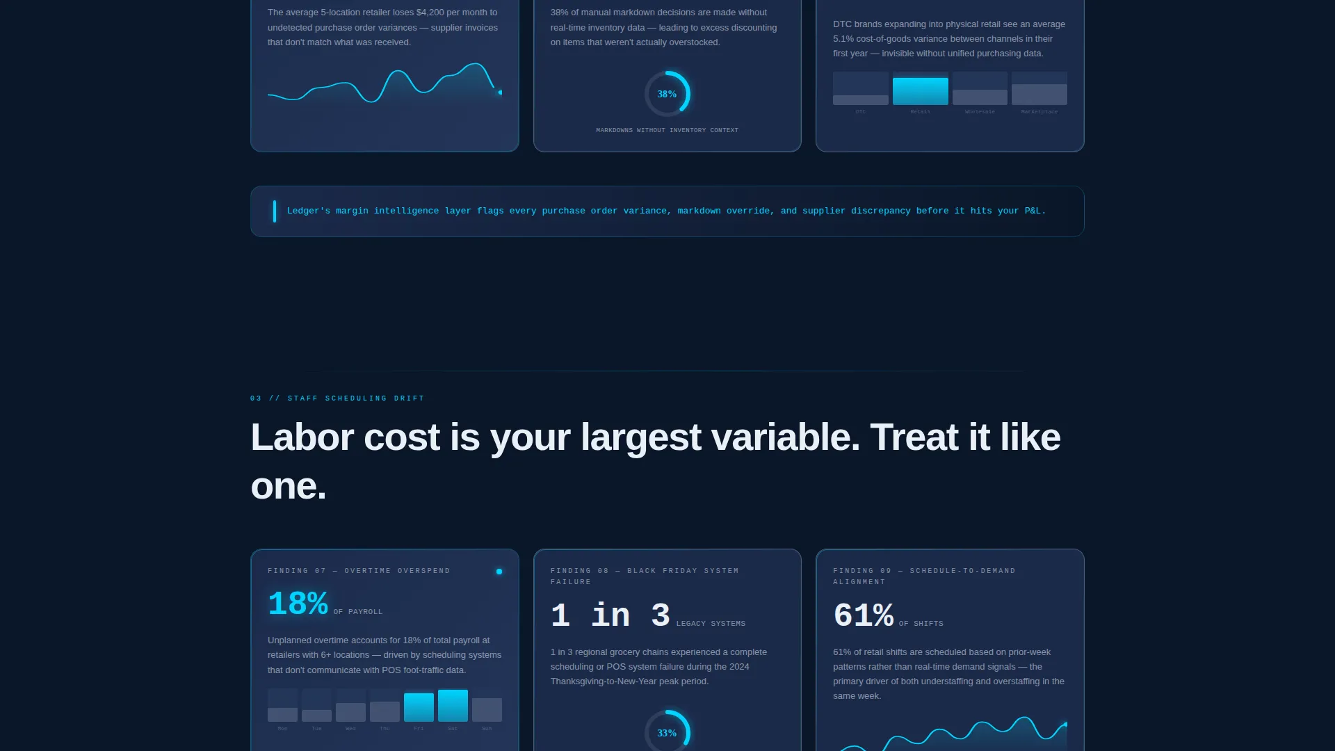
Cards are grouped into named chapters such as Inventory Blind Spots, Margin Leakage, and Staff Scheduling Drift. Each card presents a retail pain point as a data finding, paired with a mini-visualization rendered in cyan against satellite blue. The cumulative effect builds intellectual momentum before any product interface appears.
Dual Conversion Flow
The primary call to action, "Start Your Free Store," appears first below the logo bar and stays pinned as a floating button during scroll. Clicking it opens a three-field inline form: store name, number of locations, and work email. No credit card is required. A secondary path offers a gated research report download for visitors not yet ready to trial.
Product user interface Reveal Section
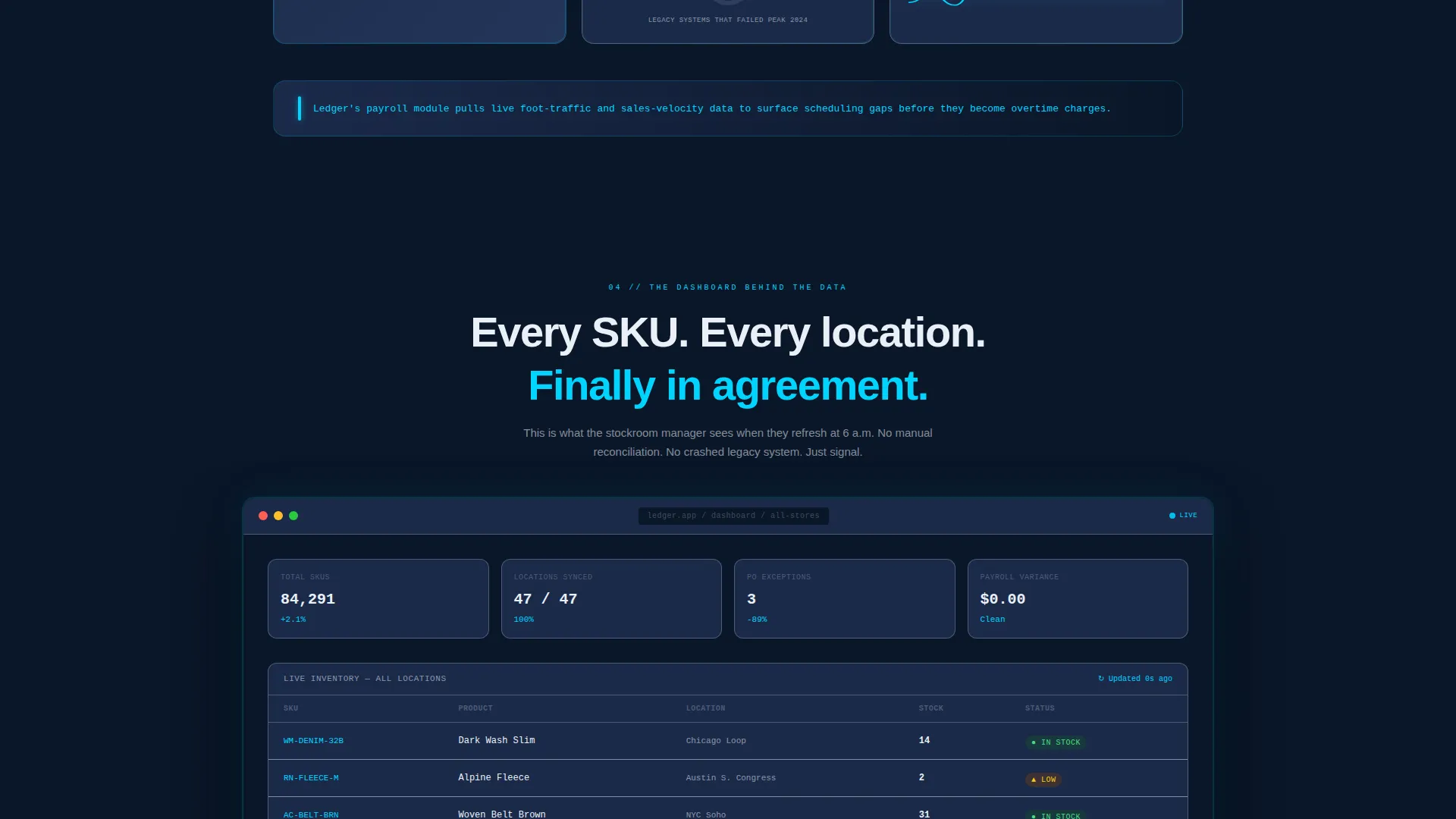
The product dashboard appears only in the final third of the page. It is framed as "the dashboard behind the data," connecting every earlier data finding to a visible interface element. This sequencing makes the product feel like a natural conclusion rather than a cold pitch.
Startup Velocity Visual Theme
The Midnight Blue color system uses deep terminal navy as the primary background, satellite blue for card surfaces, electric cyan for live-data accents and hover states, and crisp signal white for all body typography. The palette is designed to feel like a mission-control screen, where every lit element earns its place.
Freemium-Optimized call to action Structure
The floating call-to-action button stays visible throughout the scroll without disrupting reading. The inline sign-up form is kept deliberately short to reduce friction. The gated PDF path captures research-stage emails while reinforcing the platform's authority as a source of retail operations insight.
Page sections overview
| Section | Purpose |
|---|---|
| Logo Bar Header | Opens with social proof via a brand ticker, stat headline, and cyan subline |
| Primary call to action Block | Places the free-trial form immediately below the header to capture high-intent visitors |
| Chapter: Inventory Blind Spots | Presents inventory-related data findings as modular cards with mini-visualizations |
| Chapter: Margin Leakage | Covers purchasing and reconciliation pain points with supporting data cards |
| Chapter: Staff Scheduling Drift | Addresses payroll and staffing misalignment through the same card-and-finding format |
| Product user interface Reveal | Introduces the actual dashboard interface, framed by the data findings above it |
| Gated Report Download | Offers the 2025 Retail Ops Report as a secondary conversion path for research-stage visitors |
| Bottom call to action Block | Repeats the primary call to action after the full case has been built |
Design & branding system
The visual identity follows the Startup Velocity theme, built around a Midnight Blue color system. Every color decision reinforces the feeling of a live operations environment rather than a standard software marketing page.
- Deep terminal navy (#0A1628) as the primary background, satellite blue (#1B2A4A) for card surfaces, electric cyan (#00D4FF) for interactive accents, and signal white (#EAF0F7) for typography
- Mini-visualizations including animated bars, spark lines, and donut charts are rendered in electric cyan against satellite blue card surfaces
- Logo bar logos are displayed in monochrome signal white so they read clearly against the dark background without visual competition
Mobile & speed optimization
The card-grid layout is designed to reflow cleanly at smaller screen sizes. Modular cards stack vertically on mobile without losing their chapter structure or data-finding context.
- The floating call-to-action button remains accessible during mobile scroll without covering critical content
- The inline sign-up form uses only three fields, keeping the mobile input experience fast and low-friction
- Chapter headers and card titles are sized for legibility on small screens without requiring the user to zoom
How this template helps you convert
The page is built around a specific belief: visitors convert when they feel understood before they feel sold to. The structure makes that possible in a predictable sequence.
- The logo-bar header delivers instant credibility through recognizable brand social proof, reducing the skepticism a first-time visitor brings to any new software platform
- The industry-report card chapters teach the visitor something true about their own operations, creating a sense of authority and genuine value before any product feature is mentioned
- Two distinct conversion paths mean the page captures both high-intent visitors ready to start a trial and research-stage visitors willing to exchange an email for a useful report
Other information about this template
The Ledger template is a strong fit for retail software brands positioning their platform as a modern replacement for fragmented legacy tools. It works equally well for early-stage startups and established vendors entering new retail segments.
- The template style is Card Grid (Modular), making it straightforward to add, remove, or reorder chapters without restructuring the full layout
- The Industry Report creative direction gives the page a distinctive tone that separates it from typical software landing pages relying on feature lists and pricing tables
- The freemium and trial conversion model is built directly into the layout, not added as an afterthought, so the sign-up path feels natural rather than interruptive
- This template is well-suited for retail ERP platforms, point-of-sale software brands, inventory management tools, and any retail software company that wants to lead with operational authority
Theme
Startup Velocity
Creative direction
Industry Report
Color system
Midnight Blue
Style
Card Grid (Modular)
Direction
Freemium/Trial
Page Sections
Animated Logo Bar Header
Industry-report Card Grid
Dual Conversion Flow
Product User Interface Reveal Section
Startup Velocity Visual Theme
Persistent Floating Call to Action Button
Related questions
Can I customize the chapter names and card content in this template?
Does the template include both conversion paths ready to use?
Who is this landing page template designed for?
Is the floating call-to-action button part of the template?
Can I adapt this template for a single-location retail brand?



