Ledger - Powerful Seniorcarebilling Landing Page Template
Ledger is a bento grid landing page template built for senior care billing platforms. It uses a dark Data Command visual theme with electric chartreuse and phosphor blue accents to present claims pipelines, invoice workflows, and reconciliation dashboards. The layout guides billing managers and CFOs from frustration to solution, ending with a clear app download call to action.
by Rocket studio
Quick summary
Ledger is a single-page bento grid template designed for senior care billing and invoicing platforms. It opens with a Feature Tab Switcher showing live-style dashboard views, then walks visitors through a Problem to Solution arc, and closes with a strong app download call to action. The design feels like mission control, dark, data-rich, and purposeful.
Who this template is for
This template is built for teams selling or showcasing billing software in the senior care space. It speaks directly to the people who live inside claims queues every day.
- Billing managers at assisted living facilities running 80 or more beds
- Home health agency owners dealing with high volumes of rejected claims
- CFOs at multi-site memory care networks losing revenue to coding errors and late submissions
What problem this template solves
Senior care billing is genuinely complex. Medicaid reimbursements, private-pay invoices, and long-term care insurance claims each follow different rules. When those streams collide in manual spreadsheets, revenue leaks fast. This template gives your platform a landing page that mirrors that complexity and then shows exactly how your product resolves it.
- Visitors instantly recognize their own workflow in the claims pipeline header
- The scroll narrative moves from pain to proof before asking for a download
- Facility case studies show real recovery numbers, removing skepticism early
What you get with this template
The template delivers a complete, conversion-ready landing page layout. Every section is designed to add credibility before the call to action appears.
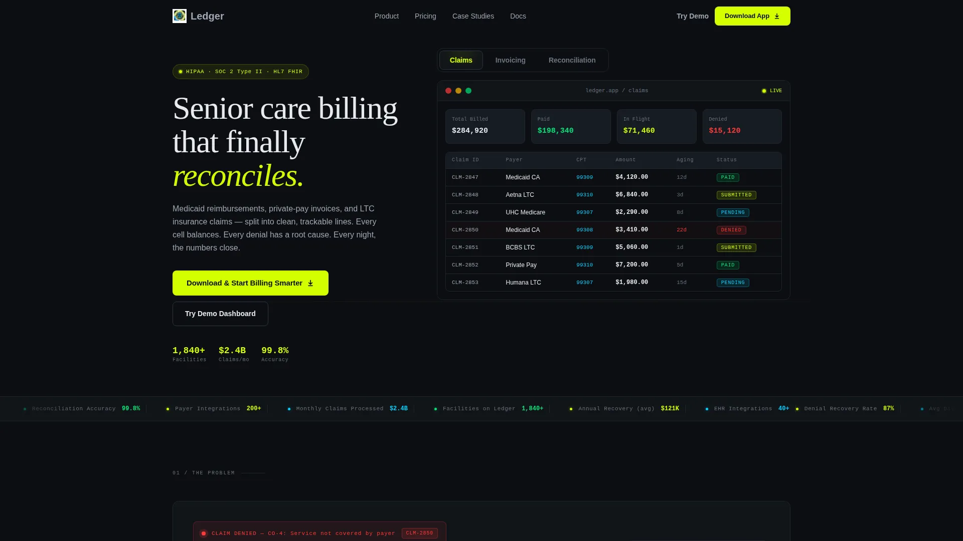
- A Feature Tab Switcher header with three dashboard views: Claims, Invoicing, and Reconciliation
- A bento grid Problem to Solution arc with animated card transitions and color shifts from red to chartreuse
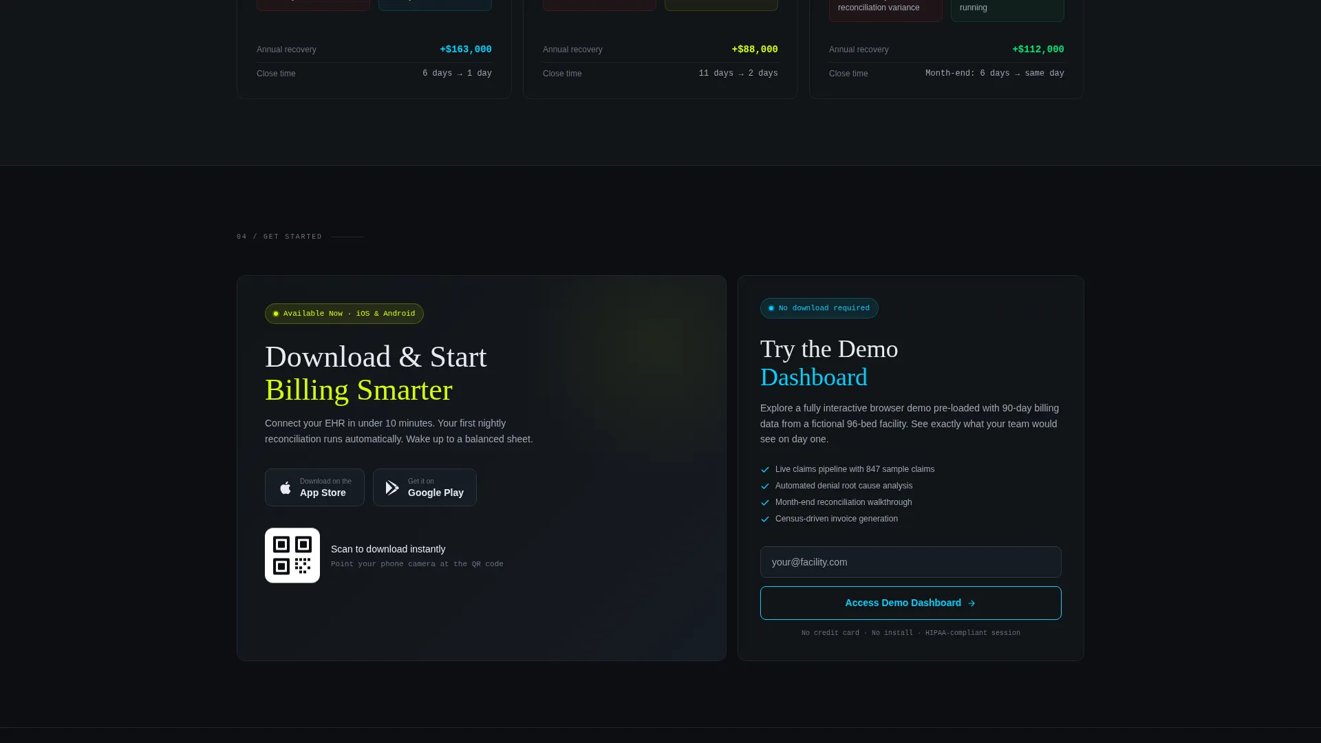
- App download calls to action with App Store and Google Play badges, a QR code, and a secondary demo path
Feature list
This template covers the full visual and structural scope needed for a senior care billing platform landing page.
Three-Tab Dashboard Header
The header features a Feature Tab Switcher with tabs labeled Claims, Invoicing, and Reconciliation. Each tab reveals a different live-style dashboard view inside a device frame. Tabs switch without a page reload, snapping in with a micro-animation that feels like flipping screens on a trading terminal.
Claims Pipeline View
The default tab displays a claims pipeline with color-coded statuses: green for paid, chartreuse for submitted, phosphor blue for pending, and red for denied. Payer names, CPT (Current Procedural Terminology) codes, dollar amounts, and aging columns are all visible. The data density is high enough that a billing manager recognizes their own workflow on first glance.
Bento Grid Problem-to-Solution Arc
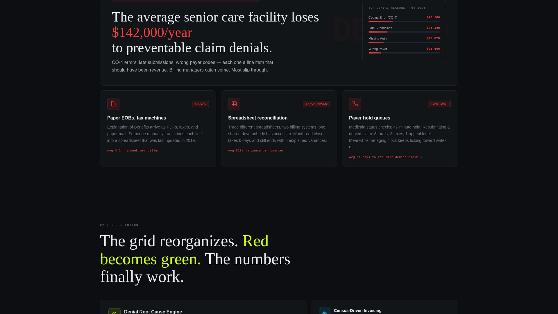
The scroll narrative opens with a rejected claim card and a stat noting that the average senior care facility loses $142,000 per year to preventable claim denials. Cards then fragment to show manual chaos, then reorganize with color shifts as the automated solution assembles. The grid grows more connected and data-rich as the visitor scrolls deeper.
Facility Case Study Cards
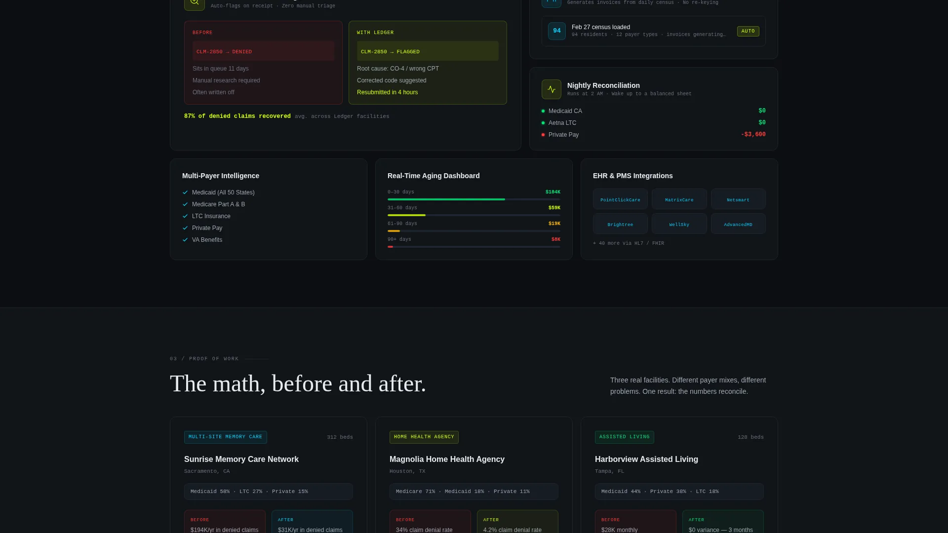
Three compact bento cards display real-format case studies showing bed count, payer mix, and annual recovery improvement. These cards appear before the primary call to action, providing proof before the ask. Each card is built to feel like a summary balance sheet.
Dual-Path Conversion Section
The primary call to action reads "Download and Start Billing Smarter" and pairs App Store and Google Play badges with a QR code for instant mobile capture. A secondary path offers a browser-based interactive demo that requires only an email address to access.
Acid Digital Color System
The template applies a void black background with electric chartreuse on active states and call-to-action elements, clinical phosphor blue for chart lines and status indicators, and muted titanium for body text. Single-pixel card borders pulse subtly on hover, giving the grid a live terminal feel.
Page sections overview
| Section | Purpose |
|---|---|
| Tab Switcher Header | Shows Claims, Invoicing, Reconciliation dashboard views |
| Rejected Claim Card | Opens the problem arc with denial stat |
| Manual Process Cards | Fragments the pain across three bento cards |
| Solution Assembly Grid | Reorganizes cards to reveal automated workflow |
| Facility Case Studies | Proves recovery math with three compact cards |
| App Download call to action | Drives primary conversion with badges and QR code |
| Demo Dashboard Path | Captures email leads via browser-based preview |
Design & branding system
The visual identity follows a Data Command theme executed through an Acid Digital color palette. Every color choice serves a functional role, so the interface reads like a live operations screen rather than a marketing page.
- Void black (#0B0E11) as the primary background, electric chartreuse (#D4FF00) for calls to action and live-updating numbers, clinical phosphor blue (#00D1FF) for chart lines and status indicators, and muted titanium (#A0A7B5) for body text
- Bento grid cards float on the dark background with single-pixel borders that pulse on hover
- The overall tone is a mission control terminal at 2 AM: dark enough that data glows, bright enough that nothing hides
Mobile & speed optimization
The bento grid layout is structured to adapt cleanly across screen sizes. The app download focus of the page makes mobile presentation especially important.
- The QR code and App Store or Google Play badges are positioned for easy tap access on smaller screens
- Bento grid cards reflow responsively so the Problem to Solution arc reads correctly on mobile viewports
- Micro-animations are scoped to individual card interactions, keeping the layout focused and avoiding heavy visual overhead
How this template helps you convert
Every design and content decision in this template is sequenced to move a skeptical billing professional toward a download.
- The Tab Switcher header lets visitors self-qualify immediately by clicking into the dashboard view that matches their biggest pain point, building relevance before they read a single word of copy.
- The Problem to Solution arc uses escalating visual evidence, including the $142,000 denial loss stat and the grid reorganization animation, to earn trust before any call to action appears.
- The dual-path conversion section removes friction by offering both a direct app download and a low-commitment demo option, so visitors who are not yet ready to download still enter the funnel.
Other information about this template
This template is built as a single-page bento grid layout. It is a strong match for SaaS platforms operating in senior care software, home health billing tools, and long-term care revenue cycle management. The template style and niche align well with markets where buyers are analytical and skeptical, and where showing real data density builds more trust than abstract claims.
- The template category is Technology, subcategory Senior Care Software and SaaS, with a niche focus on senior care billing and invoicing
- The creative direction is a Problem to Solution Arc, the header concept is a Feature Tab Switcher, and the landing page direction is App Download
- The template style is Bento Grid, the theme is Data Command, and the color system is Acid Digital
Theme
Data Command
Creative direction
Problem→Solution Arc
Color system
Acid Digital
Style
Bento Grid
Direction
App Download
Page Sections
Three-tab Feature Switcher Header
Color-coded Claims Pipeline
Animated Bento Grid Narrative
Facility Case Study Cards
Dual-path App Download Section
Acid Digital Visual System
Related questions
Who is the primary audience for this template?
What sections are included in this landing page?
Can I customize the colors and dashboard data shown in the template?
Do I need a developer to set up this template?
Is this template suitable for investor demos or product launch pages?



