Architecture Firm Subscription Management Landing Page
Ledger is a scroll reveal landing page template built for architecture firm subscription management platforms. It opens with a pulsing logo bar and a live cost counter, then progressively surfaces data-first stats on unused seats, cross-studio duplication, and renewal waste. A focused three-field audit form closes the page, designed to turn uncomfortable numbers into qualified leads.
by Rocket studio
Quick summary
Ledger is a single-page, scroll reveal landing page template for software subscription tracking platforms targeting architecture firms. It leads with a live cost counter, escalates through data-driven scroll sections, and ends with a focused lead generation form. Every design decision reinforces one message: your firm is bleeding subscription spend, and this platform can stop it.
Who this template is for
This template is built for founders and marketers launching or promoting a subscription management platform aimed at design and architecture practices. It speaks directly to the people inside those firms who feel the pain every renewal cycle.
- Operations managers at mid-size architecture firms juggling forty or more software tools across multiple studios
- IT directors who inherited disorganized license spreadsheets with no documentation from previous staff
- Founding partners who have just discovered duplicate or unused software seat charges on their accounts
What problem this template solves
Architecture firms accumulate software subscriptions faster than they audit them. Licenses auto-renew, seats go unused, and the same tool often gets purchased twice across different studios. No single page template was designed to address this specific, high-stakes problem with the visual language that resonates with technical and operational buyers.
- There is no clear moment that shows the true monthly cost of all active subscriptions in one view
- Unused seat detection, cross-studio duplication, and renewal forecasting are rarely communicated in a compelling, visual way
- Generic SaaS landing page templates do not build the emotional and data-driven case needed to move architecture operations buyers toward an audit
What you get with this template
You get a fully structured, dark-themed scroll reveal landing page with a stats-first creative direction. Each section is built to surface a specific data point before providing supporting context, building urgency progressively as the visitor scrolls.
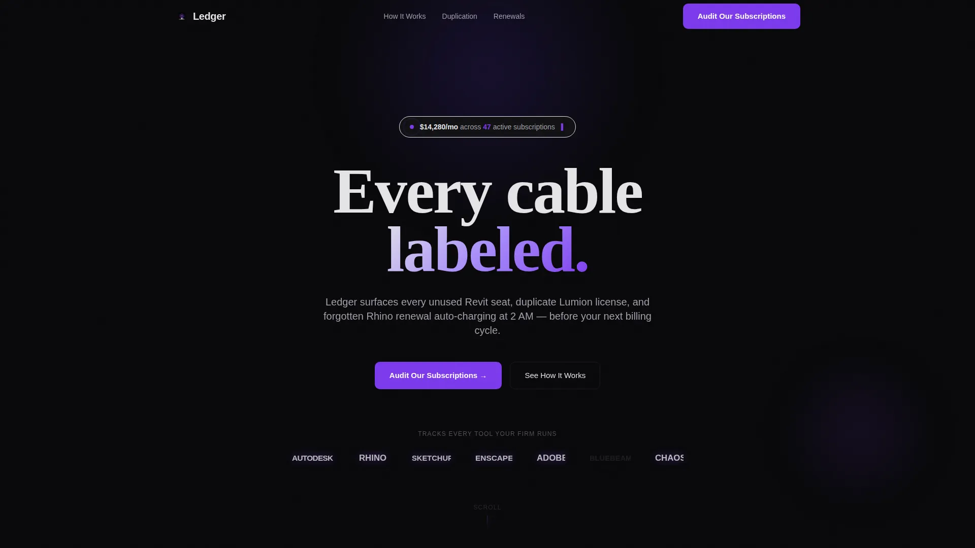
- A pulsing logo bar header with a live-style subscription cost counter as the opening hook
- Progressive scroll sections covering unused seat detection, duplication alerts, renewal forecasting, and annual savings projection
- A three-field lead generation form with a firm name input, a software tool count slider from 10 to 100 plus, and a work email field
Feature list
This template includes the following purpose-built components and layout features.
Pulsing Logo Bar with Cost Counter
The header opens with a horizontal ribbon of monochrome architecture software logos that pulse to violet one by one. Above them, a live-style counter displays the total monthly subscription cost and active subscription count, making the financial stakes clear before a single word of copy is read.
Stats-First Scroll Reveal Sections
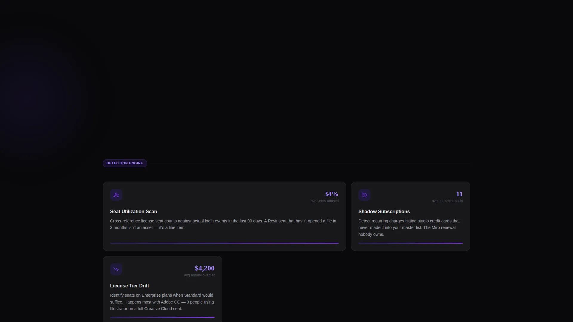
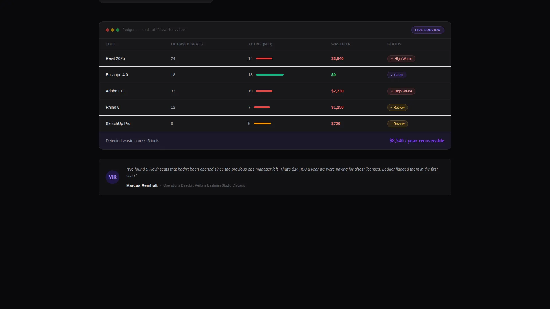
Each scroll section opens with a large, isolated animated figure such as "34% of seats unused." The stat lands alone on the void background before the surrounding context, cards, and testimonials build around it. This progressive reveal creates a rhythm of impact followed by explanation.
Animated Data Highlight Cards
Gray card surfaces float forward on scroll like drawers sliding open. Each card explains a detection method or platform capability, reinforcing the data point that opened the section. The violet color appears only on interactive elements and data highlights, keeping the visual hierarchy intentional.
Renewal Forecasting Section
A dedicated scroll section addresses renewal timing, surfacing the cost of forgotten auto-renewals. It uses the same stats-first format to show renewal risk before explaining how the platform addresses it.
Annual Savings Projection Section
The scroll escalation closes with an annual savings view, giving the visitor a projected waste recovery figure. This section is positioned just before the primary call to action to maximize emotional readiness.
Three-Field Audit Lead Form
The lead generation form appears after the third scroll section and again at page end. It collects firm name, approximate software tool count via a slider, and work email. Below the form, a single supporting line reads: "Most firms discover $40K+ in annual waste."
Page sections overview
| Section | Purpose |
|---|---|
| Logo Bar Header | Opens with pulsing software logos and a live-style subscription cost counter |
| Unused Seat Stats | Surfaces the percentage of unused seats as the first major data reveal |
| Detection Method Cards | Gray cards explain how the platform identifies license waste |
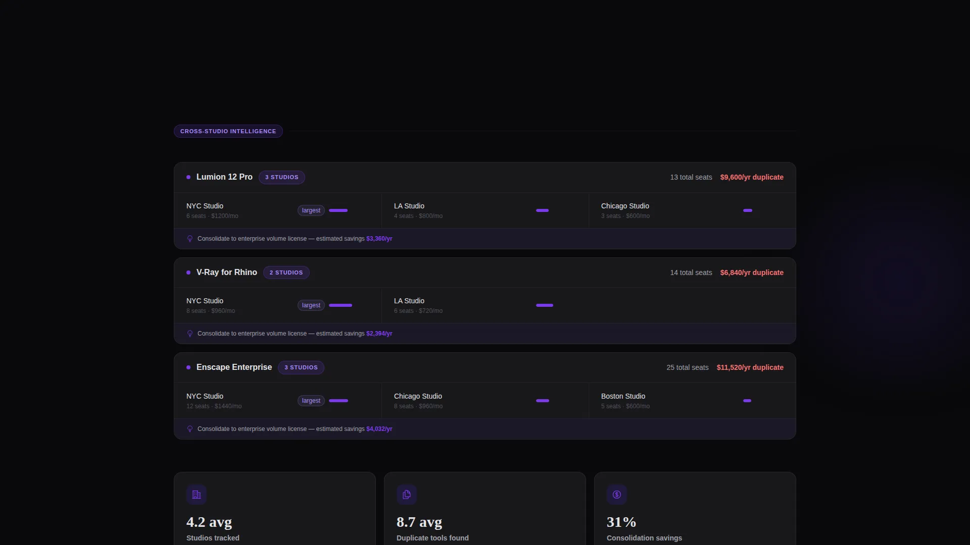
| Duplication Alert Section | Highlights cross-studio subscription duplication with a specific stat |
| Renewal Forecasting View | Shows auto-renewal risk using a data-first format |
| Savings Projection Close | Projects annual waste recovery to prime the visitor for the form |
| Primary Audit Form | Three-field lead form with firm name, tool count slider, and work email |
| Page End Form Repeat | Repeats the audit call to action at the bottom for visitors who scrolled past the first |
Design & branding system
The visual identity follows a Directory and Discovery theme using a Void and Violet color system. The palette is built around contrast and intentional color use: void black as the constant background, violet reserved for moments of data significance, and gray for readable surfaces.
- Background stays in absolute void black (#09090B) with deep ultraviolet (#2D1B69) providing depth on section transitions
- Electric violet (#7C3AED) appears only on interactive elements, data highlights, and the pulsing logo animation to signal importance
- Cool lunar gray (#E4E4E7) is used for card surfaces and body text, floating forward on scroll like labeled drawers in a clean server room
Mobile & speed optimization
The scroll reveal structure and progressive section loading are designed with a mobile reading experience in mind. Sections stack cleanly for smaller screens without losing the data-first visual rhythm.
- Each scroll section is structured so the opening stat remains prominent and legible on mobile viewports
- Card components reflow to single-column layouts on smaller screens, keeping the gray-on-void contrast intact
- The three-field audit form simplifies cleanly on touch devices, with the slider input remaining functional at all screen sizes
How this template helps you convert
This template is built around a deliberate emotional escalation. It does not ask for contact details until the visitor has already seen their problem reflected back at them in specific numbers.
- The cost counter in the header creates immediate personal relevance by showing real subscription spend figures, making the visitor curious about their own number before they have read any persuasive copy.
- Each scroll section raises the stakes with a new, specific data point, moving the visitor from curious to concerned to ready to act by the time the audit form appears.
- The "Audit Our Subscriptions" call to action, supported by the "$40K+ in annual waste" line below the form, frames the submission as a practical next step rather than a sales handoff.
Other information about this template
This template is part of a growing category of niche vertical landing pages built for software platforms serving specific professional industries. It is well suited for teams building products in the architecture firm software and subscription management space.
- The template uses a scroll reveal (progressive) build style, meaning section content appears as the visitor scrolls rather than loading all at once
- The Directory and Discovery theme and Stats-First Impact creative direction make it adaptable for any data-heavy SaaS platform targeting professional services firms
- The Void and Violet color system is a distinctive visual identity that stands apart from typical light-background SaaS templates in the same category
- This template works as a standalone lead generation page and can support an "Audit Our Subscriptions" campaign without requiring additional page structure
Theme
Directory & Discovery
Creative direction
Stats-First Impact
Color system
Void & Violet
Style
Scroll Reveal (Progressive)
Direction
Lead Generation
Page Sections
Pulsing Logo Bar with Live Cost Counter
Stats-first Scroll Reveal Layout
Animated Gray Card Components
Renewal Forecasting Section
Annual Savings Projection Close
Three-field Audit Lead Form
Related questions
Who is this landing page template designed for?
Can I adapt the scroll sections to show different data points?
Does the audit form support more than three fields?
Is the logo bar limited to architecture software logos?
What makes this template different from a generic SaaS landing page?



