Ledger - Powerful Travel Billing Landing Page Template
Ledger is a travel billing landing page template built for agencies that need clean, reconciled books fast. It features an interactive comparison table, a live dashboard hero, a fee calculator, and a frictionless app download flow. The Midnight Blue design system gives it the focused, data-dense feel of a professional finance tool.
by Rocket studio
Quick summary
Ledger is a single-page landing page template designed for travel billing and invoicing platforms. It pairs a pixel-accurate dashboard hero with three tabbed comparison tables to show exactly how manual billing stacks up against a modern reconciliation engine. The design is dark, precise, and built to move agency finance teams toward a free app download.
Who this template is for
This template is built for travel industry professionals who manage high-volume billing under tight deadlines. It speaks directly to users who know what reconciliation pain feels like and want proof that a better tool exists.
- Operations managers at mid-size travel agencies handling supplier credit notes daily
- Freelance travel advisors juggling invoices across multiple booking platforms
- DMC finance teams closing multi-currency ground costs before month-end
What problem this template solves
Travel billing is messy by default. Itineraries change, supplier invoices arrive late, currency conversions drift, and credit notes pile up before anyone has time to match them. Most agencies close their books through a mix of spreadsheets, email threads, and manual re-entry that multiplies errors and burns hours.
- No clear audit trail connecting supplier invoices to booking confirmations
- Currency conversion errors that quietly erode margins across multiple suppliers
- Month-end close processes that drag on for days instead of resolving on the first pass
What you get with this template
You get a complete, conversion-focused landing page template ready to present a travel billing platform with confidence. Every section is purpose-built: the hero proves the product exists, the comparison tables prove the gap, and the download flow removes friction at the moment of decision.
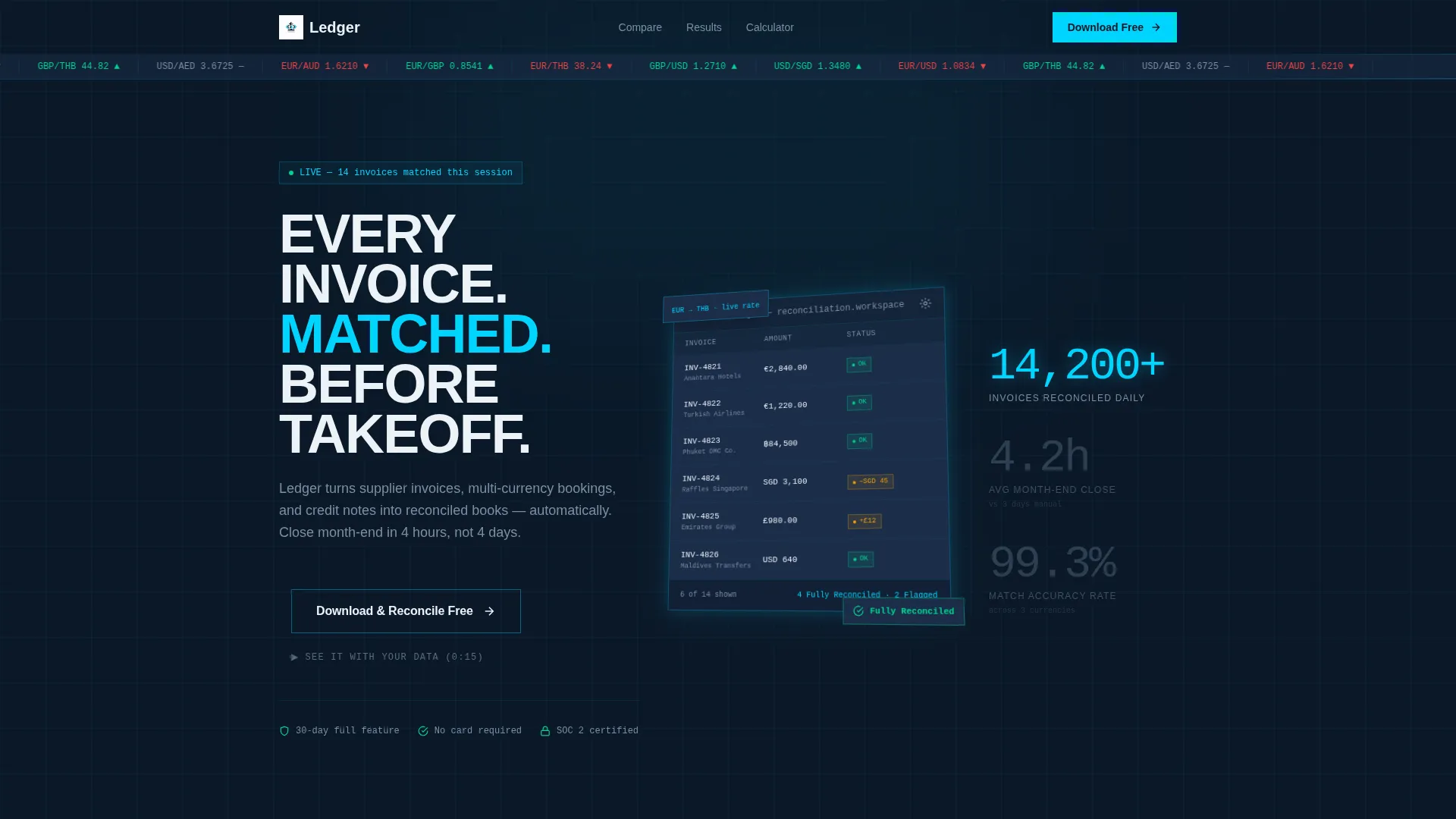
- An isometric dashboard hero showing a live reconciliation scenario with matched invoices and a currency ticker
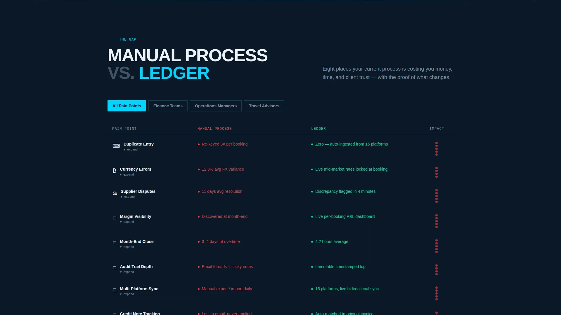
- Three tabbed comparison tables covering eight pain points between manual processes and the platform
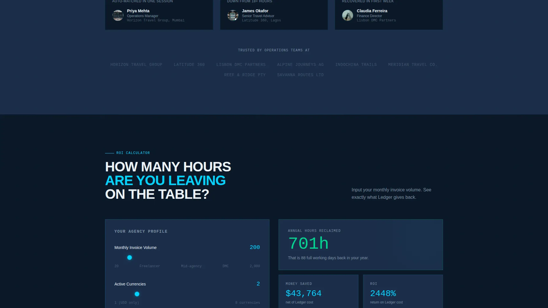
- A fee comparison calculator where visitors input monthly invoice volume and see annual hours reclaimed
- A sticky mobile download bar and a desktop-anchored primary call to action with no email gate on first touch
- A secondary demo video modal path triggered by a "See It With Your Data" prompt
Feature list
This template packs several purposeful components that work together to build trust and drive downloads.
Isometric Dashboard Hero
The header renders a pixel-accurate reconciliation screen in isometric perspective. It shows fourteen supplier invoices matched against booking confirmations, a live EUR/GBP/THB currency ticker, and green "Fully Reconciled" badges beside two amber discrepancy flags. A subtle parallax shift follows cursor movement, making the hero feel alive without distracting from the data.
Tabbed Comparison Tables
Three tabbed tables let visitors click through a structured comparison of manual billing versus the platform. Each table covers eight pain points: duplicate entry, currency errors, supplier disputes, margin visibility, month-end close time, audit trail depth, multi-platform sync, and credit note tracking. Rows animate on hover to reveal a micro-interaction from the actual app.
Fee Comparison Calculator
An interactive calculator lets visitors enter their monthly invoice volume and instantly see how many annual hours they would reclaim. This turns an abstract product claim into a personal, specific number that speaks directly to the operations manager's workload.
Frictionless App Download Flow
The primary call to action reads "Download and Reconcile Free" and asks only for platform choice (iOS, Android, or Desktop) and monthly invoice volume. There is no email gate on first touch. A "30-day full feature, no card" badge sits at the point of download to eliminate last-second hesitation.
Agency Testimonials with Proof Metrics
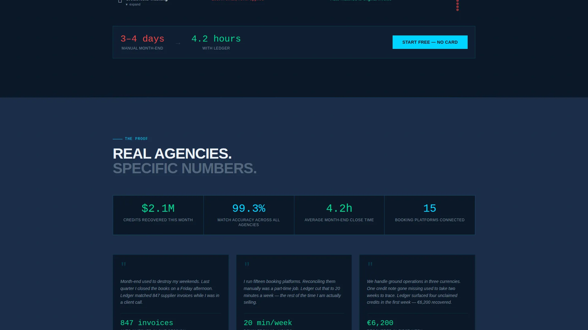
The testimonial section features real time-saved figures alongside agency quotes. Specific numbers make claims credible and give hesitant visitors a concrete benchmark to measure against their own current process.
Secondary Demo Video Modal
A "See It With Your Data" prompt opens a fifteen-second demo video modal. This gives visitors who are not ready to download a low-friction next step that still moves them deeper into the product experience.
Page sections overview
| Section | Purpose |
|---|---|
| Dashboard Hero Header | Show a live reconciliation scenario to prove the product exists |
| Currency Ticker Bar | Display real-time EUR/GBP/THB conversion context across the top |
| Pain Point Intro | Frame the manual billing problem before presenting the solution |
| Tabbed Comparison Tables | Compare manual process versus the platform across eight pain points |
| Interactive Row Animations | Reveal app micro-interactions on hover within each table row |
| Fee Comparison Calculator | Let visitors quantify hours reclaimed based on invoice volume |
| Agency Testimonials | Provide specific time-saved proof from real agency users |
| App Download Section | Anchor the primary call to action with platform and volume inputs |
| Demo Video Modal | Offer a fifteen-second secondary path for undecided visitors |
| Sticky Mobile Bar | Keep the download call to action visible on smaller screens |
| Trust Badge Strip | Reinforce the no-card, thirty-day full-feature trial promise |
Design & branding system
The template uses a Dashboard Pro theme built on a Midnight Blue color system. Every color decision serves a functional role: dark backgrounds reduce visual noise, cyan draws the eye to live data, and white anchors the typographic hierarchy.
- Deep terminal navy (#0B1929) and instrument-panel blue (#1B2E4A) dominate backgrounds and card surfaces for a focused, data-dense feel
- Active-state cyan (#00D4FF) marks live totals, interactive elements, and reconciliation status indicators
- Clean ledger white (#EDF2F7) handles all heading and body text hierarchy, while muted steel (#7B8FA1) separates secondary labels from primary figures
Mobile & speed optimization
The landing page layout adapts cleanly for mobile visitors. The sticky bottom bar keeps the primary download action within thumb reach at all times, so no user has to scroll back to convert.
- The sticky "Download and Reconcile Free" bar locks to the bottom of the screen on mobile for persistent conversion access
- The isometric hero and tabbed tables reflow into single-column layouts that preserve readability on smaller viewports
- The demo video modal is designed as a lightweight overlay, keeping the page feel responsive across device sizes
How this template helps you convert
This template is structured to move a skeptical finance professional from awareness to action in a single scroll. Every section earns the trust needed for the next section to land.
- The interactive dashboard hero and comparison tables build credibility first, showing the product and the gap before asking for any commitment.
- The fee calculator makes the value personal and specific, turning a general claim into the visitor's own annual hours reclaimed.
- The no-email, no-card download flow removes every standard friction point at the moment of highest intent, so the decision to try the platform is as easy as choosing a platform.
Other information about this template
This template is well-suited for travel billing and invoicing platform launches, product page refreshes, and app marketing campaigns targeting agency finance teams. It is designed to work as a standalone landing page within a broader Travel Software and SaaS marketing context.
- The template style is a Comparison Table layout, making it particularly effective for products that compete against manual or legacy processes
- The creative direction follows an Interactive Explorer approach, where visitors engage with the content rather than passively reading it
- The header concept is a Dashboard Preview, a format that builds immediate product credibility for data-focused buyers
- The primary landing page direction targets App Download, optimized for platforms offering a free trial or freemium entry point
- The theme and color system are consistent with professional finance and SaaS tool aesthetics used across the Travel Software and SaaS category
Theme
Dashboard Pro
Creative direction
Interactive Explorer
Color system
Midnight Blue
Style
Comparison Table
Direction
App Download
Page Sections
Isometric Parallax Dashboard Hero
Tabbed Comparison Tables
Fee Comparison Calculator
Frictionless App Download Flow
Demo Video Modal
Sticky Mobile Download Bar
Related questions
Who is this landing page template designed for?
Can I customize the comparison table content for my platform?
Does the visitor need to provide an email address to download?
What makes the hero section stand out from a standard screenshot?
Is this template suitable for a product launch or an ongoing marketing page?



