Ledger - Powerful University Booking Landing Page Template
Ledger is a scroll-reveal landing page template built for university scheduling platforms. It pairs a Data Command visual identity with an Industry Report content cadence, guiding registrars, provosts, and space-planning directors from a striking product screenshot header through data-backed evidence sections to a staged lead-generation conversion flow.
by Rocket studio
Quick summary
Ledger is a single-page, scroll-reveal landing page template designed for university booking and room-scheduling systems. It opens with a full-viewport product screenshot, then layers in utilization data, before-and-after diagrams, testimonial proof, and a two-path lead capture flow. The result is a landing page that feels less like marketing and more like a briefing.
Who this template is for
This template was built for teams selling or promoting enterprise-grade university scheduling software. The visual language and content rhythm speak directly to the people who live inside these problems every day.
- Registrars managing override requests across hundreds of departments
- Provosts and space-planning directors responsible for campus utilization strategy
- University vertical SaaS vendors targeting higher-education procurement audiences
What problem this template solves
University scheduling is structurally messy. Thousands of rooms, sections, and departments collide around the same narrow time windows, and the tools most institutions use were never built to surface the cost of that chaos. A generic SaaS landing page cannot communicate the scale or the stakes.
- Visitors arrive skeptical and need data before they trust a demo request
- The complexity of the product is hard to explain without showing the interface
- Two separate buyer personas (ready-to-demo and early-funnel) need different conversion paths
What you get with this template
Ledger delivers a fully structured, scroll-reveal landing page with every major section pre-built and connected. The layout is ready for a university booking or room-scheduling platform out of the box.
- A full-viewport product screenshot header with a floating stat callout
- An Industry Report scroll cadence with three evidence-led content sections
- A two-path lead generation system with a primary audit request form and a secondary report download gate
Feature list
This template is built around a specific set of capabilities drawn directly from the creative brief.
Full-Viewport Product Screenshot Header
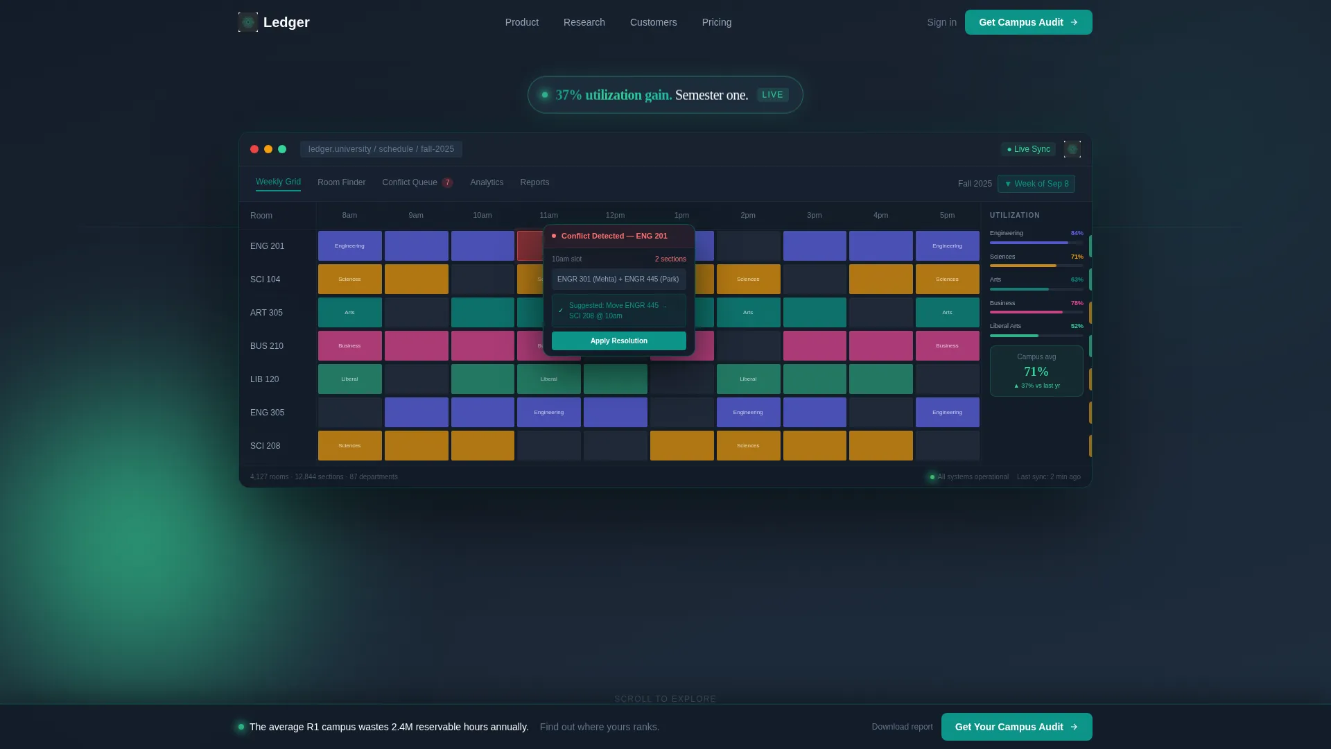
The header fills the entire screen with a pixel-perfect platform screenshot. It shows a weekly grid view across a 200-building campus, color-coded by college, with utilization heat-bands along each row. A conflict-resolution flyout is half-open over the Engineering quad. A single floating stat reads "37% utilization gain. Semester one." No hero paragraph competes with the interface.
Scroll-Reveal Progressive Layout
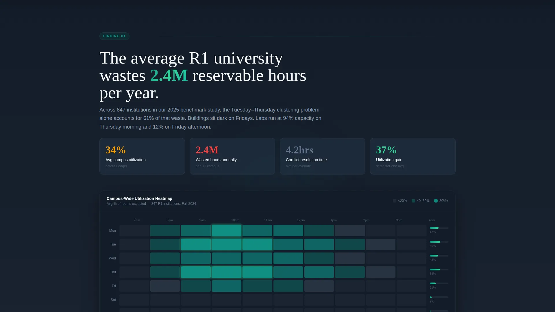
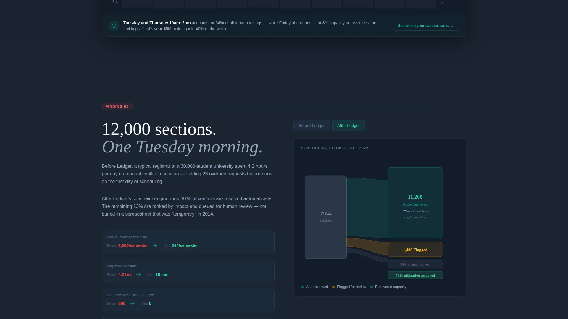
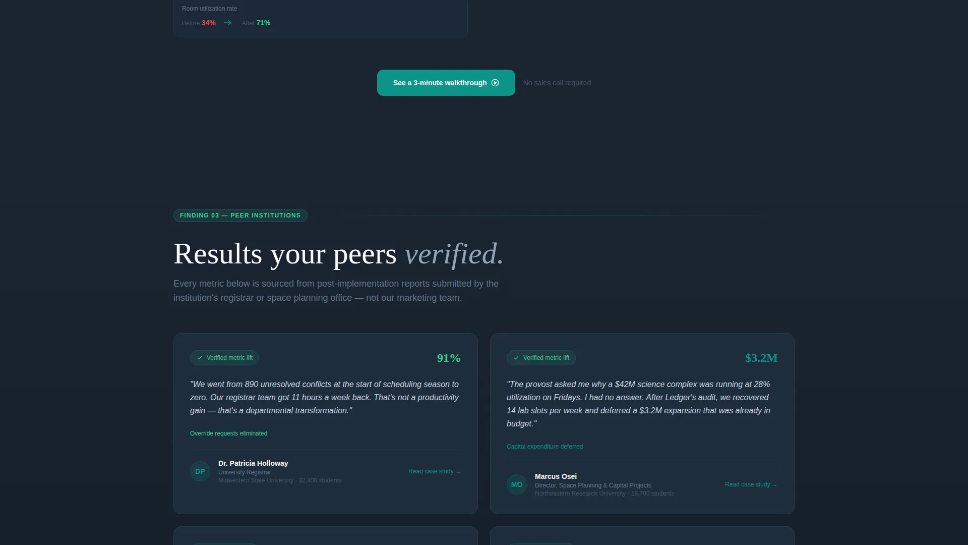
Each section fades or loads into view as the visitor scrolls. The rhythm follows a repeating claim, evidence, proof pattern. Section one surfaces a national utilization heatmap. Section two reveals a before-and-after Sankey diagram of scheduling conflicts. Section three progressively loads testimonial cards from peer institutions with verified metric lifts.
Industry Report Content Cadence
The page is structured to feel like a proprietary benchmark study. Each scroll reveal presents a new data finding that gives the visitor intelligence worth sharing internally. This earns attention before asking for it, and it positions the platform as the authoritative source on higher-education space efficiency.
Staged Lead Generation Flow
The primary call to action, "Get Your Campus Utilization Audit," appears first as a persistent bottom bar after the second scroll reveal. It then anchors a dedicated section near the page close. The form collects institution name with auto-complete from the Integrated Postsecondary Education Data System (IPEDS) database, requester role, current scheduling tool, and email.
Secondary Report Download Gate
A lighter conversion path offers "Download the 2025 Higher-Ed Space Report" behind a two-field form: email and institution only. This captures early-funnel visitors who are not ready to request a demo but will not leave without the data.
Data Command Visual Identity
The Teal Catalyst color system is applied consistently across every section. Deep charcoal backgrounds anchor the page. Command-center teal drives interactive states and data highlights. Catalyst green marks live metrics and positive-change indicators. Signal white surfaces card panels and data readouts.
Page sections overview
| Section | Purpose |
|---|---|
| Full-Viewport Header | Opens with platform screenshot and floating stat callout |
| National Utilization Heatmap | Surfaces R1 university waste data as first scroll reveal |
| Conflict Sankey Diagram | Shows before-and-after scheduling conflict reduction |
| Peer Testimonial Cards | Delivers verified metric lifts from real institutions |
| Persistent Bottom Bar | Anchors primary call to action after second scroll reveal |
| Campus Audit Form | Collects institution, role, tool, and email for demo requests |
| Space Report Gate | Captures early-funnel leads with a lightweight two-field form |
Design & branding system
The visual identity follows a Data Command theme. Every design decision reinforces the feeling of a mission control room: dark surfaces, glowing readouts, and numbers that speak louder than copy.
- Color palette: deep operational charcoal (#1B2432) for backgrounds, command-center teal (#0D9488) for interactive states and data highlights, cool slate gray (#64748B) for secondary text and dividers, signal white (#F8FAFC) for card surfaces and data panels, and catalyst green (#34D399) for live metrics and positive indicators
- Body copy sits in recessive slate so numbers and data visuals carry the visual hierarchy
- Teal dominates hover states, active controls, and chart highlights to guide the eye toward actionable elements
Mobile & speed optimization
The scroll-reveal structure is designed to feel as intentional on a phone or tablet as it does on a desktop monitor. Section reveals are timed to natural scroll behavior, keeping the data-heavy layout readable at any screen size.
- Progressive section loading keeps each viewport focused on one claim at a time
- Card surfaces and data panels reflow cleanly for narrower screens
- The persistent bottom bar call to action remains accessible without crowding the content at mobile widths
How this template helps you convert
Ledger is built around a specific conversion philosophy: give the visitor real intelligence before asking for anything. The staged flow earns trust incrementally and captures leads at two different points of buyer readiness.
- The scroll-reveal cadence leads with a national utilization benchmark, then a conflict diagram, then peer proof, so by the time the audit call to action anchors the page, the visitor has already absorbed three layers of evidence.
- The two-gate system means early-funnel visitors who are not ready to request a demo can still convert via the Space Report download, keeping them inside the pipeline without friction.
Other information about this template
Ledger is a strong fit for university vertical SaaS go-to-market teams who need a landing page that can survive scrutiny from both technical buyers and executive stakeholders at the same time.
- The template is built as a single-page, section-led layout with no multi-page navigation required
- The IPEDS auto-complete on the audit form signals institutional credibility to university procurement audiences
- The "claim, evidence, proof" scroll rhythm is adapted from industry report design conventions common in higher-education research publishing
- This template suits campaigns targeting registrar offices, provost offices, space-planning departments, and university information technology groups
Theme
Data Command
Creative direction
Industry Report
Color system
Teal Catalyst
Style
Scroll Reveal (Progressive)
Direction
Lead Generation
Page Sections
Full-viewport Product Screenshot Header
Scroll-reveal Progressive Layout
Industry Report Content Cadence
Staged Lead Generation System
Secondary Report Download Gate
Data Command Visual Identity
Related questions
Who is this landing page template designed for?
Can I adapt the form fields in the lead capture sections?
What does the scroll-reveal pattern mean for this template?
Does the template include the actual data visualizations?
Is this template suitable for a single campaign or an ongoing product page?



