Financial Services Software & SaaS Privacy Policy Website Template
Ledger is a hub-and-spoke landing page template built for financial client management platforms. It opens with a live-typed API code snippet, then guides visitors through interactive module sections covering onboarding, compliance, portfolios, billing, and reporting. The AI Iridescent color system and Startup Velocity theme give the page a sharp, terminal-dark look that speaks directly to financial advisors and RIA firms.
by Rocket studio
Quick summary
Ledger is a single-page template designed for financial services client management platforms. It uses a hub-and-spoke anchor navigation structure to walk visitors through five core product modules. The page opens with an animated API code snippet and closes with contextual calls to action at every spoke. The result is a product experience that earns trust before it asks for a click.
Who this template is for
This template is built for SaaS products serving the wealth management and financial advisory space. If your platform consolidates client workflows for professional advisors, this page speaks their language from the first frame.
- Registered Investment Advisor (RIA) firms managing large household books
- Boutique wealth managers handling complex custodian data across spreadsheets
- Compliance officers and operations teams who need clear, auditable client workflows
What problem this template solves
Financial advisors waste hours switching between disconnected tools. Onboarding documents live in one place, compliance checks in another, and portfolio data somewhere else entirely. A landing page needs to communicate, immediately, that your platform ends that fragmentation.
- Visitors arrive skeptical of yet another financial SaaS promise
- Generic feature lists fail to show how the product actually works at the workflow level
- Advisors need to feel the product's depth before they will commit to a demo or pilot
What you get with this template
You get a fully structured, single-page layout with a persistent anchor navigation rail and five interactive product-module sections. The page is designed so each section functions as a self-contained product room, not just a paragraph of copy.
- An animated code snippet header that demonstrates platform capability in real time
- Five spoke sections with simulated interactive interfaces for each core module
- Contextual calls to action at every section end, plus a sticky primary call to action in the top navigation bar
Feature list
This section outlines the specific built-in design and layout capabilities included in the Ledger template.
Animated API Code Snippet Header
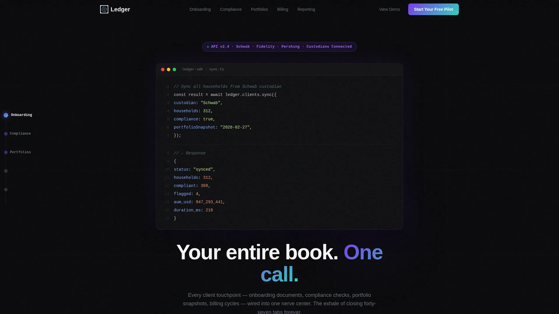
The header renders a syntax-highlighted API call in a monospaced font against the void-black canvas. The code types out line by line as if executed live, then a structured response object cascades below it. A single headline materializes underneath: "Your entire book. One call." The effect establishes platform credibility before a visitor reads a single feature bullet.
Hub-and-Spoke Anchor Navigation
A persistent left-rail navigation lists five core module links: Onboarding, Compliance, Portfolios, Billing, and Reporting. Clicking any spoke scrolls directly to that section. A subtle progress indicator on the rail shows how far along the page the visitor has traveled, rewarding continued exploration.
Simulated Interactive Module Sections
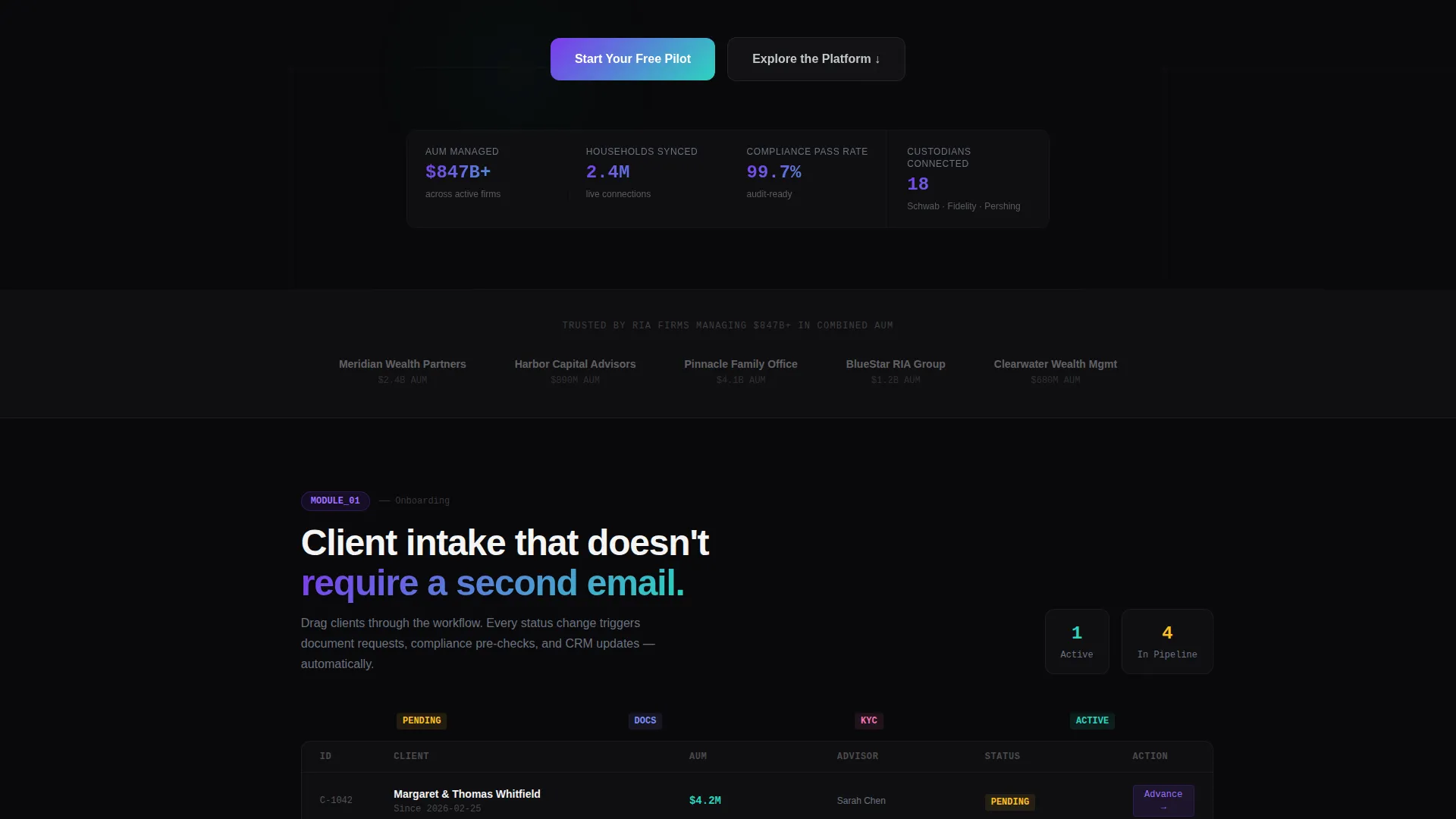
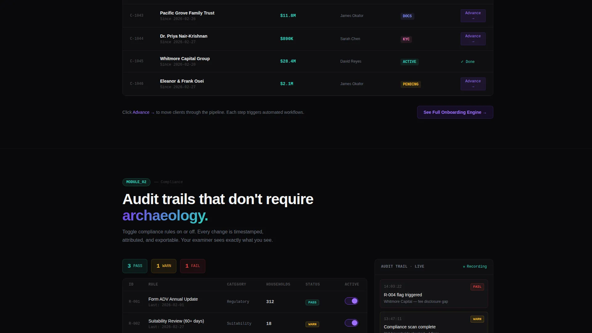
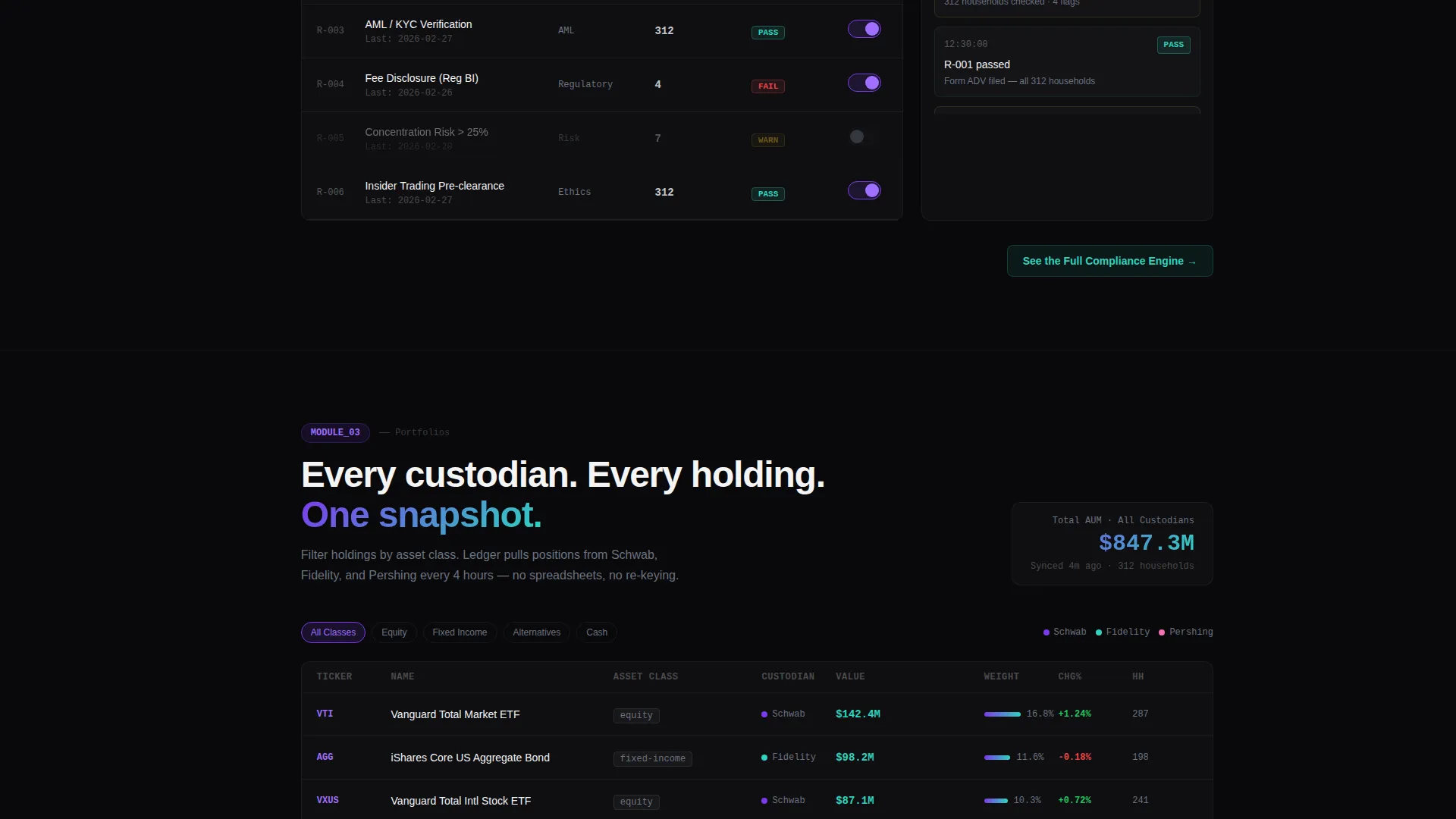
Each spoke section includes a simulated product interface that visitors can interact with. Examples include toggling compliance flags, dragging a client through an onboarding workflow, and filtering portfolio holdings by asset class. The interactions give prospects a hands-on sense of the platform without requiring a live environment.
Contextual Section-Level Calls to Action
Every spoke section ends with a targeted call to action that deepens engagement without demanding a form. Labels such as "See the Full Compliance Engine" and "Explore Portfolio Sync" push visitors toward a dedicated product demo page. This staged commitment model reduces friction at each step.
Sticky Navigation with Primary Call to Action
The top navigation bar remains visible at all times as visitors scroll. The primary call to action, "Start Your Free Pilot," is rendered in iridescent teal and stays accessible without interrupting the reading experience. Visitors always have a clear next step without being forced into it.
AI Iridescent Visual System
The color palette pairs void black as the base canvas with holographic violet for active states, liquid silver for body text and data labels, and iridescent teal for success signals and conversion accents. Hover states trigger subtle gradient shifts between violet and teal, giving interactive elements a breathing, prismatic quality that feels intentional rather than decorative.
Page sections overview
| Section | Purpose |
|---|---|
| Animated Code Header | Prove platform power with a live-typed API call and structured response |
| Sticky Top Navigation | Keep "Start Your Free Pilot" visible at all scroll depths |
| Anchor Nav Rail | Let visitors jump directly to any product module spoke |
| Onboarding Module | Show client onboarding workflow in a simulated drag-and-drop interface |
| Compliance Module | Let visitors toggle compliance flags inside a mock audit interface |
| Portfolios Module | Demonstrate portfolio filtering by asset class in a simulated view |
| Billing Module | Surface billing cycle management within a structured spoke section |
| Reporting Module | Present reporting capabilities as an interactive data preview |
| Section calls to action | Close each spoke with a contextual link toward the product demo page |
Design & branding system
The Ledger template uses an AI Iridescent color system built around a dark, terminal-inspired canvas. Every color choice serves a functional purpose, keeping data readable and interactive elements immediately recognizable.
- Void black (#09090B) as the primary background, reducing visual noise and focusing attention on content
- Holographic violet (#7C3AED) for active navigation states and interactive pulses, with iridescent teal (#2DD4BF) reserved for success signals and conversion-focused accents
- Liquid silver (#C4C7CE) for body text and data labels, maintaining readable contrast against the dark canvas throughout
Mobile & speed optimization
The Ledger template is structured with a responsive layout that adapts the hub-and-spoke navigation and module sections for smaller screens. The interactive elements and progress indicators are designed to reflow cleanly without breaking the visual hierarchy.
- The persistent left-rail navigation collapses appropriately on mobile viewports so the main content remains the focal point
- Module sections and their simulated interfaces are laid out to remain usable at touch-screen scale
- The sticky top navigation and its primary call to action remain accessible at all screen sizes throughout the scroll journey
How this template helps you convert
The Ledger template is built around a staged commitment model. Visitors are not asked to fill out a form immediately. Instead, the page builds trust progressively by letting them experience the product in miniature first.
- The animated code snippet header establishes technical credibility in the first few seconds, signaling that this is an infrastructure-level platform, not a surface-level tool.
- The interactive spoke sections let advisors simulate real workflows, so by the time they reach the final section they have already used the product in a lightweight form, making the final call-to-action click feel like a natural continuation rather than a cold commitment.
Other information about this template
The Ledger template is part of the Startup Velocity theme family and is designed for technology-category products in the financial services software and SaaS space. It is a strong fit for wealth management client portal platforms, financial advisor practice management tools, and compliance workflow software marketed to RIA firms.
- The template style is hub and spoke with anchor navigation, suited to platforms that have multiple distinct modules to showcase
- The creative direction is Interactive Explorer, meaning each section is designed to feel like a product room a visitor walks into rather than a static feature list
- The header concept is a Code Snippet, making this template particularly compelling for platforms with an API or developer-accessible infrastructure layer
Theme
Startup Velocity
Creative direction
Interactive Explorer
Color system
AI Iridescent
Style
Hub & Spoke (Anchor Nav)
Direction
Click-Through
Page Sections
Live-typed API Code Snippet Header
Hub-and-spoke Anchor Navigation Rail
Simulated Interactive Module Interfaces
Staged Contextual Calls to Action
Sticky Primary Call-to-action Bar
AI Iridescent Color and Hover System
Related questions
Is this template suitable for a single-page layout?
Can I change the module names in the anchor navigation?
Does the code snippet in the header need to reflect my actual API?
Who is the primary audience this template is designed to reach?
Can the contextual calls to action link to a separate demo or product page?



