Construction Software Professional Website Template
Ledger is a split-screen construction accounting landing page template built for software platforms that track job costs, AIA billing, change orders, certified payroll, and retention holdbacks. The interactive left-panel navigation and live comparison tables let contractors discover exactly where their current tools fall short, building trust through self-guided discovery rather than hard selling.
by Rocket studio
Quick summary
Ledger is a single-page, split-screen template designed for construction accounting software. It opens with a Logo Bar that surfaces familiar contractor tools, then uses an Interactive Explorer layout to walk visitors through a side-by-side capability comparison. Each click deepens the case. The goal is quiet confidence: let the visitor find the gap themselves.
Who this template is for
This template is built for construction accounting software teams that need to convert an informed, skeptical audience. The visitor already uses a competing tool. They need to see the difference, not be told about it.
- Mid-size general contractors running between $5 million and $80 million in annual revenue
- Specialty subcontractors managing progress billing across multiple open jobs at once
- CFOs and financial leads who have inherited disconnected spreadsheet and software setups
What problem this template solves
Construction finance teams waste margin on tools that were never built for jobsite accounting. Spreadsheets break under the weight of change orders and retention schedules. Standard software pages talk features, but contractors need to see real capability gaps before they act.
- No single place to compare job costing, AIA billing, and certified payroll side by side
- Visitors leave without engaging because generic landing pages never speak to their specific pain
- Potential buyers need to self-discover the problem before they trust a new solution
What you get with this template
You get a complete, conversion-focused landing page layout built around the construction accounting buyer journey. Every section earns its place, and nothing is decorative.
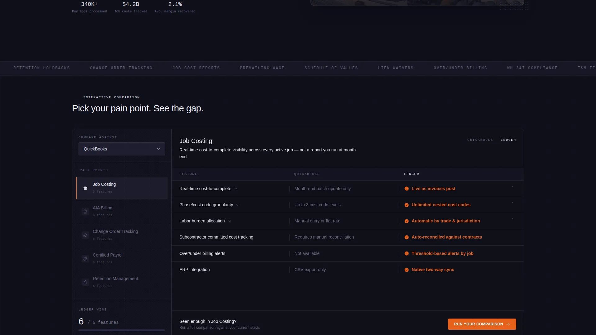
- A persistent left-panel navigation covering five core accounting pain points: Job Costing, AIA Billing, Change Order Tracking, Certified Payroll, and Retention Management
- An interactive right panel that populates a head-to-head comparison table for each selected pain point
- A Logo Bar header with a single tension-building headline that speaks directly to the visitor's current tool
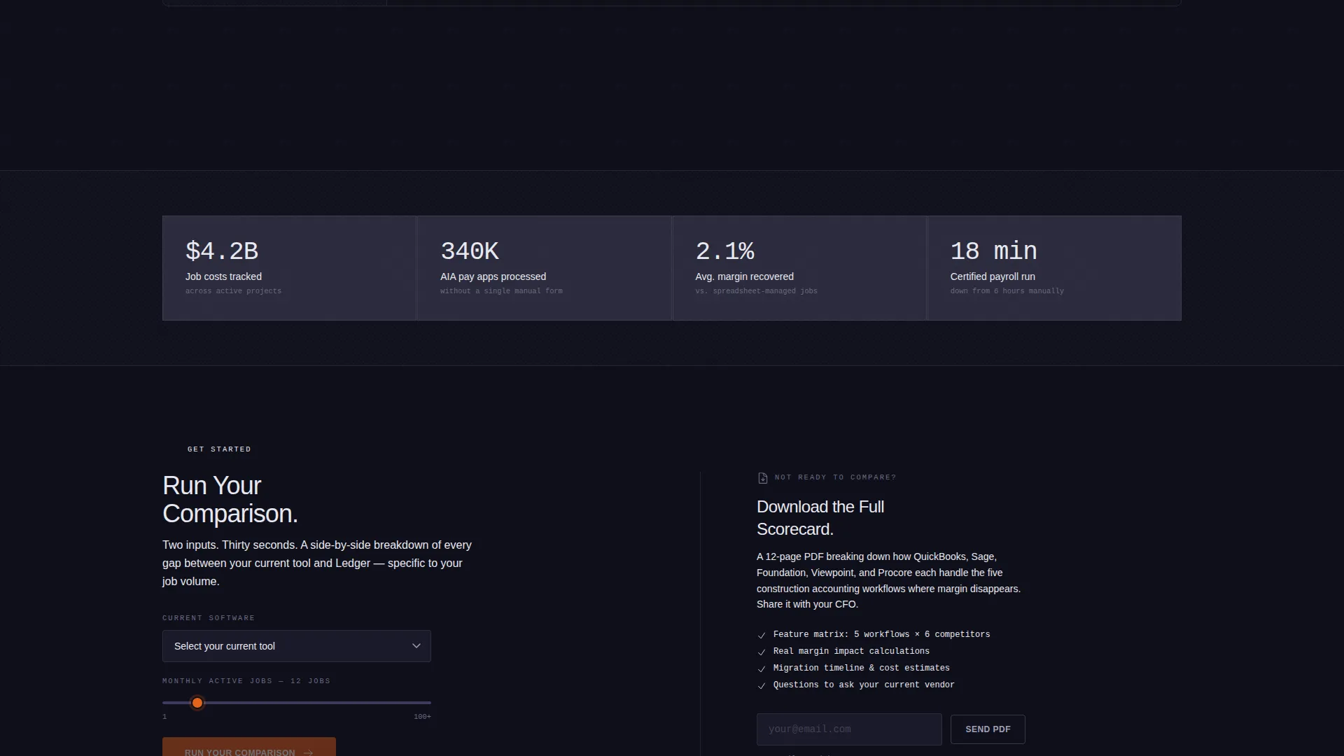
- Two conversion paths: a primary "Run Your Comparison" form and a secondary "Download the Full Scorecard" gated PDF offer
Feature list
This section covers the core functional and design components built into the Ledger template.
Interactive Split-Screen Explorer Layout
The template uses a strict 50/50 split. The left panel stays fixed as a navigation column listing five construction accounting pain points. The right panel updates with each selection, keeping the visitor in control without ever leaving the page.
Head-to-Head Comparison Tables
Each pain point selection triggers a fully populated comparison table. The table shows competitor limitations against platform capabilities in a direct, side-by-side format. Visitors read the gap rather than being told about it.
Logo Bar Header Section
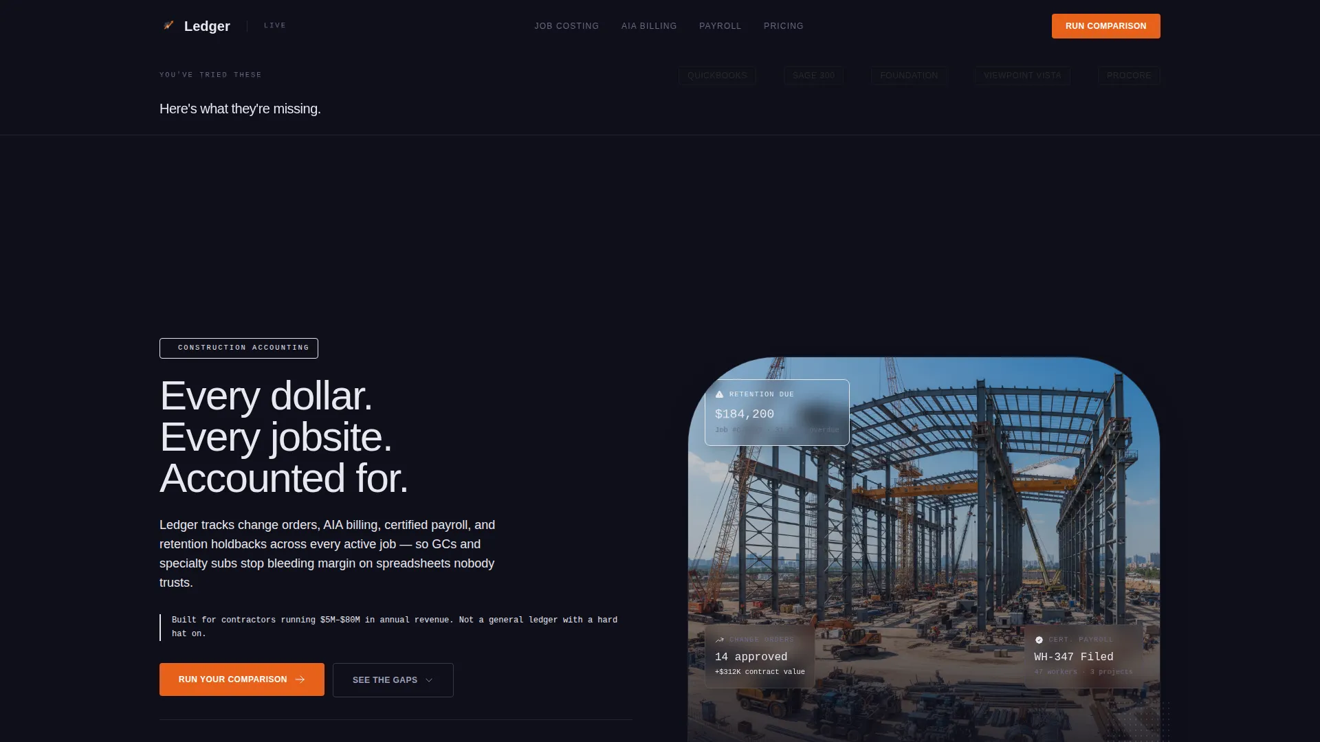
The header displays a horizontal band of recognizable contractor software logos rendered in desaturated gray. A single fade-in headline appears beneath them, creating instant recognition and curiosity for the visitor who sees their own current tool in the lineup.
Dual Conversion Path Design
The primary call to action, "Run Your Comparison," opens a two-field form with a software dropdown and a monthly job count range slider. A secondary path offers a gated PDF scorecard download for visitors who need more time before committing.
Carbon Fiber Visual Identity System
The template uses a four-color palette built for industrial credibility: deep graphite black, woven carbon gray, titanium highlight, and signal orange reserved for calls to action, toggle states, and comparison winners. No decorative elements compete with the data.
Pain-Point-Led Navigation Column
The left panel lists five specific accounting pain points as navigation triggers. This structure mirrors how a contractor actually thinks about their financial workflow, making the page feel built for them rather than at them.
Page sections overview
| Section | Purpose |
|---|---|
| Logo Bar Header | Surface familiar tools and create immediate recognition tension |
| Headline Fade-In | Deliver the core challenge statement beneath the logo lineup |
| Left Nav Column | Anchor five accounting pain points as persistent navigation triggers |
| Comparison Panel | Show capability gaps per selected pain point in a live table |
| Primary call to action Form | Capture current software and job count to trigger a custom comparison |
| Gated PDF Offer | Provide a lower-commitment path for visitors not ready to convert |
Design & branding system
The Ledger template uses a Carbon Fiber color system that communicates industrial precision. Every color choice has a job, and nothing is applied for aesthetics alone.
- Four-color palette: deep graphite black (#1A1A2E) as the base, woven carbon gray (#3D3D5C) for panel depth, titanium highlight (#A0A0B8) for secondary text and borders, and signal orange (#E8611A) used exclusively for calls to action, toggle states, and comparison winners
- Zero decorative elements: the visual language is matte, structured, and built on the premise that every mark on the surface is earned through use
- The Directory and Discovery theme organizes content like a well-sorted toolbox, making navigation feel instant and reliable rather than exploratory
Mobile & speed optimization
The split-screen layout is designed to feel intentional at every viewport. The persistent navigation and comparison panel adapt cleanly for smaller screens without losing the interactive structure.
- The left navigation column and right comparison panel restack vertically on mobile, preserving the pain-point-to-comparison flow
- Signal orange call-to-action elements remain visually prominent regardless of screen size, keeping conversion paths accessible at any breakpoint
How this template helps you convert
The Ledger template earns conversions by letting visitors build their own case. Nobody is told their current tool is broken. They find it themselves.
- The Logo Bar opens with the visitor's own tool on screen, creating immediate self-recognition and a question they need answered
- The interactive comparison panel reveals specific capability gaps per pain point, making the decision feel logical rather than pressured
- The dual conversion path captures both ready buyers through the comparison form and cautious researchers through the gated PDF scorecard
Other information about this template
The Ledger template is suited to any construction accounting software platform that competes in the mid-market contractor space. It is built to sit between familiar tools and a better alternative.
- The template style is a split-screen 50/50 layout, optimized for a single-page comparison flow with no scroll-based navigation
- The creative direction is Interactive Explorer, meaning the page deepens through clicks rather than through vertical scrolling
- The landing page direction is Comparison/Versus, making it effective for buyers who are already tool-aware and evaluating options
- The theme follows a Directory and Discovery structure, organizing pain points the way a contractor organizes a physical toolbox
- This template works well for platforms positioned against tools such as QuickBooks, Sage 300, Foundation Software, Viewpoint Vista, and Procore, as the Logo Bar header is designed to display and contextualize those familiar names for the visiting contractor audience

Theme
Directory & Discovery
Creative direction
Interactive Explorer
Color system
Carbon Fiber
Style
Split Screen (50/50)
Direction
Comparison/Versus
Page Sections
Interactive Split-screen Explorer
Head-to-head Comparison Tables
Logo Bar Header with Tension Headline
Dual Conversion Path Layout
Carbon Fiber Color System
Pain-point-led Navigation Column
Related questions
What type of software company is this template built for?
How does the interactive comparison feature work?
What are the two conversion paths included in this template?
Can the five pain-point categories in the navigation column be edited?
Who is the intended visitor for this landing page?



