Financial Services Email Marketing Cost Calculator Website Template
Ledger is a dark financial dashboard landing page built for wealth management platforms welcoming new investors. It opens with an interactive portfolio growth calculator, moves into a structured feature comparison matrix, and closes with a contextual call-to-action tied to the visitor's own projected numbers. The result is a confident, data-rich welcome experience that turns curiosity into commitment.
by Rocket studio
Quick summary
Ledger is a single-page financial services welcome landing page designed around one idea: show new users what their money can do before they act. An interactive calculator leads, a feature comparison matrix validates, and a pinned contextual call-to-action closes. The Tech Glass visual identity keeps everything dark, precise, and quietly compelling.
Who this template is for
This template is built for financial services platforms that need to convert newly onboarded users into active, engaged investors. It works best when the platform wants to replace a generic welcome email with a high-trust, data-forward experience.
- Wealth management and financial services SaaS products welcoming first-time retail investors
- Platforms targeting professionals who recently rolled over a 401(k) retirement account and want reassurance
- Fintech products serving first-time budgeters moving away from manual spreadsheets toward automated tools
What problem this template solves
New signups often stall after registration. They created an account, but they have not moved any money yet. The gap between signup and first action is where platforms lose users, and a generic confirmation email does almost nothing to close it.
- New investors feel uncertain whether they chose the right platform and need side-by-side validation
- First-time budgeters lack a concrete picture of what growth actually looks like for their specific situation
- Platforms have no structured way to connect a user's own numbers to the platform's value proposition immediately after onboarding
What you get with this template
You get a fully structured, interactive landing page with six purposeful sections built around data, credibility, and conversion. Every section feeds into the next, so the visitor's journey stays coherent from the first scroll to the final click.
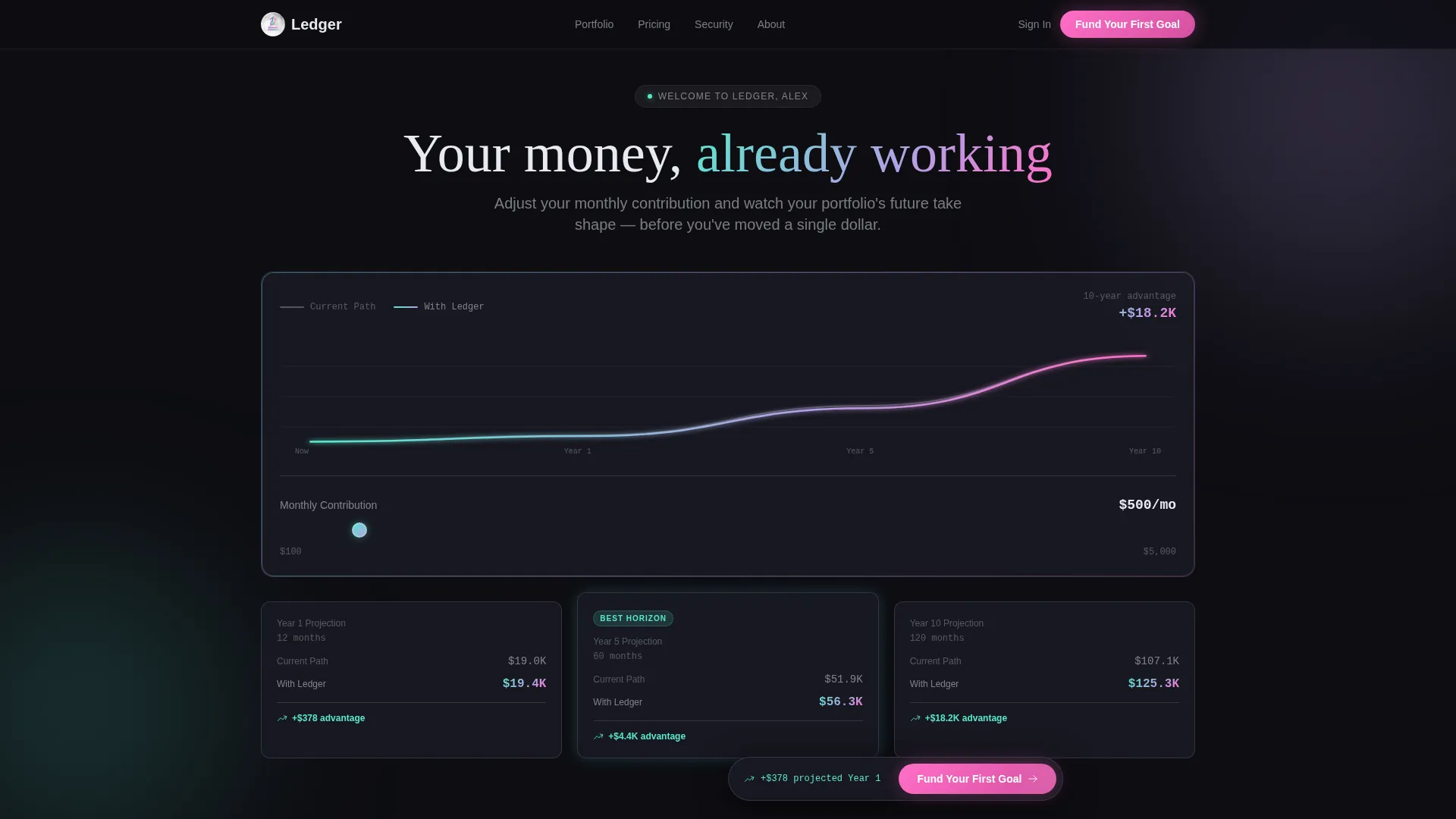
- An interactive hero calculator with a live trendline chart, draggable contribution slider, and three time-horizon projection cards
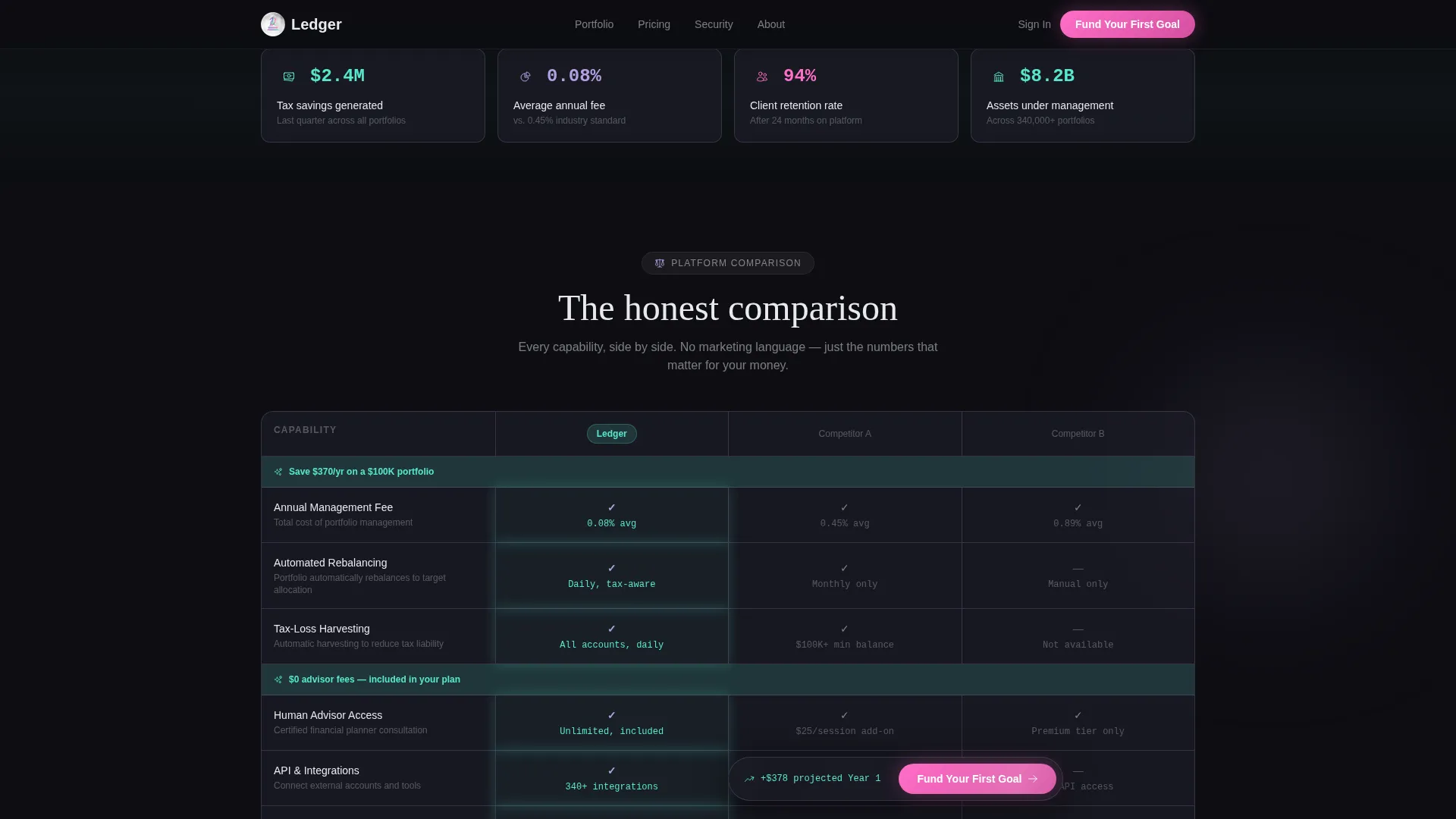
- A structured feature comparison matrix showing Ledger against two anonymized competitor columns with micro-data cells and iridescent winning-cell highlights
- A pinned, dynamically updating call-to-action button that reflects the visitor's own projected gain from the calculator
Feature list
This template is built around six core capabilities, each grounded in the brief's design and interaction specifications.
Interactive Portfolio Growth Calculator
The hero section opens with a live calculator pre-populated with onboarding data or smart defaults. A draggable monthly contribution slider updates two animated trendlines in real time. Three time-horizon projection cards display short, medium, and long-range estimates side by side.
Animated Dual Trendline Chart
Two diverging curves dominate the calculator section. One line represents a baseline path in muted gray. The other represents the platform's projected outcome in a teal-to-lilac gradient. The gap between them widens as the time horizon extends, making the difference impossible to ignore.
Feature Comparison Matrix
A structured grid compares platform capabilities row by row against two anonymized competitor columns. Cells display micro-data values such as fee percentages rather than simple checkmarks. Iridescent highlights pulse gently on the platform's winning cells, drawing the eye to differentiating data points.
Floating Stats Strip
Three frosted-glass credibility cards interrupt the scroll between major sections. Each card presents a single aggregate platform statistic. The strip reinforces trust without breaking the visual rhythm of the page.
Contextual Pinned Call-to-Action
The primary call-to-action button pins to the bottom of the viewport after the user interacts with the calculator. Its label updates dynamically to reflect the visitor's projected gain, making the click feel like confirming a decision rather than starting one.
Slide-Out Fee Schedule Panel
A secondary call-to-action triggers a slide-out panel with granular cost breakdowns. This path serves visitors still in evaluation mode who need more detail before committing. It keeps the main conversion flow clean while providing a structured exit for the analytically minded.
Page sections overview
| Section | Purpose |
|---|---|
| Hero Calculator | Show personalized projected portfolio growth with live interactive trendlines and a contribution slider |
| Stats Strip | Reinforce platform credibility with three floating glass aggregate metric cards |
| Feature Comparison Matrix | Validate the platform choice through a structured row-by-row capability and fee comparison |
| Testimonials | Build peer trust with three glass-card quotes from distinct investor archetypes |
| Call-to-Action Section | Close the visit with a contextual projected-gain call to action and a slide-out fee schedule panel |
| Footer | Horizontal footer pattern completing the page structure |
Design & branding system
The visual identity follows a Tech Glass theme built on a deep obsidian base. Color appears only where it carries meaning, giving data highlights and calls-to-action maximum visual weight against the dark background.
- Color palette: deep obsidian (#0D0D12) base, holographic lilac (#B4A0E5) and spectral teal (#56E8CD) as gradient accents, frosted panel white (#E8EAF0) for surface containers, and iridescent pink (#FF6EC7) reserved exclusively for calls-to-action and active states
- Typography system: Fraunces display serif for headlines, DM Sans for interface labels and body text, and JetBrains Mono for all numerical and data cell values
- Data grid borders use 1-pixel lilac strokes at 20% opacity, giving each module the appearance of etched glass floating above a dark surface
Mobile & speed optimization
The template is designed desktop-first, reflecting the Bloomberg terminal aesthetic that defines the overall experience. Responsive behavior scales the layout to tablet and mobile without removing interactive elements.
- GSAP ScrollTrigger powers section reveal animations, and GPU-accelerated transforms keep motion smooth across devices
- The live calculator slider, pinned call-to-action, and slide-out fee panel are all built for touch interaction on smaller screens
- Static page sections use server components to reduce client-side rendering load, keeping the interactive sections fast and focused
How this template helps you convert
The conversion strategy in this template is built around a single principle: the visitor's own data becomes the argument. Every section references the number the visitor built in the hero calculator, so the final click feels like a confirmation rather than a leap.
- The hero calculator creates a personal projected number immediately, giving the visitor a specific outcome to evaluate rather than a generic value claim.
- The feature comparison matrix then validates that number by showing how platform fees and capabilities compare directly to alternatives, row by row with real micro-data.
- The pinned call-to-action button reinforces the projected gain at every scroll depth, so the visitor arrives at the bottom of the page with their own evidence already in view.
Other information about this template
This template is part of a broader Financial Services Email Templates category designed for technology-sector SaaS products. It is built specifically for the financial services welcome email niche, where the onboarding moment is the highest-leverage conversion opportunity on the entire user journey.
- The template uses English copy, United States Dollar currency formatting, and the standard US date format throughout all data cells and projection cards
- Animation intensity is high by design: GSAP ScrollTrigger reveals, real-time SVG trendline updates, and pulsing iridescent cells are all included to match the terminal-grade interactivity the audience expects
- The slide-out fee schedule panel provides a structured secondary conversion path without cluttering the primary call-to-action flow, supporting visitors at different stages of the evaluation process


Theme
Tech Glass
Creative direction
Feature Matrix
Color system
AI Iridescent
Style
Dashboard/Data Grid
Direction
Comparison/Versus
Page Sections
Interactive Portfolio Growth Calculator
Animated Dual Trendline Chart
Feature Comparison Matrix with Micro-data Cells
Floating Credibility Stats Strip
Contextual Pinned Call-to-action
Slide-out Fee Schedule Panel
Related questions
Who is this landing page template designed for?
Can I customize the calculator defaults for my platform's data?
What makes the feature matrix different from a standard comparison table?
Does the call-to-action button update based on what the visitor enters in the calculator?
Is the slide-out fee schedule panel included in the template?



