FinOps Technology Professional Website Template
Ledger is a dashboard and data grid landing page template built for FinOps research labs. It combines a cockpit-black visual system with interactive benchmark filtering, a cost anomaly simulator, and a terminal-styled research feed. The design earns visitor trust through analytical depth before presenting a frictionless free trial conversion path.
by Rocket studio
Quick summary
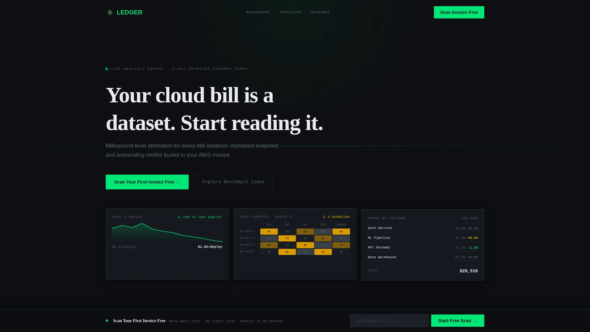
Ledger is a precision-built landing page template for a FinOps research lab. It opens with three floating dark glass panels displaying live cost metrics, then pulls visitors deeper through a filterable benchmark directory, a CSV-based cost anomaly simulator, and a terminal research feed. Every section escalates engagement before a single conversion ask appears.
Who this template is for
This template is designed for technical and financial professionals who work with cloud infrastructure costs at scale. It speaks directly to people who need more than a generic SaaS pricing page.
- Platform engineering leads and FinOps practitioners who need to demonstrate analytical credibility to skeptical buyers
- Chief Financial Officers and VP Engineering leaders looking to justify cloud spend reduction with concrete attribution data
- Independent FinOps consultants or research-led teams launching a benchmark and tooling platform
What problem this template solves
Cloud cost visibility is a real operational problem. Platform teams can see the invoice total but cannot attribute spend to individual features, services, or decisions. This template addresses that exact gap in how FinOps platforms present themselves online.
- Most FinOps landing pages lead with pricing or generic savings claims, losing engineers before the product earns trust
- Visitors arrive with specific questions about idle compute, orphaned snapshots, or autoscaling misfires and find no matching depth
- The conversion path asks too much too soon, with credit card fields and company size dropdowns that push technical evaluators away
What you get with this template
You get a fully structured single-page layout that combines data visualization aesthetics with a progressive conversion strategy. Every built-in section is designed to demonstrate capability before requesting anything from the visitor.
- A hero section with three dark glass panel metric cards and a typewriter headline, built to establish immediate analytical credibility
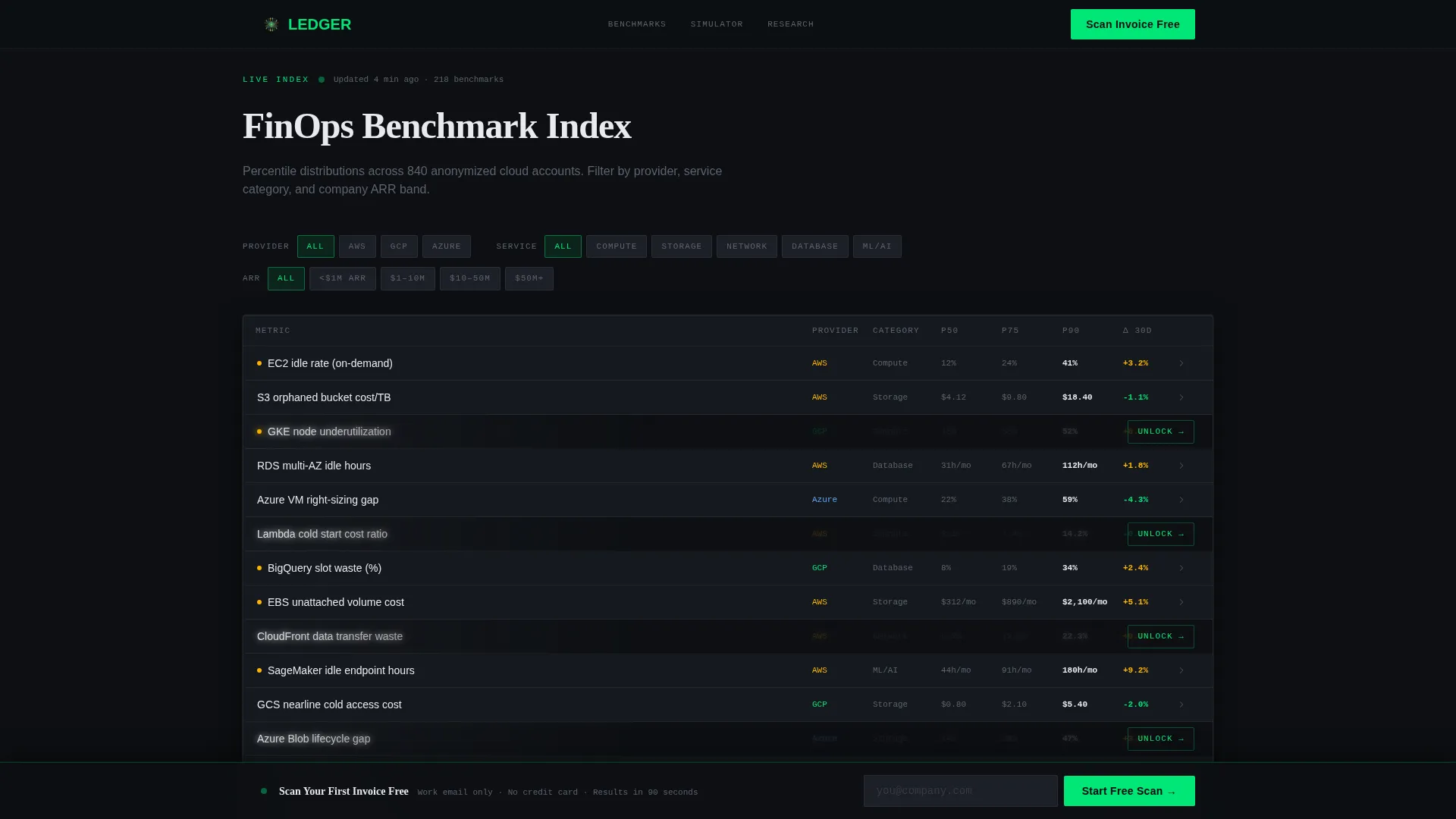
- An interactive benchmark directory grid with 200-plus entries filterable by cloud provider, service category, and company size, complete with blurred rows and a soft unlock prompt
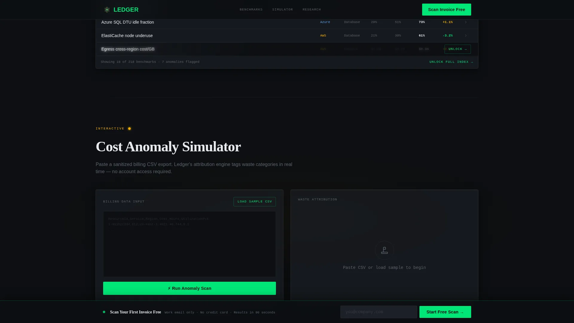
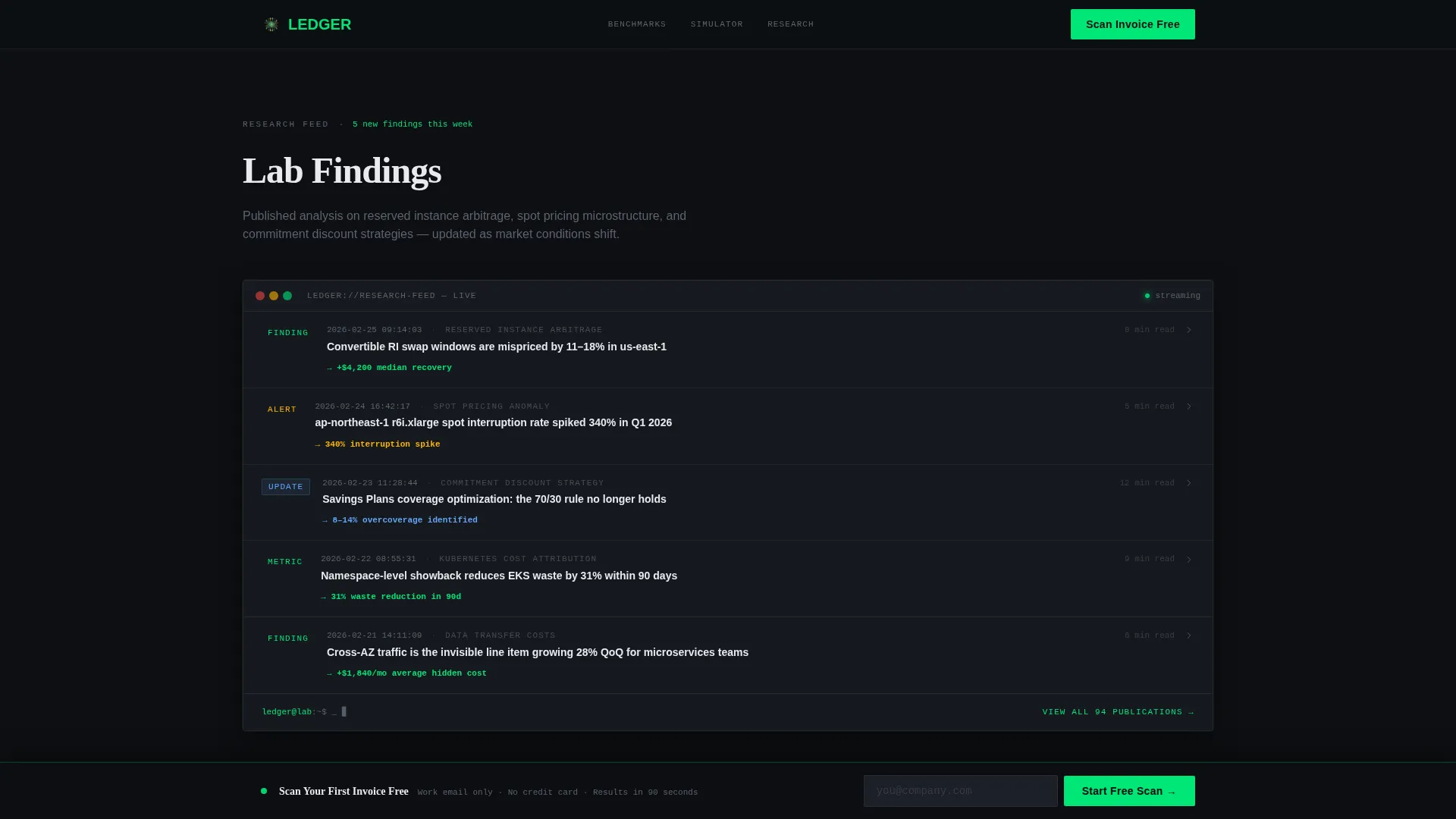
- A cost anomaly simulator, a research terminal log, a client outcomes bento grid, and a sticky bottom conversion bar that appears only after the visitor has engaged with the core content
Feature list
This template includes a focused set of interactive and visual components. Each one is drawn directly from the platform's core value proposition.
Dark Glass Panel Hero
Three translucent frosted-glass metric cards float over a cockpit-black background. Each panel displays a distinct live FinOps metric: a cost-per-deploy trendline, a regional idle compute heatmap, and a unit cost attribution table. A typewriter headline animates in below the panels.
Filterable Benchmark Directory
A live data grid displays over 200 FinOps benchmarks in a staggered cascade animation. Visitors filter by cloud provider, service category, and company size. Every third row blurs softly with an unlock prompt, creating a low-friction secondary conversion path.
Cost Anomaly Simulator
Visitors paste a sanitized billing CSV directly into the page. Waste categories light up in real time with animated detection. This section transforms a passive reading experience into active participation before any signup is required.
Terminal Research Feed
A terminal-styled log displays the lab's latest published findings with timestamps. Topics include reserved instance arbitrage, spot pricing models, and commitment discount strategies. The monospaced type treatment reinforces the precision and depth of the research output.
Client Outcomes Bento Grid
An asymmetric bento grid presents specific cost reduction outcomes from real engagements. Metrics like recovered spend totals and waste reduction percentages are displayed as data points, not marketing claims. The layout builds social proof through numbers rather than testimonials.
Sticky Freemium Conversion Bar
A slim bottom bar pins the primary call to action in place after the visitor scrolls past the benchmark directory. The conversion gate asks for a work email only, with no credit card and no additional form fields.
Page sections overview
| Section | Purpose |
|---|---|
| Hero Glass Panels | Display three live FinOps metric cards with typewriter headline |
| Benchmark Directory Grid | Filterable data grid of 200-plus benchmarks with staggered cascade |
| Cost Anomaly Simulator | CSV paste tool with animated waste category detection |
| Research Terminal Log | Timestamped terminal feed of published FinOps findings |
| Client Outcomes Bento | Asymmetric bento grid with specific cost reduction metrics |
| Footer | Minimal single-row linear footer layout |
Design & branding system
The visual identity follows a stealth aircraft cockpit aesthetic. Every design decision reinforces the idea that data is the only thing that matters, and every bright pixel must justify its presence.
- Color system uses cockpit black (#0D0F12) and woven graphite (#1C1F26) for all backgrounds, titanium mid-gray (#5C6370) for body text, white (#E8EAED) for headlines, signal green (#00E676) for interactive and live data states, and warning amber (#FFB300) reserved strictly for anomaly callouts
- Typography pairs Fraunces display serif for headlines, DM Sans for body and interface text, and JetBrains Mono for all data, terminal, and code-style content
- Animations include GSAP scroll reveals, a typewriter headline effect, staggered grid cascade entrance, glass panel float, and terminal log typing, all tuned to feel like systems coming online rather than decorative transitions
Mobile & speed optimization
The template is designed desktop-first. Data grids, glass panels, and the anomaly simulator require screen real estate to function as intended.
- Desktop layout is the primary experience, sized for the workstations used by platform engineers and finance leads
- Static sections use server-side rendering patterns while interactive components including the grid and simulator are isolated as client-side elements to preserve responsiveness
- The sticky conversion bar, benchmark filters, and blurred row unlock prompts are all built to remain usable without degrading the core data grid experience
How this template helps you convert
The conversion strategy is built on earned trust rather than early friction. The template demonstrates analytical depth before presenting a single call to action.
- Visitors engage with the benchmark directory and anomaly simulator before the sticky conversion bar appears, so the free trial offer arrives only after the platform has already proven its value
- The primary call to action reads "Scan Your First Invoice Free" in signal green and requires only a work email, removing every common form-friction barrier including credit cards and company size fields
- A secondary path leads non-ready visitors into the ungated benchmark index, where blurred rows create a gentle unlock prompt that converts at a lower commitment level without losing the audience
Other information about this template
This template is built for a specific professional context that values precision over polish. A few additional details are worth noting for teams evaluating it.
- The template style is classified as Dashboard and Data Grid, sitting within the Directory and Discovery theme
- The creative direction is Launch Energy, where each scroll section unlocks a new capability, mimicking a systems startup sequence
- The header concept is Dark Glass Panels, a distinct visual motif where frosted translucent cards appear to project data onto a smoke-like background
- The landing page direction targets Freemium and Trial conversion, with the entire page architecture oriented around a zero-friction first-touch offer
- The template is localized for English, United States Dollar currency, and United States date format
Theme
Directory & Discovery
Creative direction
Launch Energy
Color system
Carbon Fiber
Style
Dashboard/Data Grid
Direction
Freemium/Trial
Page Sections
Dark Glass Panel Hero Section
Filterable Benchmark Directory Grid
CSV Cost Anomaly Simulator
Terminal-styled Research Feed
Client Outcomes Bento Grid
Sticky Freemium Conversion Bar
Related questions
Who is this template designed for?
Does the benchmark directory require visitors to log in?
What does the free trial conversion flow include?
What typography and color system does this template use?
Can sections be adapted or removed from the template?



