Specialist Optometry Software Professional Website Template
Ledger is a scroll-reveal landing page template built for optometry accounting software. It opens with a live, animated dashboard mock showing real practice financials, then delivers oversized statistics section by section to prove value before the call to action ever appears. The result is a sharp, high-trust page that drives clicks to a demo environment.
by Rocket studio
Quick summary
Ledger is a single-page, scroll-reveal landing page template designed for optometry accounting software. It leads with an interactive dashboard preview, delivers punch-then-prove stat sections on every scroll, and drives visitors directly to a sandbox demo. The monochrome steel visual system keeps the focus on numbers, not decoration.
Who this template is for
This template is built for software companies serving independent optometry practices and multi-location eye care groups. If your product handles the financial complexity that practice owners deal with every day, this page was designed to speak their language from the first scroll.
- Independent optometry practice owners managing insurance reimbursements and bookkeeping
- Office managers juggling a practice management system alongside accounting software
- Multi-location optometry groups who currently consolidate financials in spreadsheets each month
What problem this template solves
Practice owners and office managers do not have time to read marketing copy. They need to see the product work before they trust it. Most software landing pages ask for trust too early, burying the proof behind hero images and long paragraphs.
- No clear financial proof above the fold to justify attention
- Generic software pages that do not reflect optometry-specific workflows like insurance aging or frame inventory
- Weak calls to action that send visitors to a form instead of a live experience
What you get with this template
You get a fully structured, scroll-reveal landing page that leads with product proof and ends with a direct click to a demo. Every section is purpose-built for optometry accounting software positioning.
- An interactive header dashboard mock with animated financial counters and a single-to-multi-location toggle
- Stat-first reveal sections that show one oversized number before any explanation slides in
- A persistent bottom call-to-action bar and an inline secondary video link that keep the demo click in view throughout the page
Feature list
This template includes six distinct design and interaction features drawn directly from the brief.
Animated Dashboard Header
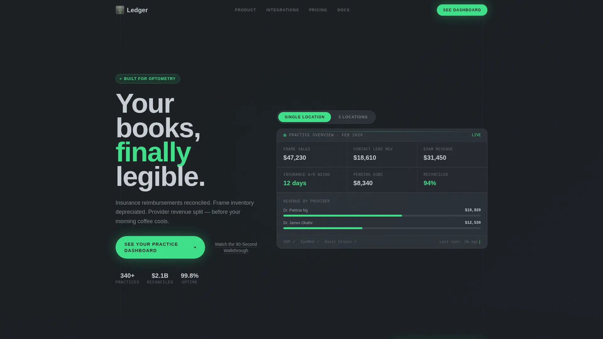
The header opens with a live-looking optometry profit and loss dashboard. Numbers roll upward on load, category bars draw left to right, and figures like frame sales, contact lens revenue, and insurance accounts receivable aging tick in real time. No stock photography appears. The product itself is the visual hero.
Single-to-Multi-Location Toggle
Visitors can switch between a single-location view and a three-location consolidated view inside the dashboard. The layout restructures itself on the toggle, letting practice owners with multiple sites see consolidation happen in front of them before reading a single word of copy.
Scroll-Reveal Stat Sections
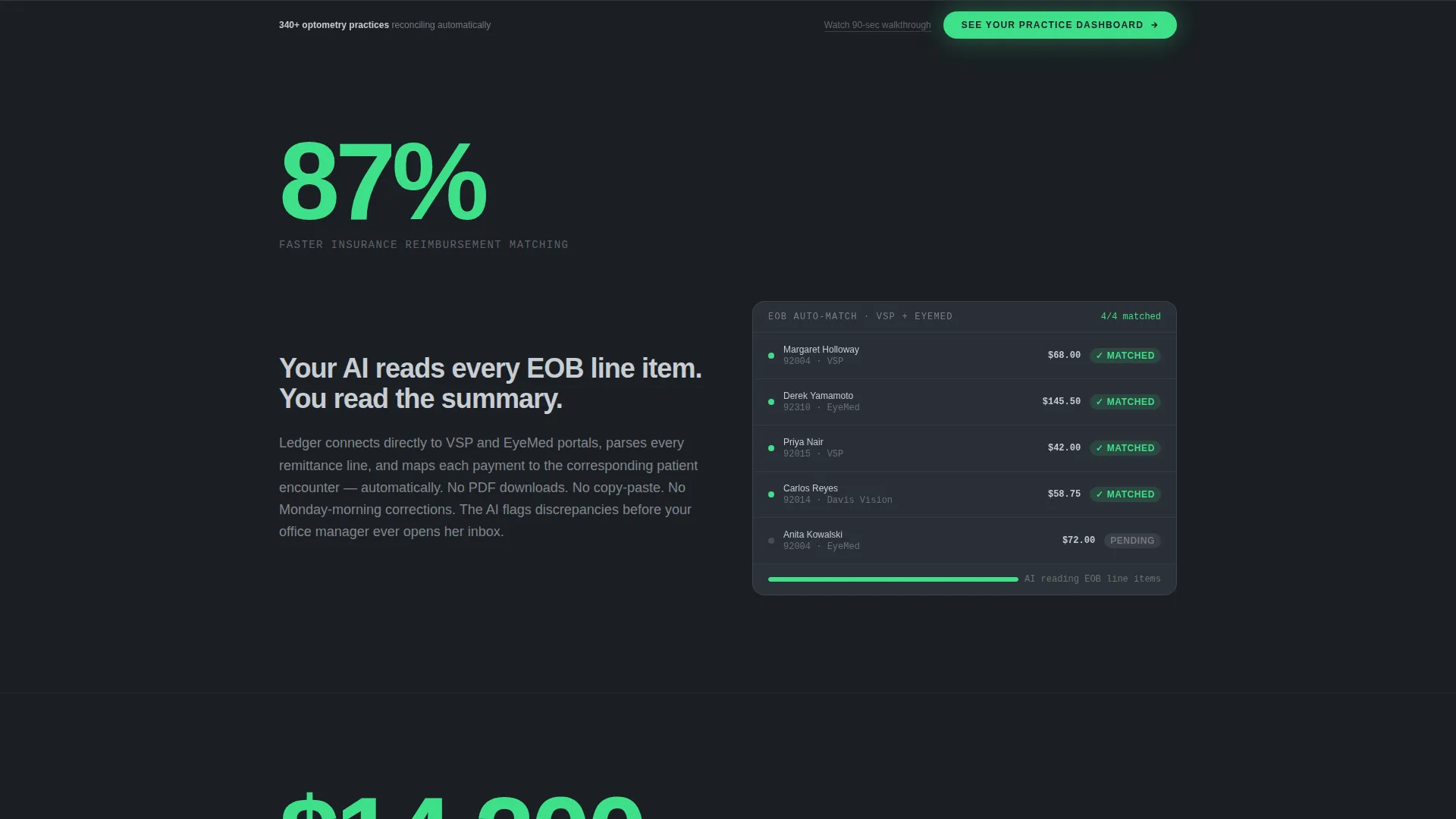
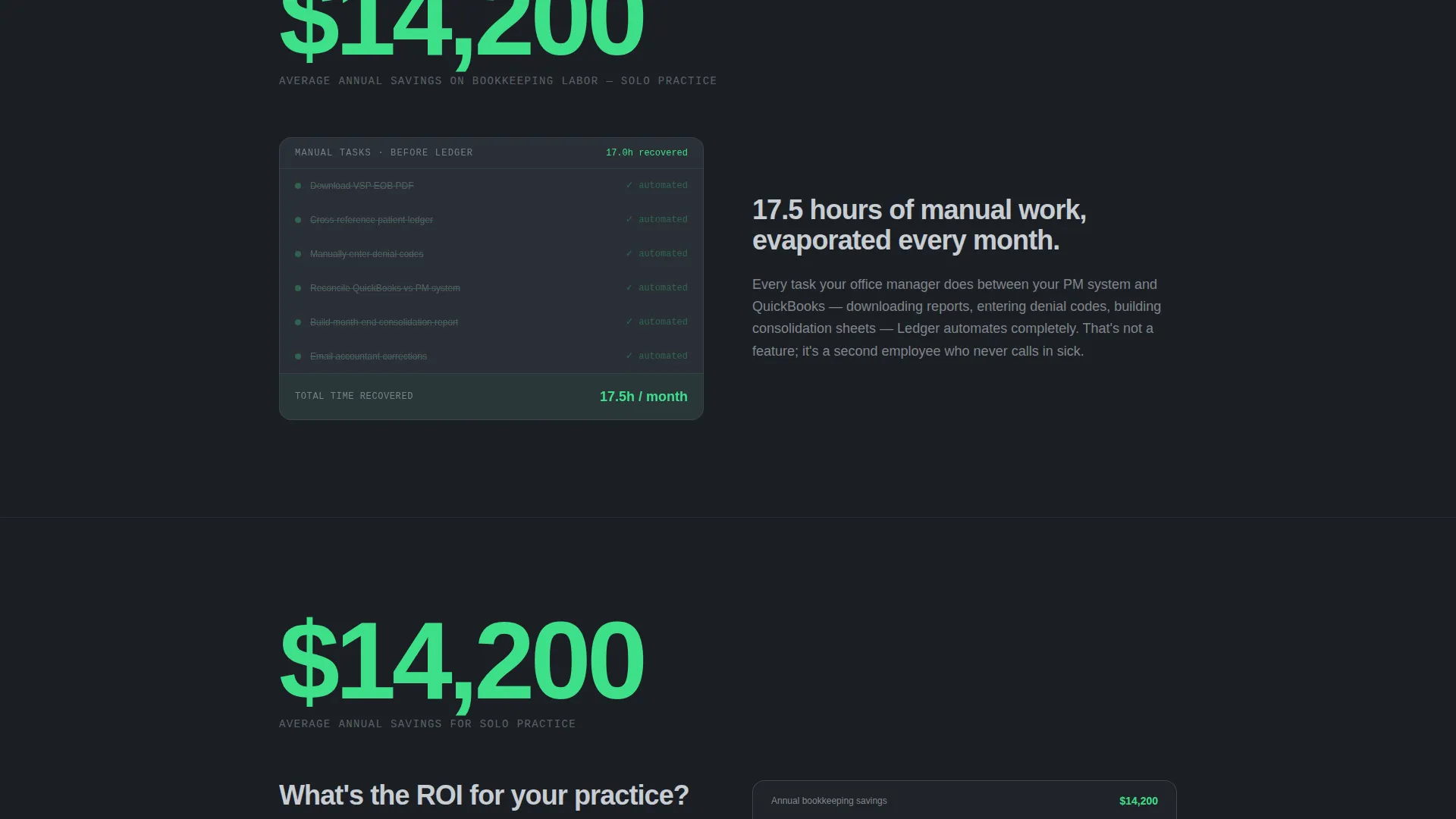
Each new content section opens with one oversized statistic, such as "87% faster reimbursement matching" or "$14,200 average annual savings on bookkeeping labor." The supporting explanation and motion graphic only appear after a deliberate pause, creating a punch-then-prove rhythm that holds attention through the full page.
Personalized ROI Finale
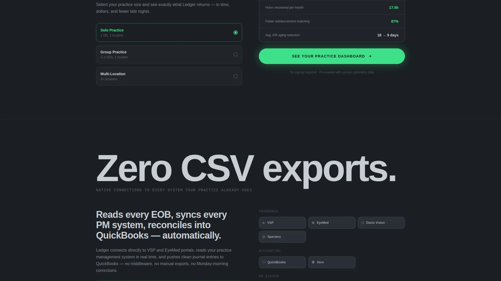
The final stat section combines all earlier proof points into a single return-on-investment number that adjusts by practice size. It acts as the page's closing argument, turning individual statistics into a concrete, practice-specific financial outcome just before the primary call to action.
Persistent Demo Call-to-Action Bar
Once a visitor scrolls past the page midpoint, a fixed bottom bar appears carrying the primary call to action: "See Your Practice Dashboard." It stays visible for the remainder of the scroll without interrupting the content flow, keeping the demo click accessible at all times.
Inline Secondary Video Link
A text link reading "Watch the 90-Second Walkthrough" appears alongside the primary call to action. It opens an inline video that covers the product at a lighter commitment level. The video ends on the same demo call to action, ensuring every exit path leads back to the conversion goal.
Page sections overview
| Section | Purpose |
|---|---|
| Animated Dashboard Header | Opens the page with a live optometry P&L mock and location toggle |
| First Stat Reveal | Hits with "87% faster reimbursement matching" before context appears |
| Reimbursement Explainer | Explains how the software reads EOB line items and maps encounters |
| Second Stat Reveal | Leads with "$14,200 average annual savings" on bookkeeping labor |
| Labor Savings Visual | Motion graphic shows manual data entry tasks disappearing one by one |
| ROI Personalizer | Combines all stats into a practice-size-adjusted return-on-investment figure |
| Primary call to action Block | "See Your Practice Dashboard" button with inline video secondary link |
| Persistent Bottom Bar | Fixed call-to-action bar that appears after the visitor passes midpoint |
Design & branding system
The visual identity follows a Dynamic Motion theme built on a Monochrome Steel color palette. Every color choice serves a function. The system feels like the face of a precision instrument: cool, surgical, and zero-decoration.
- Forge-dark charcoal (#1B1F24) and brushed gunmetal (#3A3F47) form the base surfaces, keeping the dashboard and stat sections grounded
- Polished chrome (#C8CDD3) provides typographic contrast for labels, figures, and supporting text
- Signal green (#3EE089) appears exclusively on positive financial indicators and calls to action, giving it clear visual meaning every time it appears
Mobile & speed optimization
The scroll-reveal template is structured so that every section presents cleanly at mobile viewport widths. Animated elements are designed to degrade gracefully on smaller screens without losing the core punch-then-prove rhythm.
- Stat reveal sections stack vertically on mobile, keeping the oversized number prominent before the explanation appears
- The persistent bottom call-to-action bar is sized for thumb-tap interaction on touch screens
- The dashboard toggle and animated counters are built to remain legible on compact display sizes
How this template helps you convert
This template is structured around one outcome: getting the visitor to click through to a live demo environment. Every design and content decision supports that goal.
- The animated dashboard header proves competence immediately, so visitors arrive at the call to action having already seen the product work with real optometry figures
- The punch-then-prove stat rhythm builds compounding trust across each scroll, making the "See Your Practice Dashboard" click feel like a natural next step rather than a sales ask
- The inline video secondary link and persistent bottom bar remove the two most common drop-off points, offering a lower-commitment path and keeping the demo click visible without requiring the visitor to scroll back up
Other information about this template
This template is categorized under Technology, specifically within the optometry software and optometry accounting software niche. It is a strong fit for teams positioning a product against the manual, spreadsheet-heavy workflows that independent and multi-location eye care practices still rely on today.
- The template style is Scroll Reveal (Progressive), meaning sections animate into view as the visitor scrolls rather than loading all at once
- The header concept is an Interactive Preview, not a static image or illustration
- The creative direction is Stats-First Impact, a structure where proof precedes explanation in every section
- The landing page direction is Click-Through, meaning the page has no form; it routes visitors directly into a sandbox demo pre-loaded with sample optometry data
- This template is well suited for software teams whose product handles insurance explanation of benefits (EOB) reconciliation, frame inventory depreciation, and provider-level revenue splitting
Theme
Dynamic Motion
Creative direction
Stats-First Impact
Color system
Monochrome Steel
Style
Scroll Reveal (Progressive)
Direction
Click-Through
Page Sections
Animated Optometry Dashboard Header
Single-to-multi-location Toggle
Punch-then-prove Stat Sections
Practice-size ROI Personalizer
Persistent Bottom Call to Action Bar
Inline Secondary Video Link
Related questions
Does this template include a lead capture form?
Can I customize the financial figures shown in the dashboard header?
Is the single-to-multi-location toggle functional out of the box?
Who is this landing page template designed for?
Can I adapt this template for a different software niche?



