Pension Booking System Bento Grid Landing Page
Ledger is a bento grid landing page template built for pension booking systems. It combines a Feature Tab Switcher header, interactive comparison tiles, and a conversion-focused feature matrix to help pension administrators, payroll managers, and financial advisers understand and trust your platform at a glance. The dark fintech aesthetic signals precision from the first scroll.
by Rocket studio
Quick summary
Ledger is a single-page bento grid template designed for pension vertical SaaS platforms. It leads with a three-tab product header, pulls visitors through interactive comparison tiles, and closes with a detailed feature matrix and dual conversion paths. Every section is built around one quiet question: why are you still doing this manually?
Who this template is for
This template is made for SaaS teams and digital product studios building in the pension administration space. If your platform helps pension professionals move faster and make fewer errors, this landing page speaks directly to their daily reality.
- Payroll managers who wrestle with monthly remittance deadlines across multiple employer schemes
- Pension scheme trustees who need clean, audit-ready contribution records before each quarter closes
- Independent financial advisers consolidating workplace pensions for growing small and medium-sized businesses
What problem this template solves
Pension administration software is genuinely hard to explain on a landing page. The work is complex, the stakes are high, and decision-makers are cautious. Most product pages either overwhelm visitors with jargon or undersell the product with vague benefit statements.
- There is no clear way to show the difference between the old manual process and the new automated one
- Visitors cannot interact with the product before committing to a demo, so trust is slow to build
- The comparison against spreadsheets and legacy software is rarely visualized in a way that lands with busy, skeptical professionals
What you get with this template
You get a fully structured bento grid landing page ready to represent a pension booking and reconciliation platform. The layout is interactive by design, so visitors explore rather than just read.
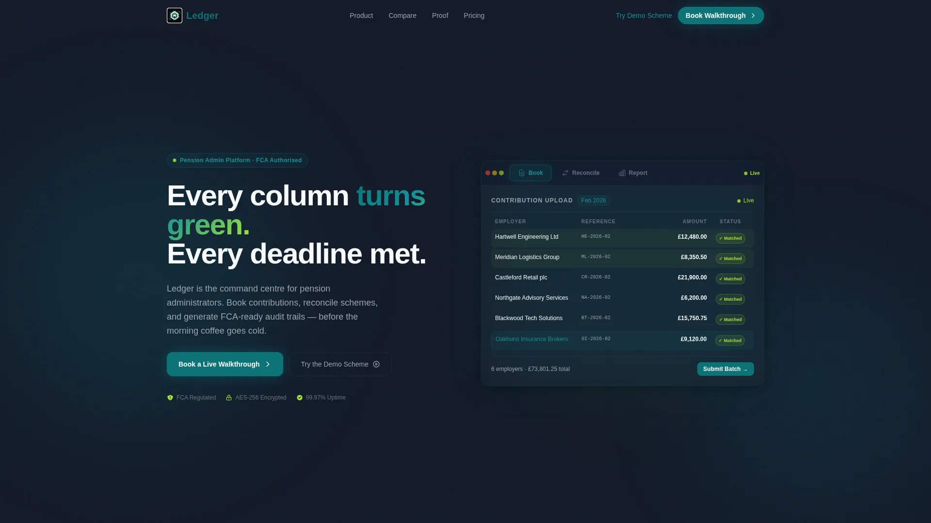
- A Feature Tab Switcher header with three product views: Book, Reconcile, and Report
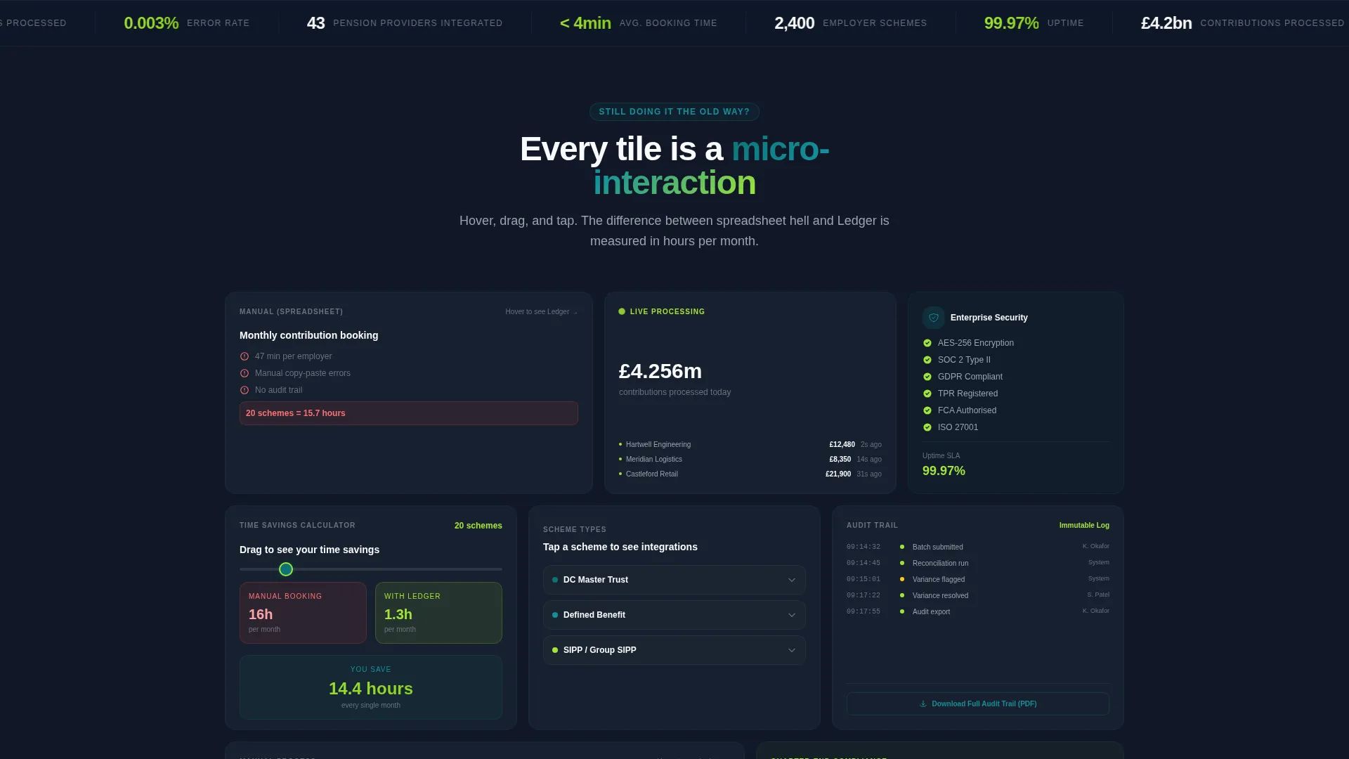
- A bento tile section with hover interactions that flip legacy workflows into automated equivalents
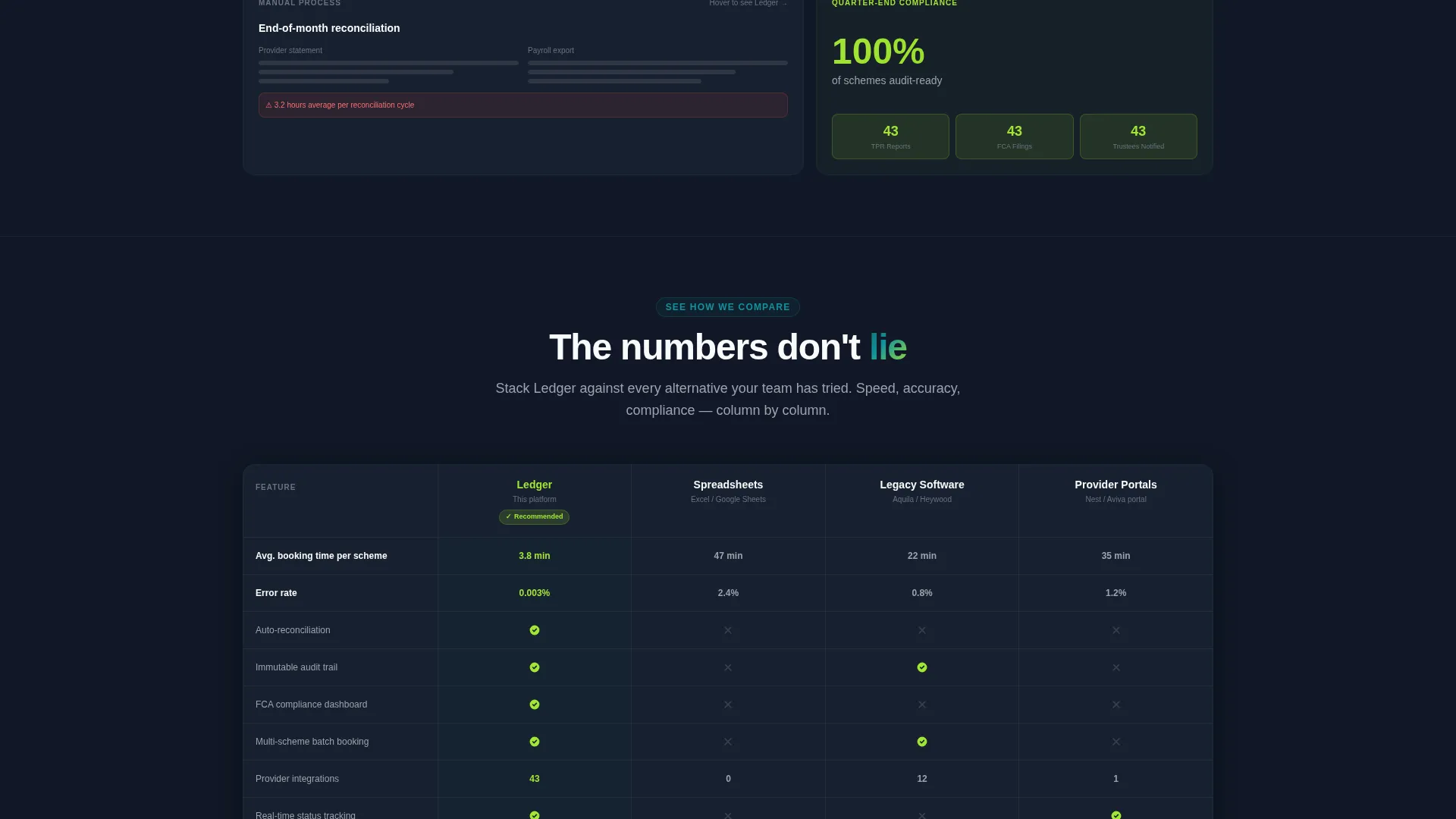
- A Comparison/Versus feature matrix with a persistent sticky bar, a full competitor column breakdown, and two distinct conversion paths
Feature list
This section covers the core built-in components and structural elements that make Ledger function as a conversion tool, not just a product brochure.
Three-Tab Product Header
The header mounts three clickable tabs labeled Book, Reconcile, and Report. Each tab reveals a different rendered product panel beneath it. Book shows a live contribution upload grid. Reconcile displays a side-by-side match view of pension provider data against payroll exports. Report surfaces a compliance dashboard with scheme-level charts and a downloadable audit trail link.
Interactive Bento Tile Grid
Each tile in the bento grid is a self-contained micro-interaction. Hover a tile to watch a legacy spreadsheet process flip into its automated counterpart. Drag a slider to compare manual booking time against system booking time. Tap a scheme-type card to expand provider-specific integration details.
Comparison and Versus Feature Matrix
A persistent sticky bar reading "See How We Compare" anchors the comparison section. The matrix pits the platform against manual spreadsheets, legacy pension admin software, and provider portals across four columns: speed, error rate, audit compliance, and integration count.
Dual Conversion Path Design
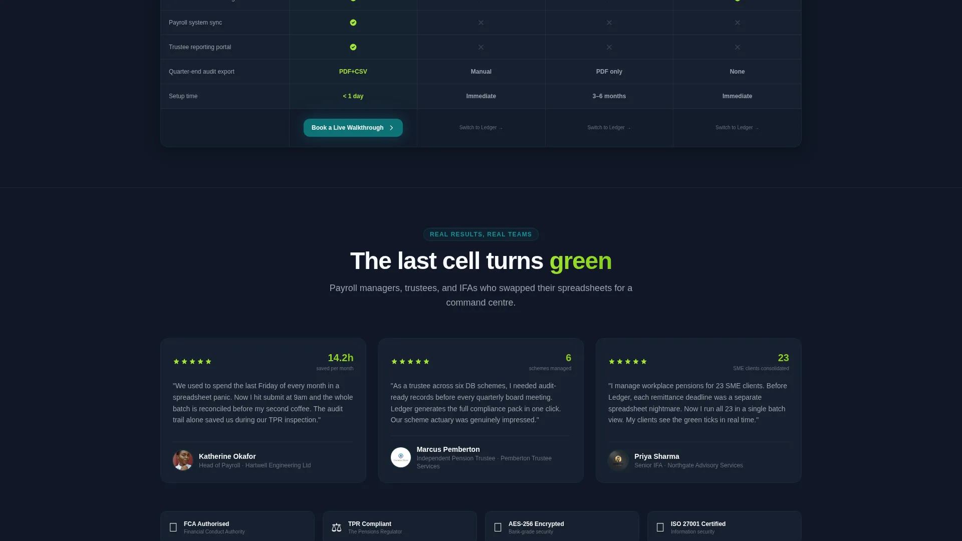
The primary call to action, "Book a Live Walkthrough," appears at the matrix footer and again inside the header's third tab. A short capture form asks for company name, number of active schemes, and current booking method via a dropdown. The secondary path, "Try the Demo Scheme," offers a no-signup sandbox contribution run.
Dark Fintech Visual System
The Teal Catalyst color system uses deep command teal for primary actions, near-black dashboard ink for card backgrounds and headers, crisp ledger white for data surfaces, and electric catalyst lime for status badges, toggle states, and confirmation pulses. The overall feel is a focused fintech terminal with purposeful flashes of green.
Narrative Comparison Engine
The scroll architecture follows a deliberate pace. Early bento tiles establish the problem. Middle tiles demonstrate the product in action. Final tiles stack proof through uptime statistics, encryption badges, and financial conduct readiness callouts. Every section quietly reinforces the gap between the old way and the new one.
Page sections overview
| Section | Purpose |
|---|---|
| Feature Tab Header | Showcase Book, Reconcile, Report panels |
| Contribution Upload Grid | Demonstrate live employer data entry |
| Side-by-Side Reconcile | Compare payroll exports against provider data |
| Compliance Report Dashboard | Display scheme charts and audit trail |
| Bento Interaction Tiles | Flip legacy workflows into automated views |
| Booking Time Slider | Visualize manual versus system speed |
| Scheme Type Cards | Expand provider integration detail |
| Sticky Compare Bar | Anchor visitor to the feature matrix |
| Versus Feature Matrix | Contrast platform against three alternatives |
| Primary call to action Block | Capture walkthrough booking leads |
| Demo Scheme Path | Drive no-signup sandbox exploration |
Design & branding system
The visual identity follows the Startup Velocity theme with the Teal Catalyst color system. Every color choice serves a functional purpose in the interface, from backgrounds that reduce eye strain to accent tones that signal action completed.
- Deep command teal (#0D7377) drives all primary interactive elements and active tab states
- Near-black dashboard ink (#111827) fills card backgrounds and section headers, creating depth without harshness
- Electric catalyst lime (#A3E635) appears on status badges, toggle confirmations, and contribution success pulses, communicating that something worked
Mobile & speed optimization
The bento grid layout is structured so each tile scales and reflows independently. Interactive elements maintain their function at smaller viewport sizes, and the dark card surfaces keep contrast clear across device types.
- Bento tiles reflow into a single-column stack on smaller screens without losing their hover and tap interaction logic
- The sticky comparison bar remains accessible during scroll on both desktop and mobile viewports
- Product screenshot cards use a subtle shadow and floating treatment that holds visual weight at any screen size
How this template helps you convert
The conversion logic in Ledger is built around reducing hesitation and building confidence before a sales conversation happens. Every structural decision pushes a cautious, analytical buyer one step closer to committing.
- The "Try the Demo Scheme" sandbox path lets a prospect complete a fictional contribution run before speaking to anyone, turning abstract interest into hands-on familiarity with the product workflow.
- The feature matrix gives payroll managers and pension trustees a clear, side-by-side reason to choose the platform, removing the need for a long discovery call just to answer basic comparison questions.
Other information about this template
Ledger is built as a single landing page, not a multi-page website, so every conversion element exists within one continuous scroll experience. The template is part of a Startup Velocity theme family and pairs naturally with SaaS platforms targeting regulated financial services verticals.
- The Comparison/Versus architecture is well-suited to pension booking system products competing against entrenched spreadsheet habits or aging legacy software
- The FCA-readiness callout section and encryption badge placement are included in the final proof tiles, reinforcing trust signals for a regulated industry audience
- The bento grid template style supports a high density of information without visual clutter, making it appropriate for technically literate buyers who scan rather than read linearly
- The Interactive Explorer creative direction means the page rewards engagement: the more a visitor clicks and drags, the more confident they become before ever speaking to a sales team
Theme
Startup Velocity
Creative direction
Interactive Explorer
Color system
Teal Catalyst
Style
Bento Grid
Direction
Comparison/Versus
Page Sections
Feature Tab Switcher Header
Interactive Bento Tile Grid
Comparison and Versus Matrix
Dual Conversion Architecture
Dark Fintech Color System
Proof and Trust Tile Stack
Related questions
Who is this landing page template designed for?
What are the two conversion paths included in this template?
Can I customize the tab labels and product screenshots in the header?
Does the bento grid layout work well on mobile devices?
What makes this template different from a generic SaaS landing page?



