Ledger - Precision Wedding Landing Page Template
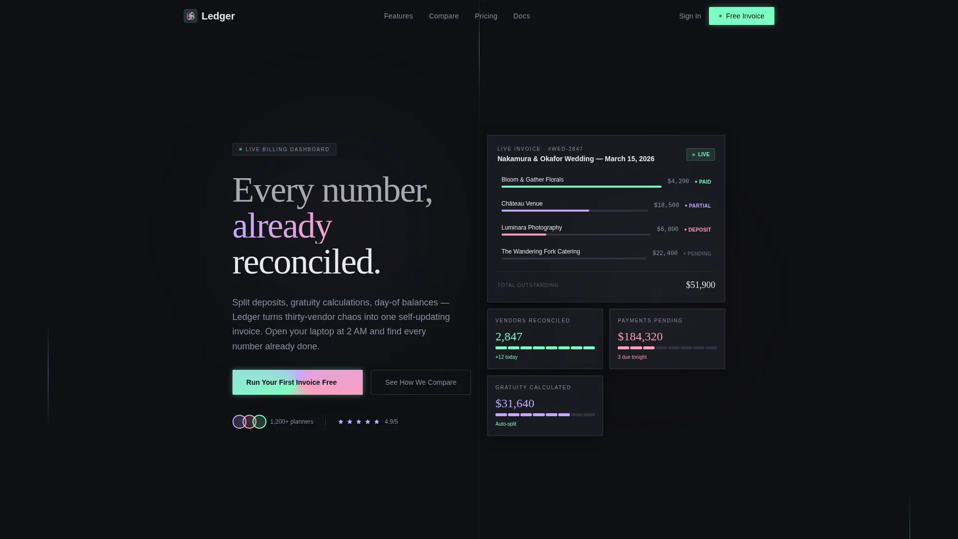
Ledger is a dashboard-style landing page template built for wedding billing and invoicing platforms. It uses a Feature Matrix layout to show how a living invoice system handles deposits, installments, gratuity splits, and day-of balances. The design runs on a Data Command theme with an iridescent palette on deep graphite, built to convert comparison-minded wedding professionals.
by Rocket studio
Quick summary
Ledger is a single-page template designed for wedding billing and invoicing platforms. It leads with a Logo Bar header, unfolds into a scrolling Feature Matrix, and closes with a sticky conversion bar. The iridescent palette on deep graphite makes complex payment data feel precise and purposeful. Independent planners and venue coordinators are the core audience.
Who this template is for
This template is built for the people managing the financial side of weddings, not just the beautiful side. If you are selling or promoting a wedding billing platform, this landing page positions your product where it counts.
- Independent wedding planners juggling deposits and installments across dozens of vendors per event
- Boutique venue coordinators reconciling catering overages and gratuity splits late at night
- Day-of coordinators who need to release final vendor payments before the reception ends
What problem this template solves
Wedding vendor payments are scattered across spreadsheets, email threads, and generic invoicing tools. No single view shows which deposits are cleared, which balances are outstanding, and which gratuity splits still need approval. That chaos costs planners time and trust.
- Vendors, clients, and coordinators all need payment clarity at the same moment, often during the event itself
- Generic invoicing tools were not built for split deposits, tiered installments, or real-time day-of payment releases
- The gap between what planners use today and what they actually need feels embarrassing once the comparison is visible
What you get with this template
You get a complete, ready-to-customize landing page layout for a wedding billing platform. Every section is purpose-built to earn visitor trust and move them toward the primary call to action.
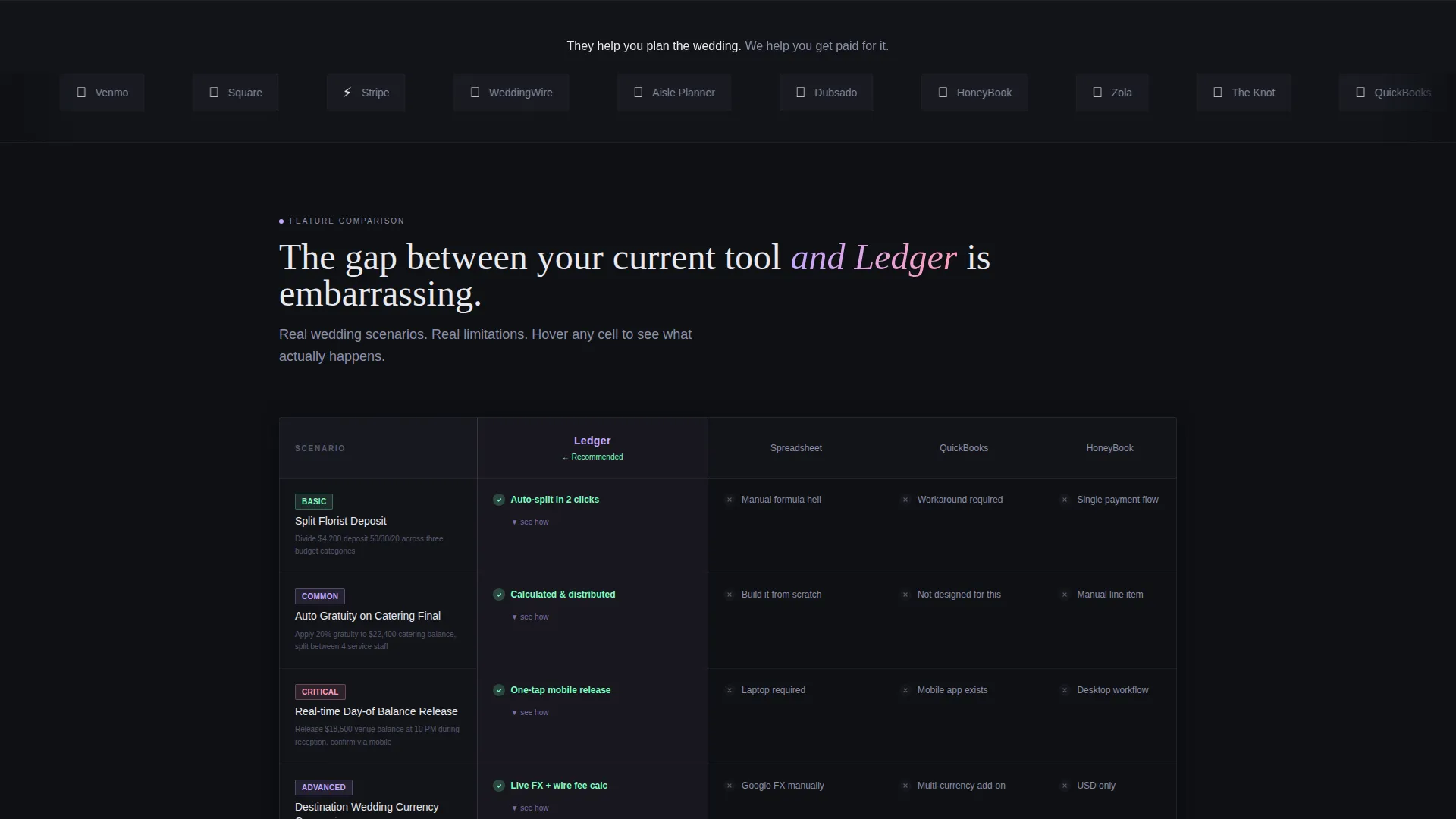
- A Logo Bar header with scrolling industry tool logos establishing ecosystem context immediately
- A scrolling Feature Matrix that animates row by row, each tied to a real wedding billing scenario
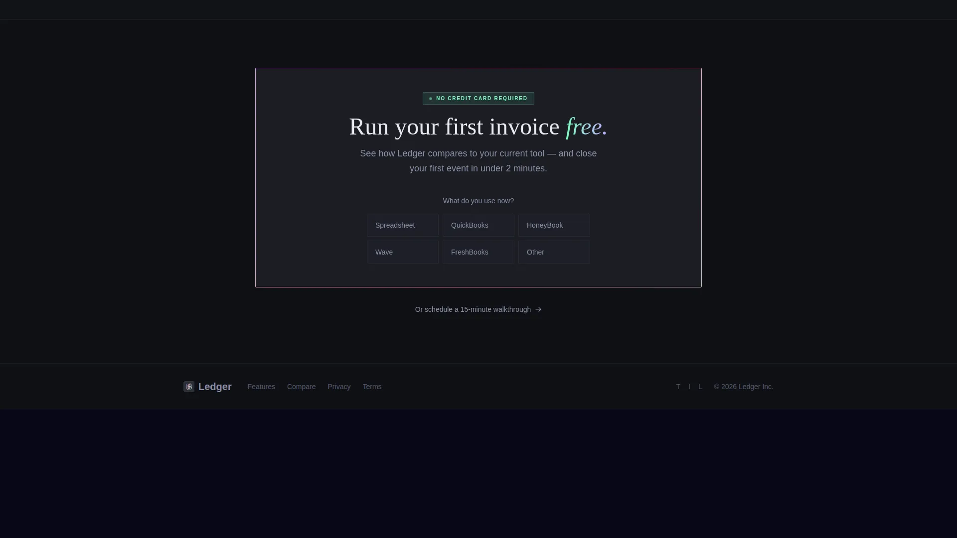
- A sticky bottom conversion bar with a primary call-to-action and a low-friction secondary qualification form
Feature list
This template is built around a tight set of components, each serving the comparison-driven conversion flow.
Logo Bar Header Ribbon
A horizontal scrolling ribbon of recognizable wedding industry tool logos sits beneath a single confident headline. Visitors instantly see their existing software stack and understand where this platform fits alongside it.
Animated Feature Matrix Grid
The core of the page is a comparative data grid. Columns represent Ledger, manual spreadsheets, generic invoicing tools, and other wedding-specific platforms. Each row animates into view tied to a specific billing scenario, from a simple florist invoice to a destination wedding with currency conversion and international wire fees.
Hover-Expand Cell Interactions
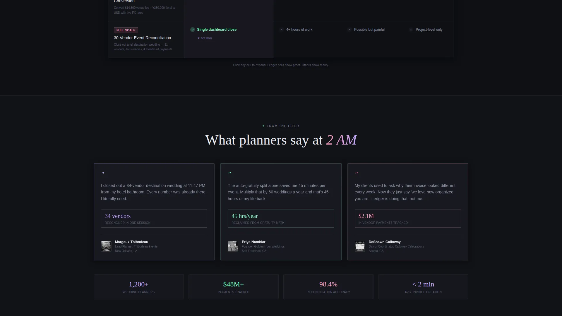
Each cell in the comparison grid expands on hover to reveal a micro-interaction or dashboard screenshot. This proves each capability in context rather than just checking a box.
Escalating Scenario Rows
The comparison rows are ordered by billing complexity. Stakes rise as visitors scroll, moving from split deposits across three vendors, through automatic gratuity calculation on catering finals, to real-time payment tracking during the event itself.
Sticky Conversion Bar
A sticky bottom bar activates after the visitor scrolls past the third comparison row. It anchors the primary call-to-action, "Run Your First Invoice Free", keeping it visible without interrupting the matrix story.
Secondary Qualification Form
A single-field form asks only what tool the visitor currently uses, via a dropdown with four options, followed by an email field. It qualifies intent while keeping friction minimal.
Page sections overview
| Section | Purpose |
|---|---|
| Logo Bar Header | Establish ecosystem context with scrolling industry tool logos and a single headline |
| Feature Matrix Grid | Animate comparison rows by billing scenario to reveal the capability gap |
| Hover-Expand Cells | Prove each feature with micro-interactions and dashboard screenshots on hover |
| Sticky call to action Bar | Anchor the primary call-to-action after the third comparison row activates it |
| Secondary Qualify Form | Capture tool intent and email with a two-field low-friction form |
Design & branding system
The visual identity runs on a Data Command theme built for precision and controlled drama. Deep graphite forms the base, while iridescent gradients trace card borders, progress bars, and active data cells with faint luminescence.
- Core palette: deep graphite (#1B1D23) for backgrounds, holographic lilac (#C4A8FF) and soft iridescent rose (#FF9DBB) for accents, electric mint (#7DFFC2) reserved for status indicators and hover states
- Iridescent gradients behave like a prism refracting light across a matte black surface, clinical and precise with moments of visual surprise
- Typography and layout stay grid-forward to reinforce the dashboard register without sacrificing readability
Mobile & speed optimization
The dashboard grid layout is designed to remain scannable and functional on smaller screens. The sticky conversion bar and qualification form are both built to work at any viewport width.
- The Feature Matrix columns reflow for mobile so comparison rows stay readable without horizontal scrolling
- Hover-expand interactions adapt gracefully to tap events on touch devices
- The sticky call to action bar stays fixed at the bottom of the screen on mobile, keeping the primary action always within reach
How this template helps you convert
The page is built for Comparison/Versus conversion, a pattern that works by making the status quo feel inadequate before asking for a click.
- The Logo Bar opens with instant ecosystem familiarity, reducing skepticism before the visitor reads a single feature claim
- The Feature Matrix builds a progressively stronger case row by row, using real wedding billing scenarios so the comparison feels personal and specific rather than abstract
- The sticky call to action bar and the secondary qualification form offer two commitment levels, a direct free trial and a softer intent signal, so visitors at different decision stages both have a natural next step
Other information about this template
This template is part of the broader Wedding Software and SaaS category, sitting at the intersection of technology and wedding industry tooling. It was designed with the billing and invoicing niche in mind, where the buyer is already frustrated and comparison-ready.
- The template style is Dashboard/Data Grid, making it well-suited for any platform that needs to visualize structured financial data clearly
- The AI Iridescent color system is purpose-built for this theme, giving data-heavy layouts a visual identity that feels elevated rather than clinical
- The creative direction of a Feature Matrix works beyond wedding platforms and can support any vertical where side-by-side capability comparison drives purchase decisions
- The Logo Bar concept is especially effective when the platform audience already uses a recognizable software ecosystem, because it frames the new tool as complementary rather than disruptive
Theme
Data Command
Creative direction
Feature Matrix
Color system
AI Iridescent
Style
Dashboard/Data Grid
Direction
Comparison/Versus
Page Sections
Animated Feature Matrix Comparison Grid
Logo Bar Ecosystem Header
Hover-expand Cell Interactions
Escalating Billing Scenario Rows
Sticky Conversion Bar with Call to Action
Low-friction Qualification Form
Related questions
Who is this landing page template designed for?
What makes the Feature Matrix layout effective for this niche?
How does the sticky call to action bar activate?
How does the secondary qualification form keep friction low?
Can this template work for a billing platform outside the wedding industry?



