Financial Services Software Specialist Privacy Policy Website Template
Ledger is a dashboard-style landing page template built for financial services email marketing platforms. It showcases a curated library of battle-tested email campaigns organized by category, compliance tier, and performance metrics. The glassmorphic design, frosted panel grid header, and spec-sheet scroll layout work together to drive app downloads from financial advisors, wealth managers, and fintech growth teams.
by Rocket studio
Quick summary
Ledger is a single-page, dashboard-style template for a financial services email marketing platform. It presents a cataloged library of proven email campaigns using a frosted-glass visual system, data-grid layout, and category-level spec sheets. The page is designed to earn app downloads by showing organized, quantified proof before asking for any commitment.
Who this template is for
This template serves marketing professionals in regulated financial industries who need ready-made email campaigns they can trust and deploy quickly. It speaks directly to people who feel the gap between what they send today and what a well-stocked library could deliver.
- Compliance-weary marketing directors at registered investment advisories (RIAs) looking for pre-approved swipe files
- Solo financial advisors who know they should be emailing their client base but struggle to start
- Fintech chief marketing officers hunting for conversion benchmarks against category peers
What problem this template solves
Financial services marketers face a specific problem: email content that is both engaging and compliant is hard to produce consistently. Generic landing page templates ignore that constraint entirely, leaving growth teams with pages that feel disconnected from the regulated environment they work in.
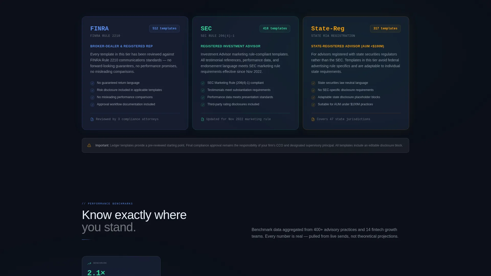
- No clear way to display compliance tiers (Securities and Exchange Commission, Financial Industry Regulatory Authority, state-registered) alongside performance data
- No visual system that communicates "organized and verified" without feeling cold or corporate
- No built-in conversion path tailored to app downloads from a professional, trust-first audience
What you get with this template
You get a complete, single-page layout that functions like a product catalog for email campaigns. Every section is pre-structured so you can drop in your library categories, metrics, and compliance labels without redesigning from scratch.
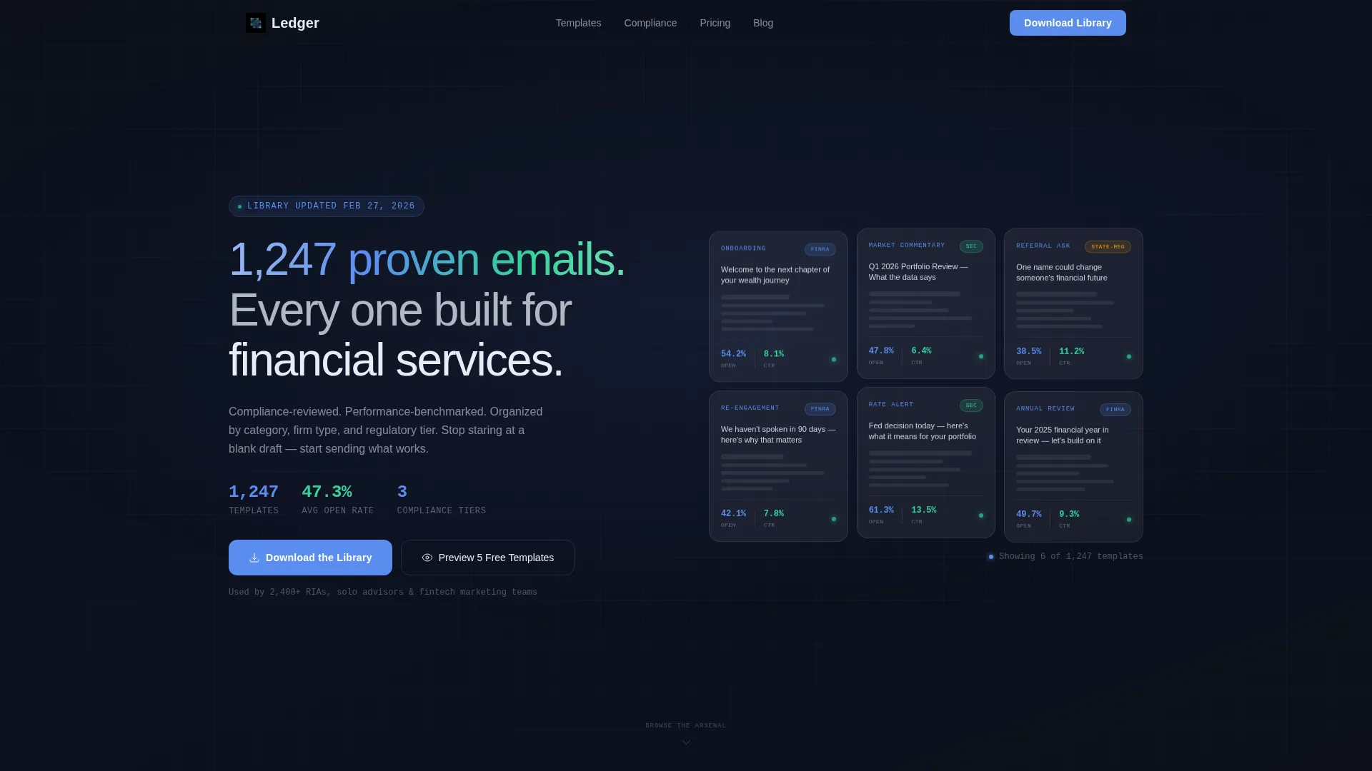
- A frosted-glass header grid showing six to eight email template previews, each with open rate, click-through rate, and compliance status
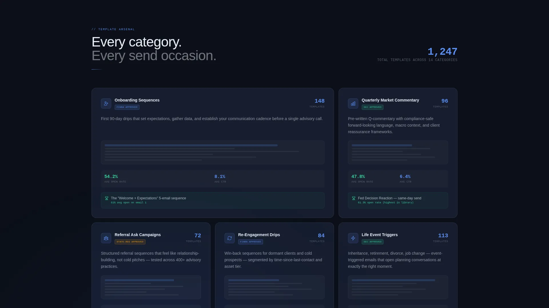
- Scrollable category spec-sheet sections for campaign types such as onboarding sequences, quarterly market commentary, referral asks, and re-engagement drips
- A primary download call-to-action with paired app store badge components and a secondary sticky bar offering a free preview email gate
Feature list
This template is built around a set of carefully considered design and layout features that serve the financial services email marketing use case specifically.
Glassmorphic Dark Panel Header
Six to eight frosted-glass rectangles are arranged in an asymmetric grid against a vault-black background. Each panel displays an email template preview with its open rate, click-through rate, and compliance status rendered in ledger blue. Subtle parallax depth on mouse movement adds spatial layering without distracting from the data.
Category Spec-Sheet Scroll Sections
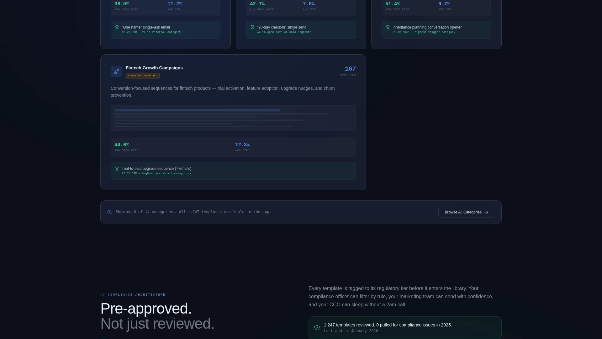
Each scroll section functions like a product data sheet for a specific campaign category. Cards display template count, average open rate, compliance tier, and a frosted preview thumbnail. The scroll inventories the library rather than telling a story, letting the volume and specificity of the data do the persuading.
Sticky Free-Preview Bar
After the third section, a sticky bar appears offering five free template previews. It triggers a lightweight email gate collecting only work email and firm type before routing the visitor to the app onboarding flow. This keeps friction low while qualifying leads effectively.
App Download Call-to-Action Block
The primary call-to-action reads "Download the Library" and is paired with app store and Google Play badge components styled in the glassmorphic palette. The block is positioned after enough proof has accumulated on the page that the visitor's next thought is action, not evaluation.
Compliance Tier Labeling System
Every template category card carries a visible compliance tier label: Securities and Exchange Commission, Financial Industry Regulatory Authority, or state-registered. This detail is structural, not decorative. It removes a key hesitation point for compliance-sensitive buyers before they ever reach the call-to-action.
Page sections overview
| Section | Purpose |
|---|---|
| Dark Glass Header | Showcases template previews with live-style metrics in a frosted asymmetric grid |
| Hero Headline Block | States the core value proposition: 1,247 proven, financial-services-specific emails |
| Onboarding Sequence Cards | Spec-sheet cards for onboarding campaign category with counts and compliance labels |
| Market Commentary Cards | Displays quarterly commentary templates with average open rate data |
| Referral and Re-engagement | Catalogs referral ask and re-engagement drip categories side by side |
| Free Preview Sticky Bar | Persistent bar offering gated access to five sample templates |
| App Download call to action | Primary conversion block with glassmorphic app store badge components |
Design & branding system
The visual identity follows a Directory and Discovery theme executed through a glassmorphic color system. Every surface reads as slightly transparent, as if the interface is built from layered acrylic sheets floating above a dark desk.
- Core palette: deep vault black (#0B0F19) for backgrounds, translucent panel gray (rgba 255, 255, 255, 0.12 over #1A1F2E) for frosted cards, cool ledger blue (#5B8DEF) for data labels and metrics, and confirmation mint (#34D399) reserved for download badges and success states
- Typography uses a medium-weight sans-serif for the headline and clean, readable type across all data labels and card content
- No hero images or stock photography; the product previews themselves serve as the visual centerpiece throughout the page
Mobile & speed optimization
The dashboard grid and frosted-panel layout are structured to translate cleanly to smaller screens without losing the data-dense quality that makes the template credible.
- The asymmetric header grid adapts to a stacked single-column layout on mobile, preserving panel previews and metric labels
- Category spec-sheet cards reflow into a vertical scroll on narrow viewports, keeping compliance tier labels and open rate data visible
- The sticky free-preview bar and app download call-to-action remain anchored and accessible at all viewport sizes
How this template helps you convert
The page is engineered to move a skeptical, compliance-aware professional from curiosity to download without relying on hype or generic sales language.
- The header grid leads with proof rather than promises, showing real-looking template previews and metric data before the visitor reads a single line of body copy.
- The spec-sheet scroll format creates a sense of accumulating value. As the visitor moves through categories, the library feels larger and more indispensable with each section.
- The sticky bar and gated preview lower the commitment threshold at exactly the right moment, letting hesitant visitors sample before they download.
Other information about this template
This template is categorized under Technology and Financial Services Software, reflecting its purpose as a purpose-built tool for fintech and advisory marketing teams. It is part of a broader set of niche-specific landing page templates designed for high-trust, regulated industries.
- The template style is classified as Dashboard and Data Grid, making it well suited for platforms that need to communicate scale, organization, and verified performance data
- The creative direction follows a Spec Sheet approach, meaning each section reads like a product catalog entry rather than a narrative pitch
- The header concept uses Dark Glass Panels, a design pattern that signals precision and depth without relying on photography or illustration
- The landing page direction targets App Download as the primary conversion goal, with the free-preview email gate serving as a lower-friction secondary path
- The Directory and Discovery theme positions the platform as a resource library rather than a SaaS product, which tends to resonate with buyers who already know their problem and want a curated solution
Theme
Directory & Discovery
Creative direction
Spec Sheet
Color system
Glassmorphic
Style
Dashboard/Data Grid
Direction
App Download
Page Sections
Glassmorphic Dark Panel Header Grid
Category Spec-sheet Scroll Layout
Compliance Tier Label System
Sticky Free-preview Email Gate
App Download Call to Action Block
Related questions
Who is the Ledger template built for?
Can I customize the template categories and metrics?
Does the template include the email gate form?
Is Ledger a single-page landing page or a multi-page site?
What makes this different from a generic SaaS landing page template?



