Decentralized WMS Landing Page Template
Ledger is a decentralized warehouse management system landing page template built for VP-level supply chain operators. It uses a comparison table layout, Industry Report creative direction, and a Tech Glass visual identity in Carbon Fiber tones. The page frames distributed WMS architecture against legacy and cloud-centralized systems so buyers can immediately see the operational case for resilience.
by Rocket studio
Quick summary
Ledger is a single-page comparison landing page template for a decentralized warehouse management system. It pairs an Industry Report content structure with a Tech Glass visual identity to help supply chain decision-makers evaluate distributed WMS architecture against legacy and cloud-centralized alternatives. The layout escalates from hard data to scenario proof to a total-cost-of-ownership calculator.
Who this template is for
This template is built for enterprise software teams and demand-generation marketers promoting a decentralized warehouse management system to senior operations buyers. The target visitor is a VP-level supply chain operator who runs one or more large distribution centers and has experienced WMS downtime during a peak shipping period.
- Supply chain software vendors targeting VP and Director-level operations leaders
- Enterprise SaaS marketing teams positioning distributed architecture against legacy monolithic WMS platforms
- Demand-generation teams running account-based campaigns toward large distribution center operators
What problem this template solves
Most WMS landing pages lead with feature lists. This template leads with consequences. It gives buyers the analytical framing they need to justify a platform switch internally, moving from emotional frustration about downtime to a structured, data-backed case for decentralized architecture.
- Visitors arrive skeptical after living through vendor lock-in and costly WMS outages at peak season
- Generic feature comparison pages fail to communicate the real operational risk of monolithic and cloud-centralized systems
- Decision-makers need scenario-based proof, not bullet points, to bring a new platform to their procurement team
What you get with this template
The template delivers a structured, full-length comparison landing page ready for customization. Every section is purpose-built to move a senior buyer from problem recognition to calculated confidence before the primary call to action appears.
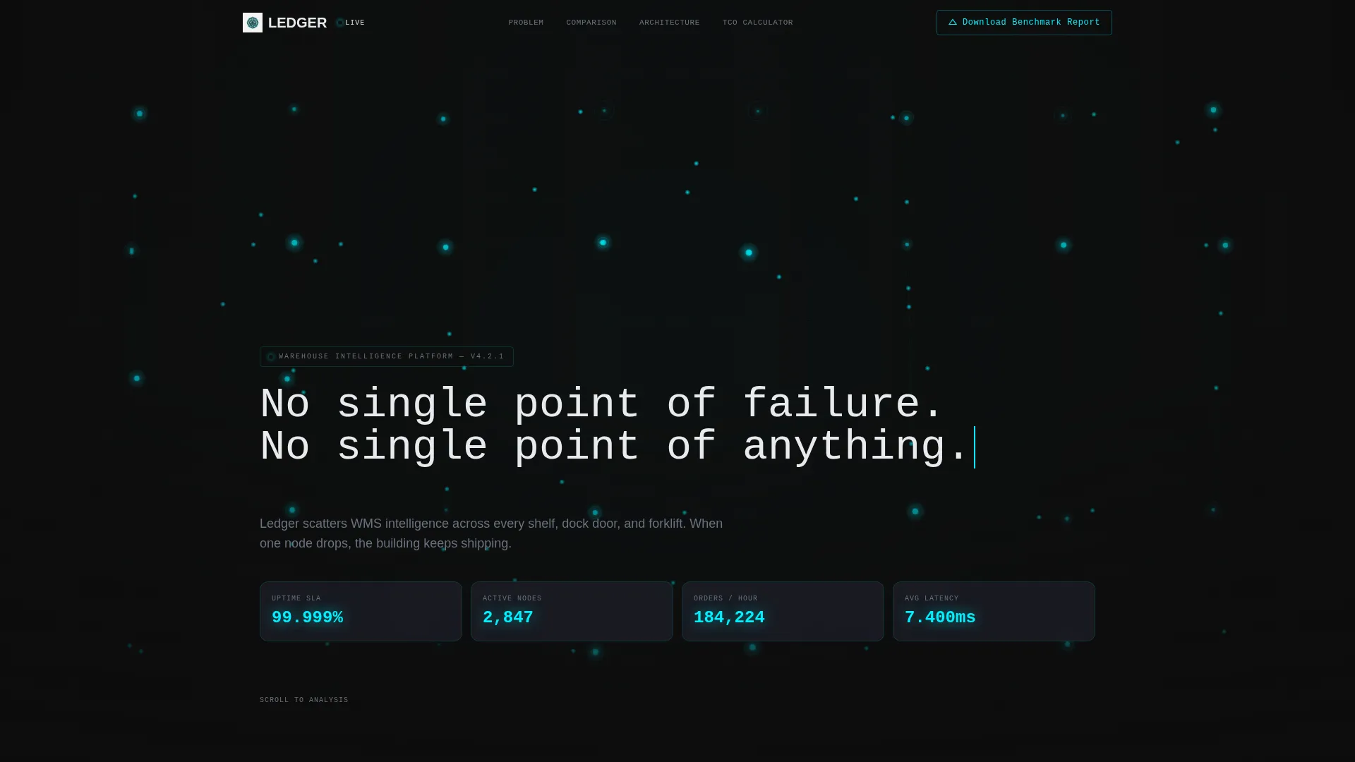
- A dark full-bleed header with animated cyan wireframe warehouse render and live-ticking uptime and throughput metrics
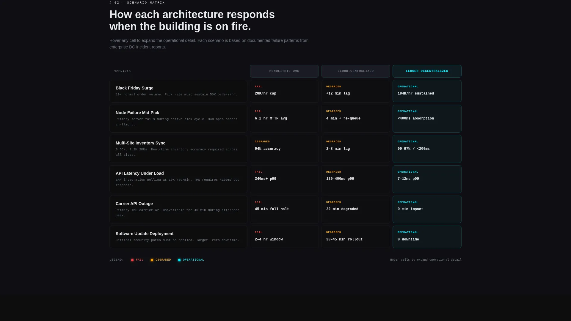
- Three scenario comparison tables staging real operational crises across legacy monolithic, cloud-centralized, and decentralized WMS architectures
- A total-cost-of-ownership calculator that accepts distribution center square footage and SKU count as inputs, leading directly into the primary call to action
Feature list
This template includes purpose-built components designed for a high-stakes B2B buying environment. Each element earns its place by advancing the analytical narrative from problem framing to proof.
Animated Dark Full-Bleed Header
The header opens on a top-down 3D warehouse floor plan rendered in cyan wireframe against deep carbon black. Distributed node points pulse with soft bloom glows. After a two-second hold, a monospaced headline phases in letter by letter. Uptime percentage, node count, and orders-per-hour metrics tick live in cyan beneath the subtitle.
Scenario-Based Comparison Tables
Three glass-panel comparison tables replace standard feature checklists. Each table row stages a real operational scenario, such as a Black Friday surge or a node failure mid-pick, and shows how legacy monolithic, cloud-centralized, and decentralized architectures respond. Table cells light up in electric cyan on hover to reveal deeper metric breakdowns.
Data-Led Problem Framing Section
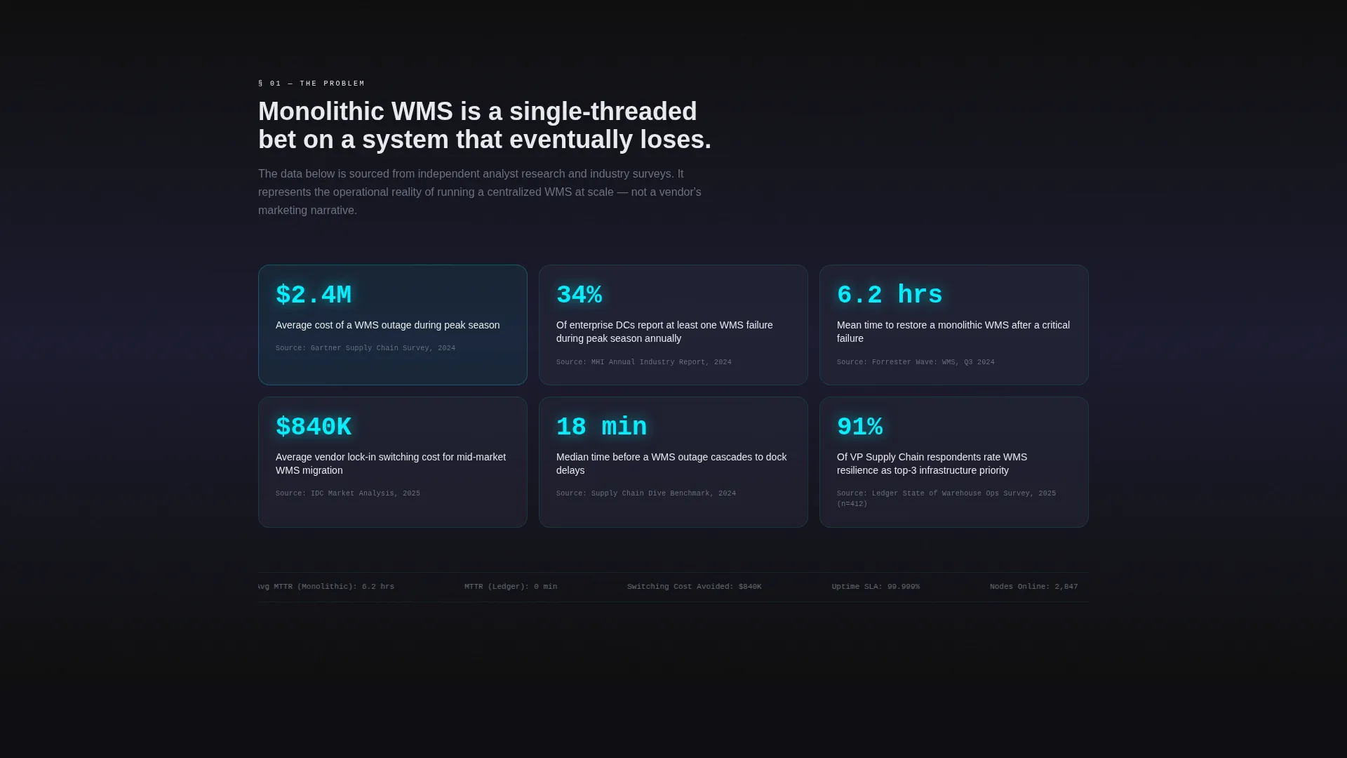
The first scroll section presents hard figures: average annual cost of WMS downtime, peak-season failure rates, and vendor lock-in switching costs. All data points are cited and sourced, matching the Industry Report creative direction. This section builds analytical credibility before the comparison tables arrive.
Total-Cost-of-Ownership Calculator
Visitors input their own distribution center square footage and SKU count into an interactive calculator. The tool returns projected savings figures, making the primary call-to-action button a natural next step rather than a cold ask. The calculator is positioned at the bottom of the cost analysis section.
Sticky Navigation with Gated Secondary call to action
A sticky top navigation bar carries a secondary call to action reading "Download the Full Benchmark Report," gated behind a single-field business email capture. The nav remains visible throughout the scroll so the lower-commitment offer is always one click away.
Case Study and Benchmark Proof Section
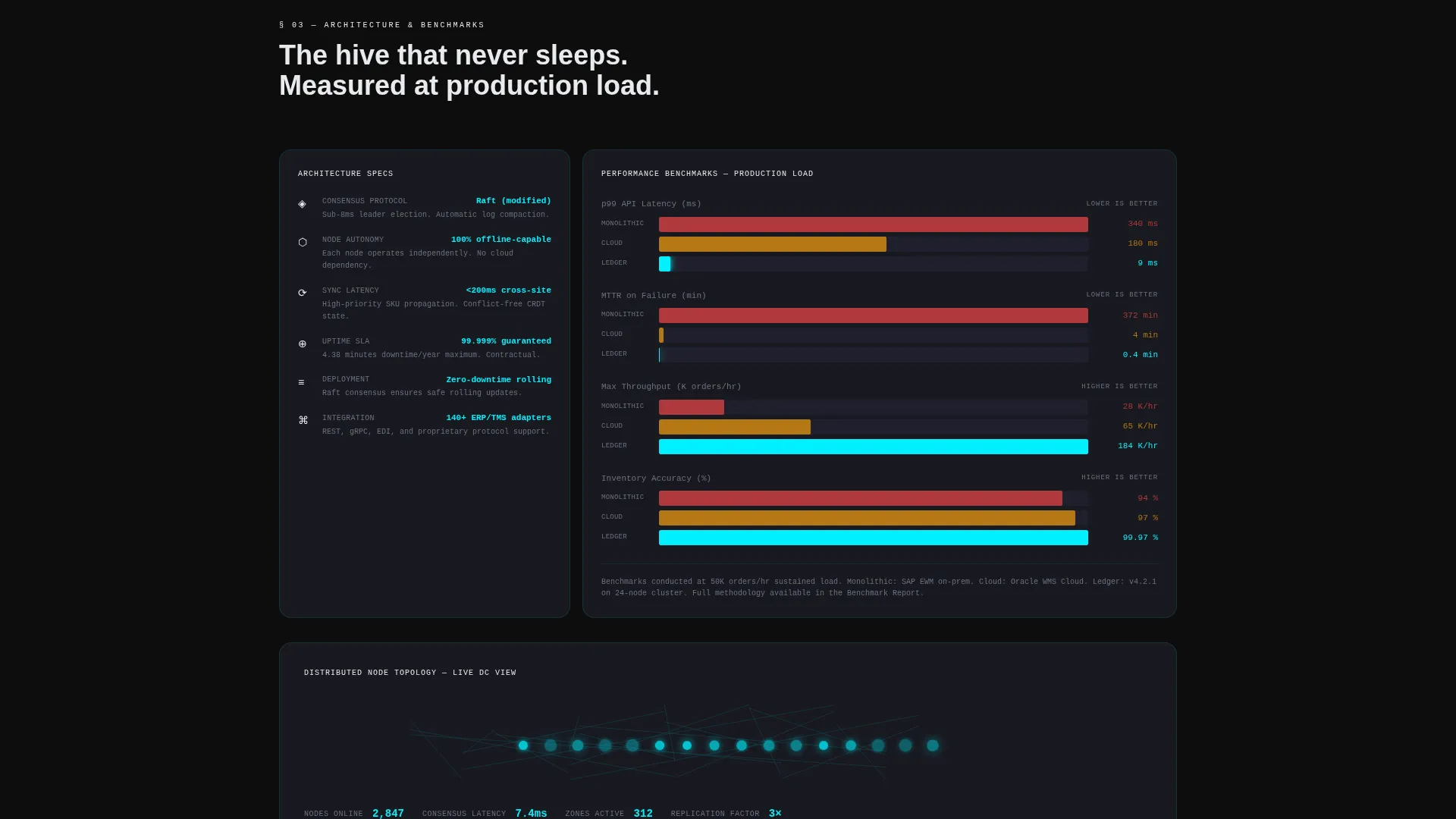
Below the comparison tables, the page presents case study snapshots and latency benchmarks graphed in real time. This section transitions the visitor from analytical framing to operational proof, reinforcing the decentralized architecture argument with observable performance data.
Page sections overview
| Section | Purpose |
|---|---|
| Full-bleed header | Opens with animated warehouse wireframe and live metrics |
| Problem data section | Frames WMS downtime costs with cited hard data |
| Scenario comparison tables | Compares three architectures across real operational crises |
| Case study snapshots | Provides operational proof through real-world examples |
| Latency benchmark graphs | Visualizes real-time performance data for distributed nodes |
| TCO calculator | Lets visitors model projected savings using their own DC inputs |
| Primary call to action block | Delivers "Run Your DC Simulation" after the visitor has seen projections |
| Sticky nav call to action | Keeps the benchmark report download offer visible during scroll |
Design & branding system
The visual identity follows a Tech Glass theme built on a Carbon Fiber color system. The palette is designed to feel like a precision instrument: tactile darkness interrupted by engineered light. Every surface, layer, and interactive state serves the analytical tone of the Industry Report creative direction.
- Base layers use deep carbon black (#0D0D0D) and woven graphite (#1A1A2E), stacked in near-black depth with frosted glass dividers between sections
- Glass card surfaces use translucent panel gray (#2A2D3E) at 40% opacity, keeping content readable while preserving the layered depth of the background
- Electric cyan (#00F0FF) appears exclusively on data points, glow lines, metric values, and interactive hover states, so every cyan element commands immediate attention
Mobile & speed optimization
The template is structured with a mobile-first layout approach, ensuring that the data-heavy comparison tables and calculator remain usable on smaller screens without losing the visual hierarchy of the Carbon Fiber design system.
- Comparison tables are designed to scroll horizontally on mobile viewports, preserving column structure without collapsing critical data
- The sticky navigation call to action condenses cleanly on smaller screens so the benchmark report download offer remains accessible throughout the scroll
How this template helps you convert
The conversion architecture follows a progressive commitment model. The visitor does the analytical work first; the call to action arrives only after they have already built confidence through the data and the calculator.
- The gated benchmark report download in the sticky nav captures early-stage visitors with a low-commitment ask, building the email list before the visitor reaches the primary offer
- The total-cost-of-ownership calculator creates personal investment by accepting the visitor's own facility data, so the "Run Your DC Simulation" button at the bottom feels like retrieving results rather than starting a sales conversation
Other information about this template
Ledger is designed as a standalone comparison landing page, meaning all conversion flows, the calculator, the comparison tables, and the gated email capture, live on a single scrolling page. No secondary pages are required to complete the buyer journey this template is built around.
- The template style is Comparison Table, making it well suited for competitive positioning campaigns and analyst-style demand generation
- The header concept is classified as Dark Full-Bleed with Glow, a treatment that signals technical authority and suits enterprise software audiences expecting serious visual design
- The Industry Report creative direction makes the page suitable for distribution as a campaign asset alongside whitepapers, benchmark reports, and analyst briefing materials
- The lp direction is Comparison/Versus, meaning the content architecture is specifically built to displace a competitor or category assumption rather than introduce a new concept from scratch
Theme
Tech Glass
Creative direction
Industry Report
Color system
Carbon Fiber
Style
Comparison Table
Direction
Comparison/Versus
Page Sections
Animated Dark Full-bleed Header
Scenario-based Comparison Tables
Data-led Problem Framing
Total-cost-of-ownership Calculator
Sticky Navigation with Gated Call to Action
Case Study and Benchmark Proof Section
Related questions
Who is this landing page template designed for?
Can I customize the comparison table scenarios for my product?
How does the TCO calculator work in this template?
Is the benchmark report download a separate page?
What visual theme does this template use?



