Brutalist Accounting Firm Landing Page Template
Ledger is a Bold Brutalist accounting firm landing page built for firms that handle serious financial complexity. It uses stark comparison tables, a financial dashboard header, and a click-through structure designed to build trust and urgency. The template guides founder-CEOs and CFOs toward a diagnostic intake, no form required on this page.
by Rocket studio
Quick summary
Ledger is a single-page, click-through landing page template built for advanced accounting firms. It opens with a stylized financial dashboard, then walks through comparison tables that contrast common accounting failures with a firm's precise methodology. The entire scroll is engineered to build enough intellectual discomfort that clicking "See What You're Overpaying" feels like the only rational next step.
Who this template is for
This template is built for accounting firms and financial advisory practices that serve sophisticated, high-stakes clients. It speaks directly to firms whose value proposition goes well beyond annual tax filing.
- Boutique accounting firms serving founder-CEOs and growing businesses
- CFO advisory practices taking over inherited or disorganized financial structures
- Multi-entity or family business accounting specialists
What problem this template solves
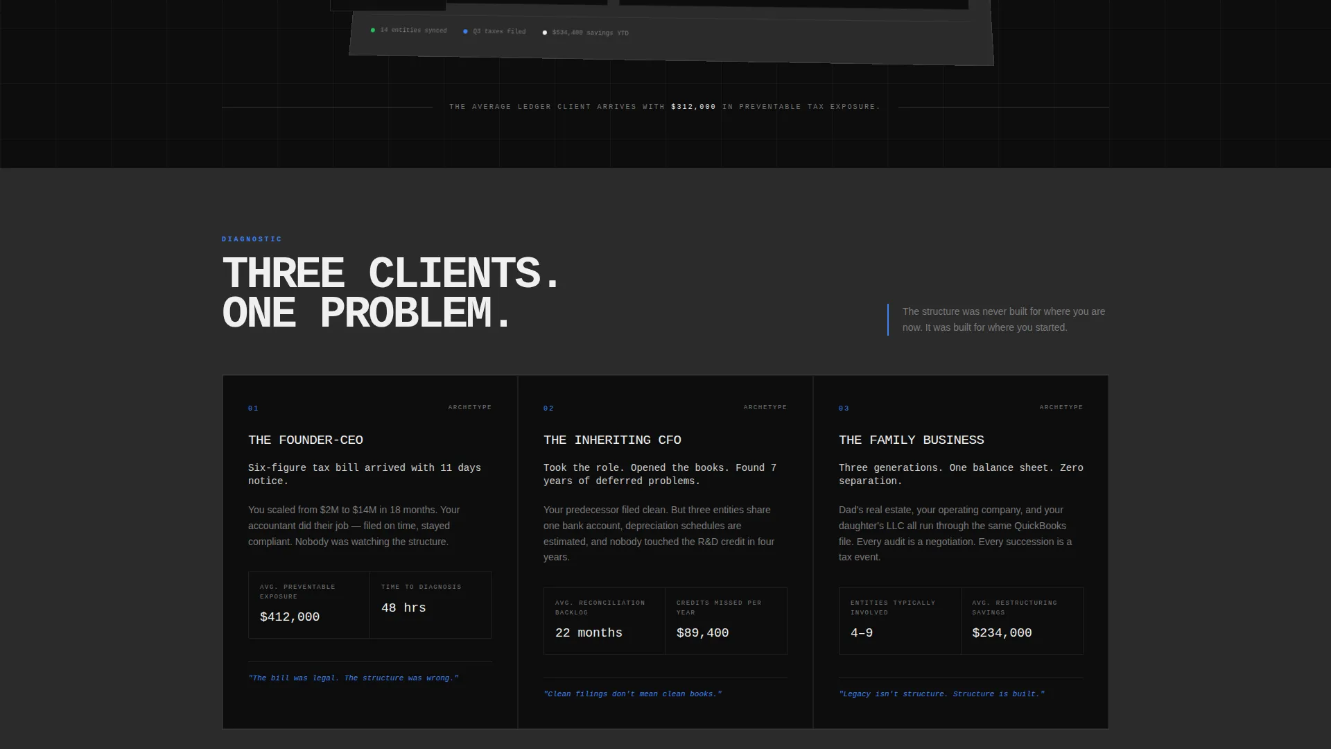
Most accounting firm pages look like brochures. They list services, show team photos, and ask visitors to call. That approach fails when your prospective client is staring at a six-figure tax bill they didn't see coming. This template is built for a different kind of conversation.
- Commodity positioning: generic service pages make every firm look interchangeable
- Missed urgency: visitors leave without feeling the cost of inaction
- Weak conversion path: forms and phone numbers ask for commitment before trust is built
What you get with this template
You get a fully structured, single-page layout that reads like a financial briefing rather than a marketing brochure. Every section is sequenced to move the reader from diagnosis to decision.
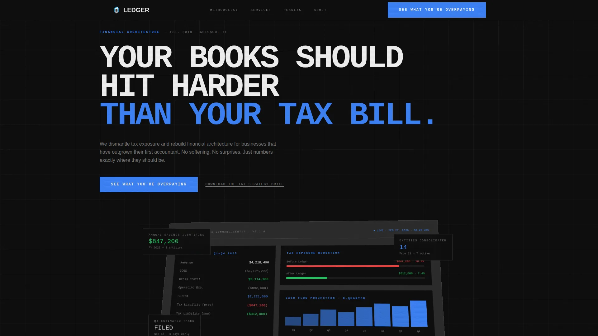
- A viewport-filling financial dashboard header with fictional but specific-feeling metrics
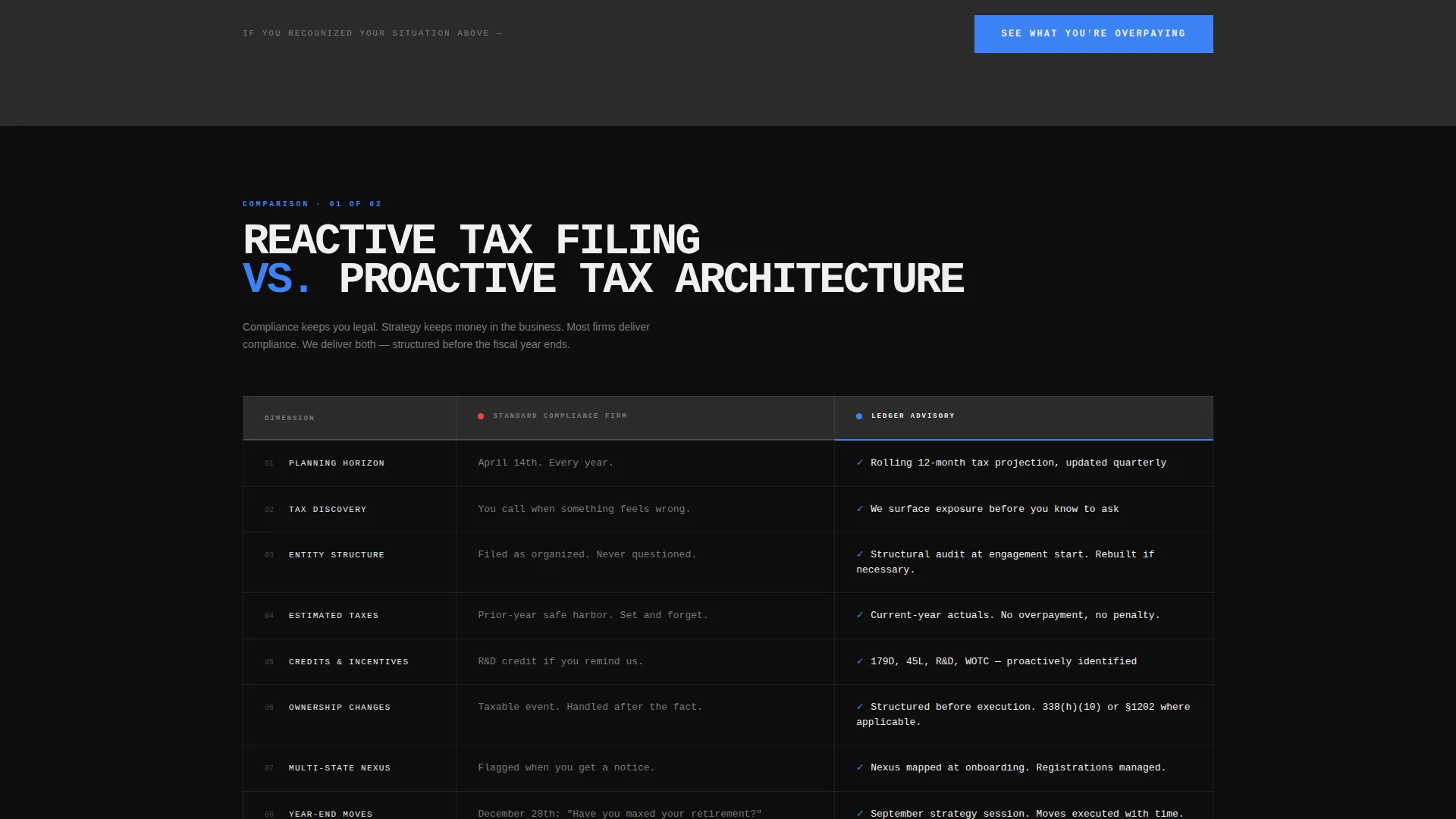
- Stark brutalist comparison tables pitting common pain points against the firm's methodology
- A click-through call to action structure routing visitors to a diagnostic intake page
Feature list
This template ships with a focused set of high-impact design and structural components, each serving the click-through conversion goal.
Financial Dashboard Header
The header fills the entire viewport with a stylized financial command center. It shows P&L summaries, tax liability gauges, and cash flow projections at a slight isometric tilt. Numbers are specific and fictional, designed to feel credible and immediately relevant to the target reader.
Brutalist Comparison Tables
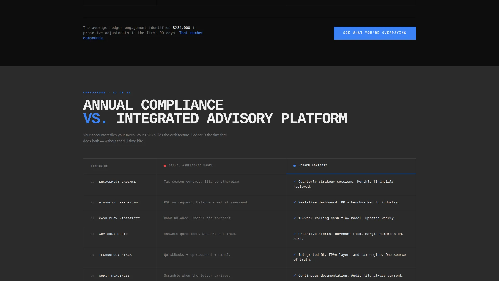
Each section presents a side-by-side comparison table in a hard-edged grid format. Columns pit reactive approaches against the firm's proactive methodology. Tables use no rounded corners and no gradients, reinforcing the precision and authority of the brand voice.
Escalating Scroll Narrative
The page structure moves from diagnostic to prescriptive to evidentiary. Each section ends on an unresolved number or tension that earns the next scroll. This rhythm keeps high-intent readers engaged through the full page.
Click-Through call to action System
The primary call to action, "See What You're Overpaying," appears at the header and repeats after each comparison table. On mobile, it anchors as a fixed bottom bar. No form appears on this page. A secondary text link, "Download the Tax Strategy Brief," captures email for visitors not yet ready to click through.
Carbon Fiber Visual System
The entire page uses a four-tone Carbon Fiber color system: structural black, machined graphite, titanium mid-tone, and hazard white. Interactive elements flash cold electric blue on hover and toggle states. The result is a visual identity that reads like the inside of a vault door.
Monospace Typography Treatment
Headlines and key data points are stamped in brutalist monospace type. This typographic choice reinforces the financial-report aesthetic and makes numbers feel precise and authoritative rather than decorative.
Page sections overview
| Section | Purpose |
|---|---|
| Dashboard Header | Establish credibility with a financial command center visual |
| Primary call to action Bar | Route high-intent visitors to the diagnostic intake page |
| Diagnostic Comparison Table | Surface common accounting pain points side by side |
| Prescriptive Comparison Table | Present the firm's methodology against reactive alternatives |
| Evidentiary Metrics Block | Display bold monospace client outcome data |
| Repeat call to action Block | Reinforce the click-through prompt after evidence section |
| Secondary Lead Capture | Offer the Tax Strategy Brief download for email capture |
Design & branding system
The visual identity is Bold Brutalist, built entirely on the Carbon Fiber color system. Every design decision prioritizes weight, precision, and zero decorative warmth.
- Colors: structural black (#0D0D0D) and machined graphite (#2B2B2B) alternate as section backgrounds, with hazard white (#F0F0F0) for all text and cold electric blue (#3B82F6) for interactive states
- Typography: brutalist monospace for headlines and data; hard-edged layout grids with no rounded corners and no gradients throughout
- Surfaces: backgrounds alternate in hard-edged blocks, reinforcing the matte, load-bearing aesthetic of the Carbon Fiber palette
Mobile & speed optimization
The mobile layout preserves the template's authority without sacrificing usability on smaller screens. The fixed-bottom call to action bar is built specifically for mobile visitors who need a persistent nudge to click through.
- Fixed bottom call to action bar keeps "See What You're Overpaying" accessible on every scroll position on mobile
- Comparison tables reflow cleanly for vertical viewing without losing their hard-edged grid structure
- Dashboard header scales to remain visually impactful at smaller viewport widths
How this template helps you convert
The template is built around a single conversion goal: getting the right visitor to click through to the diagnostic intake page. Every design and copy decision serves that goal.
- The dashboard header creates immediate financial credibility by showing specific, realistic-feeling metrics before a single word of body copy is read.
- The comparison table structure makes the cost of the visitor's current situation concrete and visible, building the intellectual discomfort that makes clicking feel rational.
- The repeated call to action placement after each table section removes friction at every natural decision point, so a visitor who is ready to act never has to scroll to find the next step.
Other information about this template
This template is part of a focused category of accounting firm services page templates designed for practices that have moved well beyond basic tax compliance work. It fits within the broader accounting firm website templates space but is specifically scoped as a landing page, not a multi-page site.
- The template style is Comparison Table, making it well suited to firms whose differentiation is best shown through direct contrast with industry norms
- The creative direction follows an Industry Report format, which suits firms whose clients respond to data and structured analysis over lifestyle imagery
- The header concept is a Dashboard Preview, a format that signals sophistication and operational control before any service description appears
- This template is categorized under Technology in the template marketplace, reflecting its modern, precision-oriented design system
Theme
Bold Brutalist
Creative direction
Industry Report
Color system
Carbon Fiber
Style
Comparison Table
Direction
Click-Through
Page Sections
Financial Dashboard Header
Brutalist Comparison Tables
Escalating Scroll Narrative
Click-through Call to Action System
Carbon Fiber Color System
Monospace Typography Treatment
Related questions
Does this template include a contact form?
Can I customize the comparison table content for my firm?
What does the financial dashboard header actually display?
Is this template a good fit for a generalist accounting practice?
How many times does the primary call to action appear on the page?



