Ledger - Ruthless Subscription Landing Page Template
Ledger is a bold brutalist subscription management landing page built for finance leaders who need to confront runaway SaaS costs head-on. It opens with a glowing dollar figure, builds pressure through scroll-reveal data sections, and drives conversions with a comparison table and dual call-to-action placement. The template is sharp, dark, and deliberately uncomfortable in all the right ways.
by Rocket studio
Quick summary
Ledger is a single-page, scroll-reveal landing page template for a financial services subscription management platform. It leads with a full-bleed glowing cost figure, builds through progressive data reveals, and closes with a comparison table and persistent audit call to action. Every design decision serves one purpose: make the cost of inaction impossible to ignore.
Who this template is for
This template is built for finance-focused teams who need to turn raw subscription data into a compelling case for action. It speaks directly to the people who feel the pain of unmanaged recurring costs every single day.
- Chief Financial Officers at mid-market companies managing 200 or more active software subscriptions
- Finance operations managers reconciling expense reports and hunting for duplicate vendor charges at month-end
- Startup controllers who have just discovered overlapping tool purchases across departments
What problem this template solves
Most businesses are losing money to subscriptions they cannot see clearly. Spreadsheets miss renewals, expense reports hide duplicates, and vendor contracts quietly roll over at higher rates. There is no shortage of pain, but there is rarely a page that makes that pain undeniable fast enough to drive action.
- Visitors arrive skeptical and leave before a value proposition lands
- Manual tracking processes look defensible until someone puts a dollar figure on their failure rate
- Generic SaaS landing pages do not speak the language of a CFO scanning a page at midnight
What you get with this template
You get a complete, production-ready scroll-reveal landing page structured to deliver financial shock first and explanation second. Every section is pre-built and arranged to create escalating urgency from the first viewport to the final call to action.
- A full-bleed hero section with a glowing phosphor-green cost figure and a character-by-character typewriter subheadline
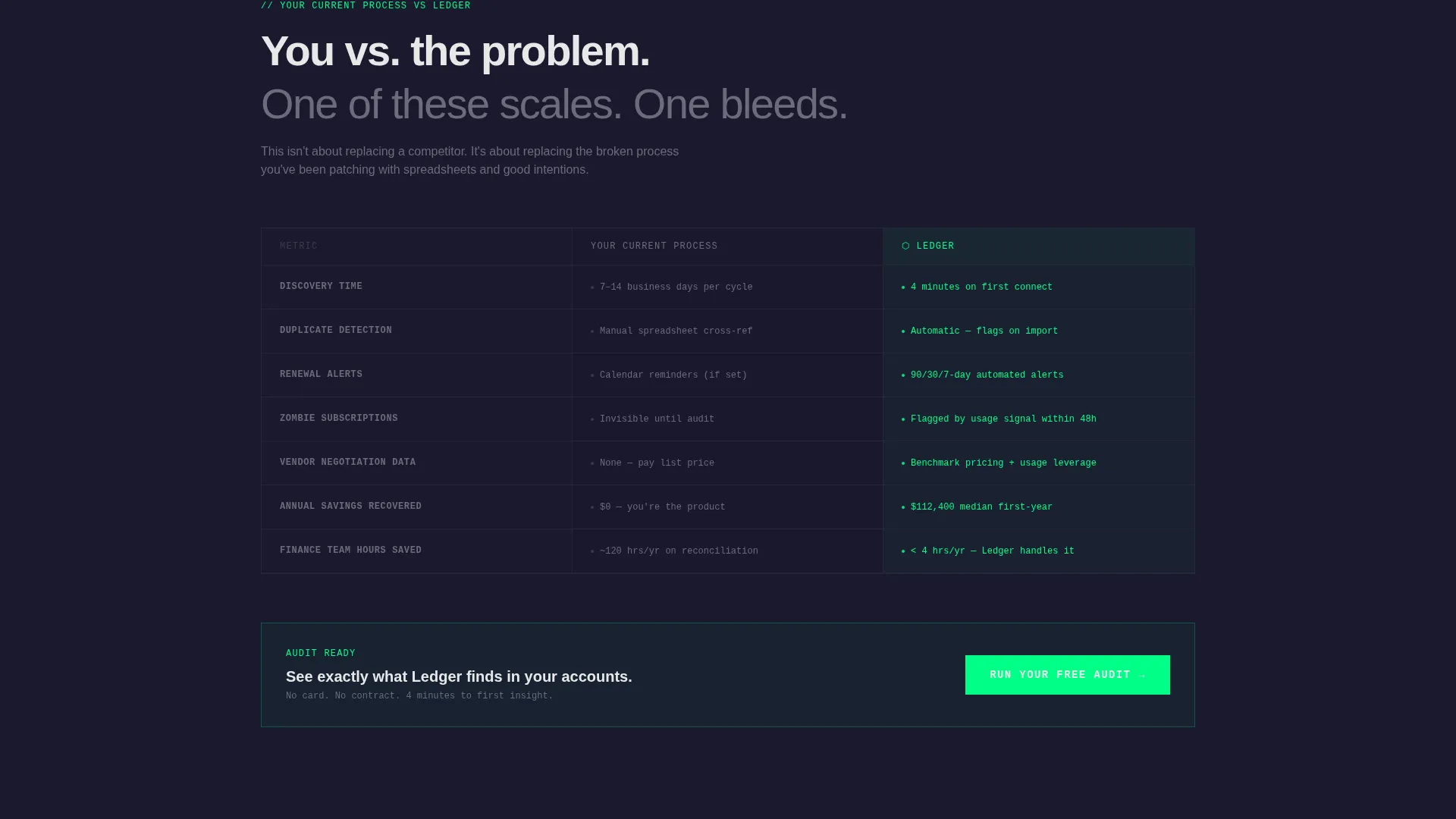
- A progressive comparison table pitting manual tracking against automated detection across five key rows
- A live counter simulation section, two strategically placed audit calls to action, and a gated PDF secondary conversion path
Feature list
This template is built around a specific conversion architecture. Each feature below reflects a deliberate structural or visual decision described in the source brief.
Full-Bleed Glowing Hero Section
The hero fills the entire viewport with a pitch-black background. A single phosphor-green dollar figure fades in at massive scale, surrounded by a soft radial glow. A typewriter-style subline appears character by character beneath it, setting confrontational tone before any explanation arrives.
Scroll-Reveal Progressive Data Flow
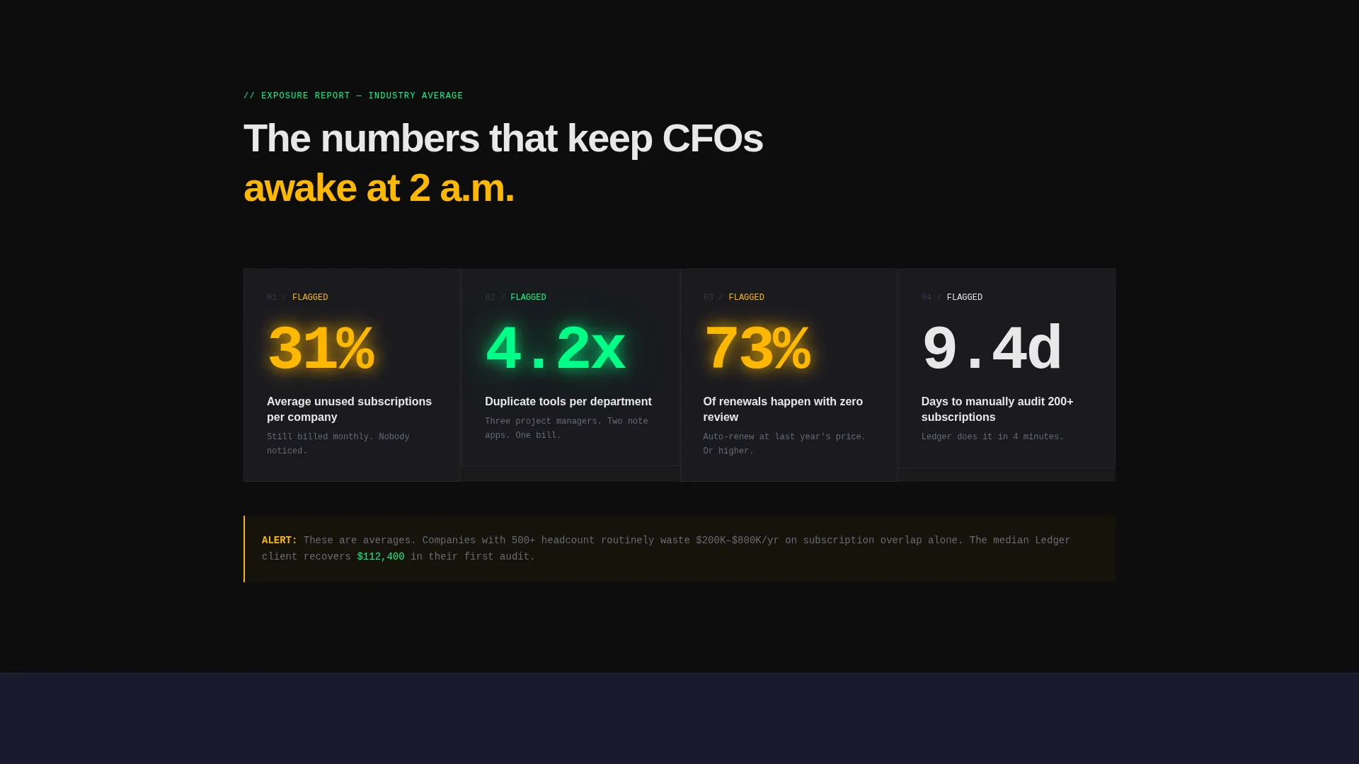
Each scroll step reveals a new data point before context appears. The visitor feels the weight of the numbers first. Explanation follows only after the emotional impact has already landed, which keeps attention locked and curiosity high throughout the descent.
Side-by-Side Comparison Table
The template includes a two-column table that builds row by row as the visitor scrolls. The left column shows the visitor's current manual process in muted graphite. The right column shows automated detection in phosphor green. Rows cover discovery time, duplicate detection, renewal alerts, vendor negotiation leverage, and annual savings recovered.
Live Counter Simulation Section
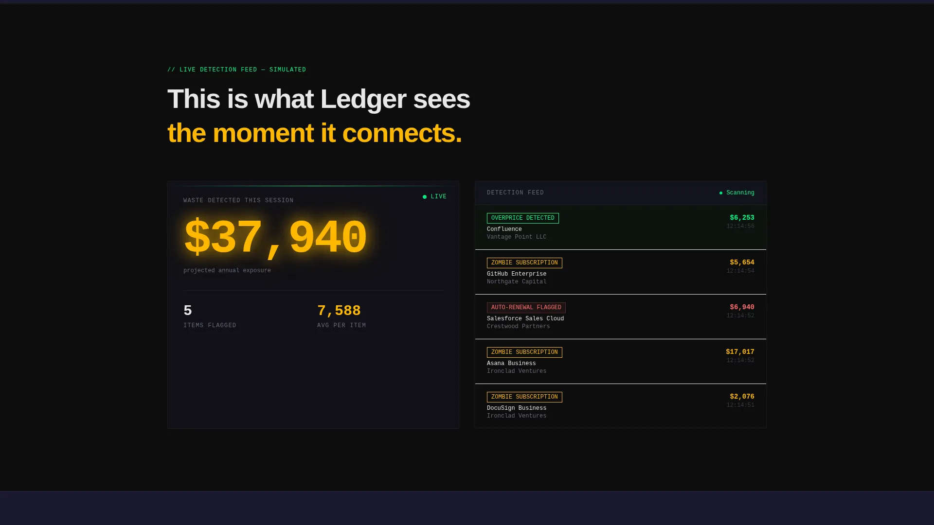
A dedicated section simulates subscriptions being flagged in real time. This creates the impression of active system intelligence and reinforces the platform's core value before the final call to action appears.
Dual Call-to-Action Placement
The primary call to action, labeled "Run Your Free Audit," appears twice: once directly after the comparison table and once as a persistent bottom bar that activates after 40 percent scroll depth. This ensures the conversion opportunity is always within reach without interrupting the scroll experience early.
Gated PDF Secondary Path
A secondary link labeled "See the Full Breakdown" opens a case study PDF gated behind a single email field. This provides a lower-commitment conversion option for visitors who are not yet ready to connect their expense platform but still want to engage with the content.
Page sections overview
| Section | Purpose |
|---|---|
| Hero: Cost Figure | Open with a glowing dollar amount to establish immediate financial shock |
| Subscription Waste Stats | Reveal average waste data point before any product explanation appears |
| Manual versus. Automated Table | Compare broken manual tracking against automated detection row by row |
| Live Flagging Counter | Simulate real-time subscription detection to demonstrate platform intelligence |
| Primary Audit call to action | Capture work email, company size toggle, and expense platform connection |
| Persistent Bottom Bar | Keep the audit call to action accessible after visitor crosses 40 percent scroll depth |
| Gated PDF Path | Offer a case study download as a lower-friction secondary conversion option |
Design & branding system
The visual language is Bold Brutalist, built on a Carbon Fiber color system. Every palette choice is functional. Nothing decorates without a reason. The result feels like the cockpit of a stealth aircraft: silent and recessed until something demands your attention, then it burns.
- Core backgrounds hold between deep matte black (#0D0D0D) and woven graphite (#1A1A2E), with typography in stark white (#E8E8E8) set in oversized monospaced or heavy grotesque weights
- Phosphor green (#00FF87) drives live data accents and interactive elements, pulsing like a heartbeat on a monitor, while warning amber (#FFB800) marks cost alerts that need immediate attention
Mobile & speed optimization
The scroll-reveal structure is designed to perform on smaller screens without losing its tension. Progressive reveal animations are sequenced so each section loads its impact element before the explanatory copy, preserving the stats-first pacing on mobile viewports.
- Scroll-depth triggers for the persistent bottom bar and the comparison table row reveals are designed to work cleanly across touch-scroll and wheel-scroll interactions
- The single-column form flow (work email first, then company size toggle, then platform connection) reduces friction on mobile without requiring a redesigned input layout
How this template helps you convert
The conversion architecture is built around making inaction feel more expensive than signing up. The page earns the click before it asks for one.
- The hero section opens with a specific dollar figure rather than a generic headline, creating immediate personal relevance for any finance leader who lands on the page.
- The progressive comparison table dismantles the visitor's current process row by row, replacing the illusion of "good enough" with a concrete cost of staying manual.
- The dual call to action placement and low-friction secondary PDF path mean the page captures intent at two different commitment levels, recovering visitors who are not yet ready for the full audit flow.
Other information about this template
This template is a strong fit for financial services subscription management platforms that serve mid-market and enterprise finance teams. It is part of the Scroll Reveal (Progressive) template style family and pairs the Bold Brutalist theme with a Stats-First Impact creative direction.
- The template is categorized under Technology and Financial Services Software, making it relevant for SaaS spend management, software license auditing, and vendor contract oversight tools
- The lp_direction is Comparison/Versus, meaning the entire page architecture is optimized around contrast: the visitor's current broken process versus a better automated alternative
- The Carbon Fiber color system and Dark Full-Bleed and Glow header concept are matched intersection attributes, ensuring visual and structural coherence across the full template style set

Theme
Bold Brutalist
Creative direction
Stats-First Impact
Color system
Carbon Fiber
Style
Scroll Reveal (Progressive)
Direction
Comparison/Versus
Page Sections
Full-bleed Glowing Hero Section
Scroll-reveal Progressive Data Flow
Side-by-side Comparison Table
Live Counter Simulation Section
Dual Audit Call-to-action Placement
Gated PDF Secondary Conversion Path
Related questions
Who is the primary audience for this landing page template?
What conversion actions does the page support?
Can I edit the hero cost figure and data points?
What makes this different from a standard SaaS landing page?
Does the persistent bottom bar work across device types?



