Accounting Firm Privacy Policy Landing Page Template
Ledger is a modular card-grid landing page template built for accounting firms that need to communicate data privacy with clarity and confidence. It features a three-tab header switcher, expandable policy cards, a sticky app download bar, and a dark Dashboard Pro visual theme. The design turns a dense privacy policy into an approachable, explorable experience.
by Rocket studio
Quick summary
Ledger is a single-page accounting firm privacy policy template built on a modular card-grid layout. It uses a dark charcoal and sky blue color system, a three-tab interactive header, and expandable topic cards to make data privacy feel transparent rather than intimidating. The primary goal is earning visitor trust before delivering a low-friction app download prompt.
Who this template is for
This template is designed for accounting firms and financial service providers that handle sensitive client data and need to explain their privacy practices clearly. It speaks directly to the people most likely to scrutinize that information before they commit.
- Small business owners who have shared bookkeeping credentials and want reassurance
- Chief Financial Officers onboarding a new audit or advisory relationship
- Solo practitioners who need to understand exactly how their tax data is stored and protected
What problem this template solves
Most accounting firm privacy pages are walls of legal text that visitors abandon without reading. That silence creates doubt precisely when trust matters most. This template breaks the policy into digestible, self-contained card modules so visitors actually engage with the content.
- Dense policy documents push readers away before they reach the key safeguards
- Visitors cannot locate the specific information they care about without endless scrolling
- A disconnected layout fails to guide users toward the secure client portal or app download
What you get with this template
You get a fully structured, single-page privacy policy landing page built for an accounting firm audience. Every visual and interactive element comes pre-designed and ready to customize.
- A Feature Tab Switcher header with three labeled tabs and animated card clusters beneath each one
- A modular grid of expandable policy cards covering collection, sharing, retention, and encryption
- A sticky bottom bar with a two-field app download prompt that earns its ask through progressive transparency
Feature list
This template packs several purpose-built components that work together to turn a required legal document into a confidence-building experience.
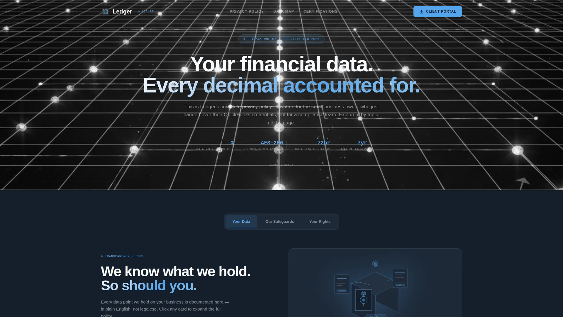
Three-Tab Header Switcher
The header opens with three clickable tabs labeled "Your Data," "Our Safeguards," and "Your Rights." Each tab reveals a different animated card cluster below it without triggering a page reload. The default tab displays a minimal isometric illustration of documents flowing into an encrypted vault alongside the headline "We know what we hold. So should you."
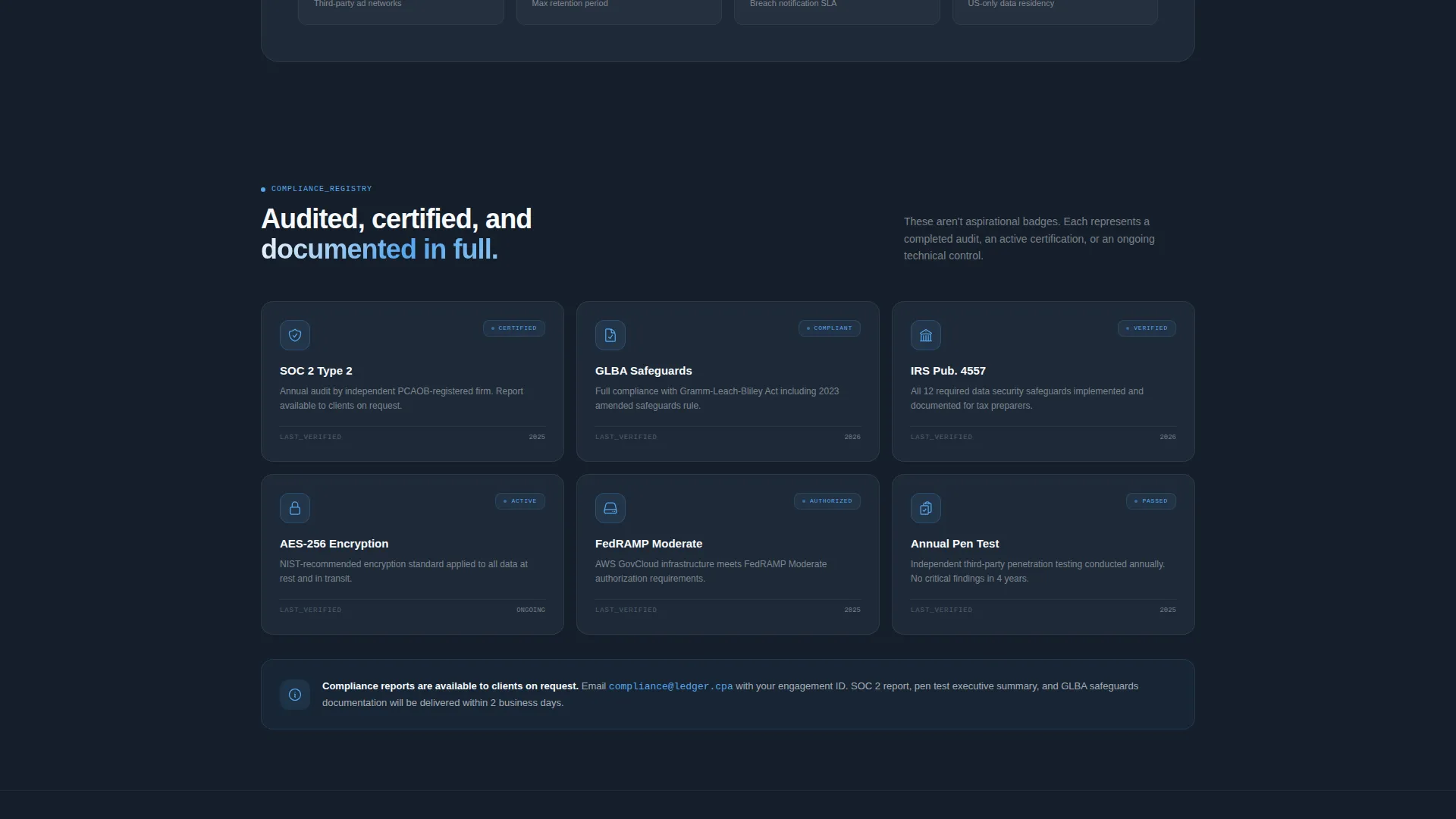
Expandable Policy Card Grid
Each modular card covers one self-contained policy topic such as Data Collection, Third-Party Sharing, Retention Periods, or Encryption Standards. Clicking a card expands it to reveal a plain-language explanation paired with a small iconographic diagram. Hover states pulse with a sky blue border to signal interactivity clearly.
Progressive Transparency Layout
As visitors scroll, the card sequence shifts from what-is-collected, to how-it-is-protected, to what-the-user-controls. This intentional ordering builds a sense of progressive transparency rather than dropping all information at once. The structure rewards attentive readers and reinforces the firm's organized, accountable identity.
Sticky App Download Bar
A sticky bottom bar appears after the visitor has interacted with at least two cards. The primary call to action reads "Download Our Secure Client Portal." It asks only for platform preference (iOS or Android) and an email address, keeping the conversion path to two taps and a send.
Secondary Data Map Path
A secondary call to action labeled "View Your Data Map" sits alongside the download prompt. It deep-links into the app's privacy dashboard, giving technically curious visitors a direct path to detailed data handling information without leaving the main experience.
Dashboard Pro Dark Theme
The entire page uses a deep charcoal slate background with mid-tone graphite secondary surfaces, sky blue interactive highlights, and clean white typography. The aesthetic reads like a well-organized accounting dashboard at early morning: precise, composed, and purposefully dark.
Page sections overview
| Section | Purpose |
|---|---|
| Tab Switcher Header | Organizes privacy content into three navigable topic clusters |
| Your Data Tab | Shows document-to-vault illustration and opening headline |
| Our Safeguards Tab | Surfaces protection-focused card cluster on click |
| Your Rights Tab | Reveals user control and rights-related card cluster |
| Data Collection Card | Explains what information the firm collects and why |
| Third-Party Sharing Card | Clarifies which parties, if any, receive client data |
| Retention Periods Card | States how long data is held and under what conditions |
| Encryption Standards Card | Describes the technical measures protecting stored data |
| Sticky Download Bar | Delivers low-friction app download prompt after card exploration |
| Data Map Link | Connects visitors to in-app privacy dashboard details |
Design & branding system
The visual identity follows a Dashboard Pro theme built around the Slate and Sky color system. Every color decision reinforces the feeling of a secure, organized financial environment.
- Deep charcoal slate (#1E2A38) fills card backgrounds; mid-tone graphite (#4A5568) defines secondary surfaces
- Open sky blue (#56A5EC) activates on interactive elements, hover states, and tab indicators
- Clean ledger white (#F7F9FC) handles all body typography and provides breathing room against the dark backgrounds
Mobile & speed optimization
The modular card-grid structure is inherently suited to narrower screens because each card is a self-contained unit. The layout adapts without requiring a full redesign of the content hierarchy.
- Cards reflow cleanly into single-column stacks on mobile viewports
- The sticky bottom bar remains anchored and accessible at all screen sizes
- Tab switching and card expansion use smooth reorganization animations rather than full-page transitions, keeping interactions feeling light
How this template helps you convert
The template is built around the principle that trust must be demonstrated before a download is requested. Every design decision supports that sequence.
- The tab switcher and card explorer let visitors self-direct their research, building genuine confidence in the firm's transparency before any ask is made
- The sticky download bar appears only after the visitor has explored at least two cards, earning the call to action through demonstrated openness rather than leading with it
- The two-field download form (platform choice plus email) removes decision fatigue and reduces the commitment barrier to its smallest possible footprint
Other information about this template
This template sits at the intersection of accounting firm website design and technology-category landing pages. It is particularly well matched to firms that already offer or plan to offer a client-facing mobile portal.
- The template style is Card Grid (Modular), making it straightforward to add, remove, or reorder policy topic cards as regulations or firm practices change
- The Interactive Explorer creative direction makes it a practical alternative to a static PDF privacy disclosure or a plain HTML policy page
- The App Download landing page direction means the conversion goal is clearly a portal or app installation, not a contact form submission
- The header concept (Feature Tab Switcher) is reusable for other firm pages that need to segment content by audience or topic without building separate pages


Theme
Dashboard Pro
Creative direction
Interactive Explorer
Color system
Slate & Sky
Style
Card Grid (Modular)
Direction
App Download
Page Sections
Three-tab Header Switcher
Expandable Modular Policy Cards
Progressive Transparency Scroll Flow
Sticky App Download Bar
Sky Blue Interactive Hover States
Dashboard Pro Dark Visual Theme
Related questions
Can I change the policy card topics to match my firm's actual practices?
Does the sticky download bar require a specific app or portal to work?
Is this template suitable for a firm that does not yet have a mobile app?
How difficult is it to update the color scheme to match an existing brand?
Who is the intended visitor for this landing page?


