Privacy-First Enterprise Software Complete Privacy Policy Website Template
Ledger is a privacy-first point-of-sale landing page template built for independent retailers who refuse to trade customer trust for convenience. The modular card grid layout, Dashboard Pro theme, and Midnight Blue color system combine to present a fully rendered POS interface that converts skeptical shop owners into confident trial signups without a credit card required.
by Rocket studio
Quick summary
Ledger is a single-page landing page template for a privacy-first point-of-sale system. It uses a modular card grid layout, a live dashboard header, and a Problem→Solution Arc to turn privacy anxiety into confident action. The design runs on a Midnight Blue palette with electric teal accents. The primary call to action drives a no-credit-card free trial.
Who this template is for
This template is built for founders and operators who sell directly to customers and cannot afford a data scandal. It speaks to people whose brand reputation depends on keeping customer information private.
- Independent bookshop owners who want to stop third-party data harvesting through their register
- Café and coffee shop operators who have promised regulars a no-spam experience
- Privacy-conscious boutique chains where a single data breach headline could end customer loyalty
What problem this template solves
Most point-of-sale marketing pages bury data-collection practices in fine print. Prospective buyers have no easy way to compare what competitors collect versus what a privacy-first system actually touches. This template addresses that trust gap head-on.
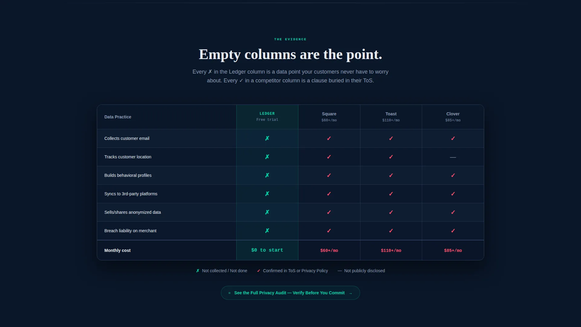
- It turns abstract privacy claims into visible, side-by-side proof through a full-width comparison table
- It dismantles competitor data practices with evidence-led card content before presenting the product as the solution
- It removes conversion friction by asking for only a shop name and email at signup, letting the form itself prove the product philosophy
What you get with this template
You get a fully structured, single-page landing page that takes a visitor from skepticism to trial signup through a deliberate narrative flow. Every section has a job, and every design decision reinforces the privacy message.
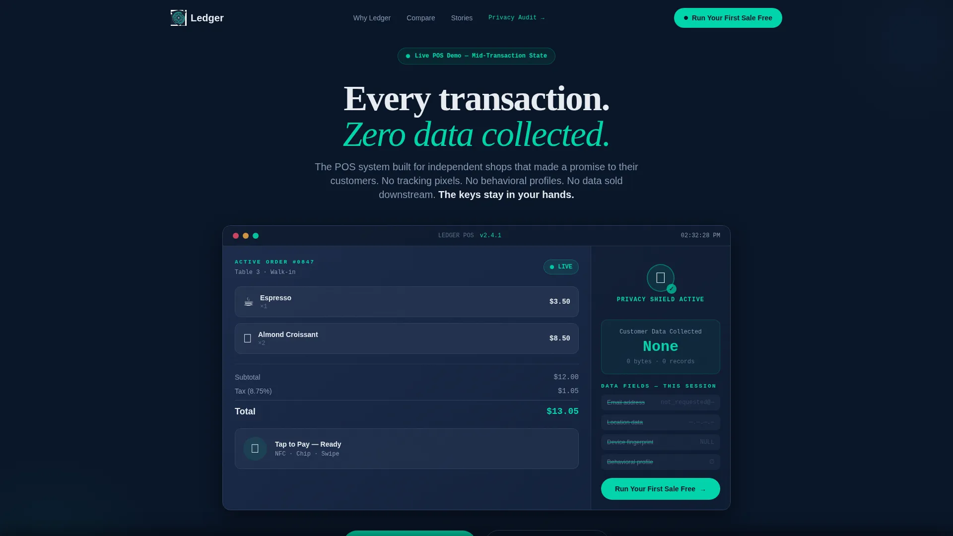
- A live dashboard header showing a mid-transaction POS state with a zero-data-shared badge and struck-through data fields
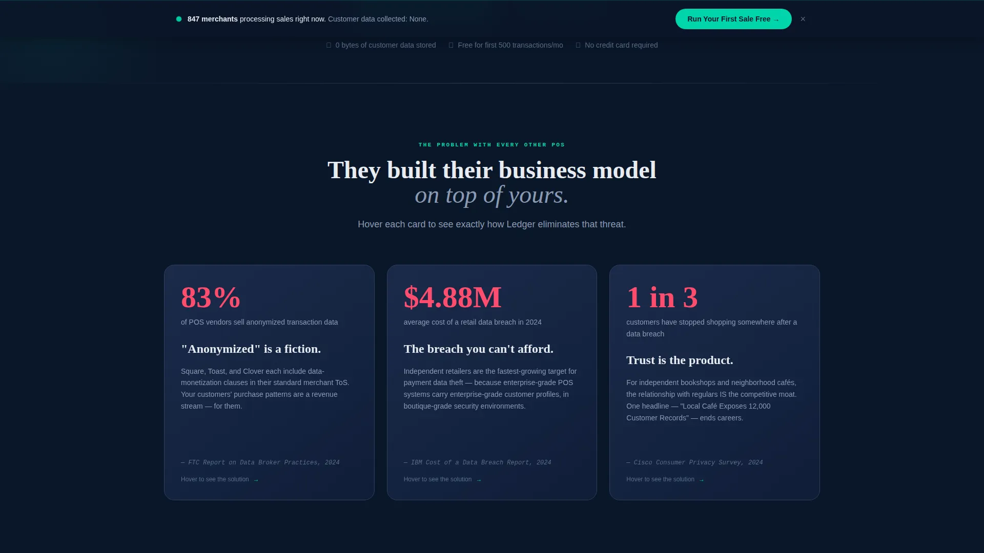
- A three-card problem row with hover-flip reveals connecting each data horror story to a specific product feature
- A sticky bottom bar and an in-header call-to-action both driving the same "Run Your First Sale Free" trial path
Feature list
This template packages several purposeful components into one cohesive landing page. Each feature below is drawn directly from the design brief and reflects what is built into the template.
Live Dashboard Hero Section
The header fills the entire viewport with a rendered POS interface mid-transaction. It shows one espresso, two pastries, and a tap-to-pay detected state. A privacy shield icon pulses green beside a zero-data-shared badge, and a sidebar lists every data field explicitly struck through in electric teal.
Hover-Flip Problem Cards
The first card row presents three real data horror stories in stark white-on-navy typography. Each card flips on hover to reveal the specific product feature that eliminates that threat. The interaction turns accusation into antidote in one gesture.
Full-Width Comparison Table
After the card rows, the layout opens into a wide comparison table. Ledger's data-collection columns are empty. Competitors' columns are filled. The contrast does the selling without a single marketing superlative.
Sticky Trial Conversion Bar
After the comparison table, a sticky bottom bar persists as the visitor scrolls. It repeats the primary call to action and keeps the trial path reachable at any point on the page.
Minimal Trial Signup Form
The trial form asks only for a shop name and an email address. No credit card, no phone number, no postal address. The form demonstrates the product's data-minimization philosophy before the visitor even clicks submit.
Secondary Transparency Path
A clearly labeled secondary link reads "See the Privacy Audit" and points skeptical visitors toward a transparency report. This gives cautious buyers a verification route without pulling them away from the primary conversion flow.
Page sections overview
| Section | Purpose |
|---|---|
| Viewport Dashboard Header | Show live POS state with zero-data badge |
| Problem Card Row | Present three competitor data horror stories |
| Hover-Flip Feature Cards | Reveal product solution behind each problem |
| Full-Width Comparison Table | Contrast Ledger data columns against competitors |
| Sticky call to action Bar | Keep trial signup accessible throughout scroll |
| Trial Signup Form | Collect only shop name and email to start |
| Privacy Audit Link | Offer a transparency report for skeptical visitors |
Design & branding system
The visual identity follows a Dashboard Pro theme built entirely on a Midnight Blue color system. Every color choice is functional. Nothing is decorative.
- Deep terminal navy (#0A1628) forms the primary background, giving the interface a focused, instrument-panel quality
- Muted slate (#1B2A4A) surfaces card backgrounds, separating content blocks without using borders or visual noise
- Crisp signal white (#E8ECF1) handles all primary typography and data display, while electric teal (#00D4AA) is reserved exclusively for live status indicators, toggle states, and calls to action
Mobile & speed optimization
The modular card grid layout is designed to reflow cleanly across screen sizes. The template avoids heavy decorative assets and stock photography entirely, keeping the visual weight low.
- Card components are modular and self-contained, making them straightforward to resize or reorder for smaller viewports
- The header relies on a rendered interface mockup rather than large image files, which supports faster initial load perception
- The sticky bottom bar remains accessible on mobile, keeping the trial call to action within thumb reach throughout the scroll
How this template helps you convert
The page follows a deliberate narrative arc that moves a skeptical visitor toward a single, low-friction action. Every structural choice is built to reduce hesitation.
- The Problem→Solution Arc builds tension through evidence before introducing the product, so the call to action lands after trust is already established rather than before it.
- The two-path conversion structure serves both ready buyers through the primary "Run Your First Sale Free" button and cautious researchers through the "See the Privacy Audit" secondary link.
- The minimal signup form, asking for only a shop name and email, removes the most common trial-abandonment trigger and reinforces the product's core promise in the same moment.
Other information about this template
This template is categorized under Technology and Privacy-First Enterprise Software. It is purpose-built for the privacy-first point-of-sale niche, where brand credibility depends on visible data practices rather than policy documents.
- The template style is Card Grid (Modular), making individual sections easy to update or reorder without breaking the overall layout
- The creative direction follows a Problem→Solution Arc, a structure well suited to products that compete against established players with questionable data practices
- The header concept is a Dashboard Preview, meaning the product interface itself serves as the hero visual with no reliance on stock photography or abstract illustration
Theme
Dashboard Pro
Creative direction
Problem→Solution Arc
Color system
Midnight Blue
Style
Card Grid (Modular)
Direction
Freemium/Trial
Page Sections
Live Dashboard Hero Section
Hover-flip Problem Cards
Full-width Comparison Table
Sticky Trial Conversion Bar
Minimal Two-field Signup Form
Secondary Privacy Audit Path
Related questions
Who is this landing page template designed for?
Does the trial signup form ask for a credit card?
Can I edit the problem cards and comparison table content?
What visual style does this template use?
Is there a path for visitors who are not ready to sign up immediately?



