Decentralized LMS Bento Grid Landing Page Template
Ledger is a Bold Brutalist bento grid landing page template built for a decentralized learning management system. It features an interactive LMS dashboard preview as the header, a feature matrix with legacy-versus-sovereign comparison toggles, and a low-friction migration form. Every design choice reinforces one idea: on-chain credentials that no institution can revoke or erase.
by Rocket studio
Quick summary
Ledger is a single-page bento grid template for a decentralized learning management system. It opens with a live interactive dashboard preview, moves through a systematic feature comparison matrix, and closes with a conversion form built for teams migrating off legacy platforms. The design is Bold Brutalist, cold, and intentional, built for Web3 educators who mean business.
Who this template is for
This template speaks directly to professionals building or rethinking learning infrastructure on decentralized foundations. It is not a general-purpose education template. It is made for operators who understand what on-chain credential permanence actually means.
- DAO education leads designing onboarding programs for decentralized communities
- Corporate learning and development teams ready to leave vendor-locked legacy platforms behind
- Web3 bootcamp founders who need portable, tamper-proof proof-of-learning for every graduate
What problem this template solves
Legacy learning management systems hold credentials hostage. Vendor shutdowns, contract disputes, and data migrations erase learner histories overnight. Teams waste time rebuilding records that should have been permanent from day one.
- Credentials tied to a vendor platform disappear when the contract ends or the company pivots
- Learner progress and micro-certifications have no portable, verifiable format across institutions
- Switching LMS providers feels risky because there is no clear, low-friction path to compare and migrate
What you get with this template
This template delivers a complete, conversion-focused bento grid landing page. Every section is scoped and ready to customize with your own course data, wallet logic, and branding tokens.
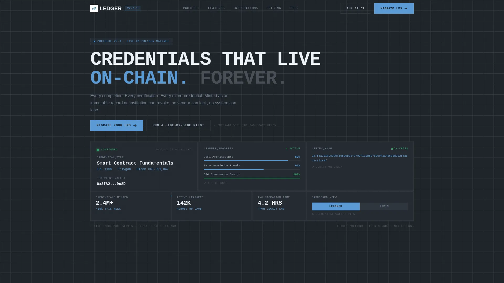
- An interactive header section mimicking a live LMS dashboard with credential minting, progress tracking, and hash verification tiles
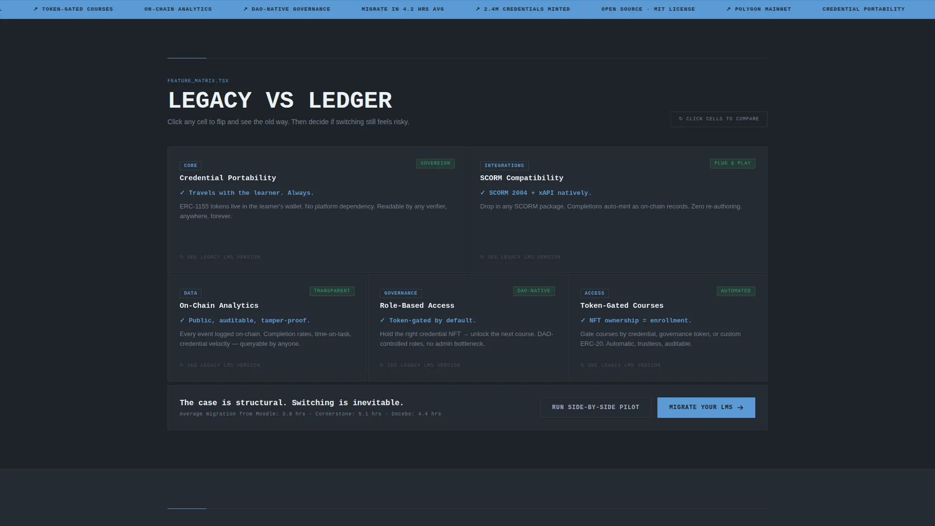
- A feature matrix section with built-in legacy-versus-sovereign comparison toggles for each capability cell
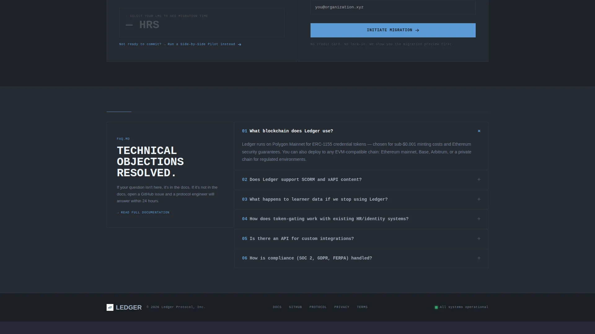
- A three-field migration conversion form with a dynamic average migration time display above the submit action
Feature list
This section walks through the core components built into the Ledger template. Each one reflects a deliberate design and interaction decision from the source brief.
Interactive Dashboard Header
The header is a functioning bento tile grid that simulates the actual LMS interface. One tile shows a credential being minted with a truncated wallet address and timestamp. Another displays a blocky course completion progress bar. A third renders a verification hash resolving character by character, like terminal output. Visitors can click tiles to expand them and toggle between learner view and admin view.
Legacy versus. Sovereign Feature Matrix
After the header, the page scrolls through a systematic comparison grid. Each bento cell isolates one platform capability: credential portability, on-chain analytics, role-based access, token-gated courses, and more. Every cell contains a toggle that flips between the legacy approach and the Ledger approach, with red-flagged struck-through text on the legacy side and verified portable state on the sovereign side.
Persistent Floating Call to Action
A floating "Migrate Your LMS" button appears after the visitor reaches the third scroll depth. It stays visible throughout the rest of the page, ensuring the primary conversion action is never more than one click away regardless of scroll position.
Dynamic Migration Form
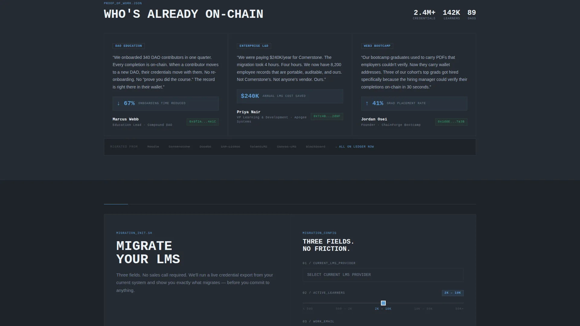
The conversion form asks three fields only: current LMS provider selected from a dropdown of the ten most common platforms, number of active learners via a range slider, and a work email address. A single line above the form displays the average migration time based on the selected provider, making the cost of switching feel measured rather than abstract.
Dual Conversion Path Layout
Two distinct conversion paths coexist on the page without competing. The primary call to action targets teams ready to commit to migration. A secondary path, "Run a Side-by-Side Pilot," routes hesitant teams toward a sandbox environment. This structure captures both decided and undecided visitors in the same scroll.
Bento Grid Layout System
The entire page is built on a bento grid. Sections expand, collapse, and group with intentional whitespace and raw unrounded edges. The grid makes dense technical information scannable without reducing it to a wall of text.
Page sections overview
| Section | Purpose |
|---|---|
| Interactive Dashboard Header | Hooks visitors with a live LMS tile simulation |
| Feature Comparison Matrix | Dismantles legacy LMS row by row with toggles |
| Floating Migration Button | Keeps the primary call to action accessible at all scroll depths |
| Migration Conversion Form | Captures lead data with three low-friction fields |
| Side-by-Side Pilot call to action | Offers a second path for teams not ready to migrate |
Design & branding system
The visual identity is Bold Brutalist with a Slate and Sky color palette. Every design token reinforces the aesthetic of raw infrastructure made legible.
- Core colors are deep gunmetal (#1E2328) for card backgrounds and section dividers, exposed concrete gray (#4A4F57) for secondary surfaces, atmosphere blue (#5B9BD5) for hover states and active toggles, and sharp ice white (#EDF2F7) for typography and card surfaces
- Typography is monospaced and heavy, white text on dark surfaces with no drop shadows and no gradients, only weight and contrast
- Interactive states use atmosphere blue exclusively, making every hover and toggle feel like a signal firing through a live network
Mobile & speed optimization
The bento grid layout is structured to adapt across screen sizes without losing the density that makes the desktop experience compelling. Tile interactions and toggle states are designed to remain usable on touch devices.
- Bento grid cells reflow for smaller viewports while preserving the visual hierarchy of each section
- The floating call-to-action button is positioned to avoid obscuring key content on mobile screens
- The three-field migration form is minimal by design, reducing input friction on any device
How this template helps you convert
Every layout and copy decision in this template is engineered toward one outcome: moving the right visitor from skeptic to convert without friction.
- The interactive header lets visitors experience the product before reading a single line of body copy, building trust through direct demonstration rather than abstract claims.
- The feature matrix comparison architecture makes switching feel structurally inevitable by dismantling the legacy alternative cell by cell, rather than simply listing benefits.
- The dual conversion path with a three-field form captures both high-intent visitors ready to migrate and lower-intent visitors who want a pilot, maximizing the yield from a single page visit.
Other information about this template
This template is built for the decentralized enterprise software category, sitting at the intersection of Web3 infrastructure and professional learning technology. It is category-specific, not general purpose.
- The template style is Bento Grid, the theme is Bold Brutalist, and the creative direction follows a Feature Matrix with a Comparison and Versus architecture
- The header concept is an Interactive Preview, meaning the product experience is the first thing a visitor sees, no hero illustration, no static banner
- This template fits the decentralized LMS niche and is appropriate for DAO tooling pages, Web3 education platforms, and on-chain credentialing products
- The color system is Slate and Sky, and the landing page direction is Comparison and Versus, both are deliberate signals to a technically literate audience that this product is infrastructure, not software-as-a-service
Theme
Bold Brutalist
Creative direction
Feature Matrix
Color system
Slate & Sky
Style
Bento Grid
Direction
Comparison/Versus
Page Sections
Interactive Dashboard Header Tiles
Legacy Versus. Sovereign Comparison Toggles
Persistent Floating Migration Call to Action
Dynamic Provider-based Migration Form
Dual Conversion Path Structure
Full-page Bento Grid System
Related questions
Can I customize the comparison toggle content for my own platform?
Does the interactive header require a live blockchain connection?
Who is the migration form designed for?
Can the secondary pilot call to action link to an external sandbox environment?
Is this template suitable for a non-Web3 learning platform?



