Healthcare Software & SaaS Booking Website Template
Ledger is a healthcare billing landing page template built for revenue cycle professionals who need clarity, not more complexity. It features a tab-switching hero, an anchor-navigated feature matrix, animated comparison grids, and an inline revenue estimator. The whole page drives one goal: getting qualified billing teams to book a live product demo.
by Rocket studio
Quick summary
Ledger is a single-page, hub-and-spoke landing page template for a medical billing and revenue cycle management platform. It opens with an interactive tab switcher, moves through five anchor-linked feature sections, and closes with an inline revenue estimator. Every design decision pushes one outcome: a demo click from a billing professional who finally sees their problem reflected on screen.
Who this template is for
This template is built for healthcare billing and revenue cycle teams who need a high-trust, data-forward landing page. It speaks directly to the people carrying the weight of claim denials and slow reimbursements every day.
- Billing managers at multi-provider practices managing high volumes of Electronic Remittance Advice (ERA) files
- Revenue cycle directors at rural hospitals watching reimbursement rates decline quarter over quarter
- Independent physicians who have cycled through multiple clearinghouses and need a credible alternative
What problem this template solves
Medical billing software is hard to sell with generic SaaS pages. Buyers are skeptical, technically literate, and burned by past vendors. This template solves the credibility gap by making the cost of inaction numerically visible before asking for anything.
- Claim denial rates and aging accounts receivable (A/R) days are shown as animated, before-and-after comparisons
- The page answers the "how is this different?" question with a structured feature matrix instead of vague bullet points
- Visitors can calculate their own projected annual revenue recovery, turning abstract benefits into a personal dollar figure
What you get with this template
You get a fully structured, single-page layout that guides billing professionals from problem awareness to demo intent. Every section is purposeful and built around the decision-making language of revenue cycle teams.
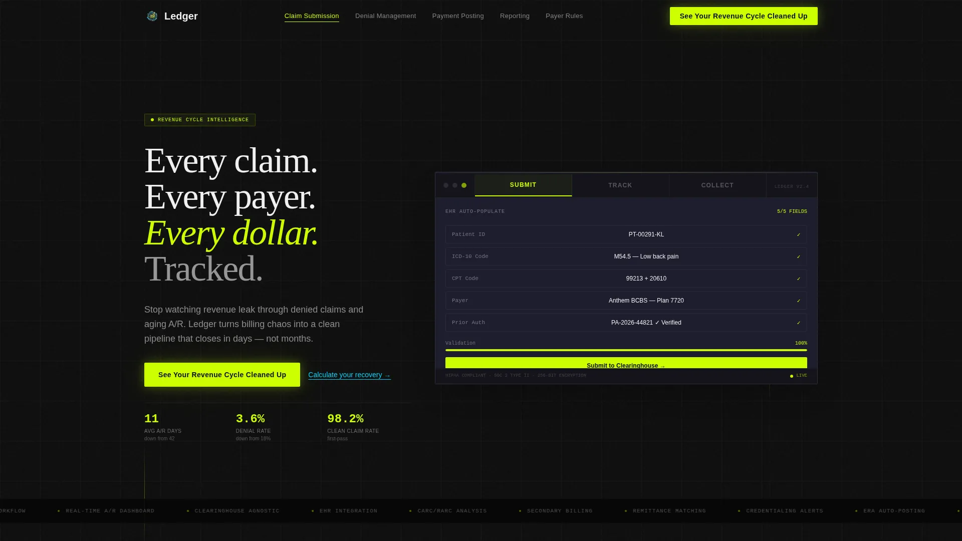
- A hero section with a three-tab switcher (Submit, Track, Collect) showing animated product mockup transitions
- Five anchor-linked spoke sections covering Claim Submission, Denial Management, Payment Posting, Reporting and Analytics, and Payer Rules Engine
- An inline revenue estimator that takes monthly claim volume and current denial rate, then outputs a projected recovery figure
Feature list
This template includes a focused set of interactive and visual components, each designed to serve a specific conversion role on the page.
Three-Tab Hero with Spring Transitions
The header features a Feature Tab Switcher with three labeled tabs: Submit, Track, and Collect. Each tab click triggers an animated transition inside a live product mockup frame using spring-physics easing. Submit shows a claim form auto-populating, Track reveals a color-coded pipeline view, and Collect displays a real-time reconciliation dashboard.
Fixed Anchor Navigation with Five Spokes
A fixed left-side anchor navigation links to five feature spoke sections. Clicking any spoke smoothly scrolls the visitor to the corresponding section without losing page context. This structure lets billing professionals navigate directly to the capability they care about most.
Animated Feature Comparison Matrix
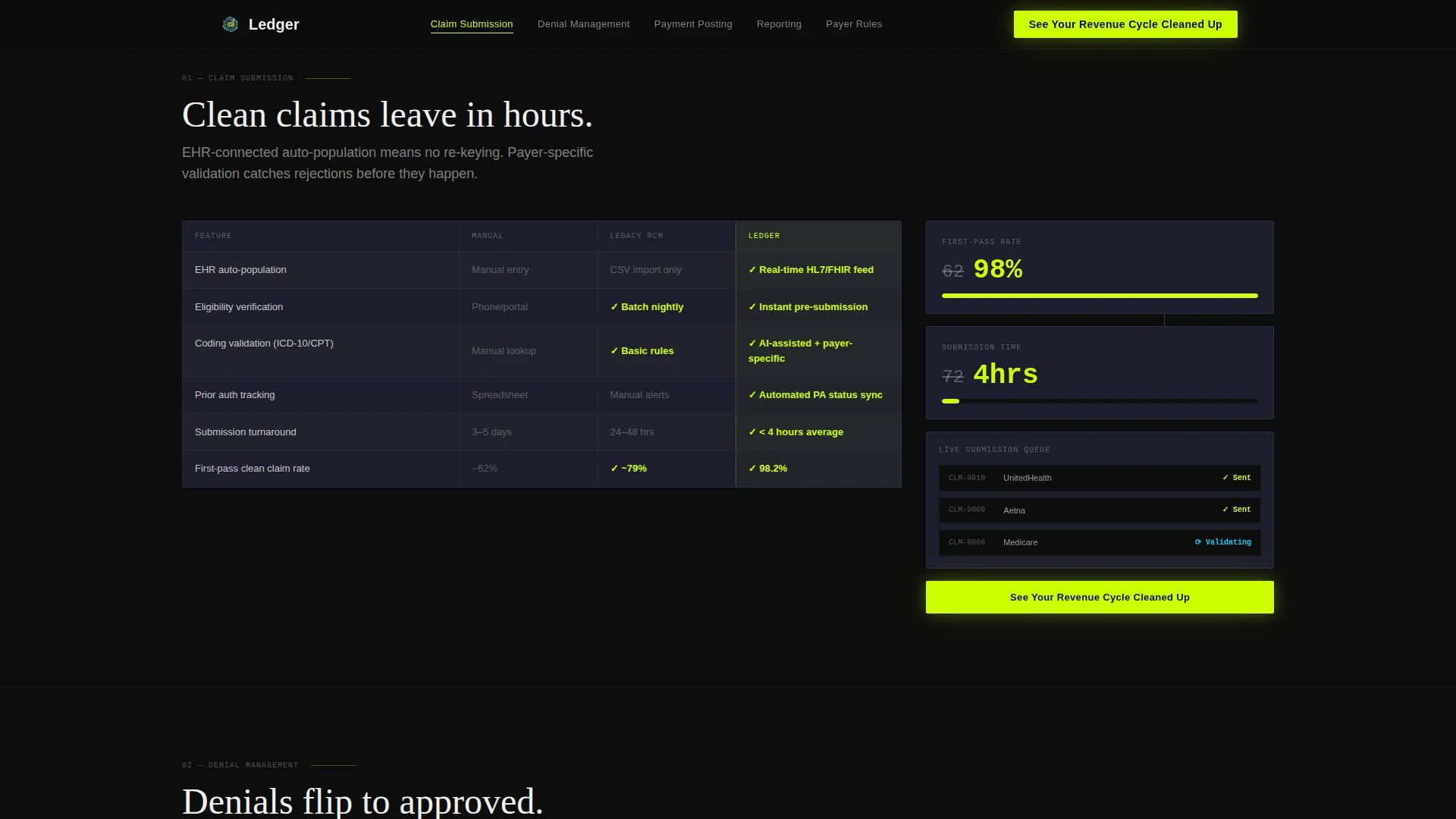
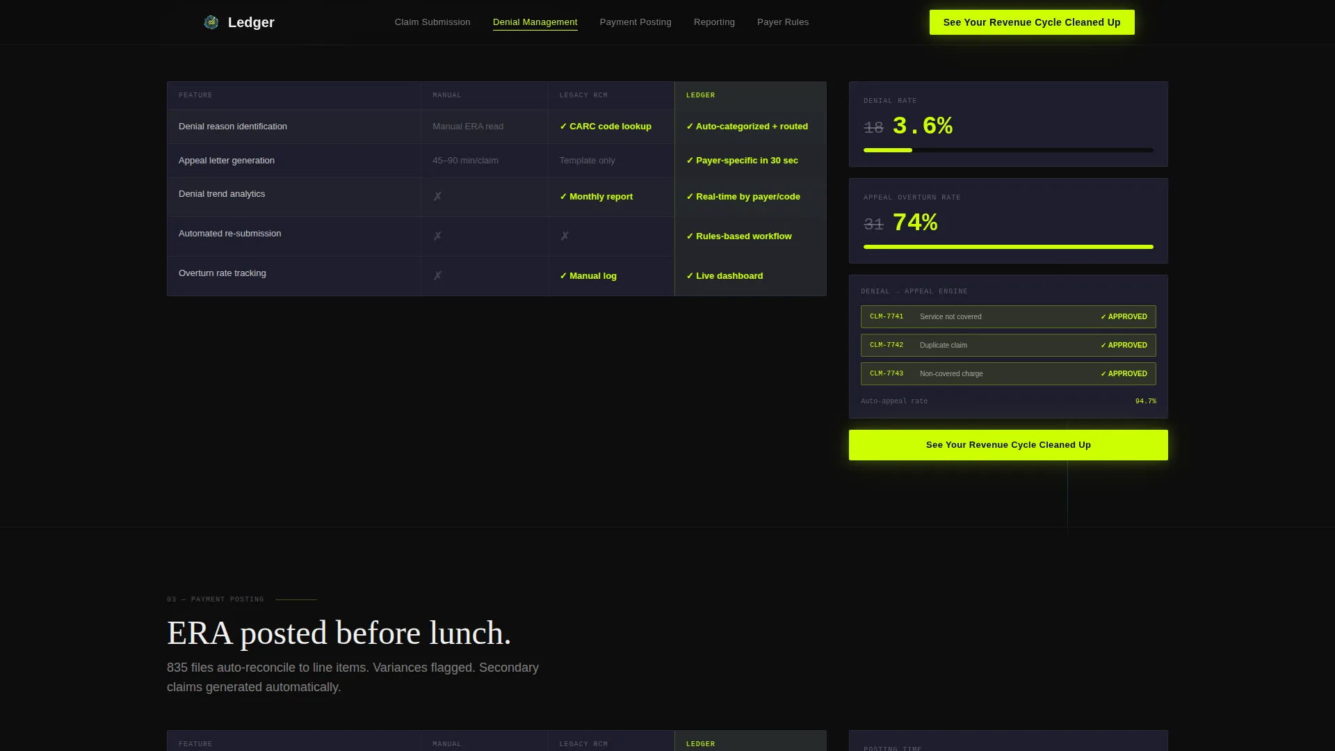
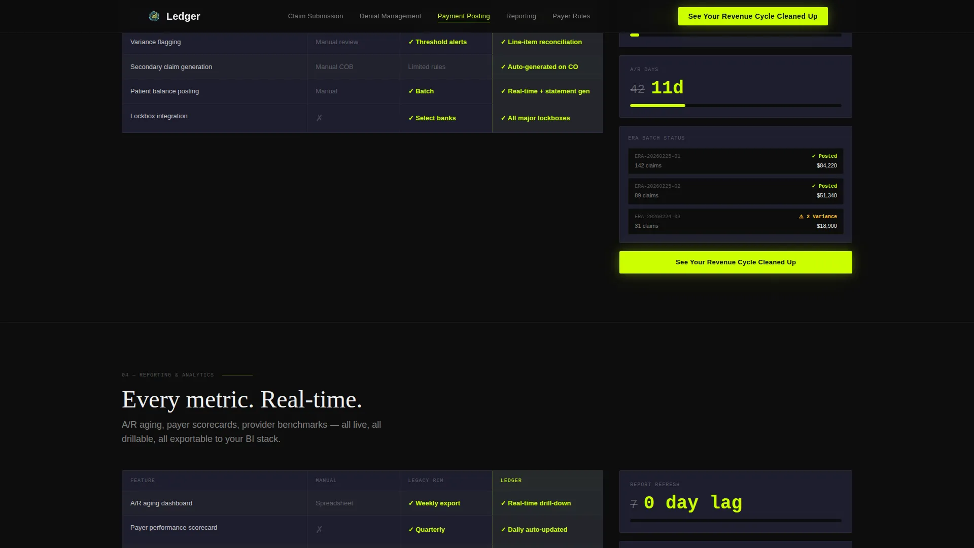
Each spoke section is built as a comparison grid with rows for individual features and columns for Manual, Legacy System, and This Platform. Chartreuse checkmarks and animated count-up metrics make the platform's advantages immediately scannable. Key metrics include A/R days dropping from 42 to 11 and denial rates falling from 18% to 3.6%.
Inline Revenue Estimator
A secondary text link labeled "Calculate your recovery" opens a lightweight inline estimator. Visitors enter their monthly claim volume and current denial rate. The tool outputs a projected annual revenue recovery figure in phosphor blue, and the primary call to action shifts to "Start Recovering This Amount."
Persistent Call-to-Action Button
The primary call to action, "See Your Revenue Cycle Cleaned Up," appears as a chartreuse button in the fixed anchor nav and repeats at the close of every spoke section. There is no form on this page. The only ask is a click through to a live product demo.
Section-Level Micro-Animations
Each spoke section carries its own motion treatment. Data flows across the Claim Submission section, status bars fill in Payment Posting, and denied claims visually flip to approved in Denial Management. These animations reinforce the Dynamic Motion theme and prevent the page from feeling static during scroll.
Page sections overview
| Section | Purpose |
|---|---|
| Hero Tab Switcher | Introduce platform with animated Submit, Track, Collect mockup tabs |
| Claim Submission Spoke | Compare manual versus. legacy versus. platform with animated metrics |
| Denial Management Spoke | Show denial-to-approval status flips and comparison grid |
| Payment Posting Spoke | Display reconciliation visuals and count-up A/R metrics |
| Reporting and Analytics Spoke | Present data output capabilities in the feature matrix format |
| Payer Rules Engine Spoke | Highlight intelligent payer logic with matrix comparison rows |
| Revenue Estimator Section | Inline calculator outputs projected recovery and shifts call to action |
| Footer | Single-row linear pattern with minimal links |
Design & branding system
The visual identity runs on an Acid Digital color system layered over a Dynamic Motion theme. The overall feel is a dark monitoring dashboard, high-contrast and purposeful, where every glowing element earns its place.
- Chartreuse (#CCFF00) is used for primary calls to action, data highlights, and comparison checkmarks, hitting the eye like a status light flipping from red to green
- Deep terminal black (#0D0D0D) covers section backgrounds, phosphor blue (#00D4FF) marks secondary indicators and hover states, and muted graphite (#1E1E2E) surfaces card backgrounds
- Typography pairs DM Sans for body and interface text with Fraunces serif for headlines, and all body text runs in pure white (#F0F0F0) against black fields for high-contrast readability
Mobile & speed optimization
This template is built desktop-first, reflecting how billing managers and revenue cycle directors actually work. The layout prioritizes large-screen readability and interactive density, with responsive behavior extending the experience to smaller screens.
- The fixed anchor navigation and comparison grids are optimized for widescreen displays where side-by-side column scanning is natural
- Interactive sections such as the tab switcher and inline estimator use client-side rendering, while static sections use server components to reduce load overhead
- Spring-physics animations are handled through motion libraries scoped to interactive components only, keeping non-interactive sections lightweight
How this template helps you convert
This template is designed as a click-through page. It does not collect form submissions. Instead, it earns the demo click by building numerical confidence before making any ask.
- The revenue estimator makes the cost of inaction personal. Visitors see their own projected recovery figure before they ever reach the call-to-action button, which removes the abstract risk from clicking through.
- The comparison matrix answers the skeptic's question head-on. Billing professionals can scan exactly how the platform compares to manual processes and legacy systems, feature by feature, without reading paragraphs of marketing copy.
- The persistent chartreuse call-to-action button stays visible throughout the entire scrolling experience. Repeating it at every spoke section close means the conversion moment is always one click away, regardless of where a visitor stops reading.
Other information about this template
Ledger is built for the US healthcare billing context and uses terminology native to revenue cycle professionals. References to ERA files, Electronic Explanation of Benefits (EOB), payer rules, and clearinghouse workflows are woven naturally into the page structure.
- The template uses DM Sans and Fraunces as its type pairing, available via standard web font delivery
- The footer follows a Pattern 1 Linear Single-Row layout, keeping the page exit clean and distraction-free
- Social proof elements such as role-specific testimonials and specific metric callouts are included as placeholder blocks ready for real data
- The page is localized for English-language audiences using United States dollars and US healthcare billing terminology throughout
Theme
Dynamic Motion
Creative direction
Feature Matrix
Color system
Acid Digital
Style
Hub & Spoke (Anchor Nav)
Direction
Click-Through
Page Sections
Three-tab Hero with Animated Mockup
Fixed Anchor Navigation
Animated Feature Comparison Matrix
Inline Revenue Recovery Estimator
Persistent Call-to-action Button
Section-level Micro-animations
Related questions
Does this template include a contact form or sign-up flow?
Can I customize the comparison matrix with my own metrics?
Who is this template designed for?
How does the inline revenue estimator work?
Is the tab-switching hero animation included in the template?



