Real Estate Donor Management Landing Page Template
Ledger is a card-grid landing page template built for real estate donor management platforms. It presents a dashboard-style interface, modular workflow cards, and a comparison-driven conversion flow. The design uses a Monochrome Steel palette with a signal cyan accent, giving nonprofit finance and development teams an immediate, confident first impression of the product.
by Rocket studio
Quick summary
Ledger is a single-page template designed for platforms that manage donated real estate from pledge to tax receipt. It combines a full-viewport dashboard header, a modular card grid showing core workflows, and a sticky comparison tool that turns a visitor's current pain into a reason to sign up. The result is a landing page that earns trust before it asks for contact details.
Who this template is for
This template is built for SaaS founders and product teams serving the nonprofit real estate giving space. It speaks directly to the professionals who use these platforms every day.
- Nonprofit CFOs reconciling property appraisals at fiscal year-end
- Development directors managing multiple simultaneous land donations from high-net-worth families
- Gift officers who need to present deeded asset status to a board of trustees
What problem this template solves
Real estate philanthropy generates a fragmented paper trail. Appraisal documents, deed transfers, IRS deadlines, and donor records rarely live in one place, and the cost of a missed step is significant.
- Manual spreadsheet reconciliation wastes time and introduces errors across large gift portfolios
- Generic CRM tools lack the workflow structure needed for qualified appraisal deadlines and staged deed transfers
- Board reporting on in-progress property gifts requires manual assembly from scattered sources
What you get with this template
The template delivers a complete, ready-to-customize landing page structured around the platform's core value. Every section has a defined job and a clear visual hierarchy.
- A full-viewport Dashboard Preview header showing a live-looking portfolio map, appraisal sidebar, and gift-closing progress ring
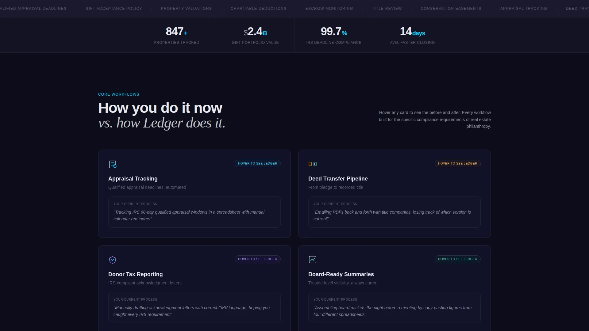
- A responsive card grid with hover-flip micro-interactions for four core workflows: Appraisal Tracking, Deed Transfer Pipeline, Donor Tax Reporting, and Board-Ready Summaries
- A sticky bottom bar call to action and a two-column interactive comparison tool with a three-field lead capture form
Feature list
This template is built around a set of purposeful design and interaction choices, each one grounded in the specific needs of real estate gift management.
Dashboard Preview Header
The header renders at full viewport width and displays a portfolio map with six pinned properties color-coded by donation stage. A sidebar shows recent appraisals with partially visible dollar figures, and a progress ring tracks quarterly gift closings. No stock photography is used. The interface looks mid-task, with a cursor hovering over a parcel in escrow.
Modular Card Grid Layout
Workflow cards are arranged in a responsive grid below the header. Each card represents one core process: Appraisal Tracking, Deed Transfer Pipeline, Donor Tax Reporting, or Board-Ready Summaries. The grid scales cleanly across screen sizes without losing its structural clarity.
Hover-Flip Micro-Interactions
Each card flips on hover to reveal a context-specific micro-interaction. Options include a tiny animated chart, a simulated document preview, or a before-and-after data transformation. This interaction pattern reinforces the comparison narrative built into the page.
Sticky Comparison call to action Bar
A persistent bottom bar carries the primary call to action: "See How You Compare." It stays visible as visitors scroll, maintaining conversion pressure without interrupting the content. The bar activates the two-column comparison tool without leaving the page.
Interactive Comparison Tool
The comparison tool lets visitors select their current workflow, such as spreadsheets, a generic CRM, or paper files. Ledger's advantages populate in real time beside the selected option. This makes the visitor's current process feel quantifiably costly before any contact information is requested.
Three-Field Lead Capture Form
The primary form collects organization name, estimated annual property gifts, and email address. Three fields, no friction. A secondary path offers a gated PDF comparison sheet for visitors who are not ready to engage directly, capturing the lead at a lower commitment level.
Page sections overview
| Section | Purpose |
|---|---|
| Dashboard Preview Header | Establishes product credibility with a realistic, data-rich interface view |
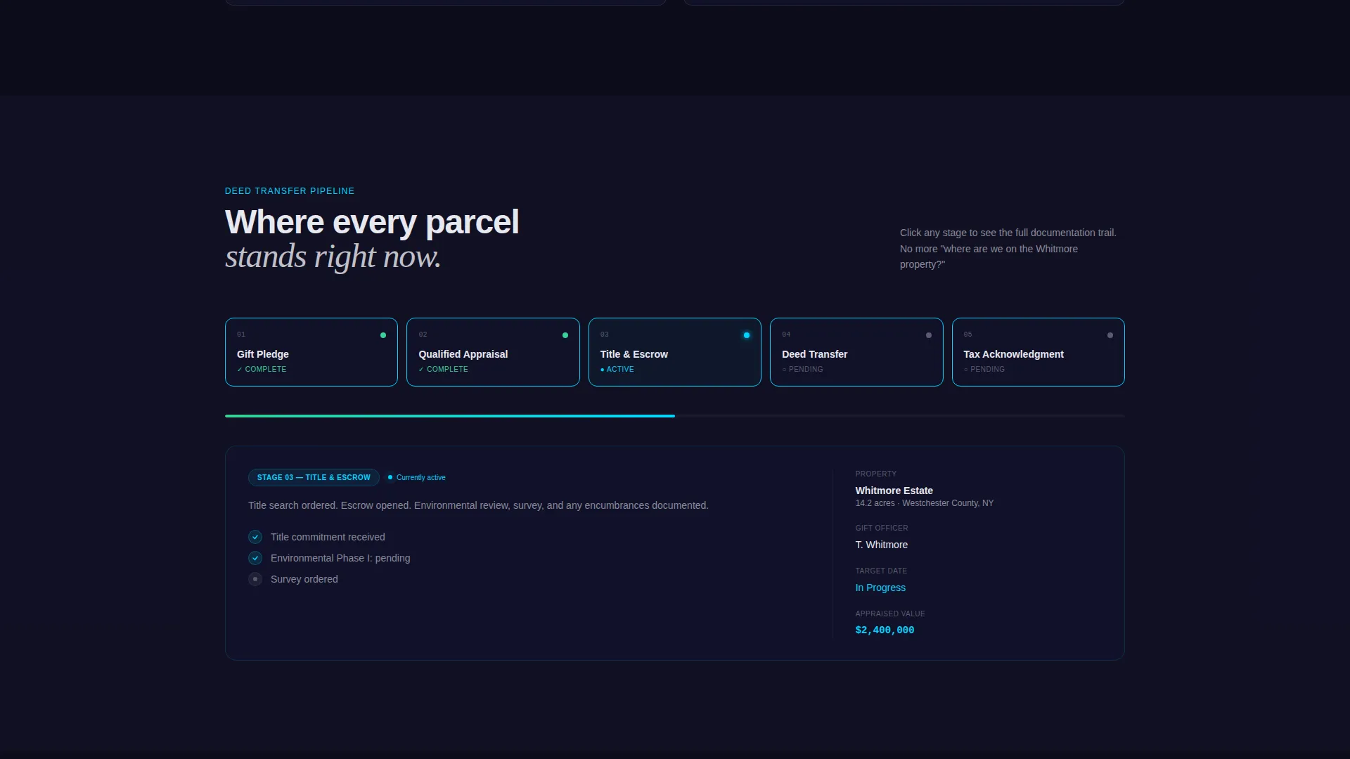
| Workflow Card Grid | Presents four core platform capabilities in scannable, interactive modules |
| Comparison Tool | Helps visitors quantify their current workflow pain against the platform |
| Lead Capture Form | Collects organization name, annual gift volume, and email in three fields |
| Sticky call to action Bar | Keeps the primary call to action visible throughout the scroll journey |
| Gated PDF Offer | Provides a lower-commitment lead capture path via downloadable comparison sheet |
Design & branding system
The visual identity uses the Monochrome Steel color system, styled around a Startup Velocity theme. Every color choice reinforces a sense of precision and engineered calm.
- Core palette: forge-black (#1A1A2E), brushed chromium (#C0C0C8), cold-rolled mid-gray (#5A5A6E), and signal cyan (#00D4FF) reserved strictly for interactive states and data highlights
- No lifestyle imagery or stock photography anywhere on the page; all visual content is product interface or data representation
- The overall feel is described in the brief as running your hand along a polished steel handrail in a brand-new co-working space: hard, clean, and engineered to stay out of the way of the work
Mobile & speed optimization
The card grid layout and full-viewport header are designed to adapt across device sizes. The modular structure makes responsive behavior predictable and straightforward to implement.
- Responsive grid columns reflow at standard breakpoints so workflow cards remain readable on smaller screens
- The sticky call to action bar is positioned to remain functional on mobile without obscuring primary content
- The two-column comparison tool is designed to present clearly without requiring wide viewport space
How this template helps you convert
Every structural decision in this template is oriented toward moving a skeptical nonprofit finance professional from curiosity to contact.
- The comparison tool surfaces the visitor's own workflow pain in quantifiable terms before any form appears, which builds a case for change without requiring sales pressure.
- The dual conversion path, a primary three-field form and a gated PDF download, lets visitors choose their own commitment level, capturing leads at two distinct stages of buyer readiness.
Other information about this template
This template sits at the intersection of real estate software and nonprofit technology. A few additional details are worth noting for teams evaluating it.
- The template style is Card Grid (Modular), making individual sections easy to reorder or extend as a platform grows its feature set
- The Interactive Explorer creative direction means the scroll experience is participatory, not passive, which suits technically confident buyers like CFOs and development directors
- The Comparison/Versus landing page direction is particularly well suited to markets where prospects are migrating away from spreadsheets or generic CRM tools rather than adopting a brand-new category
- The header concept, Dashboard Preview, is a proven approach for B2B SaaS products where the interface itself is the main selling point


Theme
Startup Velocity
Creative direction
Interactive Explorer
Color system
Monochrome Steel
Style
Card Grid (Modular)
Direction
Comparison/Versus
Page Sections
Full-viewport Dashboard Header
Responsive Modular Card Grid
Hover-flip Micro-interactions
Sticky Comparison Call to Action Bar
Two-column Interactive Comparison Tool
Dual Lead Capture Paths
Related questions
Who is this landing page template designed for?
Can I customize the card grid to show different workflow stages?
Does the template include the interactive comparison tool logic?
What is the purpose of the gated PDF offer?
Is the dashboard header built with live data?



