Accounting Exam Prep Landing Page Template
Ledger is a card grid landing page template built for accounting exam prep services. It combines a metrics-led header, FAQ-driven modular cards, and a warm Family First visual identity to guide working candidates through CPA, CMA, and EA exam decisions. The layout earns trust before asking for anything, leading visitors naturally toward a free study plan download.
by Rocket studio
Quick summary
Ledger is a single-page template designed for accounting exam prep services. It opens with five oversized proof-based counters, then flows into an expanding card grid where every card answers a real candidate question. The page closes with a low-friction lead form and a diagnostic quiz path, all wrapped in a warm teal-and-cream visual system.
Who this template is for
This template is built for accounting exam prep businesses that serve candidates who are balancing study with real life. It speaks directly to the emotional and logistical reality of working parents, career-changers, and first-generation graduates preparing for high-stakes professional exams.
- Accounting exam prep providers offering CPA, CMA, or EA (Enrolled Agent) coaching or study resources
- Independent instructors and small prep programs that need a credible, conversion-ready page without a large build budget
- Education businesses targeting adult learners who need reassurance as much as they need content
What problem this template solves
Most exam prep pages lead with price, features, or instructor credentials. Candidates who are juggling jobs and families do not respond to that approach. They arrive with specific fears: not having enough time, being too far removed from school, or not being able to afford a retake. This template addresses those fears head-on.
- Candidates abandon pages that feel corporate or generic before they find the information that would have convinced them
- A scattered layout forces visitors to work hard for answers, and busy adults simply will not do that
- Without a clear low-risk entry point, high-intent visitors leave without converting, even when the service is exactly what they need
What you get with this template
You get a fully structured, single-page layout that delivers trust signals, answers objections, and collects leads without friction. Every section has a defined role, and the visual hierarchy keeps candidates moving forward rather than bouncing.
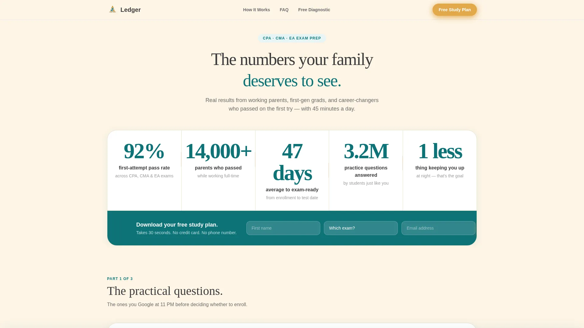
- A stats wall header with five oversized proof counters set in deep teal on soft cream backgrounds
- A modular FAQ-driven card grid where each card expands on click to answer a specific candidate concern
- Two lead capture paths: a three-field free study plan form and a five-minute diagnostic quiz with personalized resource output
Feature list
This section describes the core functional and design capabilities built into the Ledger template.
Stats and Metrics Header Wall
Five oversized counters open the page on a cream background. Numbers are set in heavy teal type with pencil-graphite micro-labels beneath each one. The metrics cover pass rates, candidate volume, study timelines, practice question totals, and an emotional proof point. No photography or illustration is used. The proof speaks on its own.
Expanding FAQ Card Grid
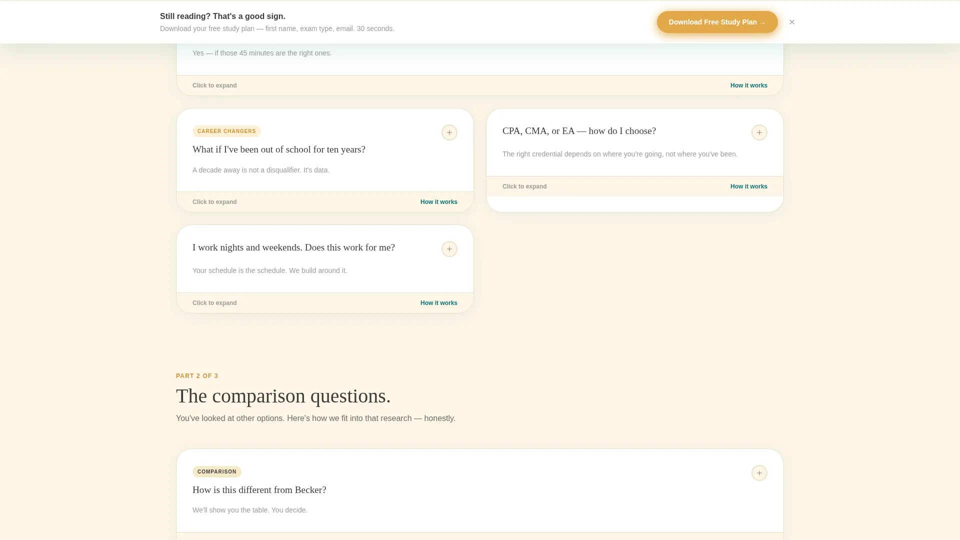
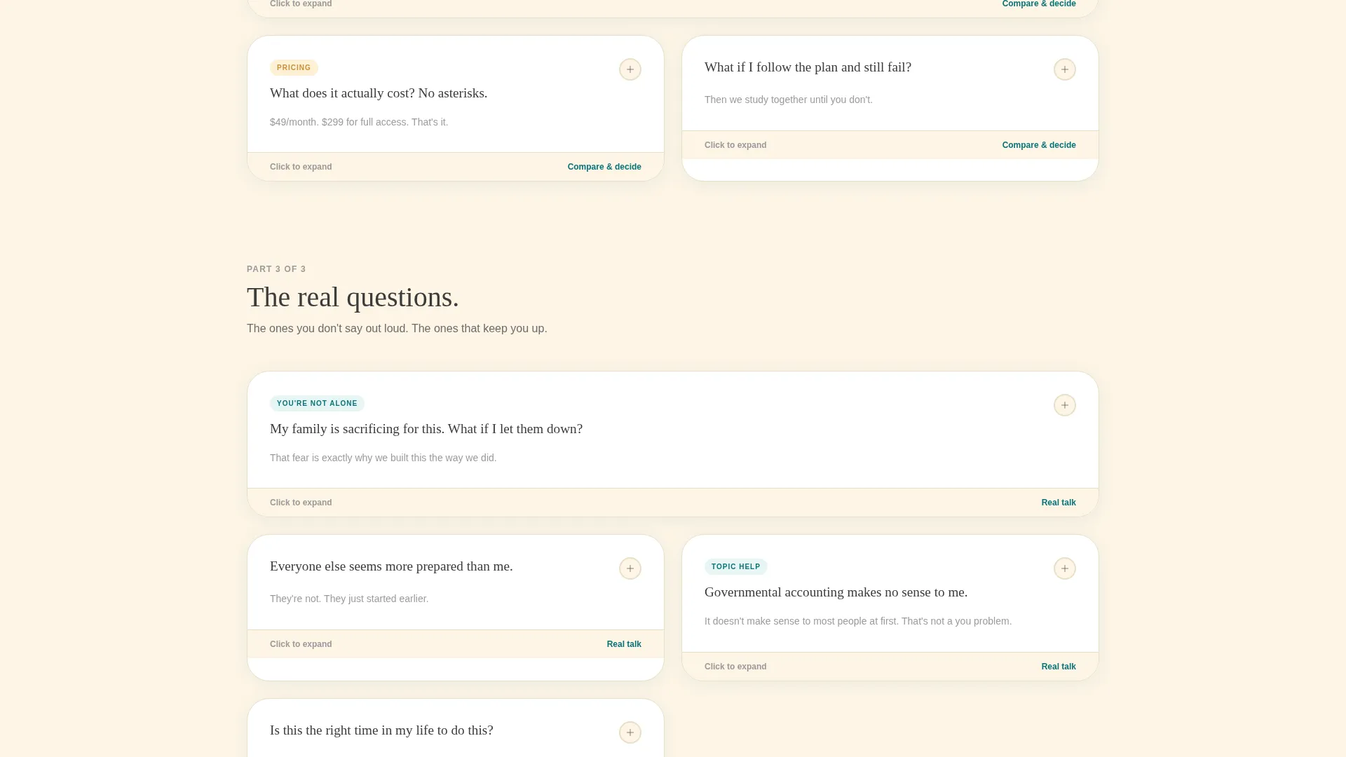
The card grid is the heart of the layout. Each card holds a closed question that expands on click to reveal a practical answer. Questions are ordered by emotional weight, starting with logistics at the top and moving toward fear and self-doubt lower on the page. This mirrors the real decision arc of a candidate choosing to trust a program with their family's future.
Dual Lead Capture Paths
The primary call to action, "Download Your Free Study Plan," appears inside the header metrics bar and again as a sticky bottom bar after the third card row. The form collects only first name, exam type, and email. The secondary path offers a five-minute diagnostic quiz that scores weak topics and returns a personalized card grid of recommended free resources.
Sticky Bottom Bar call to action
After the third row of cards, a persistent bottom bar keeps the primary call to action visible without interrupting the reading flow. The bar uses encouragement gold on the button and stays anchored as the visitor scrolls through deeper content. It removes the need to scroll back up to convert.
Warm Family First Color System
The Teal Catalyst palette is applied with intention throughout the layout. Deep study teal anchors headings and key numbers. Soft kitchen-light cream covers background surfaces. Pencil graphite handles body text for comfortable reading. Encouragement gold highlights progress indicators, badges, and all primary call-to-action elements.
Diagnostic Quiz Path
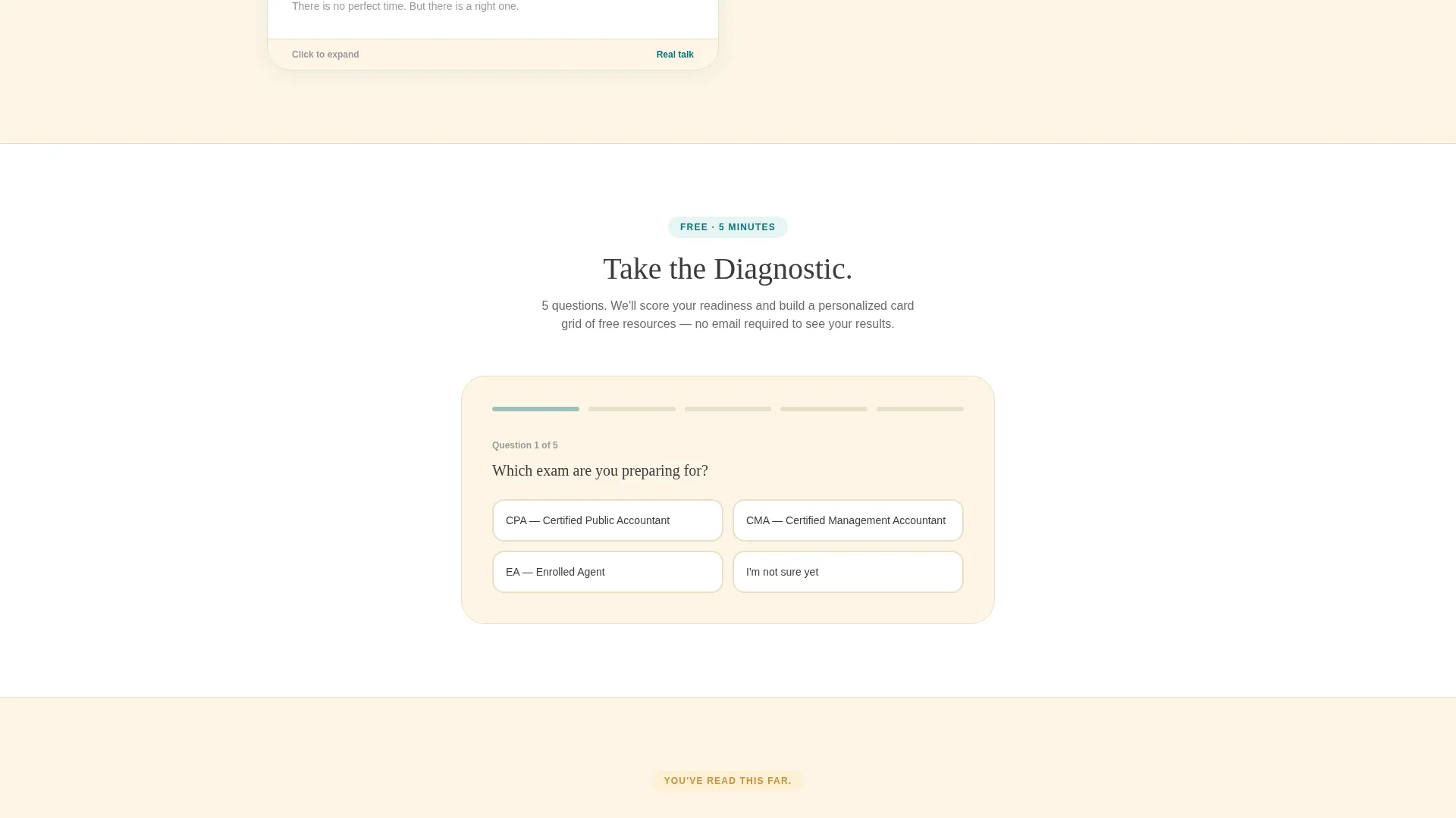
A secondary conversion route offers a five-minute interactive quiz. It scores a candidate's weak topic areas across CPA, CMA, or EA subject matter and delivers a personalized card grid of recommended free resources. This path lets hesitant visitors receive real value before they are asked to share any contact information.
Page sections overview
| Section | Purpose |
|---|---|
| Stats Metrics Header | Opens the page with five proof counters that establish credibility immediately |
| Primary call to action Bar | Embeds the free study plan download form directly inside the header section |
| FAQ Card Grid Row 1 | Addresses logistics questions like daily study time and schedule flexibility |
| FAQ Card Grid Row 2 | Handles knowledge-gap concerns like returning after years away from school |
| FAQ Card Grid Row 3 | Presents comparison and differentiation content for informed candidates |
| Sticky Bottom Bar | Keeps the primary call to action visible after the third card row |
| FAQ Card Grid Row 4 | Explores deeper emotional concerns around self-doubt and commitment |
| Diagnostic Quiz Section | Offers the five-minute quiz as a low-risk secondary conversion path |
| Resource Card Output | Displays personalized free resource recommendations after quiz completion |
Design & branding system
The visual identity follows a Family First theme built around warmth, reliability, and earned confidence. Every color and type choice reinforces the feeling of a well-organized study space rather than a slick marketing page.
- Deep study teal (#0D7377) anchors primary headings, oversized counter numbers, and structural highlights throughout the layout
- Soft kitchen-light cream (#FDF5E6) covers all major background surfaces, giving the page a lamp-lit, restful quality that reduces visual fatigue during long reading sessions
- Encouragement gold (#E2A84B) appears on progress indicators, badges, and all call-to-action buttons, including the sticky bar and the primary form submit element
Mobile & speed optimization
The card grid layout is modular by design, which makes it naturally suited to responsive display across screen sizes. Candidates studying on phones during a lunch break or a commute can navigate the page without losing context.
- Each card in the grid collapses to a readable single-column format on smaller screens, keeping the expand-on-click behavior intact
- The sticky bottom bar is designed to remain visible and tappable on mobile viewports without covering primary content
- The three-field lead form is minimal by design, reducing friction for candidates filling it out on a small keyboard
How this template helps you convert
The page is built around the principle that candidates who receive useful answers before being asked for anything are far more likely to convert. Every structural decision supports that idea.
- The header metrics wall delivers social proof immediately, before any scroll, so visitors know within seconds that real people have succeeded through this program
- The FAQ card grid answers objections in the exact order candidates feel them, reducing drop-off at each emotional stage of the decision and keeping hesitant visitors engaged through the deeper, more vulnerable questions
- The dual call to action structure gives candidates two natural entry points at different levels of readiness, so both action-ready visitors and research-phase visitors have a clear next step that does not feel forced
Other information about this template
This template is built specifically for the accounting exam prep niche and carries design and structural decisions that reflect the real emotional context of that audience. The page does not try to feel like a generic course platform or a corporate training provider.
- The template supports content for all three major accounting certification tracks: Certified Public Accountant (CPA), Certified Management Accountant (CMA), and Enrolled Agent (EA) exam preparation
- The FAQ card structure can be updated with any set of real candidate questions, making it straightforward to tailor the content to a specific exam type or study format
- The no-photography, no-illustration rule in the header is a deliberate design choice that keeps the page feeling grounded and proof-based rather than aspirational or generic
Theme
Family First
Creative direction
FAQ-Driven
Color system
Teal Catalyst
Style
Card Grid (Modular)
Direction
Content/Resource
Page Sections
Stats and Metrics Header Wall
Expanding FAQ Card Grid
Dual Lead Capture Paths
Sticky Bottom Bar Call to Action
Diagnostic Quiz with Resource Output
Family First Color and Type System
Related questions
Can I edit the FAQ card questions to match my own exam prep content?
Does the template include both lead capture paths out of the box?
Is the sticky bottom bar always visible, or does it appear after a scroll trigger?
Can this template be used for a single exam type, such as CPA preparation only?
What makes this template different from a standard course or education landing page?



