Accounting Homework Help Landing Page Template
Ledger is a single-page accounting homework help landing page built around a Comparison Table layout. It guides stressed accounting students from their specific struggle to the right support tier in one confident scroll. The Persona Selector header, Problem-to-Solution arc, and tiered workshop comparison make it easy for students to find their fit and register fast.
by Rocket studio
Quick summary
Ledger is a landing page template for an accounting homework help service. It opens with a Persona Selector that reshuffles content by student type, then walks visitors through a Problem-to-Solution arc before presenting a three-tier workshop comparison table. The primary goal is event registration, and every section is built to move a panicking student toward booking a seat.
Who this template is for
This template is built for accounting educators, tutoring services, and academic support businesses that serve students at every stage of their accounting journey. If your audience arrives stressed and leaves needing a clear next step, this layout was designed for them.
- Tutoring services staffed by CPAs or accounting graduate students
- Academic support platforms targeting undergraduate and MBA accounting students
- International student study programs working through Generally Accepted Accounting Principles (GAAP) concepts
What problem this template solves
Most tutoring landing pages dump a list of services on the visitor and hope they scroll far enough to convert. Accounting students, in particular, arrive overwhelmed. They need to feel understood before they feel ready to book anything.
- Students cannot quickly identify which service tier matches their current need
- Generic tutoring pages do not reflect the specific pain of intermediate financial accounting or consolidation adjustments
- No clear path exists between "I'm lost" and "here's what I should book tonight"
What you get with this template
You get a fully structured, single-page layout that handles the entire student decision journey from identification to registration. Every section is purposeful and sequenced to reduce drop-off at each scroll stage.
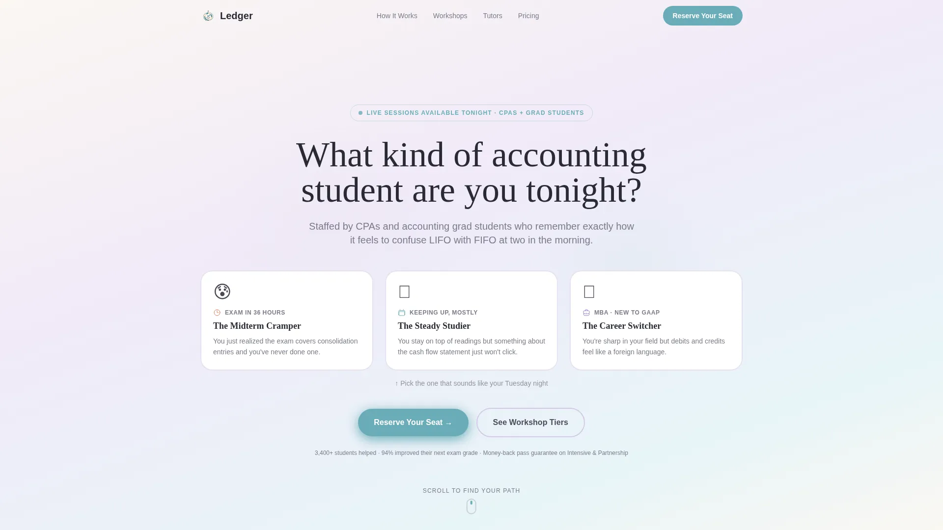
- A clickable Persona Selector with three illustrated student archetypes that reshuffles page content on selection
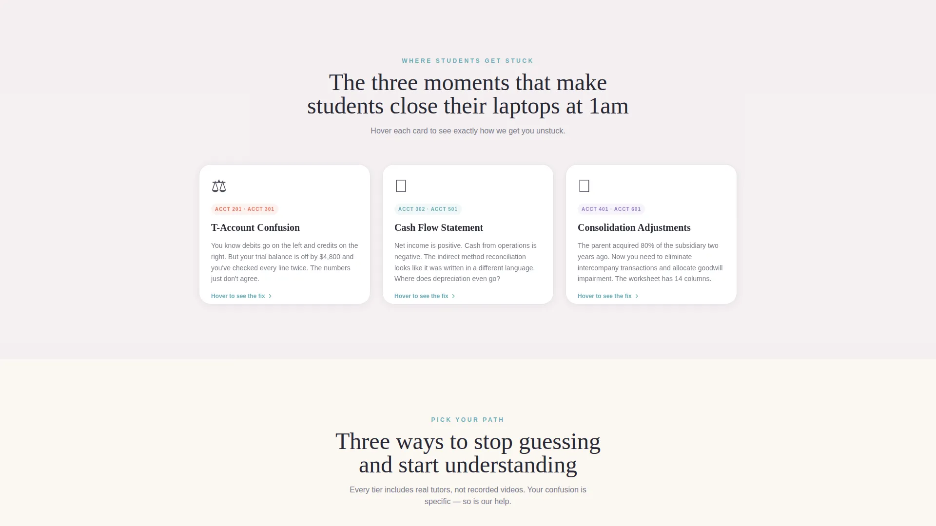
- A Problem-to-Solution section with three flip-card problem scenarios, each revealing its corresponding service solution on hover
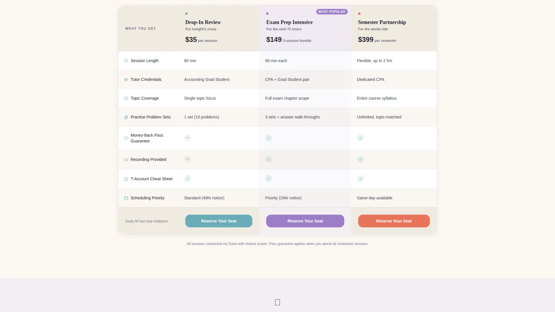
- A three-tier workshop Comparison Table with rows for session length, tutor credentials, topic coverage, practice problem sets, and a money-back pass guarantee
Feature list
This template ships with a focused set of interactive and structural components drawn directly from the brief.
Persona Selector Header
Three illustrated student archetypes sit side by side at the top of the page. Each is clickable. Selecting one reshuffles the content below to show the most relevant help packages, testimonials, and workshop schedules for that student type.
Problem Flip-Card Section
The "Where Students Get Stuck" section presents three relatable failure scenarios: T-account confusion, statement of cash flows, and consolidation adjustments. Each card flips on hover to reveal exactly how the service addresses that specific gap.
Three-Tier Comparison Table
A structured comparison table lays out Drop-In Review, Exam Prep Intensive, and Semester Partnership side by side. Rows cover session length, tutor credentials, topic coverage, included practice problem sets, and a money-back pass guarantee, giving students a clear basis for choosing.
Pinned Registration call to action
A "Reserve Your Seat" call-to-action button sits pinned at the bottom of the comparison table beside each tier. Clicking opens a lightweight registration form with fields for name, university, course code, preferred workshop date via a calendar picker, and auto-filled persona type.
Email Lead Capture Path
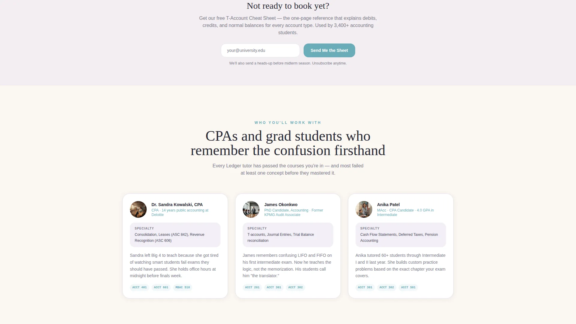
A secondary conversion option, "Send Me Free T-Account Cheat Sheets," captures email-only leads who are not yet ready to register. This entry point is designed to warm visitors toward booking through a drip sequence timed to midterm and finals calendars.
Course Code Dropdown
The registration form includes a dropdown of common accounting courses plus a free-text field. This lets students identify their exact course, making intake faster and tutor matching more precise.
Page sections overview
| Section | Purpose |
|---|---|
| Persona Selector Header | Segments visitors by student type and personalizes page content |
| Where Students Get Stuck | Presents three common accounting pain points as relatable flip cards |
| Problem-to-Solution Transition | Bridges the gap between struggle identification and service discovery |
| Workshop Comparison Table | Compares three service tiers across five decision-relevant rows |
| Reserve Your Seat call to action | Drives primary event registration with a lightweight embedded form |
| Email Cheat Sheet Capture | Captures email-only leads with a free T-account resource offer |
Design & branding system
The visual identity follows an Educational Guide theme using a Soft Mist color palette. The overall feel is a well-lit university library at golden hour: calm enough to ease anxiety, structured enough to signal academic credibility.
- Warm parchment (#FAF7F2) dominates backgrounds; muted graphite (#4A4A5A) anchors body text and table borders; foggy lavender (#E8E0F0) washes section dividers and card backgrounds
- Gentle teal (#6AACB8) appears exclusively on interactive elements and calls to action, directing the eye toward the next step
- Illustrated student archetypes in the header reinforce the Educational Guide theme and make the page feel personal rather than corporate
Mobile & speed optimization
The layout is built with a mobile-first student audience in mind. Students accessing help late at night are often on phones or laptops with variable connections, so the template keeps the experience lean and focused.
- Flip cards and the persona selector are designed for both click and tap interactions
- The comparison table is structured to reflow cleanly on smaller screen widths without losing row labels
- The registration form is compact by design, with a calendar picker and pre-filled persona field to reduce manual input on mobile
How this template helps you convert
The entire page is sequenced as a persuasion arc, not just a list of services. Each section does a specific job in moving a visitor from panic to commitment.
- The Persona Selector creates immediate personal relevance. Students see themselves in one of three archetypes and feel the page was built for them, which lowers resistance before they have read a single service description.
- The flip-card problem section names the exact pain points students are experiencing tonight. By the time they reach the comparison table, they already trust that this service understands their situation.
- The dual conversion paths let the page capture both high-intent visitors ready to register and lower-intent visitors who need a warm-up resource first, reducing the number of people who leave empty-handed.
Other information about this template
This template is suited for accounting tutoring services that want a polished, credible online presence without building a multi-page site from scratch. It is especially effective for services that run recurring workshops tied to academic calendars.
- The drip sequence tied to the email capture is timed to midterm and finals calendars, making seasonal re-engagement straightforward to plan
- The course code dropdown and free-text option in the registration form support a wide range of accounting courses beyond the most common ones
- The money-back pass guarantee row in the comparison table is a built-in trust signal that directly addresses the risk concern most students have before booking
- This template works well for services staffed by Certified Public Accountants (CPAs) and graduate students who want their credentials surfaced clearly in the tutor credentials row of the comparison table
Theme
Educational Guide
Creative direction
Problem→Solution Arc
Color system
Soft Mist
Style
Comparison Table
Direction
Event Registration
Page Sections
Clickable Persona Selector
Problem Flip-card Section
Three-tier Comparison Table
Pinned Reserve Your Seat Call to Action
Email-only Lead Capture
Related questions
Can I change the three student personas in the header?
What does the comparison table include by default?
How does the email lead capture path work?
Is this template suitable for services staffed by graduate students or CPAs?
Who is this landing page template best suited for?



