Specialist Consulting Firm Software Comparison Website Template
The Steward Data Command Donor Management Landing Page Template is built for data consulting firms that serve nonprofits. It uses a modular card grid layout, a terminal-style animated hero, and a sticky comparison module to move senior decision-makers from recognition of the problem to requesting a data assessment. The design speaks fluently to nonprofit CFOs, capital campaign directors, and advancement VPs who already know their donor data is broken.
by Rocket studio
Quick summary
This template gives a donor data consulting firm a high-converting, single-page presence built around one argument: fragmented donor records cost nonprofits more than a professional engagement ever could. It opens with an animated code terminal, walks visitors through a problem-to-solution arc across modular cards, and closes with a side-by-side comparison module that does the persuasion before the form appears.
Who this template is for
This is a focused tool for consulting firms and agencies that help nonprofits clean, reconcile, and restructure their donor data. It is not a generic services page. Every section is calibrated for senior nonprofit buyers who are already aware of their pain and just need a credible reason to act.
- Nonprofit data consultants who need a polished, conversion-focused landing page without building from scratch
- Boutique consulting teams that pitch nonprofit CFOs, capital campaign directors, and university advancement VPs
- Development operations agencies that want a template they can adapt per engagement or client pitch
What problem this template solves
Many organizations in the nonprofit sector struggle to present their consulting offer in a way that resonates with financially literate, skeptical buyers. A generic services page does not work for this audience. These decision-makers need to see their specific dysfunction named and then watch it resolve.
- No clear structure for walking a nonprofit CFO from problem recognition to booking a call
- Absence of a side-by-side comparison that quantifies the cost of in-house cleanup versus a professional engagement
- No mechanism for capturing lead data alongside the CRM platform and record count context the consulting team actually needs
What you get with this template
This template delivers a complete, single-page layout built around a Problem-to-Solution Arc with a Data Command visual identity. Every section is a purpose-built component that advances one argument. You can deploy it as a lead generation page for a consulting firm or adapt it as a stewardship actions showcase for specific nonprofit verticals.
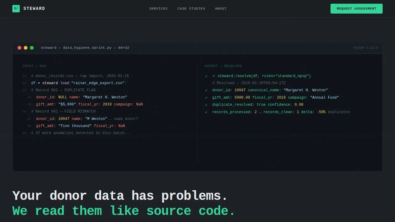
- Animated code-terminal hero section with syntax-highlighted donor record transformation, monospaced headline, and line-by-line execution animation
- Modular dark problem cards, signal-green-divided solution cards, and before-and-after case study cards with green delta highlights
- Sticky comparison toggle module, floating call-to-action bar triggered at 60 percent scroll depth, and a structured lead capture form with CRM dropdown and record count slider
Feature list
This template is built around six core capabilities, each pulled directly from the design brief and each earning its place in the page architecture.
Animated Code-Terminal Hero
The hero fills the upper two-thirds of the viewport with a syntax-highlighted pseudo-code block. Messy donor record columns with null values and duplicate IDs resolve in real time into clean, normalized output. Each resolved row earns a signal-green checkmark. A monospaced headline below the animation sets the tone immediately: "Your donor data has problems. We read them like source code."
Problem-and-Solution Card Grid
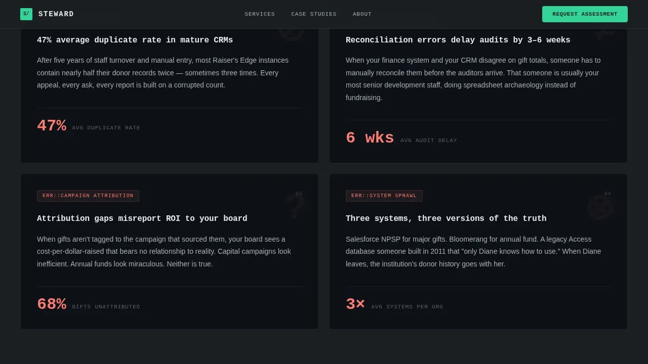
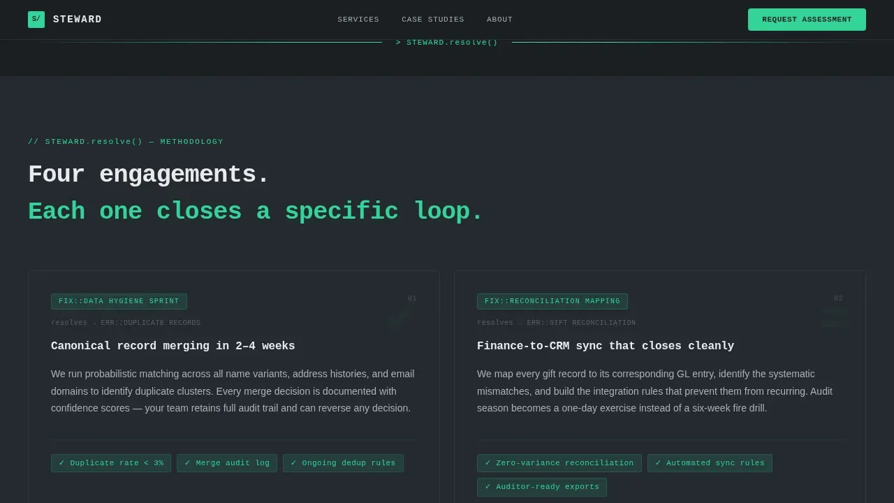
Two modular card clusters carry the core argument. The first cluster presents specific donor data dysfunctions with real statistics. A thin signal-green dividing line separates them from the solution cluster, where each card mirrors its problem counterpart and names the consulting methodology that resolves it. The parallel structure makes comparison instinctive and keeps donors engaged with the logic of the offer.
Sticky Comparison Toggle Module
A persistent sticky module lets visitors toggle between "In-House Cleanup" and "Steward Engagement." Each card row updates dynamically to display timelines, cost ranges, error rates, and staff hours side by side. This module handles the persuasion work. By the time a visitor reaches the form, the numbers have already made the argument. The primary call to action, "Request a Data Assessment," appears directly below the comparison module.
Before-and-After Case Study Cards
The final card cluster presents case studies in a consistent card format. Each card shows a before metric, an after metric, and the delta highlighted in signal-green. This gives the consulting firm a structured way to present social proof without long-form narrative. The format is repeatable, so new case studies can be added as cards without redesigning the section.
Structured Lead Capture Form
The form is sequenced deliberately. It asks for organization name first, then CRM platform via dropdown, then estimated record count via a range slider, then email. This sequence gathers the context the consulting team needs to qualify the lead before the first call. The form appears inside the comparison module and again in the floating bar that activates at 60 percent scroll depth.
Floating Call-to-Action Bar
A secondary call-to-action bar appears as a fixed element after the visitor scrolls past 60 percent of the page. It carries the same "Request a Data Assessment" prompt and keeps the conversion path visible without interrupting the reading flow. This persistent element ensures that committed visitors never have to scroll back up to find the form.
Page sections overview
| Section | Purpose |
|---|---|
| Animated Code Hero | Open with donor data transformation visual and monospaced headline |
| Problem Card Cluster | Name specific data dysfunctions with supporting statistics |
| Signal-Green Divider | Visual break separating problem and solution card clusters |
| Solution Card Cluster | Mirror each problem card with the consulting methodology that resolves it |
| Sticky Comparison Module | Side-by-side toggle of in-house versus consulting engagement metrics |
| Case Study Cards | Before-and-after metric cards with green delta highlights |
| Lead Capture Form | Structured form collecting org name, CRM platform, record count, and email |
| Floating call to action Bar | Persistent conversion prompt active after 60 percent scroll depth |
| Single-Row Footer | Linear footer with contact and navigation essentials |
Design & branding system
The visual identity follows a Data Command theme built on a Monochrome Steel color system. Every design decision reinforces the feeling of structured authority: the quiet confidence of a well-ordered database running cleanly at 2 a.m.
- Color palette: deep gunmetal (#1B1F23) and charcoal (#252A30) backgrounds alternate to separate card clusters; terminal white (#E8EAED) for body text; brushed aluminum (#A8B0B8) for secondary labels; signal-green (#34D399) reserved exclusively for interactive states, success indicators, and primary calls to action
- Typography: JetBrains Mono for the hero code block and all monospaced display elements; DM Sans for body copy, card labels, and form fields
- Visual tone: no warmth, no decorative softness; backgrounds alternate between gunmetal and charcoal to create card cluster separation; signal-green appears only where action or resolution is communicated
Mobile & speed optimization
The template is designed desktop-first, reflecting the reality that nonprofit CFOs and advancement VPs typically review consulting proposals on large screens before board meetings. The layout still adapts to smaller viewports so the page remains fully usable on any device.
- Static content sections are structured as server components to keep initial load fast; interactive modules including the comparison toggle, CRM dropdown, record count slider, and floating call-to-action bar are built as client components
- Scroll-triggered reveal animations activate as sections enter the viewport, keeping the animation experience consistent across screen sizes without blocking the reading flow
- The sticky comparison module and floating call-to-action bar are designed to reflow gracefully on tablet viewports so the conversion path stays intact on all devices
How this template helps you convert
A donation page is one of the most important assets for a nonprofit, and the consulting firm that earns a nonprofit's trust around donor data earns a long-term relationship. This template is engineered to move senior buyers from skepticism to submission of a data assessment request.
- The animated hero creates immediate recognition: visitors see their own messy donor records reflected in the code terminal and understand within seconds that this firm speaks their language. Trust signals are built into the visual metaphor before a single word of copy is read.
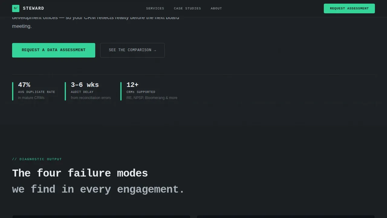
- The Problem-to-Solution Arc structures the scroll so that every card either names a dysfunction the visitor already lives with or presents the methodology that resolves it. Donor segments, gift reconciliation errors, and campaign attribution gaps are called out by name. By the midpoint of the page, the visitor is not reading about consulting; they are reading about their own organization.
- The sticky comparison toggle closes the argument with numbers. Timelines, cost ranges, error rates, and staff hours update in real time as the visitor toggles between options. The lead capture form appears directly below, at the moment the visitor has already decided. The floating call-to-action bar ensures no committed visitor leaves without seeing the prompt again.
Other information about this template
This template is built specifically for the consulting firm donor management niche within the nonprofit sector. It can support a wide range of stewardship-adjacent use cases beyond the primary pitch scenario described in the brief.
- The plan template structure is reusable: consulting teams can adapt the card grid to present stewardship actions for different donor segments, including lapsed donors, new donors, monthly donors, and major donor portfolios, by swapping card content without changing the layout
- Donor communications strategy can be reflected across the card clusters: for example, a card can describe a donor communications cadence for re-engage donors outreach, assign follow ups with a due date, and show how the whole team stays consistent across donor segments
- The comparison module framework works for more than in-house versus consulting: it can be repurposed to compare plan template options side by side, showing timelines, follow ups, and outcomes for different donor engagement tracks
- The form's CRM platform dropdown supports common nonprofit CRM platforms referenced in the nonprofit sector, making it straightforward to collect the data point that shapes the consulting firm's intake workflow
- Donor retention and monthly giving context: the template's case study cards can surface before-and-after metrics for donor retention rates, average gift size shifts, or recurring giving participation, giving the consulting firm a consistent format for every impact story they want to tell
- Payment options context: if the consulting firm operates a donation page alongside this landing page, the template's design language is consistent enough that a separate donation page built in the same palette will not create hesitation for donors; payment options such as Apple Pay and Google Pay can be supported in a linked donation page without altering this template's layout
- Donor record integrity: the template is designed around the premise that a clean donor record is the foundation of every stewardship action, every donor communication, and every fundraising campaign; this premise is legible in every section from hero to footer
- This is a simple template in the sense that its architecture is clean and purposeful, but the interactivity level is high; the whole team working on the consulting firm's site can operate the card content without touching the animation or toggle logic
- The template can support ongoing support scenarios by adding a card or section that describes the consulting firm's post-engagement monitoring offer, keeping long term supporters of the methodology visible in the page narrative
- Donor base growth context: new donors and repeat supporter acquisition can both be represented in the case study card format, giving the firm a flexible social proof system that grows alongside their client portfolio
Theme
Data Command
Creative direction
Problem→Solution Arc
Color system
Monochrome Steel
Style
Card Grid (Modular)
Direction
Comparison/Versus
Page Sections
Animated Code-terminal Hero Section
Problem-and-solution Modular Card Grid
Sticky Comparison Toggle Module
Before-and-after Case Study Cards
Structured Intake Lead Capture Form
Floating Call-to-action Bar
Related questions
Who is this landing page template designed for?
Can I adapt the card grid content for different donor segments?
What does the lead capture form collect, and why is it structured that way?
Does this template support a linked donation page?
How does the comparison module persuade visitors before they reach the form?



