Consumer App & Platform Professional Website Template
Lend is a split-screen landing page template built for peer-to-peer rental marketplaces. It places a live renter map view beside an owner earnings dashboard, then walks visitors through an animated comparison table, trust and safety signals, and earnings proof. The toggle-driven call to action adapts to both owners and renters in one seamless flow.
by Rocket studio
Quick summary
Lend is a high-energy, split-screen landing page template for peer-to-peer rental platforms. It opens with a dual-perspective dashboard that shows renters finding nearby items and owners watching their income grow. Scroll-triggered animations, a buying-versus-renting comparison table, and a friction-minimal call-to-action section work together to make listing or renting feel like the obvious next step.
Who this template is for
This template is designed for founders and product teams building peer-to-peer rental marketplaces. It is equally useful for solo developers launching a sharing-economy platform and for marketing teams refreshing an existing rental app's landing page.
- Side-hustle-minded millennials who want a platform that speaks to owners monetizing idle gear
- Event planners and contractors who need a page that communicates fast, local, low-commitment access
- Marketplace builders who want desktop-first, animation-rich launch energy without building from scratch
What problem this template solves
Most rental marketplace landing pages fail to show both sides of the transaction at once. Potential owners leave because they never see the income proof. Potential renters leave because they cannot picture what is available nearby.
- The template solves the dual-audience problem with a single split-screen hero showing map pins for renters and an earnings graph for owners simultaneously
- It removes the friction of explaining a new behavior by making the comparison between buying and renting visually obvious and financially concrete
- It builds trust before asking for any action, layering an insurance shield animation and verification badges ahead of any sign-up prompt
What you get with this template
You get a fully structured, single-page landing page with five distinct content sections, each carrying its own animation logic and conversion purpose. Every visual component is scoped to the Slate and Sky color system and the Tech Glass design style.
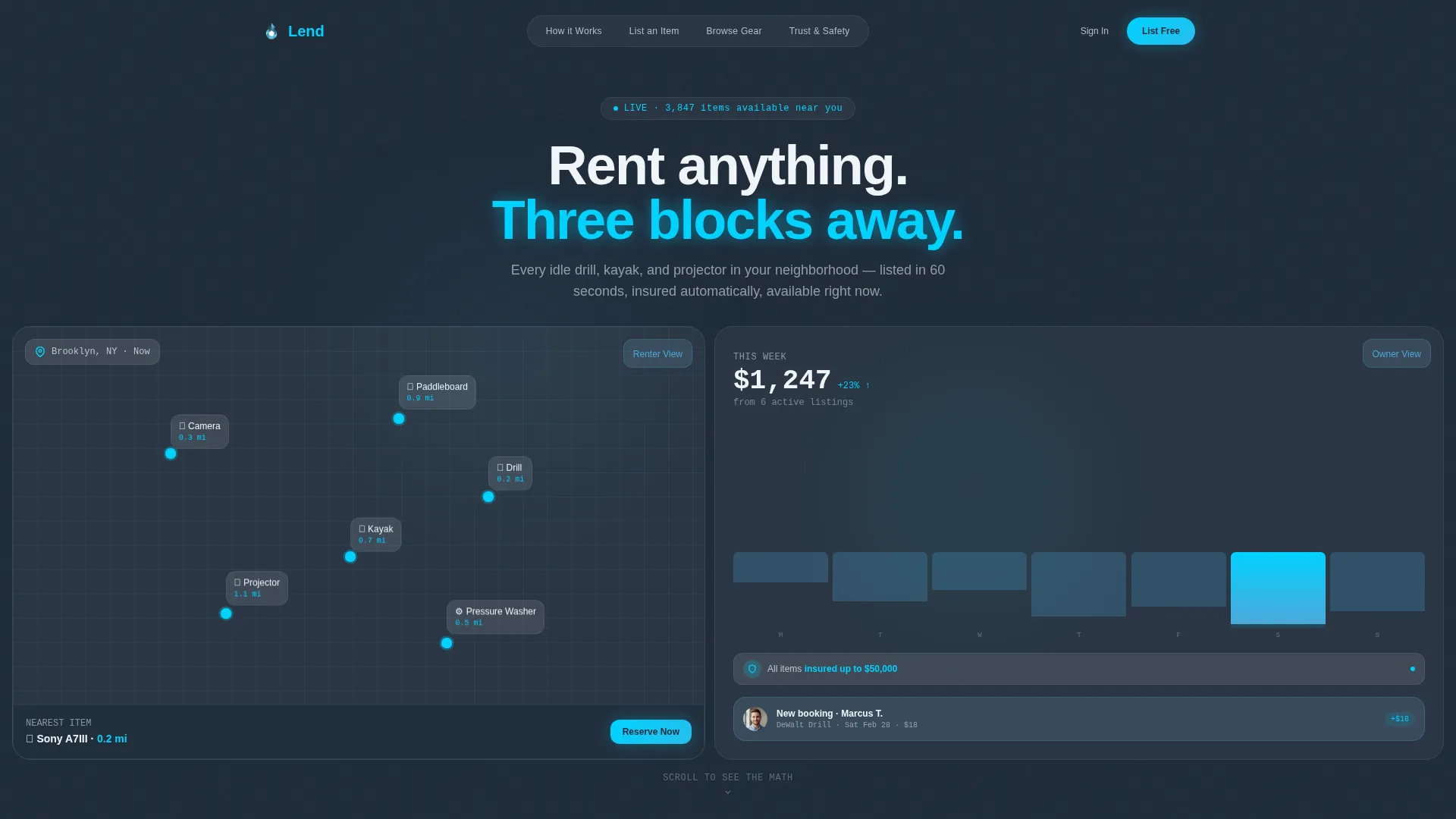
- A split-screen hero with an animated renter map view on the left and a live-style owner earnings dashboard on the right
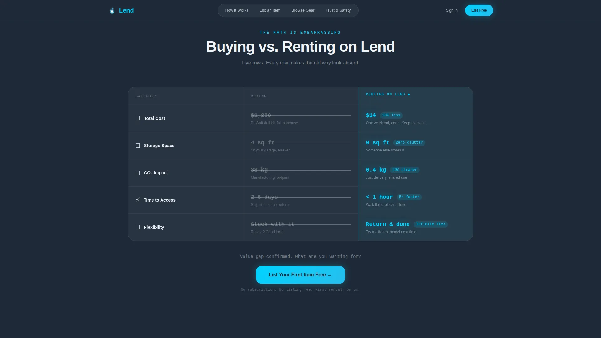
- A five-row buying-versus-renting comparison table with animated savings counters and a perspective toggle that flips the entire page between owner and renter views
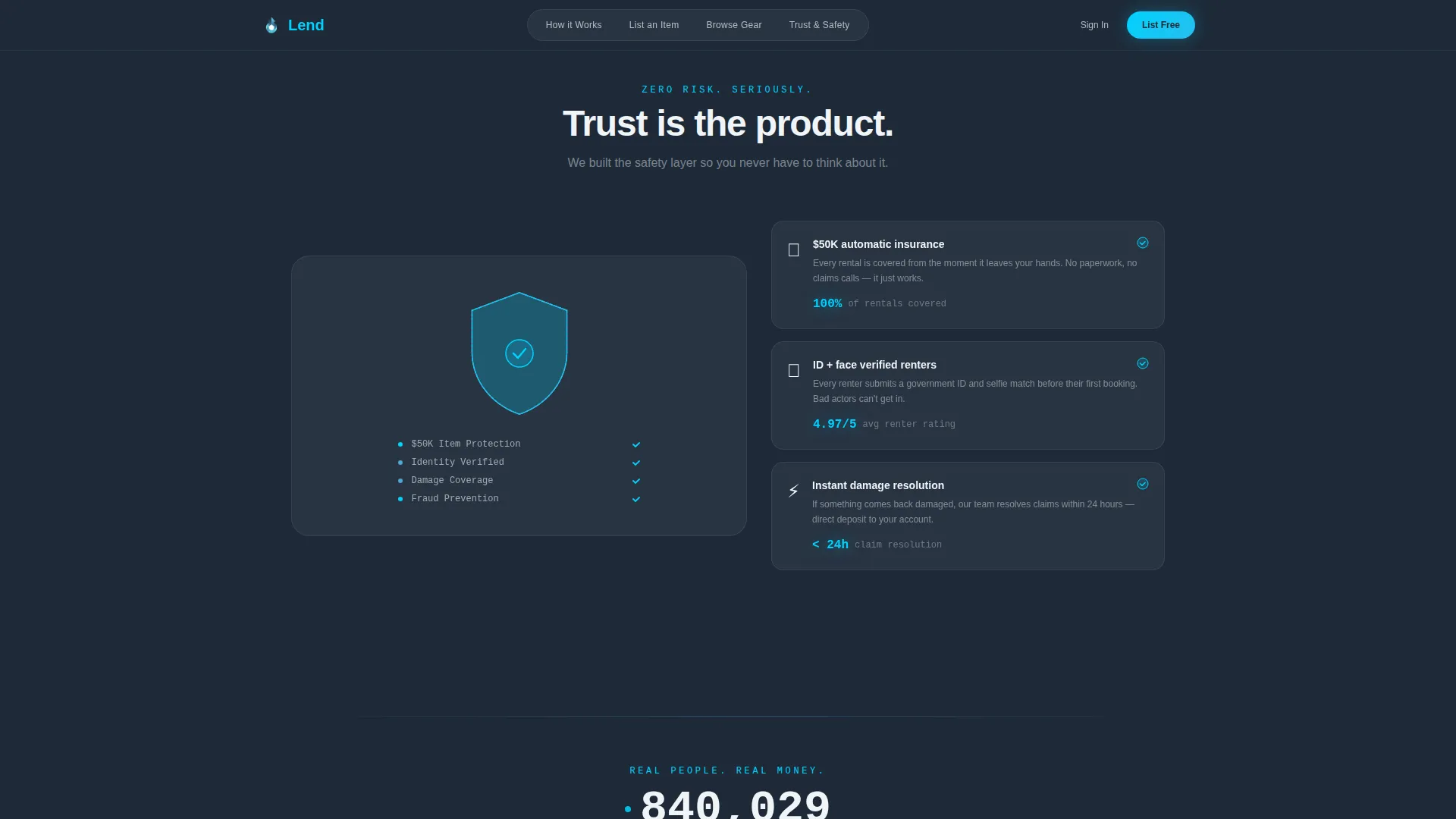
- A trust and safety section with a piece-by-piece insurance shield animation, a social proof earnings card stack, a live rental counter, and a friction-minimal call-to-action form
Feature list
This template ships with purpose-built components that reflect the specific experience of a peer-to-peer rental marketplace.
Split-Screen Dashboard Hero
The hero divides the viewport 50/50. The left half renders a neighborhood map with pulsing cyan pins and item thumbnails showing distance tags. The right half displays a climbing weekly income graph, a sliding booking notification, and an insurance-verified badge. Both halves animate at the same time so visitors grasp both sides of the marketplace instantly.
Buying versus. Renting Comparison Table
A persistent split-column section places "Buying" against "Renting on Lend" across five rows: total cost, storage space, environmental impact, time to access, and flexibility. The buying column uses muted slate with struck-through prices. The Lend column glows in signal cyan with animated savings counters that spin to their final values on scroll entry.
Owner and Renter Perspective Toggle
A secondary toggle flips the entire page view between owner mode and renter mode. In owner mode the primary call to action reads "List Your First Item Free" and the form asks only for a photo, an item name, and a daily price. In renter mode the call to action shifts to "Find It Nearby" with a single location-permission prompt.
Trust and Safety Animation
An insurance shield builds on screen piece by piece as the visitor scrolls into the section. Verification badges appear alongside the shield to reinforce platform credibility before any commitment is requested.
Earnings Proof Card Stack
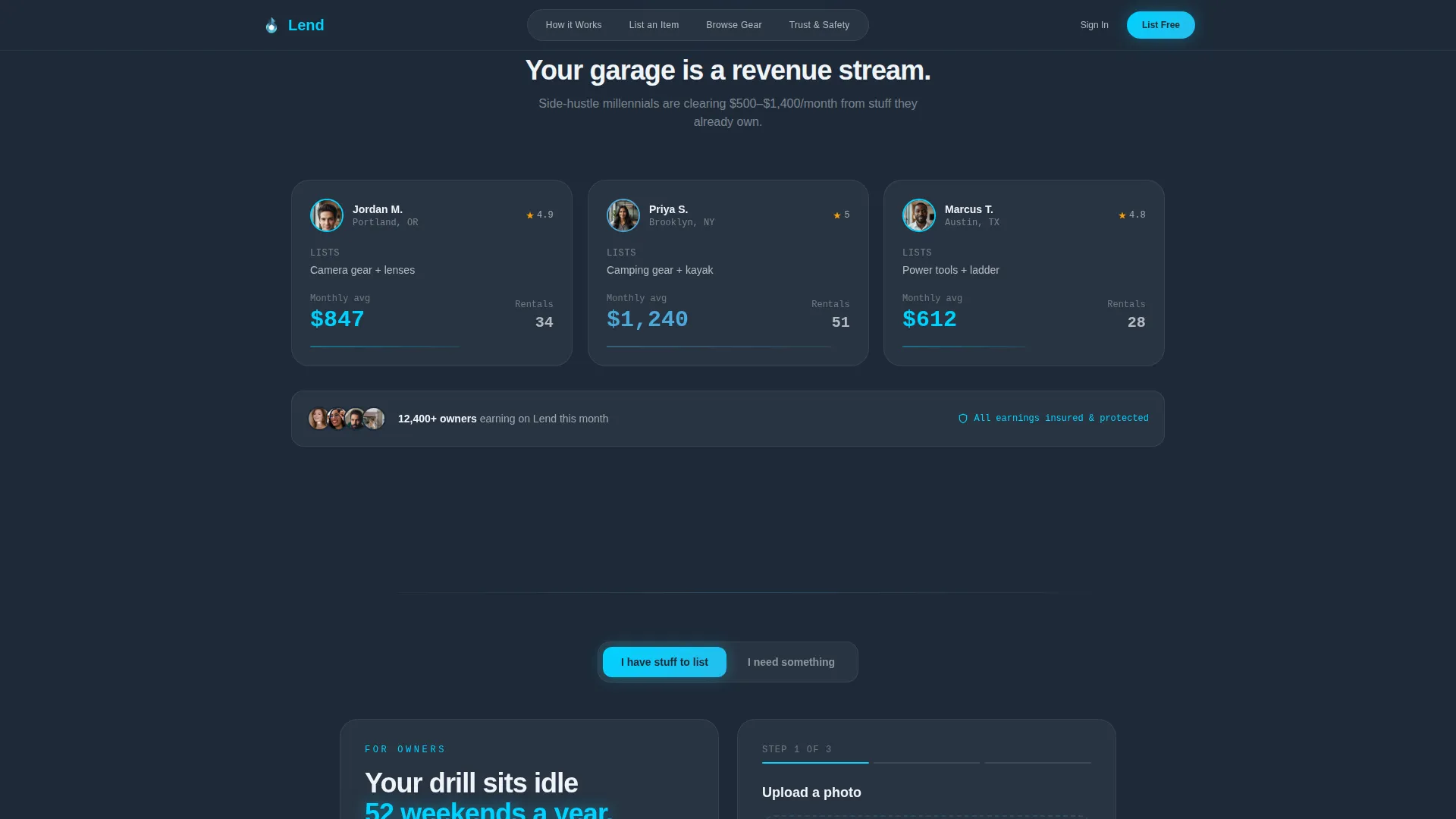
Real user earnings screenshots stack on screen like cards being dealt. A live rental counter ticks upward beside them, giving social proof a kinetic quality that a static testimonial block cannot match.
Page sections overview
| Section | Purpose |
|---|---|
| Split-Screen Hero | Show both marketplace sides at once |
| Comparison Table | Contrast buying cost versus. renting savings |
| Trust and Safety | Build insurance and verification confidence |
| Earnings Proof | Demonstrate real income with live counter |
| Owner/Renter Call to Action | Capture both audiences with one toggle form |
| Footer | Provide horizontal navigation and legal links |
Design & branding system
The visual identity uses a Tech Glass aesthetic: cool, engineered, and built to let content float forward. Every color in the Slate and Sky palette has a specific role, and the typography pairing reinforces data clarity.
- Deep graphite slate (#1E2A38) grounds left panels and data-heavy backgrounds; atmosphere blue (#4DA8DA) lights interactive surfaces and hover states; cloud white (#F0F4F8) opens the right-side content panels; signal cyan (#00D2FF) fires on every call-to-action button and live-data pulse
- DM Sans drives all headline and body copy for clean readability at large sizes; JetBrains Mono handles all numerical data, counters, and earnings figures to give them a precise, technical feel
- Micro-interactions are built into every scroll event: numbers spin to final value, checkmarks snap into place, and the shield assembles segment by segment
Mobile & speed optimization
The template is designed desktop-first because the 50/50 split-screen layout requires horizontal space to function as intended. On smaller screens, the layout stacks gracefully so no content is lost.
- Each split panel reflows into a full-width vertical block on mobile, preserving the map view and earnings dashboard as separate readable sections
- Client-side components handle all animations, including the pulsing map pins, spinning counters, and card stack deals, while static sections use server rendering to keep initial load lean
- The comparison table collapses to a single-column card format on narrow viewports so the buying-versus-renting contrast remains clear without horizontal scrolling
How this template helps you convert
The page is sequenced like a product-launch keynote: each section arrives with a proof point that makes the next click feel earned rather than forced.
- The split-screen hero removes the need for explanation by showing both owner income and renter access in a single animated view, hooking attention before a single word is read
- The comparison table makes the financial and practical cost of buying look visibly absurd next to the Lend column, so the "List Your First Item Free" call to action lands at the exact moment the value gap is widest
- The owner-renter toggle ensures neither audience feels like an afterthought, giving each visitor a tailored path to a low-friction first action
Other information about this template
This template is a strong fit for teams building in the sharing-economy space who want a launch-ready page with high animation density and dual-audience conversion logic. A few additional details worth knowing before you start:
- The footer follows a horizontal flow pattern, providing clean navigation links and legal text without visual clutter
- Localization defaults are set for English, United States Dollar pricing, and United States geography, with neighborhood references drawn from urban areas like Brooklyn, Austin, and Portland
- The template style is explicitly single-page, meaning all five sections and the footer exist within one scrollable document rather than across multiple routed pages
- Typography files referenced are DM Sans for display and body copy and JetBrains Mono for data rendering; both are widely available through standard font services
Theme
Tech Glass
Creative direction
Launch Energy
Color system
Slate & Sky
Style
Split Screen (50/50)
Direction
Comparison/Versus
Page Sections
Split-screen Dashboard Hero
Buying Versus. Renting Comparison Table
Owner and Renter Perspective Toggle
Trust and Safety Section
Earnings Proof Card Stack
Scroll-triggered Micro-interactions
Related questions
Does this template work for both owners and renters at the same time?
How many sections does the Lend template include?
Is this template designed for desktop or mobile users?
Can I adapt the comparison table rows for a different rental category?
What animation approach does this template use?



