Commanding Vision Care Landing Page Template
Optic is a bold, glassmorphic landing page template built for optometry membership sites. It features a live-stats header, an animated three-tier comparison table, a progressive signup form, and a floating mobile call-to-action bar. Every design decision pushes toward one goal: converting visiting optometrists into free-trial members fast.
by Rocket studio
Quick summary
Optic is a single-page, conversion-focused landing page template designed for optometry membership platforms. It opens with an animated metrics wall, flows into a brutalist three-column comparison table, and closes with a sticky trial call to action. The layout speaks directly to independent optometrists and new graduates who want a professional community without fluff.
Who this template is for
This template is built for founders, community managers, and marketers running an optometry membership or continuing education platform. It targets visitors who need to see proof before they commit.
- Solo-practice optometrists looking for peer clinical support and continuing education (CE) modules
- New graduates building diagnostic confidence with posterior segment cases
- Multi-location practice owners hunting for scalable staff training systems
What problem this template solves
Independent optometrists are time-poor. They face mounting reimbursement paperwork, fragmented CE requirements, and no single hub for peer case review. A generic membership landing page fails to speak their language or earn their trust quickly enough.
- Visitors leave before understanding what the membership actually includes at each tier
- Generic layouts fail to communicate clinical credibility or community scale
- No clear urgency or structured trial path pushes hesitant buyers to act
What you get with this template
You get a fully structured, single-page layout that moves visitors from curiosity to trial signup without friction. Every section is designed with optometry-native copy patterns and brutalist visual logic.
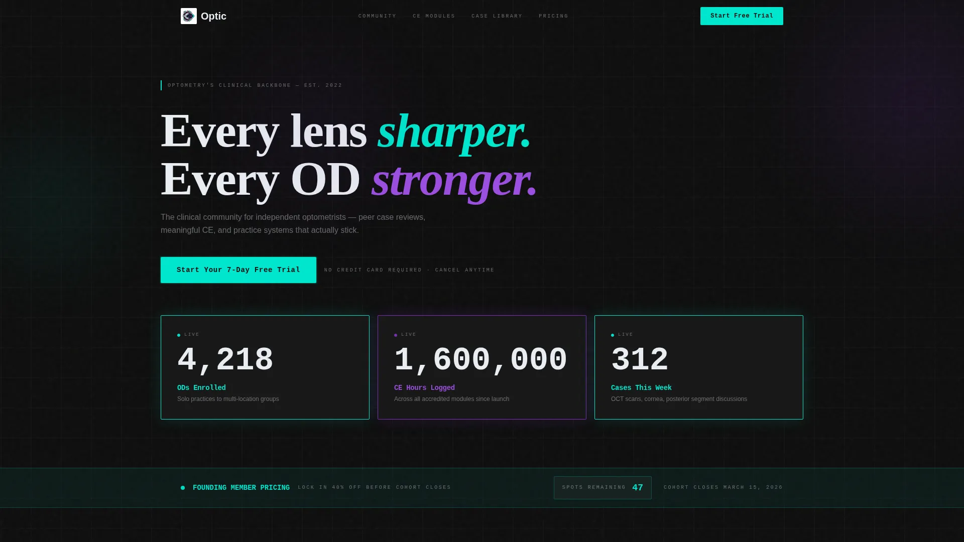
- An animated stats wall header with frosted glass metric cards and real-time-style counters
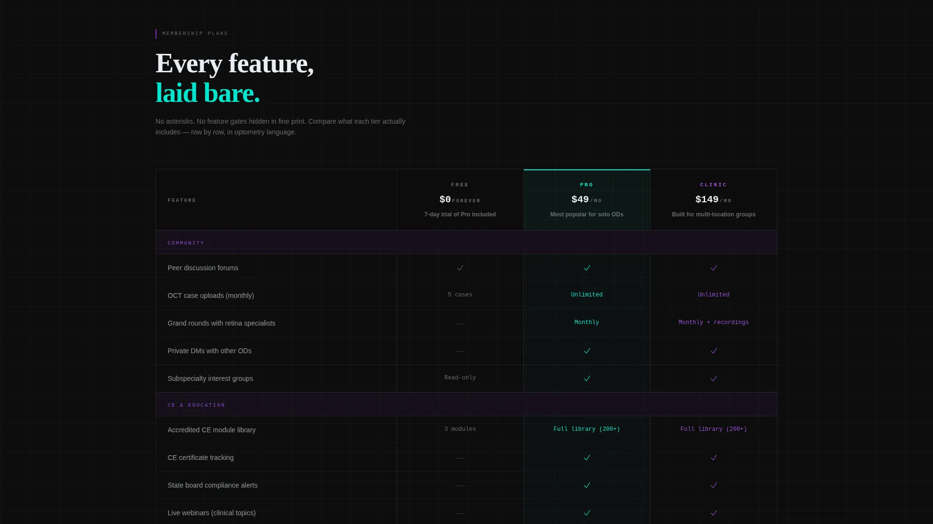
- A three-column comparison table (Free, Pro, Clinic) with scroll-triggered teal checkmark animations
- A progressive two-screen signup form that segments leads by practice size on the first screen
Feature list
This template ships with a focused set of purpose-built components. Each one serves the freemium conversion flow directly.
Animated Stats Wall Header
The header displays three oversized, monospaced figures that animate upward on page load. Metrics like enrolled member counts, logged CE hours, and weekly case discussions are each housed in a frosted glass card with teal edge lighting. No stock photography appears here, just raw proof of platform scale.
Three-Tier Comparison Table
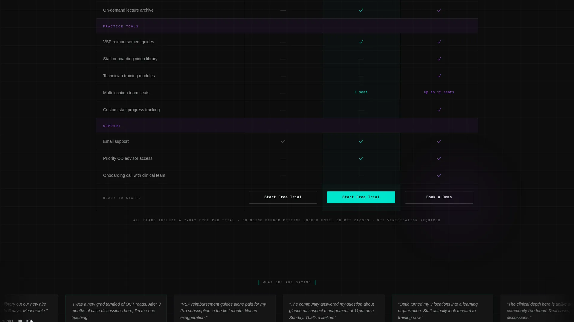
The core persuasion engine of the page. Three brutalist columns labeled Free, Pro, and Clinic sit side by side with frosted glass column headers. Feature rows use optometry-native language, such as unlimited OCT case uploads, monthly grand rounds with retina specialists, and a staff onboarding video library. Teal checkmarks animate row by row as the visitor scrolls into view.
Founding Member Urgency Banner
A countdown or founding-member urgency strip pulses directly below the stats wall. It creates launch energy and frames the free trial as a limited opportunity rather than a standing offer.
Progressive Two-Screen Signup Form
The first screen collects only an email address and a single dropdown asking how many locations the user manages. This segments the lead instantly. The second screen, shown after the initial click, collects name, NPI number, and preferred CE topics.
Scrolling Testimonial Ticker
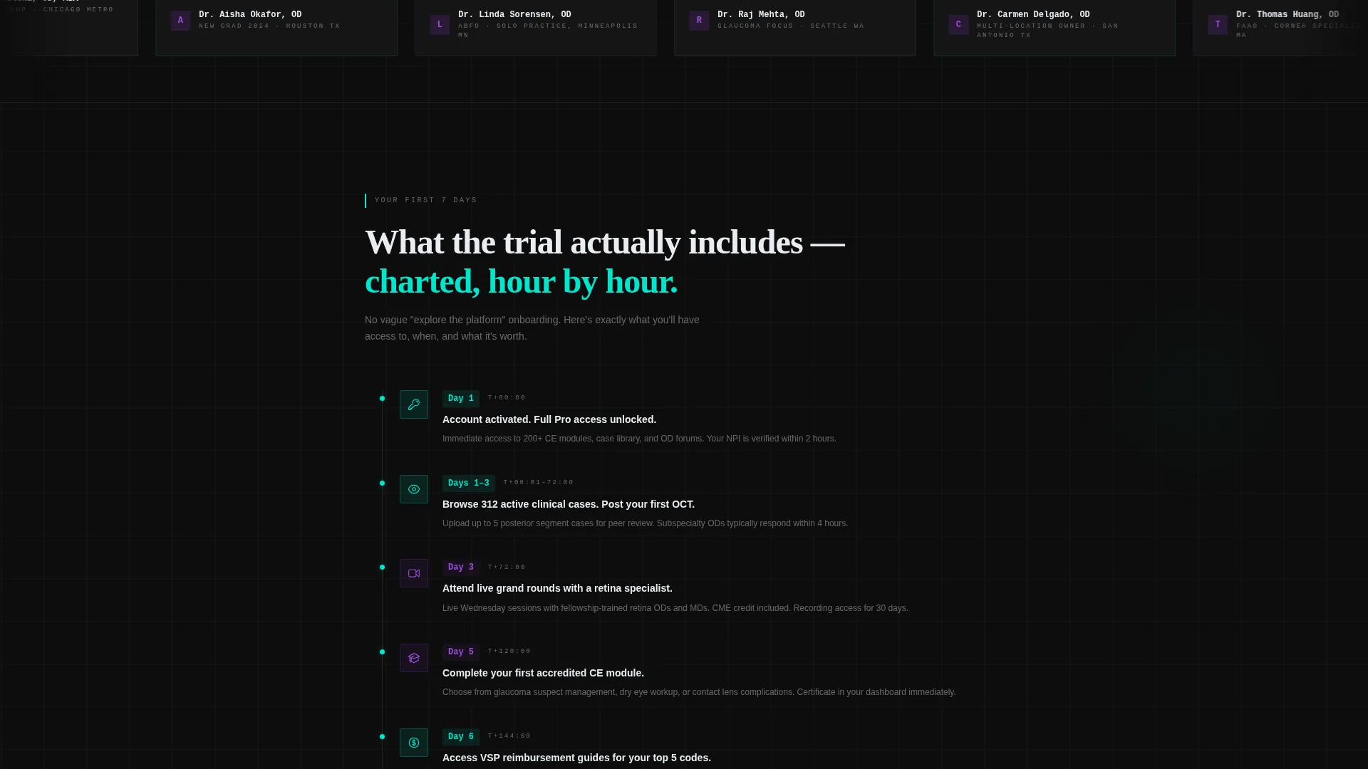
A continuously moving ticker displays real optometrist names and credentials. It runs between the comparison table and the seven-day trial breakdown, reinforcing social proof without interrupting the scroll momentum.
Floating Mobile call to action Bar
On mobile, the primary call-to-action, "Start Your 7-Day Free Trial," is anchored as a persistent bottom bar. It stays visible at all times so the signup path is never more than one tap away.
Page sections overview
| Section | Purpose |
|---|---|
| Stats Wall Header | Establish scale with animated membership metrics |
| Urgency Launch Banner | Create founding-member urgency below the header |
| Comparison Table | Compare Free, Pro, and Clinic tiers side by side |
| Testimonial Ticker | Reinforce trust with scrolling OD names and credentials |
| 7-Day Trial Breakdown | Summarize what the free trial includes, stacked like chart entries |
| Progressive Signup Form | Collect email and practice size, then deeper profile data |
| Floating Mobile Bar | Keep the primary call to action pinned at the bottom on mobile |
Design & branding system
The visual identity follows a Bold Brutalist theme layered over a Glassmorphic color system. The result feels like peering through a slit lamp: dark surround, luminous subject, every edge catching spectral color.
- Color palette: deep scleral black (#0D0D0D) as the base, frosted lens white (#E8EDF2) at 40% opacity over blurred gradient panels, refractive violet (#7B2FBE) for accent strokes and hover states, and sharp clinical teal (#00E5CC) for calls to action and live data pulses
- Typography and layout: monospaced oversized numbers slammed left in brutalist fashion, heavy 1px borders on stacked translucent cards, and a slow-moving violet-to-black gradient behind all glass panels
- Glass panels float over the gradient background, creating depth without photographic imagery
Mobile & speed optimization
The template is structured to maintain its visual hierarchy and conversion path on smaller screens. The floating call to action bar ensures the trial signup is always within reach on mobile devices.
- Floating bottom bar pins the "Start Your 7-Day Free Trial" call to action at the screen base on mobile viewports
- Frosted glass cards and brutalist column layouts are designed to stack cleanly in narrower views
- Scroll-triggered animations in the comparison table activate as rows enter the viewport, keeping performance smooth on scroll-heavy mobile sessions
How this template helps you convert
Every layout decision in this template is built around a single conversion goal: getting an optometrist to start a seven-day free trial. The page is engineered to reduce friction and build desire simultaneously.
- The stats wall opens with proof instead of promises. Oversized real-time-style metrics establish platform credibility before a single feature is mentioned, making the visitor lean in rather than scroll away.
- The comparison table does the selling. By showing Pro and Clinic features in full detail before offering the Free tier call to action, it builds desire for the full membership while making the free trial feel like the obvious next step.
- The progressive form lowers the entry barrier. Asking only for an email and practice size on screen one removes the psychological weight of a long form, lifting completion rates without sacrificing lead quality.
Other information about this template
This template is a strong match for optometry membership platforms launching with a freemium model or running a time-limited founding-member campaign. It is built as a single landing page, not a multi-page site.
- The template style is a Comparison Table layout, making it ideal for any membership product that needs to communicate tiered value clearly
- The creative direction is Launch Energy, meaning the design assumes an active promotion window and a defined urgency moment
- The header concept is a Stats and Metrics wall, which works best when the platform has real figures to display, such as enrolled member counts and CE hours logged
- The color system is Glassmorphic, a visual style that pairs translucent card layers with dark backgrounds and bright accent colors
- The niche intersection is Optometry Digital Presence within the Technology category, so the template language and feature naming are intentionally clinical and profession-specific
- This template can support a founding-member launch, a platform rebrand announcement, or an ongoing freemium acquisition campaign
Theme
Bold Brutalist
Creative direction
Launch Energy
Color system
Glassmorphic
Style
Comparison Table
Direction
Freemium/Trial
Page Sections
Animated Stats Wall Header
Three-tier Comparison Table
Progressive Two-screen Signup Form
Founding Member Urgency Banner
Scrolling Testimonial Ticker
Floating Mobile Call to Action Bar
Related questions
Can I update the stats in the header with my own membership numbers?
Does the comparison table support more than three membership tiers?
How does the two-screen signup form work?
Is this template suitable for a platform that is still pre-launch?
What does the seven-day trial breakdown section show visitors?



