Optometry Community Forum Landing Page Template
Lens is a modular card-grid landing page built for an optometry community forum. It opens with a live Rx Comparison Calculator, then unfolds into a directory, live forum threads, and a Free versus. Verified Member comparison. The design uses a teal-and-amber palette that feels as precise and purposeful as a well-dialed phoropter.
by Rocket studio
Quick summary
Lens is a single-page, card-grid landing page template designed for an optometry community forum. It leads with a chair-side Rx Comparison Calculator, then layers in modular community cards, a member directory, and a Free versus. Verified Member comparison. Every section is built to earn trust from practicing optometrists before asking for a sign-up.
Who this template is for
This template speaks directly to the people building or running an optometry community platform. It is designed with a very specific clinical audience in mind, and every design choice reflects that.
- Independent optometrists running solo or single-chair practices who need peer input quickly
- Corporate-employed optometrists looking for clinical depth beyond retail workflows
- New graduates navigating early referral decisions and seeking a trusted peer network
What problem this template solves
Optometry forums often feel generic. They borrow from broad healthcare templates that do not reflect how practicing optometrists actually think or communicate. Lens solves that directly.
- No tool-first hook means visitors leave before they see the community value
- Generic layouts fail to signal clinical credibility or peer-to-peer trust
- Vague membership tiers do not show a clear reason to upgrade from free access
What you get with this template
You get a fully structured, single-page layout that leads with utility and backs it up with community proof. Every section is modular and purposefully sequenced.
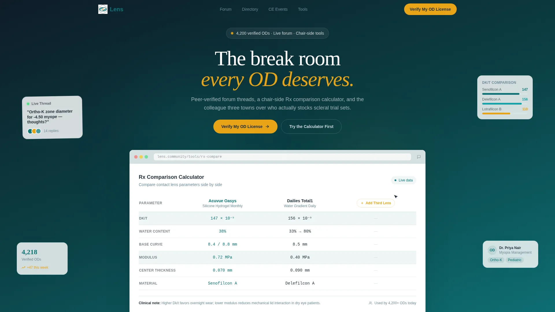
- A browser-frame product screenshot header showing the Rx Comparison Calculator in active use
- A modular card grid with live forum threads, member directory cards, and CE event listings
- A two-column Free versus. Verified Member comparison with a persistent sticky call-to-action bar
Feature list
The template bundles several distinct components, each designed to move a visitor from curious to committed.
Rx Comparison Calculator Header
The page opens with a pixel-perfect browser frame showing the Rx Comparison Calculator mid-use. Two contact lens brands are loaded side by side with columns for oxygen transmissibility (Dk/t) values, base curves, water content, and modulus ratings. Real data populates the fields, and a cursor hovers over "Add Third Lens" as if the visitor caught a colleague mid-workflow.
Modular Community Card Grid
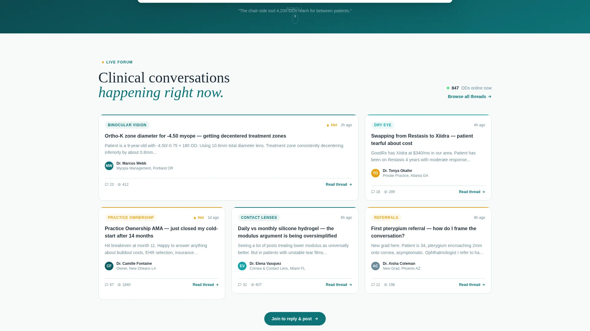
Below the calculator, cards bloom into a responsive grid. Each card represents a live forum thread, a member directory entry, or a continuing education (CE) event listing. Hover states lift each card and reveal a preview, showing three replies deep into a thread, a member's credential stack, or a webinar speaker photo.
Member Directory with Specialty Filters
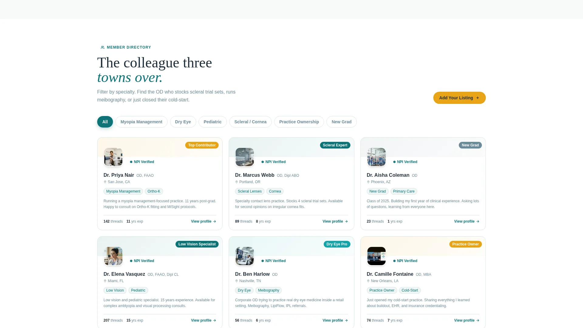
The directory section surfaces member cards with specialty filters including pediatric optometry, low vision, and myopia management. Visitors can scan the community depth before committing. This section signals that the platform has real, credentialed peers, not just a registration wall.
Free versus. Verified Member Comparison
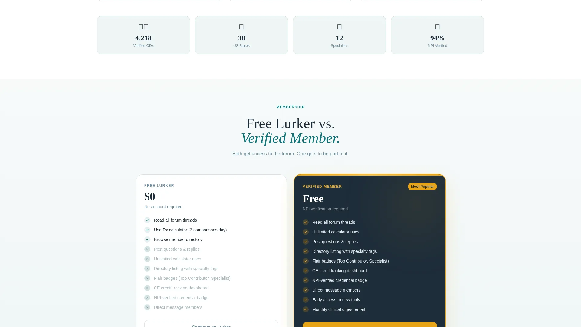
Two side-by-side cards lay out exactly what each tier includes. The free column shows read-only forum access and limited calculator uses. The member column glows with amber accents and lists unlimited tools, a directory listing, flair badges, and CE credit tracking. The difference is immediately visible.
Sticky "Verify My OD License" Call-to-Action Bar
A persistent bar appears after the visitor scrolls past roughly 60 percent of the page. It carries the primary call-to-action in amber on charcoal. The three-field sign-up form asks for National Provider Identifier (NPI) number first, then name and practice state, making the credibility signal the very first step.
Live Activity Counters
Counters tick in real time across the page, showing forum activity, member counts, and event registrations. They reinforce that the community is active right now, not dormant. The rhythm of ticking numbers accelerates the sense of momentum as a visitor scrolls deeper.
Page sections overview
| Section | Purpose |
|---|---|
| Browser Frame Header | Showcases calculator in live use |
| Rx Comparison Calculator | Delivers immediate chair-side utility |
| Forum Thread Cards | Displays active community topics |
| Member Directory Grid | Highlights specialty-filtered peer profiles |
| CE Event Listings | Surfaces continuing education opportunities |
| Free versus. Member Cards | Clarifies tier value side by side |
| Sticky call to action Bar | Persists upgrade prompt after scroll depth |
| NPI Sign-Up Form | Collects credentials as first conversion step |
Design & branding system
The visual identity follows a Directory and Discovery theme built around the Teal Catalyst color system. The palette is clinical, precise, and warm in exactly the right places.
- Deep exam-room teal (#0D7377) anchors the primary brand, navigation, and section headers
- Clinical charcoal (#1E2D3A) handles body text to keep reading clean and fatigue-free
- Soft sclera white (#F7FAFA) fills card backgrounds and the page canvas for an open, breathable layout
- Catalyst amber (#E8A317) is reserved exclusively for interactive badges, notification pings, and call-to-action buttons
Mobile & speed optimization
The card grid layout is inherently responsive. Each modular card reflows cleanly across screen widths without losing the hover-preview behavior or the sticky bar timing.
- Cards stack vertically on smaller screens while keeping specialty filter labels readable
- The sticky call-to-action bar adapts to mobile viewport heights without obscuring form fields
- The browser-frame header scales proportionally so the calculator screenshot remains legible on any device
How this template helps you convert
Lens is built around a Calculator-first creative direction, which means the conversion path starts with value, not a pitch. The sequence is intentional and deliberate.
- Visitors use the Rx Comparison Calculator before they see any membership ask, so they already have a reason to stay
- The Free versus. Verified Member comparison makes the upgrade case visually obvious, with amber accents drawing the eye to member-only benefits
- The NPI-first sign-up form frames verification as a professional credential moment rather than a generic registration step
Other information about this template
This template was designed at the intersection of the Technology category and the Optometry Digital Presence subcategory. The niche focus is an Optometry Community Forum, which means every layout decision reflects how practicing optometrists actually move through a page during a busy clinical day.
- The "Try the Calculator First" secondary call-to-action loops visitors back to the header tool, giving hesitant visitors a low-pressure re-entry point
- The break-room tone, warm but clinical, is carried through microcopy choices like thread titles such as "Ortho-K Troubleshooting," "Dry Eye Protocol Swaps," and "Practice Ownership AMA"
- The template style is Card Grid (Modular), which means individual content blocks can be reordered or swapped without rebuilding the entire page layout
- The header concept is a Product Screenshot, a specific creative direction that places the tool in active use rather than showing a static hero image
Theme
Directory & Discovery
Creative direction
Calculator/Tool First
Color system
Teal Catalyst
Style
Card Grid (Modular)
Direction
Comparison/Versus
Page Sections
Rx Comparison Calculator with Real Data
Modular Card Grid with Hover Previews
Specialty-filtered Member Directory
Free Versus. Verified Member Comparison Cards
Npi-first Three-field Sign-up Form
Persistent Sticky Call to Action Bar
Related questions
Who is this landing page template built for?
Does the Rx Comparison Calculator function out of the box?
Can I edit the Free versus. Verified Member comparison section?
When does the sticky call-to-action bar appear?
Can the three-field sign-up form be customized?



