Accessibility Documentation Professional Website Template
Lexicon is a bold brutalist landing page template built for simplified language documentation platforms. It features a full-viewport terminal animation, stats-first scroll sections, a fixed anchor navigation rail, and a one-click CLI install flow. Designed for developer tools and technical audiences, it converts visitors by proving comprehension gains before asking for a single download.
by Rocket studio
Quick summary
Lexicon is a hub and spoke landing page template for documentation platforms that translate dense technical writing into plain language. The design uses a midnight code-editor aesthetic, stats-first scroll sections, and a fixed brutalist anchor nav. It drives app downloads through a terminal-style CLI install prompt and a zero-commitment browser trial path.
Who this template is for
This template is built for founders, developers, and product teams shipping simplified language documentation tools. If you need to prove your platform's value to a technical audience before asking for an install, this layout delivers that proof systematically.
- Junior developers who need to present a documentation tool that cuts through legacy API complexity
- Product managers and open-source maintainers who want a conversion page that speaks the language of contributors and engineers
- Developer tool startups that want to lead with quantified outcomes before revealing a product pitch
What problem this template solves
Technical documentation platforms face a specific trust problem. Visitors are skeptical by default. They want to see proof before they commit to an install or a workflow change. Generic landing page templates cannot communicate that proof with the precision a developer audience demands.
- Visitors bounce before reaching the call to action because the value case is buried beneath marketing copy
- Documentation tool pages rarely speak to the actual pain points of the people reading them at 2 AM
- Most templates offer no built-in mechanism to demonstrate before-and-after transformation in a way that feels honest and immediate
What you get with this template
You get a fully structured single-page layout with five scroll-triggered spoke sections, each opening with an oversized metric. The design system is pre-configured and opinionated, so you spend your time customizing content rather than making visual decisions from scratch.
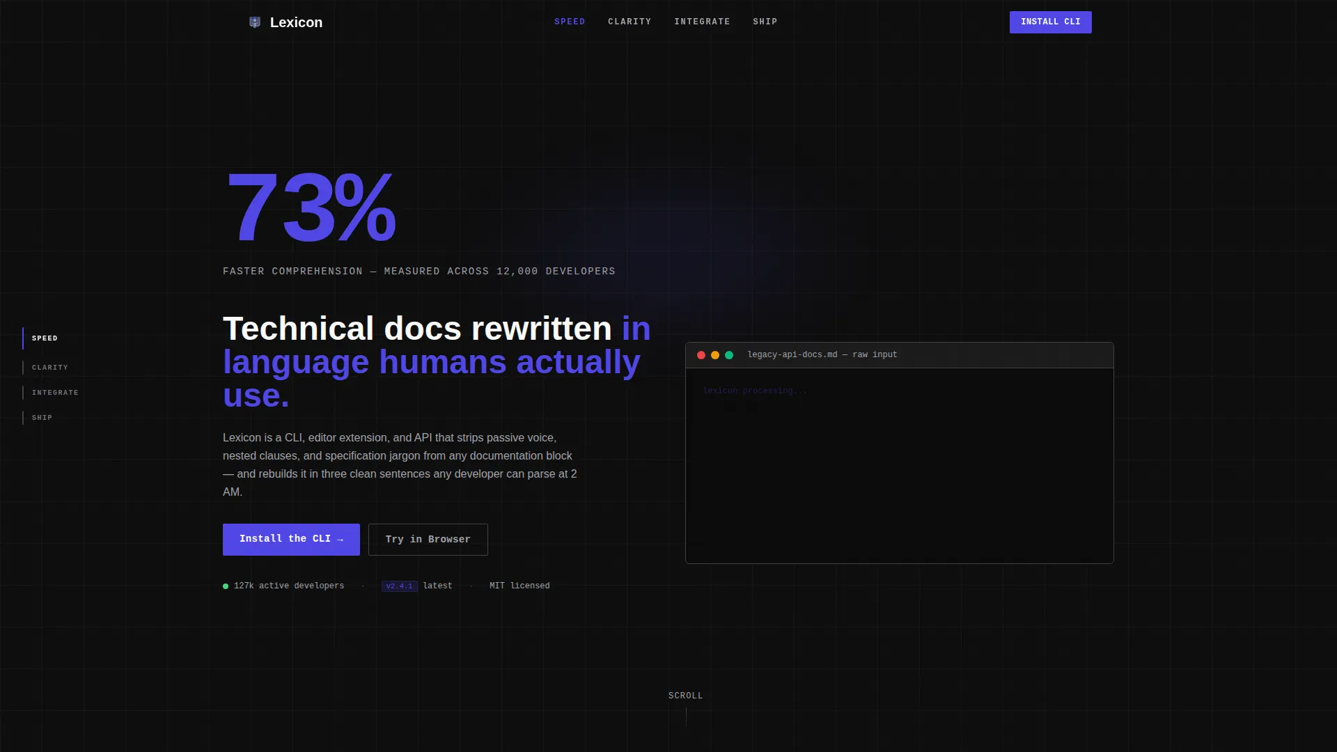
- A hero section with a live terminal before-and-after animation and a 120-pixel brutalist stat display
- Four named spoke sections (SPEED, CLARITY, INTEGRATE, SHIP) linked by a fixed left-rail anchor navigation
- A primary CLI install block with clipboard copy, platform toggles for editor extensions and browser app, and a secondary browser-trial path
Feature list
The following built-in features are included in the Lexicon template based on the source brief.
Terminal Before-and-After Hero Animation
The hero opens on a full-viewport black screen. A jargon-heavy API reference renders first at typing speed, then a cursor sweeps right and a plain-language version materializes line by line. Electric Indigo syntax highlighting marks key terms in the simplified output, making the transformation impossible to miss.
Stats-First Spoke Sections
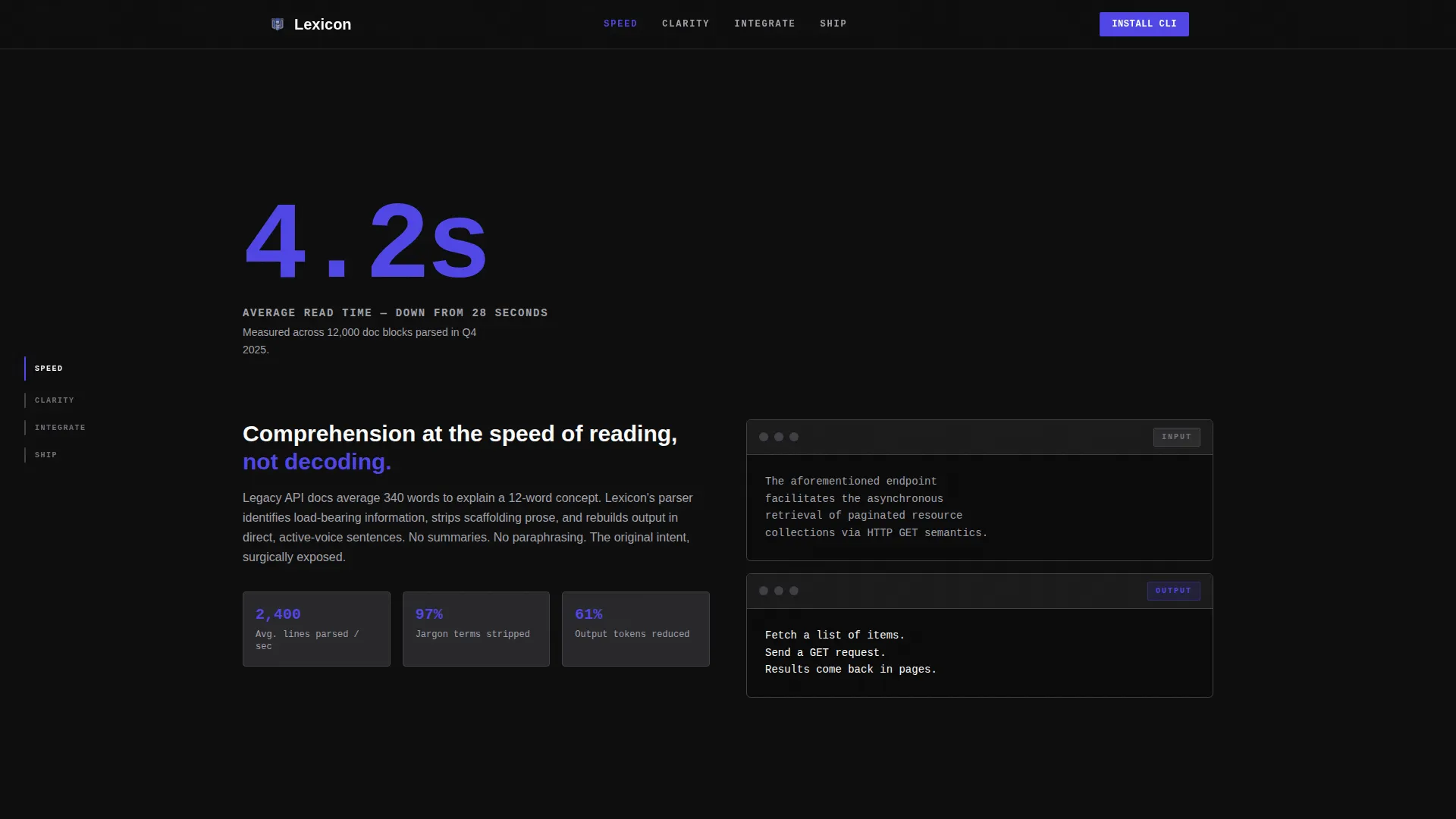
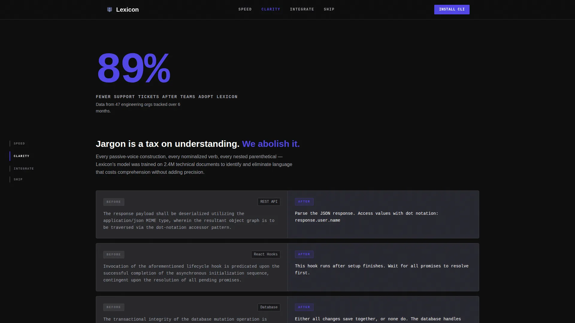
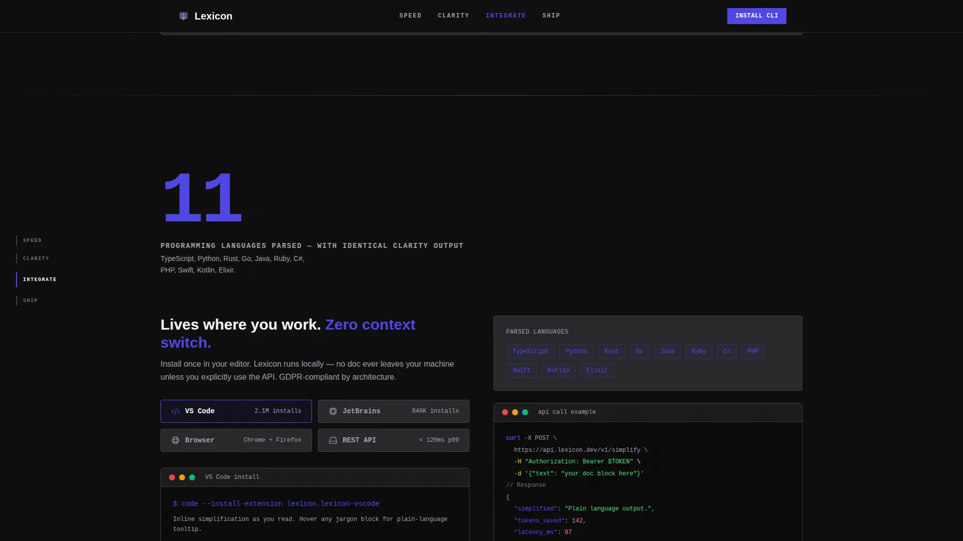
Each of the four anchor-linked spokes opens with a single oversized metric in Electric Indigo type before any explanatory copy appears. The numbers arrive first: read time, support ticket reduction, languages parsed. Scroll-triggered counters animate the figures into view, reinforcing credibility at every section break.
Fixed Brutalist Anchor Navigation
A vertical rail of capitalized labels sits fixed on the left side of the viewport throughout the scroll experience. Each label, SPEED, CLARITY, INTEGRATE, and SHIP, tracks the active spoke and highlights on scroll, giving developers an immediate map of the page's argument.
One-Click CLI Install Block
The primary call to action displays npm install lexicon inside a monospace, indigo-bordered terminal box. A clipboard copy button lets visitors grab the command in one click. Platform toggles beneath it switch between the Visual Studio Code extension, the JetBrains plugin, and the browser app view.
Browser Trial Path
A secondary path labeled "Try in Browser" sits alongside the CLI block. It lets visitors paste any documentation block and see the platform parse it without committing to an install. This zero-friction entry point reduces the barrier to first contact.
Contributor Testimonial Section (SHIP)
The final spoke aggregates real contributor testimonials alongside quantified social proof metrics. It is structured to show that actual users validated the platform's comprehension gains, closing the argument the stats opened at the top of the page.
Page sections overview
| Section | Purpose |
|---|---|
| Hero Terminal Block | Opens with live typing animation and a 120px comprehension stat |
| SPEED Spoke | Delivers the 4.2-second average read-time proof point |
| CLARITY Spoke | Shows the 89% support ticket reduction with a before-and-after showcase |
| INTEGRATE Spoke | Presents 11 languages parsed and editor or browser integration options |
| SHIP Spoke | Displays contributor testimonials and social proof metrics |
| CLI Install Block | Drives app downloads via copy-ready terminal command and platform toggles |
| GitHub-Style Footer | Closes with a developer-minimal footer pattern |
Design & branding system
The visual identity is Bold Brutalist. Every design decision is load-bearing. Nothing decorates for decoration's sake. The palette feels like a code editor at midnight with a single line highlighted in indigo.
- Colors: void black
#0D0D0Das the dominant background, Electric Indigo#4F46E5on accent elements, zinc#27272Afor card surfaces and section dividers, and chalk white#FAFAFAfor all body text - Typography: JetBrains Mono for code blocks, stat numbers, and inline tokens; Manrope for headings and body copy
- Interactivity system: scroll-triggered stat counters, staggered section reveals, a marquee element, clipboard copy on the CLI block, and anchor nav scroll tracking
Mobile & speed optimization
The template is designed desktop-first, matching the wide-viewport demands of a terminal aesthetic and a developer audience that primarily works on large screens. Mobile layout adapts the fixed anchor rail and oversized type to smaller viewports without losing the brutalist character.
- Animations use a mix of server-rendered static components and client-side interactions, keeping the heavier motion logic isolated from the core page load
- Scroll-triggered counters and staggered reveals activate only when the relevant section enters the viewport, avoiding unnecessary processing during initial paint
- The clipboard copy and platform toggle interactions are lightweight client components layered on top of a static structure
How this template helps you convert
The page is engineered to earn the install before it asks for it. By the time a visitor reaches the call to action, they have already seen their own pain quantified and the solution demonstrated in motion.
- The hero animation shows the transformation immediately, removing any need for abstract explanation of what the platform does
- Each spoke section leads with a single devastating metric, building a cumulative evidence chain that compounds across the scroll
- The CLI install block removes every remaining friction point with a one-click copy command, multiple platform entry points, and a zero-commitment browser trial alternative
Other information about this template
This template sits at the intersection of developer tools, accessibility documentation, and simplified language documentation. It is structured as a hub and spoke layout with anchor navigation, a pattern well-suited to argument-led pages where each section advances a single proof point.
- The footer follows a GitHub Developer Minimal pattern, using sparse layout conventions familiar to open-source and developer audiences
- Localization defaults to English (US) with developer-standard date formats and USD currency context
- The animation level is high by design: typing terminal, scroll-triggered counters, staggered reveals, and a marquee are all included as distinct interactive layers
- This template is categorized under Documentation and Support, with a subcategory focus on accessibility documentation and a niche focus on simplified language documentation platforms
Theme
Bold Brutalist
Creative direction
Stats-First Impact
Color system
Electric Indigo
Style
Hub & Spoke (Anchor Nav)
Direction
App Download
Page Sections
Terminal Before-and-after Hero Animation
Stats-first Spoke Sections
Fixed Brutalist Anchor Navigation
One-click CLI Install Block
Zero-commitment Browser Trial Path
Contributor Testimonial Section
Related questions
Who is the primary audience for this template?
Can I customize the stat numbers and spoke section labels?
Does the template include the browser trial interaction?
Is this a single-page layout or a multi-page template?
What design style does this template use?



