Unlock Learning Resources Landing Page Template
The Syllabus landing page template is built for K-12 education membership platforms. It combines a live Stats dashboard hero, an interactive subject-wheel explorer, a drag-through resource browser, and a Free versus. Member comparison table. Teachers can touch the product before signing up. The conversion flow ends with a three-field email form and a clear "Unlock the Full Library" call to action.
by Rocket studio
Quick summary
This template gives a K-12 education membership platform a conversion-focused landing page that lets teachers explore the product before committing. A live metrics header, an interactive subject wheel, a sample resource browser, and a split comparison table work together to show the value of full membership. The primary call to action is a frictionless three-field signup form.
Who this template is for
This template is designed for EdTech founders and educators who are building or relaunching a K-12 membership platform. It suits anyone who needs to convert busy teachers into registered members by letting them feel the product first.
- Third-year elementary teachers overwhelmed by curriculum rewrites who spend several hours each week hunting for classroom materials
- Veteran Advanced Placement instructors looking for fresh lab simulations and standards-aligned course materials
- Homeschool parents who need a coherent scope-and-sequence and want to move away from scattered online resources
What problem this template solves
Teachers do not sign up for membership platforms because of copy. They sign up when they trust that the platform already has what they need. Most landing pages describe features but never let visitors touch the product. This template solves that problem by turning the page itself into a working preview.
- Teachers spend time every week searching for reliable course materials without a single organized source
- Visitors to membership sites often leave because the gap between a free account and a paid account is never made clear
- Educators who are new to online platforms may have trouble translating their expectations from in-person learning to a fully online resource library
What you get with this template
This template delivers a complete, single-page hub-and-spoke layout with sticky anchor navigation. Every section is designed so a teacher can scan, play, and decide without leaving the page. The Tech Glass visual system makes the content feel premium and organized.
- A live Stats dashboard hero with animated counters, a radial standards graph, and a backward-running prep-time clock
- An interactive subject-wheel explorer that expands each subject spoke into a constellation of resource types with live counts and preview thumbnails
- A frosted-glass resource browser where visitors drag through sample materials, toggle between free and member views, and watch a search demo
- A sticky Free versus. Member comparison table with time-saved badges and a bold "Unlock the Full Library" primary call to action
- A social proof section with member testimonials tagged by grade band and specific hours saved
- A minimal footer adapted for EdTech
Feature list
This template is built around six core features that work together to move a visitor from curiosity to signup. Each feature is grounded in the source brief and serves a specific conversion purpose.
Live Stats Dashboard Hero
The hero section opens as a frozen-mid-pulse metrics display. Animated counters show 42,000 or more lesson plans, 185 state standards mapped in a radial graph, and a clock that runs backward from 6.2 hours to 1.4 hours of weekly prep time. Numbers are set in a light monospace font against carbon-black glass panels. No stock photography appears. The data alone earns immediate trust and sets the expectations of the platform before a single line of copy is read.
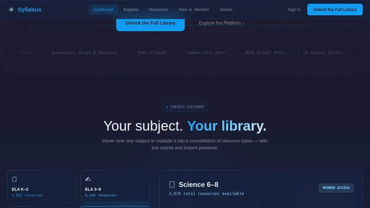
Interactive Subject Wheel Explorer
The hub-and-spoke navigation takes the form of a subject wheel. When a visitor hovers over a subject spoke such as "Science 6-8" or "ELA K-2," that spoke expands into a constellation showing resource types like labs, rubrics, slide decks, and parent letters. Each node displays a live count and a preview thumbnail. This interactive approach lets visitors engage with the library structure in a way that feels intuitive. Instructors can see how materials are organized by subject and grade band without clicking through multiple pages.
Frosted-Glass Resource Browser
Scrolling past the subject wheel, each spoke becomes its own frosted-glass section. Visitors drag through sample course materials, toggle between free-tier and member-tier views, and watch a short screen-capture showing the search engine filtering thousands of results down to three in real time. This section builds the muscle memory of membership before a visitor has paid. It is one of the most powerful conversion tools in the template because it makes the platform feel familiar and accessible.
Free versus. Member Comparison Table
A sticky anchor navigation link labeled "Free versus. Member" drops visitors into a translucent split table. Each row represents a specific teacher task such as building a unit plan, aligning to standards, or generating a parent report. The free path is shown in muted graphite. The member path is shown in electric blue with time-saved badges attached. This comparison makes the gap between free and full access immediately clear and personal. The primary call to action button sits at the base of this table, beside a secondary link that reads "Start with Free, Upgrade Anytime."
Three-Field Membership Form
The signup form at the heart of conversion asks only for an email address, a grade band, and a primary subject. No credit card is required. No lengthy profile setup exists. The form is designed this way because the page has already let visitors touch the product and see the comparison. The low friction of three fields means the decision to join feels easy rather than risky.
Social Proof with Grade-Band Tags
The testimonials section features real teacher voices tagged by role and grade band. Each testimonial includes a specific number of hours saved per week. This level of specificity matters because a third-year elementary teacher is far more persuaded by feedback from someone in the same situation than by a generic five-star review. Social proof built around concrete outcomes helps students and educators trust the platform and reinforces the learning outcomes the membership promises.
Page sections overview
| Section | Purpose |
|---|---|
| Hero Stats Dashboard | Prove platform value instantly with live animated metrics and standards data |
| Subject Wheel Explorer | Let visitors navigate course materials by subject and grade band interactively |
| Sample Resource Browser | Show free and member-tier materials side by side with a live search demo |
| Free versus. Member Table | Clarify the gap between access tiers using task-specific rows and time-saved badges |
| Social Proof Testimonials | Build trust with grade-band-tagged teacher feedback and concrete hours-saved numbers |
| Minimal EdTech Footer | Provide contact links and secondary navigation in a clean developer-minimal style |
Design & branding system
The visual identity follows a Tech Glass theme built on a Carbon Fiber color system. The palette is designed to feel like holding a premium tablet in a dim classroom, where the screen is the only light source and every surface recedes into matte darkness so content floats forward.
- Deep carbon black at hex #1A1A2E serves as the primary background, woven graphite at hex #16213E as the secondary layer, translucent panel white at hex #E8EDF2 for frosted-glass section cards, and electric learning-blue at hex #0F9BF0 for every interactive element and anchor navigation highlight
- DM Sans is used for body text and interface labels; IBM Plex Mono is used for all stats, numbers, and data displays throughout the page
- Frosted-glass opacity is applied to section cards, the comparison table, and the resource browser panels, creating a layered depth without distracting from content
Mobile & speed optimization
This template is designed desktop-first because teachers plan lessons on laptops and tablets. The layout is fully responsive and adapts cleanly to mobile screens, which matters because visitors who first encounter the platform on a phone should still be able to read the metrics, browse the subject wheel, and reach the signup form.
- Animated counters use JavaScript-powered counting sequences triggered by scroll position via Intersection Observer, keeping the hero responsive without blocking page load
- CSS transforms handle all hover states on the subject wheel constellation, which keeps animations smooth without heavy scripting
- The frosted-glass panels use CSS-level opacity and blur rather than image overlays, which helps maintain visual fidelity across device sizes
How this template helps you convert
This template is a conversion-focused landing page built around letting visitors experience the product before signing up. Every section is sequenced to lower doubt and raise confidence.
- The Stats Dashboard opens with proof: a teacher sees hours saved, standards mapped, and a library already built before reading a headline. This sets expectations and earns trust faster than descriptive copy alone can.
- The subject wheel and resource browser give visitors hands-on practice with the library structure. By the time they reach the comparison table, they have already experienced the value of membership. The three-field form then asks for very little in return for access to everything they just explored.
Other information about this template
This template is part of a broader category of syllabus templates designed for education platforms that need to communicate curriculum structure clearly. Understanding how a course syllabus works in a membership context helps explain why this page is organized the way it is.
- A course syllabus typically includes a course description, course objectives, learning outcomes, a grading scale, attendance expectations, and an absence policy. The Syllabus platform is built to give instructors all of those elements ready-made and standards-tagged.
- Learning outcomes describe what students should know or be able to do after completing a unit. The platform organizes its library around measurable outcomes, which is why the search filters include grade band and subject alongside bell schedule.
- A well-written syllabus should use clear syllabus language so that students understand expectations from the first class meeting. The platform supports this by providing ready-to-use materials that align course objectives with standards, reducing the writing burden on instructors.
- Course assignments, written assignments, group projects, and group work all appear in the platform's resource library. Each resource is tagged so instructors can find materials for a particular course quickly, whether they are planning a final exam, a discussion board activity, or weekly modules.
- For online courses, students may find it harder to translate in-person participation habits to fully online environments. A clear syllabus helps students understand expectations around online activities, discussion posts, online communication, and attendance expectations.
- University policies around academic integrity are increasingly relevant for K-12 teachers preparing students for higher education. The platform includes materials that address academic integrity, so instructors are encouraged to embed these resources into their planning from the start.
- Credit hours, final grade calculations, and a grading scale are standard syllabus components. The platform's assessment builders help instructors create rubrics that are transparent and consistent, making it easier for students to understand how their final examination performance connects to their final grade.
- Faculty members who teach both in-person and fully online sections are encouraged to use the platform's weekly schedule builder to align course content across formats. Required texts and other course materials can be linked directly inside each weekly plan.
- The syllabus should include a statement on how instructors will provide feedback and the expected time frame for responding to students. The platform supports this by providing communication templates for discussion board responses, service desk messages, and general online communication.
- Instructors are encouraged to include technology support information in their syllabus so that students know where to get help. The service desk links and contact information templates inside the platform make it easy to complete this section of any course syllabus.
- The syllabus unlock the full learning library landing page template gives platform owners a ready-built page that communicates all of this context clearly. Visitors see a living, searchable library and understand immediately how it maps to their specific course needs.
- Using the platform's no-code structure, users can build and customize this template without programming knowledge. No-code platforms like this streamline the process of launching educational tools and handle deployment without requiring technical expertise.
- AI tools built into the platform can help educators analyze student performance data, automate administrative tasks, and create a more adaptive learning environment. Incorporating these tools into course design helps instructors provide more timely feedback and build a stronger learning experience across every class.
- Microsoft Word documents, slide decks, and other course materials are all available in downloadable formats inside the member library, with links available directly from search results. Detailed information about each resource is displayed in the preview thumbnail before a member downloads anything.
- Key information such as permitted file formats, participation requirements, and course content standards are displayed clearly in the comparison table. Individual elements of the free tier are shown alongside the full member access so visitors can see exactly what they gain.


Theme
Tech Glass
Creative direction
Interactive Explorer
Color system
Carbon Fiber
Style
Hub & Spoke (Anchor Nav)
Direction
Comparison/Versus
Page Sections
Live Stats Dashboard Hero
Interactive Subject Wheel Explorer
Frosted-glass Resource Browser
Free Versus. Member Comparison Table
Three-field Frictionless Signup Form
Grade-band-tagged Social Proof Section
Related questions
Who is this template best suited for?
Does the template include the animated counters and subject wheel interactions?
How many form fields does the signup form contain?
Can I use this template for a fully online course platform?
What makes this different from a standard course landing page?


