Construction Payment Processing Landing Page Template
Lien is a construction payment processing landing page template built for platforms that move money across every tier of a job site. It combines a Data Command visual theme, a hub and spoke anchor navigation structure, and a Feature Matrix layout to show project accountants, general contractors, and subcontractors exactly how pay apps, waivers, and retention get handled without the wait.
by Rocket studio
Quick summary
Lien is a single-page landing page template designed for construction payment processing platforms. It uses a dark Void and Violet color system, animated flow diagrams, and a sticky anchor navigation to guide visitors through five core capability sections. The goal is to earn an app download by proving the platform handles every payment scenario a job site throws at it.
Who this template is for
This template is built for construction technology platforms that serve multiple roles across a project's payment chain. If your product touches pay applications, lien waivers, or retention tracking, this layout was designed with your audience in mind.
- Project accountants managing stacks of AIA G702 forms across multiple active jobs
- Chief Financial Officers at mid-size general contractors juggling thirty or more concurrent projects
- Subcontractors and suppliers who have been burned by "payment pending" delays and need a faster, clearer process
What problem this template solves
Construction payment is notoriously slow. Money moves through owners, general contractors, subcontractors, and suppliers in a chain that is easy to stall and hard to audit. Most teams are still managing this with spreadsheets, email threads, and phone calls that go unanswered for weeks.
- Visitors arrive skeptical, because they have seen payment software overpromise before
- The page needs to demonstrate depth and reliability before asking for any commitment
- A generic software landing page layout cannot carry the density of proof this audience demands
What you get with this template
You get a fully structured, single-page landing page template that leads with a dramatic full-bleed header and moves through five tightly organized capability sections. Every design decision reinforces the idea that the platform is in control of the data.
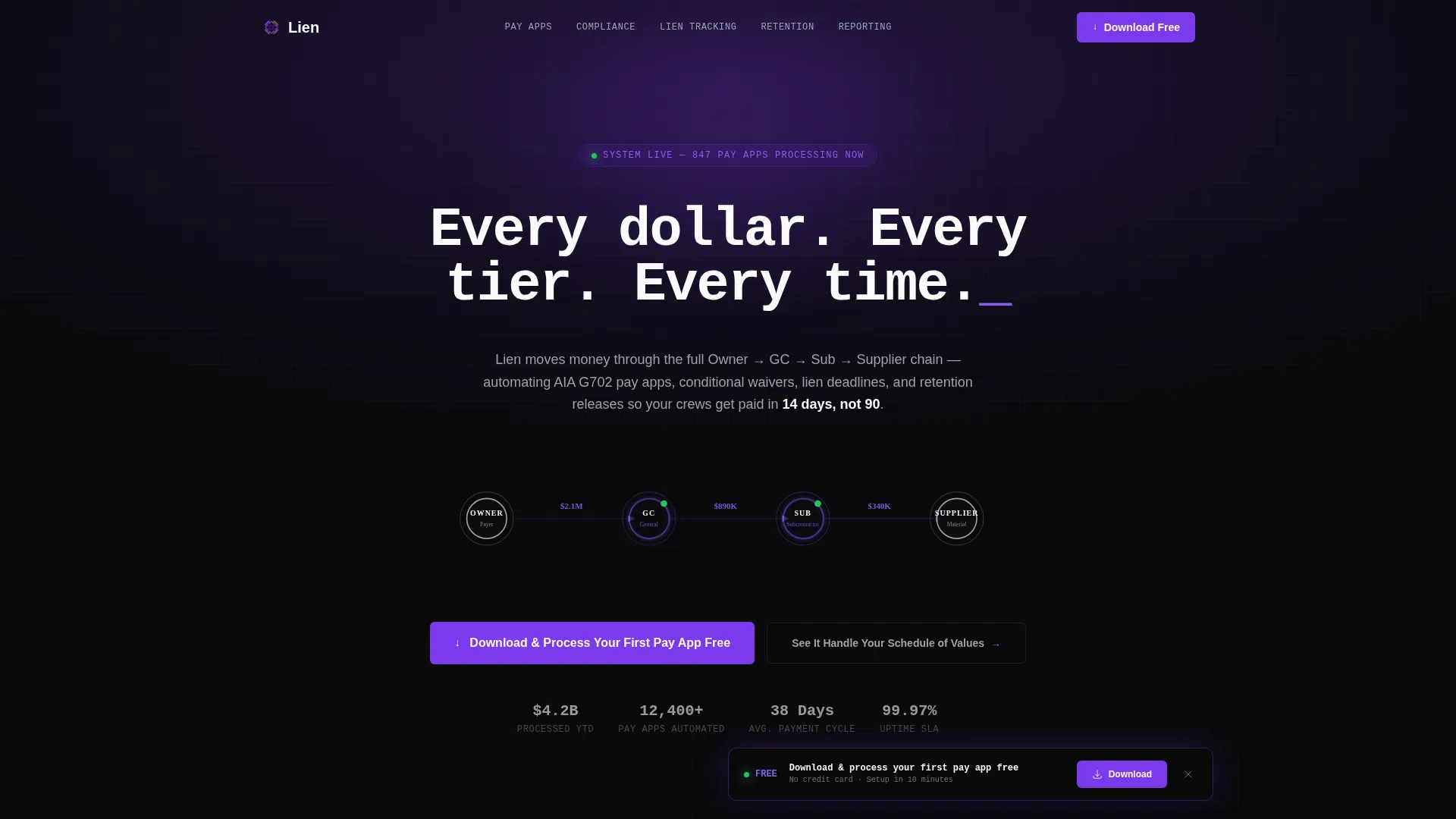
- A Dark Full-Bleed header with an animated payment flow diagram connecting Owner, General Contractor, Sub, and Supplier nodes
- A sticky anchor navigation bar linking to five spoke sections: Pay Apps, Compliance, Lien Tracking, Retention, and Reporting
- A persistent floating call-to-action bar with platform toggle buttons for iOS, Android, and Desktop
Feature list
This template delivers a set of purpose-built layout components that reflect the real complexity of construction payment workflows.
Animated Payment Flow Header
The header fills the viewport with near-black and projects a violet glow from center. A simplified flow diagram materializes with nodes labeled Owner, General Contractor, Sub, and Supplier. Animated lines pulse violet each time a payment moves, and the headline types itself in monospace text, creating a powerful first impression of a system powering on.
Hub and Spoke Anchor Navigation
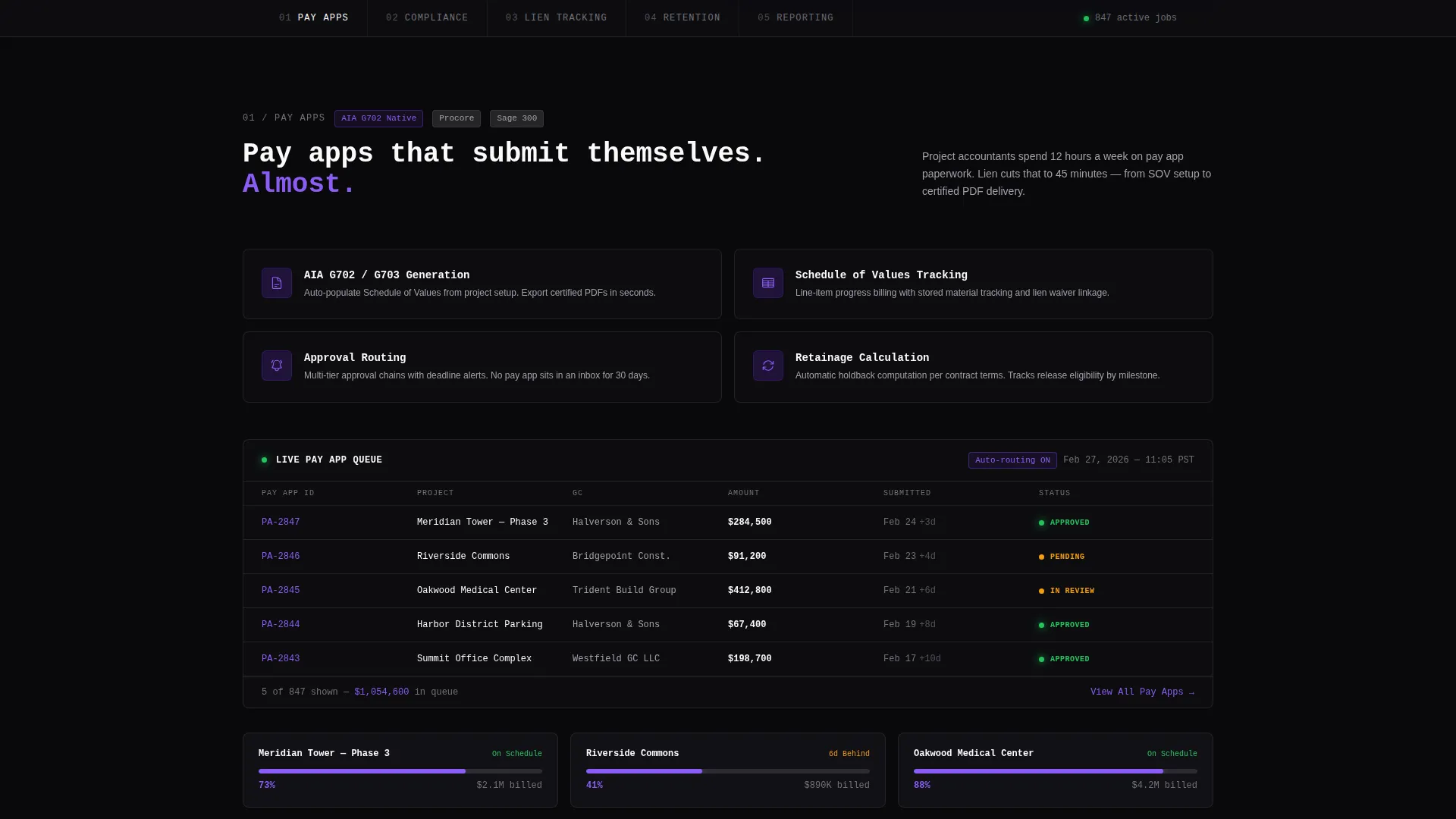
A sticky navigation bar sits at the top of the page after the header scrolls away. It lists the five core capability areas as anchor links. Each click or scroll jumps to the corresponding spoke section, keeping long-page orientation clear and reducing friction for users who arrive with a specific workflow question.
Feature Matrix Spoke Sections
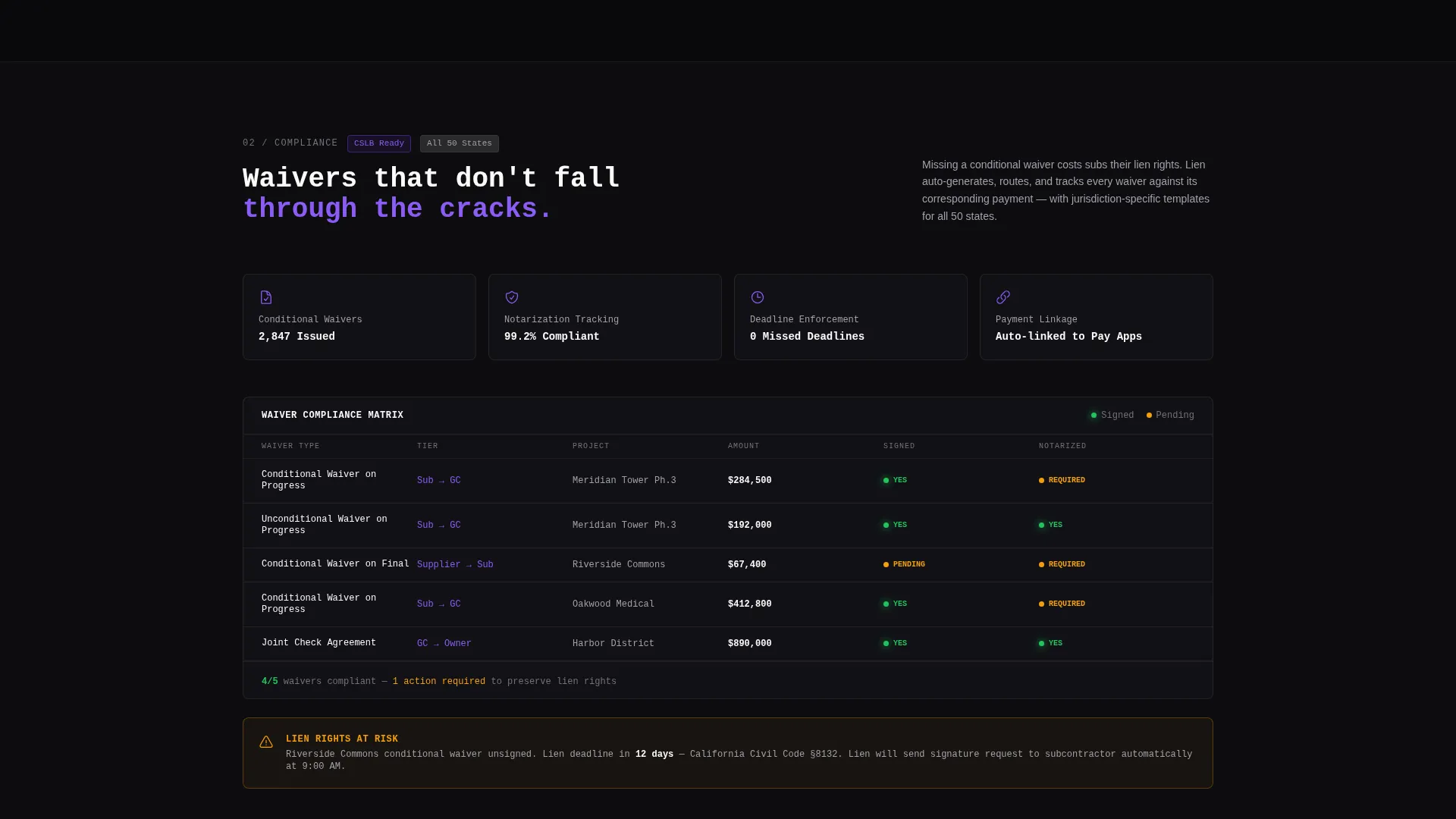
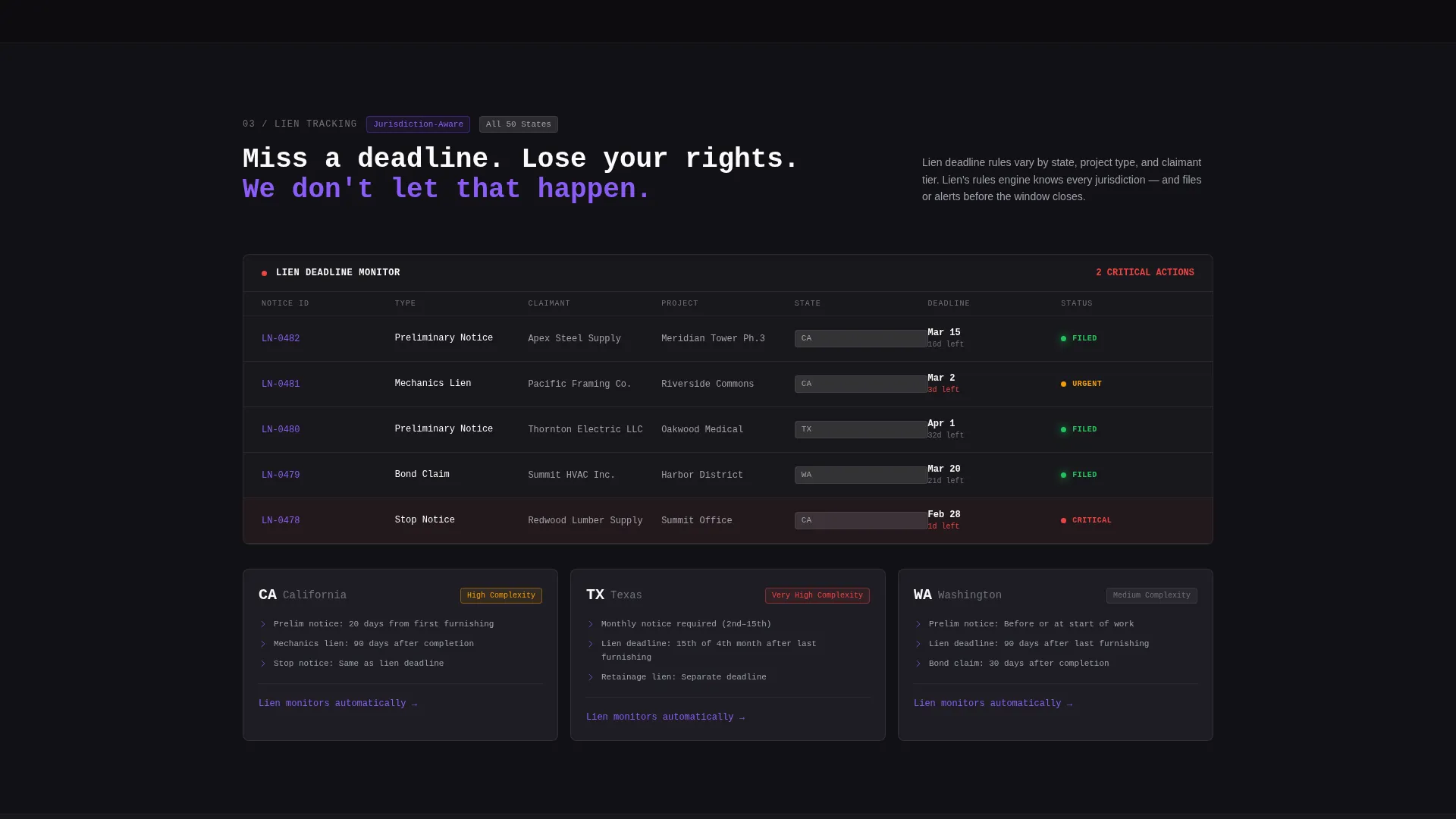
Each of the five spoke sections opens with a tight feature grid showing capability labels, status icons, and integration badges. The grid then expands into a deeper breakdown with animated data tables and workflow diagrams. The rhythm alternates between compression and expansion, earning trust through density before rewarding the user with clarity.
Breathing Section Contrast System
Every spoke section shifts by a single shade, either darker or lighter than its neighbor. This subtle alternation creates a breathing effect that keeps the eye moving down the page without visual fatigue. The effect is deliberate and tied directly to the Void and Violet palette.
Persistent Floating Call-to-Action Bar
After the visitor passes the second spoke section, a floating bar activates at the bottom of the screen. It carries the primary call to action alongside iOS, Android, and Desktop toggle buttons. A secondary path links to an interactive demo focused on the Schedule of Values.
Dual Conversion Path Layout
The primary call to action, "Download and Process Your First Pay App Free," appears in both the header and the persistent floating bar. A secondary call to action, "See It Handle Your Schedule of Values," links to an interactive demo. This dual-path structure captures visitors at different levels of readiness.
Page sections overview
| Section | Purpose |
|---|---|
| Full-Bleed Header | Introduces the platform with an animated payment flow diagram and monospace headline |
| Sticky Anchor Nav | Keeps orientation across five spoke sections as the user scrolls |
| Pay Apps Spoke | Shows pay application tracking capabilities with feature grid and data tables |
| Compliance Spoke | Covers conditional waivers and compliance workflow with status icons |
| Lien Tracking Spoke | Displays lien waiver management and release tracking in an expanded breakdown |
| Retention Spoke | Illustrates retention release scheduling and status across all tiers |
| Reporting Spoke | Presents job-level and portfolio-level reporting with animated data tables |
| Floating call to action Bar | Activates after the second spoke with download prompt and platform toggles |
| Interactive Demo Link | Secondary path offering a live Schedule of Values walkthrough |
Design & branding system
The visual identity follows a Data Command theme that puts financial data at the center and uses color only to direct attention. The palette reads like a dispatch screen in a logistics environment, where every element earns its place.
- Absolute void black (#09090B) as the base background, electric violet (#7C3AED) for hover states, progress bars, and animated accents, muted steel (#71717A) for secondary text and dividers, and cold white (#FAFAFA) for primary type
- Monospace typography for the hero headline, reinforcing the command-line aesthetic of a platform built for precision
- Violet accents fire only where the eye needs to land next, keeping the interface subordinate to the data it displays
Mobile & speed optimization
The template is structured for a single-page flow that works across screen sizes. The anchor navigation and floating call-to-action bar are both designed to remain usable on smaller displays.
- Platform toggle buttons for iOS, Android, and Desktop sit side by side, making the download path clear on any device
- The breathing contrast system between spoke sections maintains visual separation without relying on heavy graphical assets
- Animated elements such as the pulsing flow diagram and floating bar are scoped to specific sections, keeping the layout focused rather than overwhelming
How this template helps you convert
The page earns the download by accumulating proof before asking for anything. Every layout decision is oriented toward making the visitor's current workflow feel inadequate by comparison.
- The header immediately establishes authority by showing the full payment chain in motion, Owner through Supplier, before a single word of body copy appears
- The five spoke sections build confidence incrementally, each one adding a layer of capability that a spreadsheet-and-email workflow cannot replicate
- The dual call-to-action structure meets visitors at two levels of intent, either ready to download or needing one more proof point through the interactive demo
Other information about this template
This template is designed specifically for construction software products operating in the construction payment processing space. It is well suited for platforms that handle AIA G702 pay application workflows, Schedule of Values tracking, and multi-tier lien waiver management.
- The hub and spoke architecture supports platforms with multiple distinct capability modules, making it easy to segment audiences by role, such as accountant, CFO, or subcontractor
- The template style is categorized under Technology and Construction Software, and the intersection of these two categories informed every layout and copy direction decision
- Teams evaluating tools in this space, including platforms compared alongside products like GCPay, Procore, or Textura, will find this template visually and functionally positioned to compete at that level
Theme
Data Command
Creative direction
Feature Matrix
Color system
Void & Violet
Style
Hub & Spoke (Anchor Nav)
Direction
App Download
Page Sections
Animated Payment Flow Header
Hub and Spoke Anchor Navigation
Feature Matrix Spoke Sections
Breathing Section Contrast System
Persistent Floating Call-to-action Bar
Dual Conversion Path Layout
Related questions
Who is this landing page template designed for?
What are the five spoke sections in the anchor navigation?
Does the template include both a primary and secondary call to action?
What makes the visual design suited to a construction finance audience?
Can this template support platforms with multiple user roles?



