AR-Enhanced Enterprise Software Portfolio Website Template
The Lifecycle AR-Enhanced PLM Comparison Table landing page template gives product lifecycle management platforms a compelling, scroll-driven showcase. Built for VP-level PLM administrators, systems engineers, and operations leads, it guides visitors through a Problem-to-Solution arc that makes traditional PLM gaps visible before revealing how augmented reality transforms product lifecycle management into a spatially walkable, decision-ready experience.
by Rocket studio
Quick summary
The Lifecycle template is a single-page, conversion-focused layout built around an AR-enhanced product lifecycle management platform. It pairs a mission-control dark aesthetic with scroll-triggered animations that move visitors from pain to solution. Every section earns the next click, and the final call to action, "Request a Spatial Demo", arrives at exactly the right moment.
Who this template is for
Product lifecycle management software companies and AR-enhanced enterprise platforms need a landing page that speaks the language of their buyers. This template was designed for that precise audience. It communicates complex product lifecycle management concepts clearly, without oversimplifying for visitors who already live inside PLM systems every day.
This template fits teams who are marketing to:
- VP-level PLM administrators and systems engineers at mid-market to enterprise manufacturers who evaluate product lifecycle management software against hard operational criteria
- Operations leads at medical device companies who must ensure compliance with FDA regulations and maintain complete, traceable revision history before any audit
- Program managers and engineering teams in the aerospace industry who manage complex product structures, long product lifecycles, and stringent regulatory requirements
What problem this template solves
Traditional product lifecycle management platforms are powerful but hard to sell visually. Their value lives in data flows, revision histories, and change management workflows, none of which are obvious on a flat screen. Most landing pages for product lifecycle management software describe features without making the buyer feel the gap they are sitting in right now.
This template solves that directly. It builds a structured emotional arc:
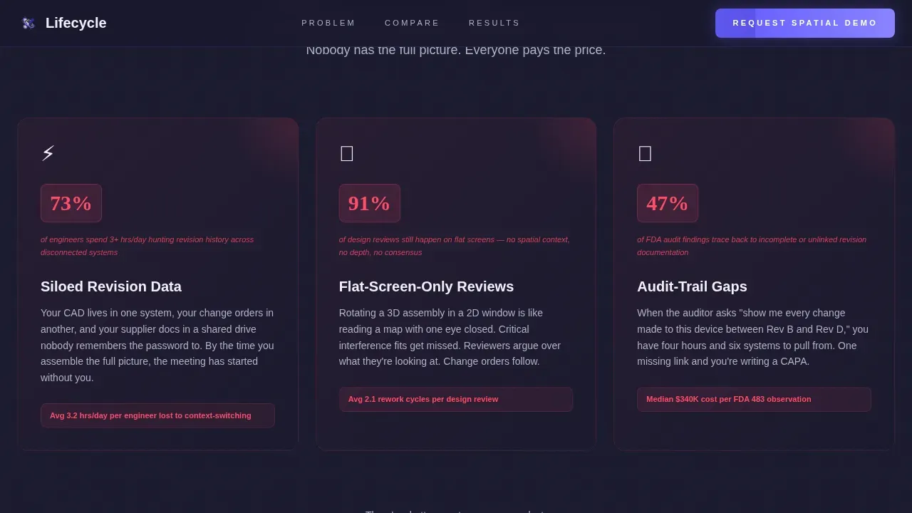
- Engineers and operations leads arrive already frustrated by siloed product data, flat-screen-only reviews, and audit trail gaps, the pain grid section names those frustrations specifically with pulsing visual stats
- The scroll-triggered comparison table translates each frustration into a side-by-side contrast: "Traditional PLM" versus "With Lifecycle AR," so relevant stakeholders self-diagnose their own gap row by row
- By the time a visitor reaches the call to action, they have already made a private decision, the form just confirms it
What you get with this template
This template delivers a complete, production-ready landing page layout. Every section is purpose-built for a product lifecycle management platform that uses augmented reality as its primary differentiator. The design system, animation logic, and copy structure all reinforce the same arc.
You get the following built-in sections and components:
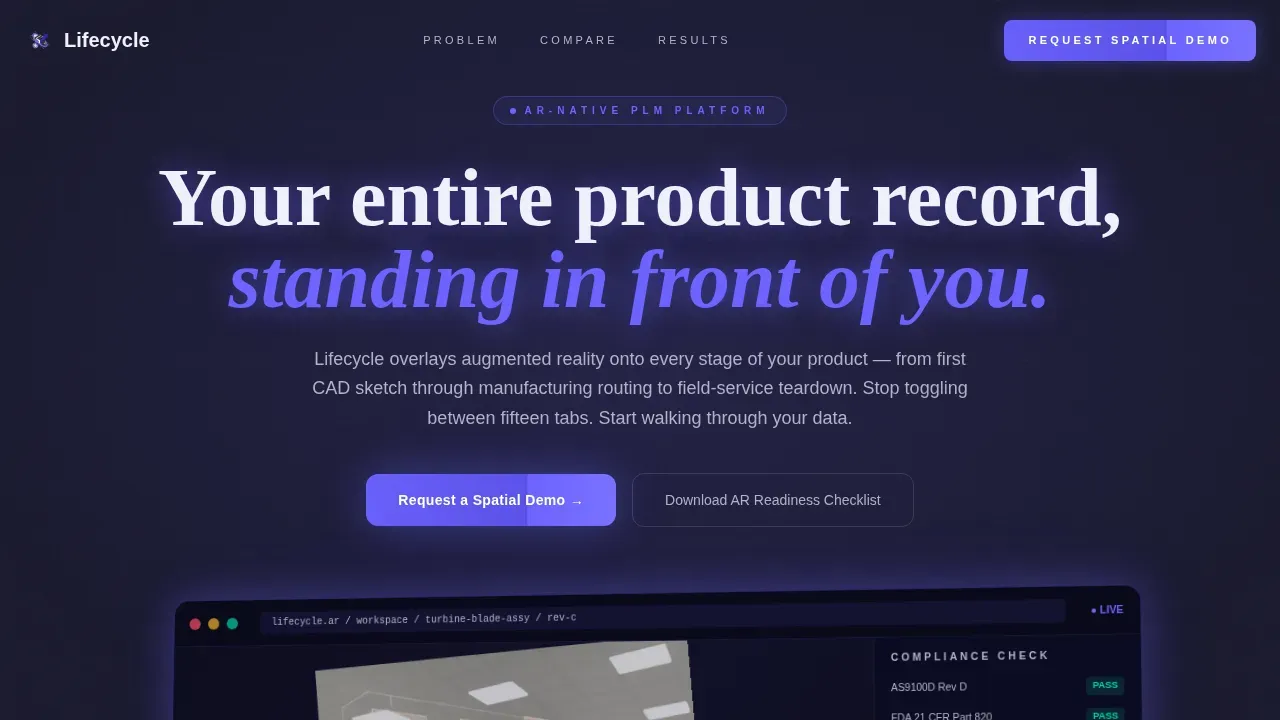
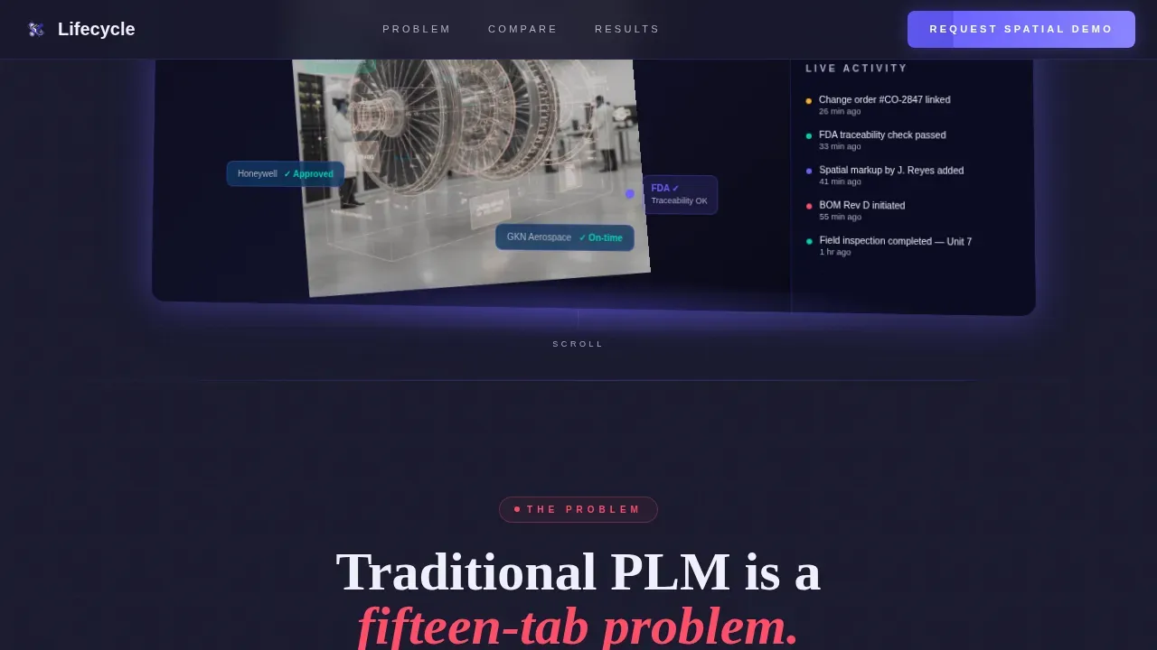
- Hero section with angled device bezel, floating turbine-blade assembly, revision callouts, supplier status badges, compliance sidebar, and a live activity feed showing real-time AR inspection notes
- Three-column pain grid with muted red pulsing stats covering siloed revision data, flat-screen-only reviews, and audit-trail gaps, followed by a scroll-animated comparison table where every row flips from gray to electric indigo as the solution side populates
- Lead generation form section with a "Request a Spatial Demo" primary call to action, a work-email-first capture sequence, a company name field, and a single dropdown ("Where does your PLM hurt most?") plus a secondary path offering a downloadable AR-readiness checklist gated behind email-only capture
Feature list
This template's important features are drawn directly from the platform brief and designed to work together as a single persuasion system for product lifecycle management software buyers.
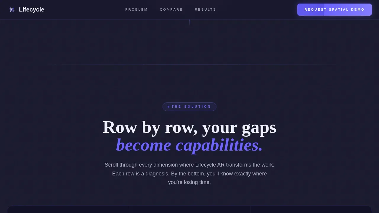
Scroll-Triggered Comparison Table
The comparison table is the centerpiece of the product lifecycle management narrative. Each row begins in a muted gray state representing traditional PLM limitations, siloed product data, manual change-order tracking, flat technical documentation review. On scroll, each row flips to electric indigo and populates the right column with specific Lifecycle AR capabilities: spatial markup, hands-free field inspection, and living digital thread. The animation pacing creates a rhythm. Problems feel heavier. Solutions arrive faster. By the final row, the visitor has walked themselves through their own product lifecycle management gap analysis.
AR Dashboard Hero Preview
The header section renders a pixel-accurate spatial view of the platform: a turbine-blade assembly floating mid-air, complete with revision callouts, supplier status badges, and a compliance-check sidebar visible in one frame. The device bezel sits angled five degrees off-axis, grounding the visual in real product development contexts. Below the assembly, a real-time activity feed scrolls live event strings, "Rev C approved, 4 min ago," "AR inspection note added, 11 min ago", making the product feel active and in use before any visitor reads a single feature bullet.
Pain Grid with Pulsing Stats
Three columns map the most common product lifecycle management frustrations: siloed revision data, flat-screen-only design reviews, and audit-trail gaps. Each cell pulses a muted red statistic, creating a visceral sense of cost before the comparison table arrives. The pain grid primes engineering teams and operations leads to recognize their own situation, which makes the solution side of the table feel earned rather than marketed.
Dual-Path Lead Generation Form
The primary call to action, "Request a Spatial Demo", appears anchored in the header and repeats after the final comparison row. The form captures work email first, then company name, then a single dropdown with options including "Change-order visibility," "Field-service documentation," and "Regulatory traceability." A secondary conversion path offers a downloadable AR-readiness checklist gated behind email-only capture, reaching visitors who are evaluating but not yet ready for a live demo. Both paths feed qualified leads at different stages of the decision-making process.
Staggered Reveal Animations
The template uses high-density scroll-triggered animation throughout. The hero headline fades in above the device bezel. The pain grid cells reveal with a staggered timing sequence. The comparison table rows flip on scroll. The activity feed scrolls continuously. All interactive surfaces, table rows, form fields, call to action buttons, carry hover states styled in electric indigo, making every interactive element feel alive and deliberate.
Mission-Control Visual Identity
The design system is built around a dark ambient workspace that signals precision and technical authority. Deep charcoal backgrounds frame electric indigo interactive surfaces, cool-slate gray dividers, and signal-white card cells. The typographic system uses DM Sans for interface copy and Fraunces for display headlines, creating a contrast between approachable readability and confident authority. The overall feel is a mission-control room at 2 AM, alive with active telemetry, quiet with focus.
Page sections overview
| Section | Purpose |
|---|---|
| Hero Dashboard Preview | Establish spatial platform credibility with an angled AR device view, floating assembly, and live activity feed |
| Pain Grid | Surface three specific PLM frustrations with pulsing red statistics to prime the comparison |
| Comparison Table | Animate a row-by-row contrast between traditional PLM and Lifecycle AR capabilities on scroll |
| Social Proof Stats | Reinforce trust with industry-specific metrics from aerospace, medical, and manufacturing deployments |
| Lead Gen call to action | Capture qualified demo requests via a segmented form and offer a secondary checklist download path |
| Footer | Linear single-row footer with navigation and legal links |
Design & branding system
The visual identity follows a Directory and Discovery theme executed through an Electric Indigo color system. The palette was chosen deliberately for a technical, VP-level audience: it reads as precise and alive without feeling decorative or consumer-facing.
The branding system includes:
- Color palette: deep workspace charcoal (#1A1A2E) for all ambient surfaces, electric indigo (#6C63FF) for every interactive surface and hover state, cool-slate gray (#B0B3C5) for secondary text and table dividers, bright signal white (#F0F0FA) for card backgrounds and data cells
- Typography: DM Sans handles all body and user interface copy for clean readability; Fraunces handles display headlines for confident visual weight, the contrast between the two creates a readable, authoritative hierarchy without relying on decorative elements
- Animation and interactivity: scroll-triggered row flips on the comparison table, pulsing red pain stats, continuously scrolling activity feed, fade-in hero headline, staggered section reveals, and hover states on all interactive surfaces
Mobile & speed optimization
The template is built desktop-first, reflecting the primary audience of VP-level administrators and engineers who work on workstations. The layout is structured around wide comparison tables, spatial hero visuals, and data-dense pain grids, all of which are optimized for larger screens first.
Mobile considerations built into the template include:
- Responsive mobile fallback layout that reflows the comparison table and pain grid into vertically stacked single-column views, preserving readability for the full product lifecycle management narrative
- Server Components handle static sections including the hero, pain grid, and footer, while Client Components manage the animated comparison table and lead generation form, keeping interactive rendering scoped to the elements that need it
- Scroll-triggered animation logic is scoped to Client Components, ensuring that heavy animation sequences do not block the rendering of static product lifecycle content above the fold
How this template helps you convert
Product lifecycle management software buyers are disciplined evaluators. They do not convert on enthusiasm. They convert when a page makes them feel understood, shows them a specific gap, and then gives them an obvious, low-friction path forward. This template is designed around that exact sequence.
- The pain grid names real PLM frustrations with specific stats, creating immediate recognition for engineering teams, operations leads, and PLM administrators who are living those problems today
- The scroll-animated comparison table builds a case row by row, so by the time visitors reach the final call to action, they have self-diagnosed their gap, the "Request a Spatial Demo" form feels like relief, not a sales prompt
- The secondary checklist path catches evaluators who are not yet ready for a demo, capturing qualified email addresses from buyers still in the decision-making phase and keeping them in the funnel without pressure
Other information about this template
Product lifecycle management is a broad discipline covering product development processes from ideation through end-of-life. The global product lifecycle management market is projected to grow from USD 26.24 billion in 2024 to USD 46.81 billion by 2032, reflecting demand for stronger product data management, better version control, and tighter regulatory compliance across industries.
This template is built to represent platforms that compete in that growing market. Several contextual facts are worth knowing when positioning it:
- Augmented reality in product lifecycle management integrates 3D digital data directly into the physical environment. AR implementation can lead to 114% faster manufacturing cycle times and 193% faster service times. AR can also cut average repair times by up to 40%, making it a compelling differentiator for platforms targeting the aerospace industry, manufacturers of medical devices, and consumer electronics companies
- The aerospace industry benefits from product lifecycle management due to the long product lifecycle of aircraft components and the stringent regulatory requirements attached to every design phase change. PLM systems that manage complex product structures and ensure complete audit trails are critical in this vertical
- In the healthcare and life sciences sector, product lifecycle management software must address regulatory compliance, patient safety, and data security. Operations leads at medical device companies rely on complete product documentation and unbroken audit trails to meet FDA regulations at every product iteration
- PLM systems provide a centralized repository for all product-related information, eliminating data silos and ensuring consistency across the organization. This centralized repository supports version control, product data management, and seamless collaboration across manufacturing teams and engineering teams
- PLM integrates with CAD tools and ERP systems to streamline operations and improve data flow across product development and business processes. Integrating PLM with ERP systems provides a single source of truth for product data, reducing manual data entry and improving decision making across relevant stakeholders
- PLM solutions facilitate seamless integration with manufacturing execution systems (MES), which reduces errors and misinterpretations in the documentation process. PLM's ability to integrate with various enterprise systems enhances operational efficiency and supports better management of product data across the entire lifecycle
- Connecting AR to PLM data via digital threads ensures that the information viewed is always the latest, most accurate version. AR serves as a visualization and interaction layer that adds value to existing PLM, CAD, and IoT investments, giving engineering teams and manufacturing teams up to date information at the point of use
- PLM software solutions empower companies to drive innovation, reduce product costs, and improve product quality. Key modules include product data management (PDM), bill of materials (BOM) management, engineering change management, and supplier collaboration, all of which support streamlining processes across the product lifecycle
- Implementing a PLM system requires executive support to allocate necessary resources. A change management strategy is essential for easing adoption. Developing a clear data migration plan facilitates an efficient transfer of existing technical documentation to the new PLM system. Companies must commit to ongoing improvement to sustain the documentation excellence that product lifecycle management enables
- PLM systems can help organizations address component obsolescence by monitoring the lifecycle of each component used in product designs. Quality assurance teams play a crucial role in ensuring product data is recorded consistently across platforms. PLM supports process planning, granular control over product configurations and product variants, and robust access control so that critical information reaches the right people at the right time
- Choosing the right landing page template is crucial for converting visitors into users when promoting AR in product lifecycle management software. Key features of an effective AR landing page include high-quality video and 3D model support, clear value-driven headlines, and interactive elements like 3D model viewers or AR annotations. Webflow's Daily 128 Industrial Template offers professional layouts suitable for showcasing high-tech AR solutions, and Unbounce's SaaS-specific templates are pre-optimized for high conversion with single calls to action and visual hierarchies that guide users toward demo requests. Siemens Teamcenter is recognized as a leading PLM solution for large-scale manufacturers. Arena PLM and QMS is well-structured for managing product lifecycle and quality management processes. Onshape is recognized for its real-time collaboration capabilities in CAD and PLM. Propel is noted for its customization options, allowing users to tailor workflows to their business needs. OpenBOM is praised for its ease of use and modern design, making it suitable for small engineering firms. Duro is described as a lightweight, user-friendly tool that simplifies engineering operations
Theme
Directory & Discovery
Creative direction
Problem→Solution Arc
Color system
Electric Indigo
Direction
Lead Generation
Page Sections
Scroll-triggered AR Comparison Table
Spatial AR Dashboard Hero
Pain Grid with Pulsing Statistics
Dual-path Lead Generation Form
High-density Scroll Animation System
Mission-control Visual Identity
Related questions
Who is this landing page template designed for?
Can this template support a secondary lead capture path?
How does the comparison table animation work?
Is this template suitable for a desktop-first audience?
What design style does this template use?


