Drag and Drop PLM Comparison Landing Page Template
The Lifecycle drag and drop PLM comparison landing page template is built for mid-market manufacturers and hardware teams ready to replace legacy PLM software. It combines an interactive workflow canvas, animated comparison tables, and a two-step qualifier flow to help product teams compare options, make informed decisions, and move toward a faster, more flexible product lifecycle management solution.
by Rocket studio
Quick summary
This is a high-interactivity comparison landing page template for a low-code product lifecycle management platform. It guides operations directors, engineering managers, and IT leads through a clear problem-to-solution arc. Animated comparison tables, a live workflow canvas, and a focused qualifier modal work together to convert research-stage visitors into demo-ready leads.
Who this template is for
Product managers, IT leads, and operations teams at mid-market manufacturers need a faster path to evaluating PLM software. This template is designed specifically for those audiences. It gives them a structured, evidence-based page that builds the internal business case as they scroll.
- Operations directors at manufacturers outgrowing spreadsheets and needing a credible system switch
- Engineering managers at hardware startups shipping physical products for the first time
- IT leads tasked with replacing a sunsetted legacy PLM instance before losing vendor support
What problem this template solves
Legacy PLM deployments are slow, expensive, and inflexible. Companies often wait months for an integrator to configure a system before a single user can log in. The cost of PLM software at the enterprise tier can reach seven figures, which puts quality tooling out of reach for mid-market teams. This template gives your platform a place to make that case clearly and convert the right buyer.
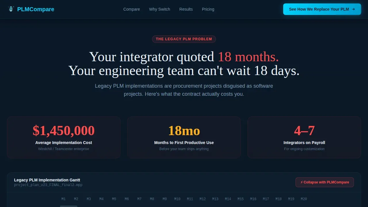
- Visitors arrive skeptical; the animated pain section makes the legacy cost and timeline tangible
- Comparison tables let buyers quickly see key differentiators without scheduling a call first
- The two-step qualifier captures intent early and routes leads before they bounce
What you get with this template
You get a complete, single-page landing structure built around comparison-driven conversion. Every section is sequenced to escalate pain, deliver relief, and close with a low-friction action. The page prioritizes effective communication of value without overwhelming the visitor.
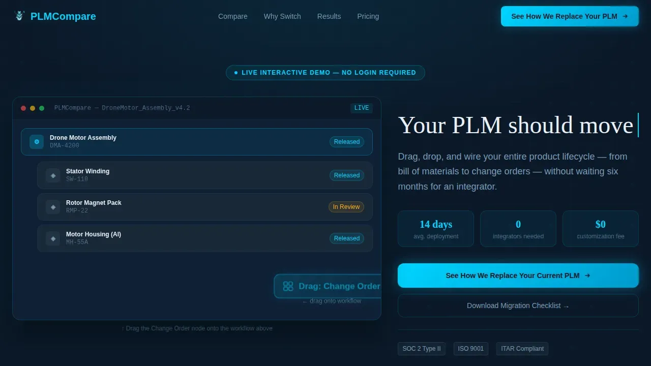
- An interactive hero canvas with a drag and drop workflow demonstration and typewriter headline
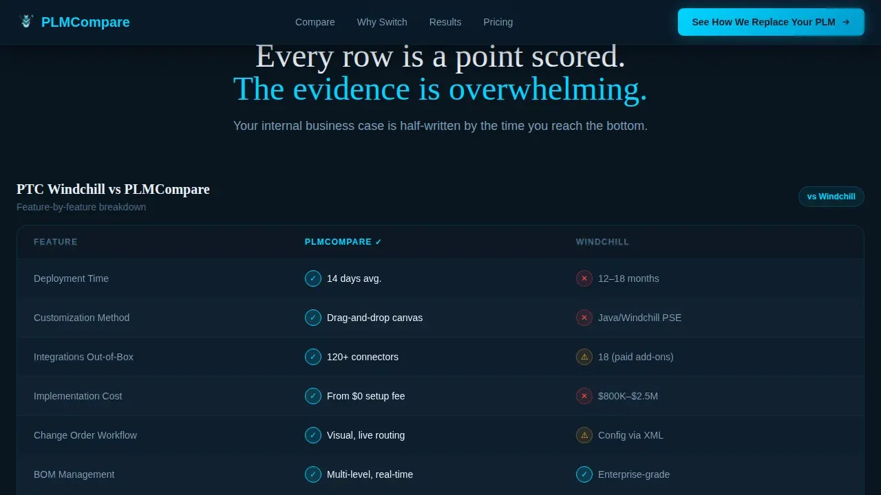
- Animated comparison tables contrasting legacy PLM with your platform on deployment time, cost, and customization
- A two-step qualifier modal plus a secondary email-capture path for research-stage visitors
Feature list
This template ships with a focused set of features designed for one purpose: converting PLM evaluators into qualified leads. Below are the key features that make this landing page perform.
Interactive Workflow Canvas
The hero section embeds a functioning micro-app above the fold. A simplified product record is already loaded when the page opens. Visitors can drag a change order node onto the canvas and watch approval routing animate in real time. Lines draw, status badges pulse, and a version history column populates automatically. This is not a static screenshot; the product is live from the first frame.
Animated Comparison Tables
Row-by-row comparison tables reveal as the user scrolls, with cyan check marks bouncing in and caution icons filling competitor columns. Each row covers a meaningful dimension: deployment time, customization method, integration count, and total cost of ownership. The scroll-triggered animation makes each data point feel like a point scored, which supports faster decision making for the buyer.
Problem-to-Solution Arc Layout
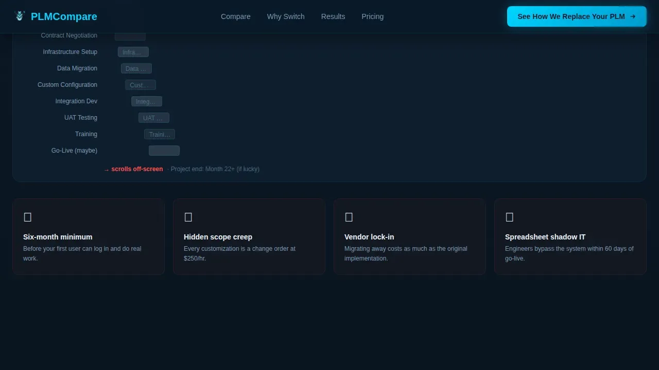
Section one presents the legacy PLM nightmare with animated cost counters and a Gantt chart that scrolls off-screen. A single click collapses it into a compact node graph. This structure builds emotional momentum before presenting your solution, which keeps visitors engaged through the full comparison process.
Two-Step Qualifier Modal
The primary call to action opens a two-step modal. Step one asks which PLM the visitor is evaluating against, with a dropdown covering major legacy systems and spreadsheets. Step two asks team size and captures one open-field frustration. This process surfaces high-intent leads and gives your sales team context before the first conversation.
Secondary Migration Checklist Path
Below each table cluster, a text link offers a downloadable migration checklist. This path captures email only, with no additional friction. It serves visitors still in the research stage who are not yet ready to book a demo but are developing a business case inside their organization.
Testimonial and Social Proof Cards
Dedicated testimonial cards include specific metrics, company roles, and outcomes from operations directors and engineering managers. Social proof placed near comparison tables reinforces credibility at the exact moment a visitor is weighing their options and considering whether to make a purchase.
Page sections overview
| Section | Purpose |
|---|---|
| Hero Canvas | Live drag and drop workflow preview with typewriter headline above the fold |
| Legacy Pain Section | Animated cost counter and scrolling Gantt chart to surface legacy PLM frustrations |
| Comparison Table Cluster | Side-by-side rows contrasting your platform against legacy PLM systems |
| Social Proof Strip | Testimonial cards with role-specific metrics from real user types |
| Call to Action Section | Two-step qualifier modal and secondary migration checklist capture path |
| Footer Row | Linear single-row footer with navigation links and brand details |
Design & branding system
The visual identity follows a Dynamic Motion theme built on a Midnight Blue color system. The palette is designed to feel like a control room at 2 a.m., with every element carrying a sense of live data and mechanical precision. Typography pairs DM Sans for body text with Fraunces for headings, creating a premium industrial contrast.
- Deep terminal navy (#0B1929) background, steel-panel charcoal (#1C2B3A) card surfaces, electric signal cyan (#00D4FF) on interactive elements, and engineering white (#EAF0F7) for text and table headers
- Cyan pulses on hover states and animated connectors; charcoal panels float above navy with depth shadows
- High-animation fidelity: typewriter effect on the headline, animated cost counter, Gantt collapse, and scroll-triggered cell bounce-in
Mobile & speed optimization
The template is built desktop-first, reflecting the reality that operations directors and IT leads work primarily on large monitors. Animation layers use CSS and Intersection Observer patterns, avoiding heavy external libraries. The page structure keeps asset load lean so the interactive canvas does not compromise the overall user experience on load.
- CSS-driven animations and scroll-triggered reveals keep the page responsive without JavaScript-heavy dependencies
- Desktop-first layout structure ensures comparison tables render cleanly across wide viewports
- Mobile layout adapts comparison tables and the qualifier modal to remain usable on smaller screens
How this template helps you convert
The page is architected around Comparison/Versus conversion, a pattern designed for buyers already evaluating specific alternatives. Every section moves the visitor one stage closer to acting. Below are the primary conversion mechanisms built into this template.
- A sticky primary call-to-action in the nav and a repeated placement after each comparison table cluster ensure the action is always one click away, regardless of where the visitor is on the page.
- The two-step qualifier modal reduces friction by asking only two questions, making it easier for busy buyers to complete the process and giving your sales team informed context for follow-up.
- The secondary migration checklist capture path serves visitors who are still developing their internal case, letting you maintain contact with research-stage leads without requiring a full demo commitment.
Other information about this template
This template is part of a broader library of specialized templates designed to serve different stages of the PLM buying process. It can function as a standalone landing page or as the primary acquisition page in a multi-page web presence. Several facts and practices are worth noting for teams evaluating this template against alternatives or planning their build.
- When comparing PLM software, user experience and interface quality are often the deciding factors; this template demonstrates those qualities from the first scroll
- Key features to look for in any PLM system include collaboration tools, document management, and revision tracking; this template is built to showcase exactly those capabilities in comparison format
- PLM software acts as a single source of truth for all departments; this page communicates that value clearly in the comparison rows
- The "Supplier Collaboration Portal" template variant includes secure file sharing, external supplier access for partners, and real-time markup tools for distributed teams
- The "Intelligent AI-Powered" PLM dashboard template offers predictive analytics, context-aware layout adjustments, and AI-assisted workflow optimization for teams ready to leverage advanced capabilities
- This template works with assets created in tools like Adobe Illustrator; design components and icon sets can be exported from Adobe Illustrator and dropped directly into the template's asset slots
- Adobe Illustrator files match the Midnight Blue color system and can be used to customize icons, connector graphics, and comparison table visuals
- Using pre-designed layouts like this template lowers development costs compared to building custom pages from scratch for each new product launch
- A/B testing different versions of the qualifier modal and call to action text is straightforward because the template is structured around clearly isolated components
- It is beneficial to request a demo or trial of PLM software before making a purchase decision; this page is built to make that action feel natural and low-risk
- The cost of PLM software varies widely across the market; this template helps your platform make the budget comparison explicit and compelling for mid-market buyers
- Teams can browse additional templates in the same library to find layouts that match other stages of the sales funnel or different buyer personas
Theme
Dynamic Motion
Creative direction
Problem→Solution Arc
Color system
Midnight Blue
Style
Comparison Table
Direction
Comparison/Versus
Page Sections
Live Drag and Drop Workflow Canvas
Scroll-triggered Comparison Tables
Problem-to-solution Arc Structure
Two-step Qualifier Modal
Secondary Email Capture Path
Testimonial Cards with Role-specific Metrics
Related questions
Who is this landing page template designed for?
Can I customize the comparison table rows and competitor names?
Does the interactive drag and drop canvas require custom development?
How does the two-step qualifier modal work?
Is this template suited for teams replacing a specific legacy PLM system?



