Swimwear & Beachwear Blog Website Template
Linen is an elegant resort wear landing page built for a label that moves between Tulum and Mykonos without changing clothes. The design uses a full-viewport editorial header, a modular asymmetric card grid, and an Ink & Paper palette to make browsing feel like a carefully curated hotel-bed edit, not a storefront.
by Rocket studio
Quick summary
Linen is a single-page, click-through landing page for a resort wear brand. It opens with a full-viewport editorial photograph, then unscrolls into a modular card grid that builds from lightest fabrics to the most structured evening piece. Every design decision prioritizes feeling over function, moving visitors toward the product catalog with quiet confidence.
Who this template is for
This template is made for resort wear brands whose customers shop by instinct and aesthetic, not by filter. If your label sits at the intersection of fashion editorial and considered travel, this page speaks that language fluently.
- Resort wear labels selling raw silk, washed linen, or hand-loomed cotton pieces to a design-literate audience
- Founders and creative directors launching a curated seasonal collection with a single click-through goal
- Brands whose visual identity demands whitespace, restraint, and editorial photography over product grids
What problem this template solves
Most e-commerce landing pages lead with utility: filters, size selectors, and carousels that feel functional but cold. A brand built on feel and considered craft loses something when it is forced into that mold. This template solves the mismatch between editorial brand identity and off-the-shelf storefront layouts.
- Removes size selectors and cart widgets so nothing interrupts the visual narrative before the catalog click
- Replaces rigid symmetrical grids with an asymmetric modular layout that feels like a stylist's arrangement, not a spreadsheet
- Uses scroll order as creative direction, building the collection from gauze wraps to a single evening piece in the right sequence
What you get with this template
You get a complete, single-page layout designed around one purpose: earning the click to the full product catalog. Every section is prompt-built for a resort wear brand with a specific aesthetic, audience, and conversion goal.
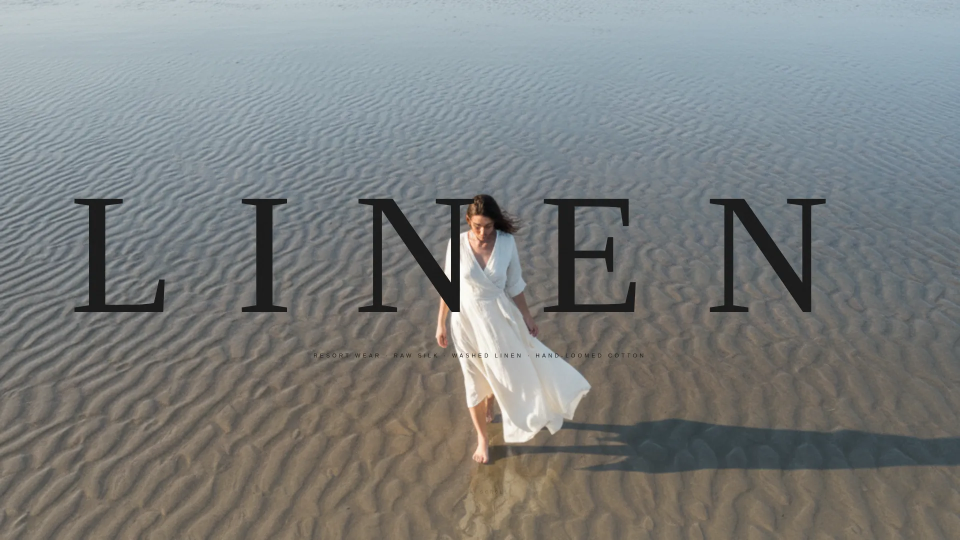
- A full-viewport editorial header with ultra-thin wide-letterspaced serif brand name over a fashion-forward overhead photograph
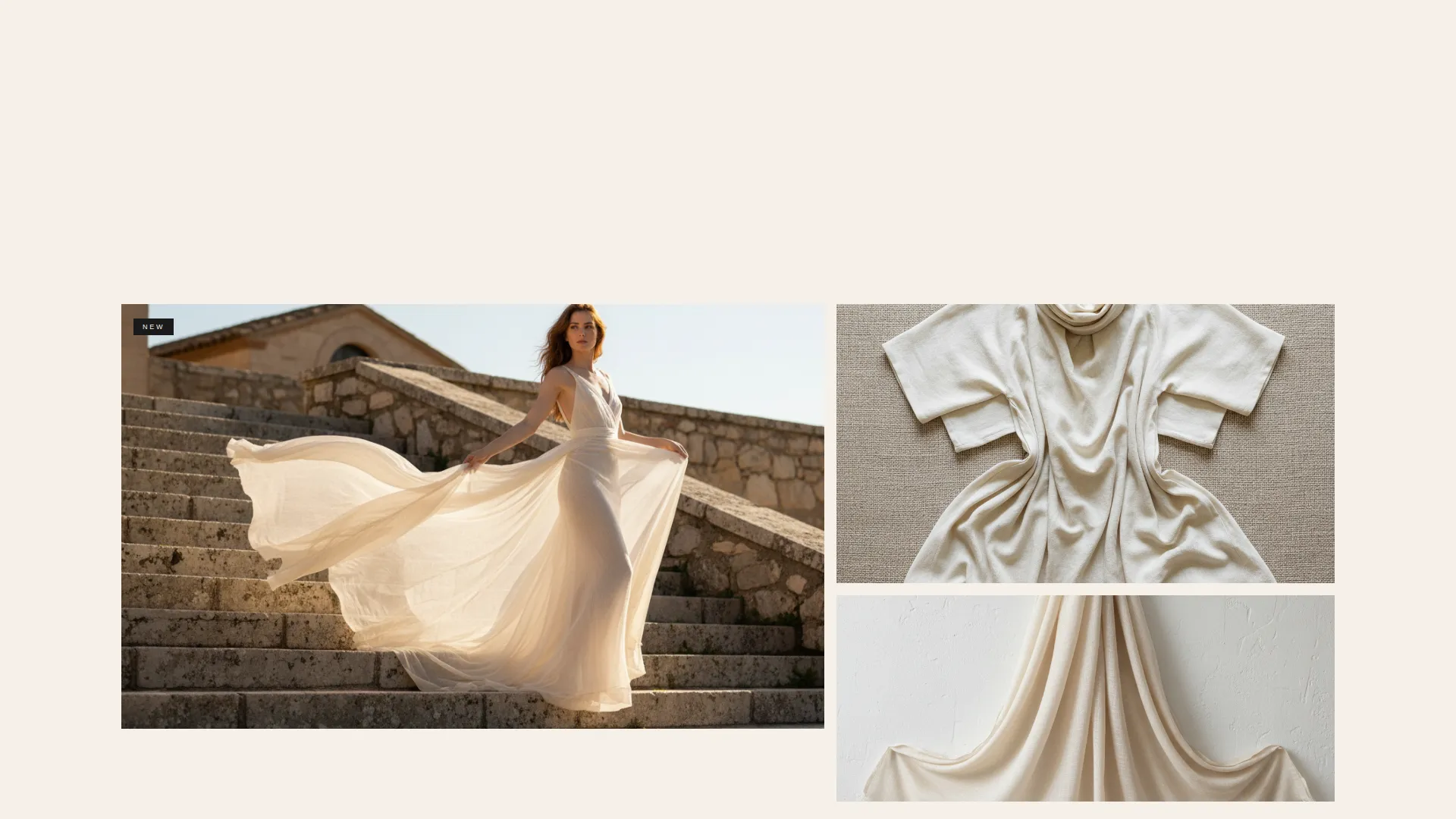
- A modular asymmetric card grid with tall, wide, and paired card formats that never lock into a rigid pattern
- Repeating "Shop the Edit" call-to-action placements after every third card cluster, plus a floating mobile version at the bottom of the viewport
Feature list
This template is built around a small set of deliberate, well-executed features. Nothing is included to pad the page. Each element earns its place.
Editorial Full-Viewport Header
The header is a full-bleed photograph shot from above, showing a woman walking a wet sand shoreline with her linen wrap trailing behind her. The brand name renders in an ultra-thin serif at large scale, letterspaced wide, ink-black against pale sand. No navigation appears until the visitor begins to scroll.
Asymmetric Modular Card Grid
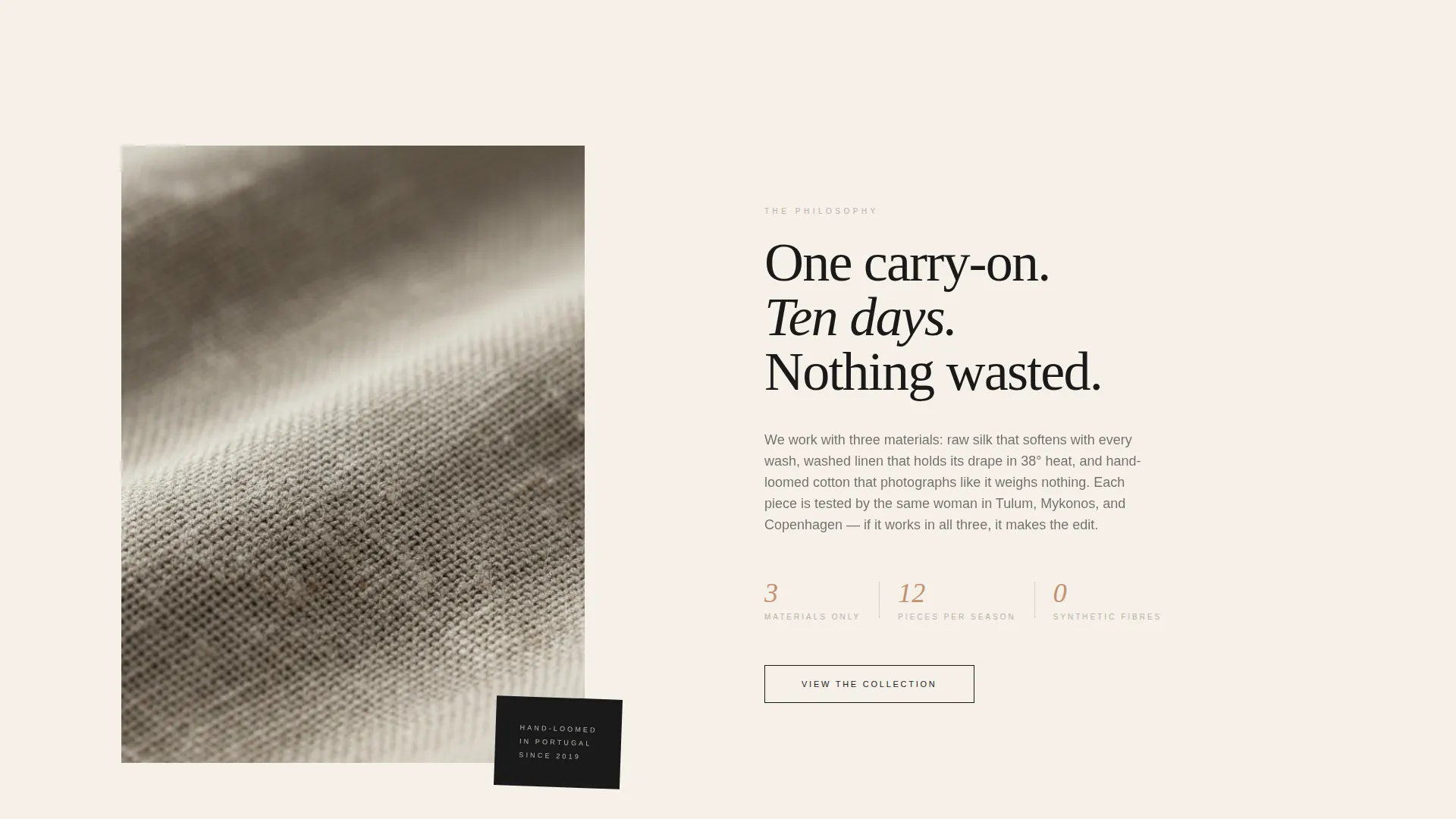
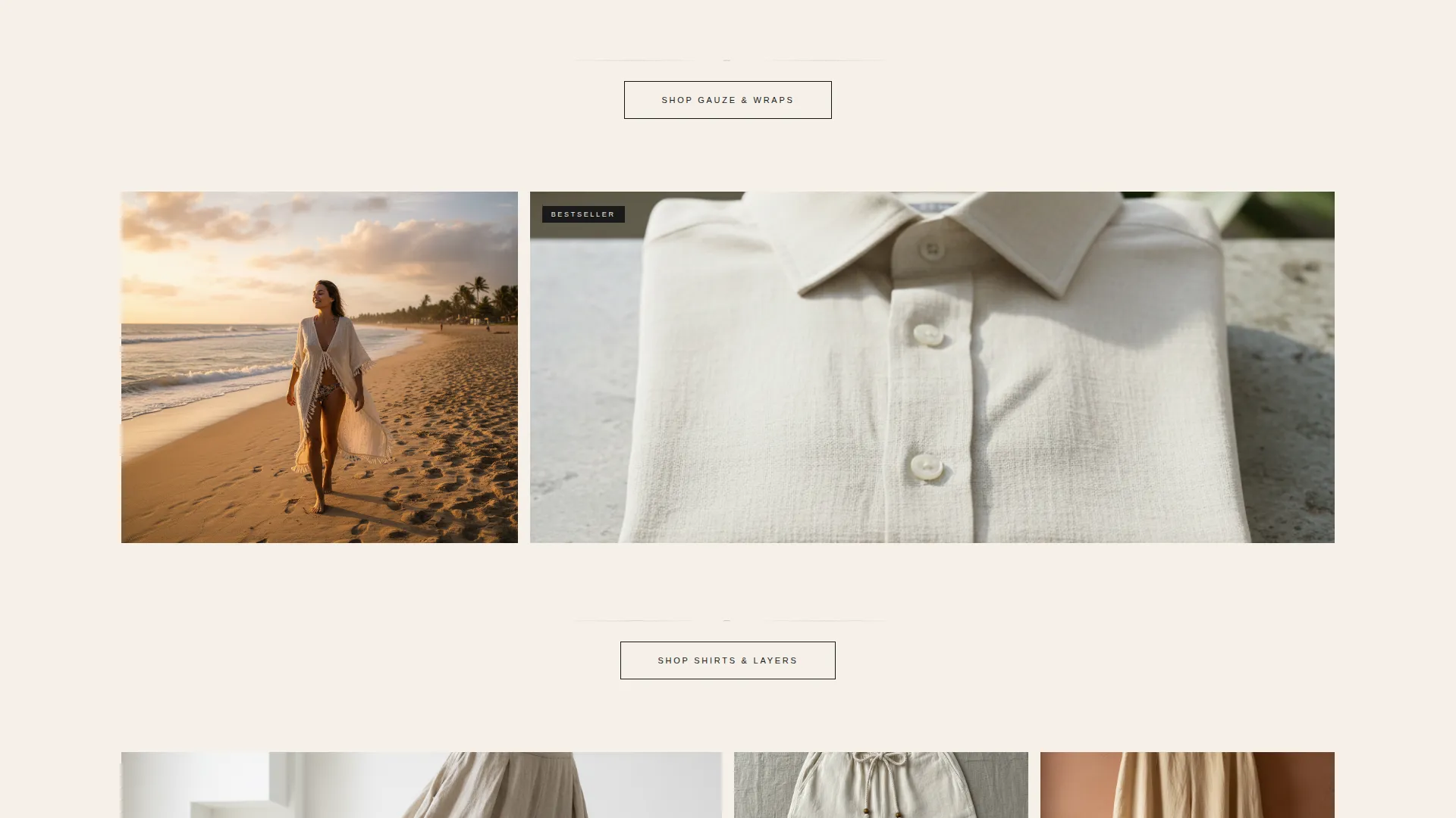
Cards are laid out in an irregular pattern of tall, wide, and paired formats, never repeating the same rhythm. Each card holds one garment, photographed flat on raw linen or worn in motion against architecture. The layout is designed to feel like a stylist has arranged pieces across a hotel bed for a considered edit.
Scroll-Sequenced Collection Order
The card grid builds deliberately from the lightest to the most structured pieces. Gauze wraps appear first, followed by open shirts, then tailored trousers, then a single evening piece. This sequence mirrors the act of packing a carry-on in the right order, and it gives the scroll a sense of narrative momentum.
Terracotta Hover Reveal
Each card sits quietly until hovered. A dried terracotta underline appears on hover, surfacing the piece name and price point. The accent color is reserved exclusively for this interaction and for price display, keeping the palette clean across all other elements.
Repeating Click-Through call to action
A "Shop the Edit" button appears after every third card cluster in the desktop layout. On mobile, the same call to action floats at the bottom of the viewport. The button uses ink-black text on an unbleached cotton background, consistent with the overall Ink & Paper color system.
Ink and Paper Color System
The palette uses four values: unbleached cotton (#F5F0E8), deep manuscript ink (#1A1A1A), warm stone shadow (#B8AFA6), and dried terracotta (#C4906E). Each color has an assigned role. Nothing competes for attention outside of its designated context.
Page sections overview
| Section | Purpose |
|---|---|
| Editorial Header | Opens with full-viewport overhead photograph and oversized brand name in ultra-thin serif |
| Card Grid Opening | First cluster of asymmetric cards introduces lightest pieces: gauze wraps |
| Mid-Scroll call to action | "Shop the Edit" button placed after third card to intercept scrollers early |
| Card Grid Middle | Second cluster continues with open shirts and relaxed separates |
| Repeating call to action Block | Second "Shop the Edit" placement after mid-scroll cluster |
| Card Grid Closing | Final cards present tailored trousers and a single evening piece |
| Final call to action Block | Closing "Shop the Edit" anchors the bottom of the desktop layout |
Design & branding system
The visual identity is built on restraint. Every color, typeface weight, and layout decision serves a single atmosphere: cool, still, and quietly luxurious, like pressing your hand against sun-warmed marble inside a whitewashed villa.
- Four-color Ink & Paper palette with each value given a fixed role: background, text, shadow tone, and accent reserved for hover states and price points
- Ultra-thin wide-letterspaced serif typography for the brand name; proportions sized to feel editorial, not commercial
- Asymmetric card layouts, raw linen photography textures, and deep whitespace create a composition that reads as fashion editorial rather than storefront design
Mobile & speed optimization
On mobile, the layout adapts the desktop asymmetric grid into a single-column scroll without losing its editorial rhythm. The floating "Shop the Edit" button remains anchored at the bottom of the viewport so the call to action is always reachable.
- Floating mobile call to action stays visible throughout the scroll, removing the need to hunt for the next step
- Card proportions restack cleanly for vertical viewing without forcing images into awkward crops
- Hover-reveal interactions translate to tap states on touch screens, keeping the terracotta piece-name reveal functional on mobile
How this template helps you convert
This template is built around a single conversion goal: moving visitors from the landing page into the full product catalog. Every layout decision reduces friction and builds desire before the click.
- The editorial header creates an immediate atmosphere that attracts a design-literate audience and sets a high standard of taste before any product appears, making the collection feel worth exploring.
- The scroll-sequenced card grid builds narrative tension across the page, so by the time a visitor reaches the final call to action, they have already experienced the full range of the collection and feel ready to explore further.
- Strategically placed "Shop the Edit" buttons after every third card cluster ensure there is always a low-pressure, well-timed invitation to click through, without the page ever feeling pushy or transactional.
Other information about this template
This template is categorized under Fashion and Lifestyle, sitting within the Swimwear and Beachwear subcategory with a specific focus on the resort wear brand niche. It is a strong fit for labels that prioritize editorial presentation over transactional layout.
- Template style is Card Grid (Modular), with a Luxe Minimal theme and a Curated Collection creative direction
- The header concept is Type Over Image, and the landing page direction is Click-Through, meaning the page is built to send traffic to a product catalog rather than close a sale on-page
- This template works particularly well for seasonal lookbook launches, capsule collection reveals, or a brand's first standalone web presence where visual identity needs to lead
Theme
Luxe Minimal
Creative direction
Curated Collection
Color system
Ink & Paper
Style
Card Grid (Modular)
Direction
Click-Through
Page Sections
Editorial Full-viewport Header
Asymmetric Modular Card Grid
Scroll-sequenced Collection Order
Terracotta Hover Reveal
Repeating Click-through Call to Action Placement
Ink and Paper Color System
Related questions
Can I replace the photographs with my own brand images?
Is there a shopping cart or size selector built into this page?
How does the hover reveal work on the product cards?
Who is this template best suited for?
Can I adjust the number of cards in the grid?