Mobile App Reviews Website Template
Lineup is a split-screen landing page template built for event app builder platforms. It pairs a live code editor panel with a rendered attendee app preview, guiding conference producers, festival ops teams, and corporate event managers from first scroll to form submission. The design uses a precise Monochrome Steel palette and a Spec Sheet layout to communicate platform depth instantly.
by Rocket studio
Quick summary
Lineup is a single-page, split-screen landing page template designed for event app builder platforms. It opens with a syntax-highlighted code panel beside a live attendee app preview, then walks visitors through platform capabilities section by section. The page ends with a focused three-field lead generation form embedded in a sticky bottom bar.
Who this template is for
This template is built for platforms that help event organizers create and launch custom attendee apps. It speaks directly to both business buyers and technical evaluators at the same time.
- Conference producers managing complex multi-speaker schedules and session tracks
- Festival operations managers coordinating large-scale attendee wayfinding and logistics
- Corporate event teams working within strict brand guidelines and compliance requirements
What problem this template solves
Event app builder platforms are often hard to explain quickly. Potential customers struggle to grasp the product's technical depth, flexibility, and visual quality from a standard marketing page.
- Visitors leave before understanding what the platform actually builds or how it works
- Developer-track leads need technical proof, not just feature headlines and stock images
- Sales-track leads need to see the finished product before they trust the process
What you get with this template
You get a fully structured, single-page layout that functions as both a product demo and a lead capture tool. Every scroll section doubles as a capability module, so visitors educate themselves as they move down the page.
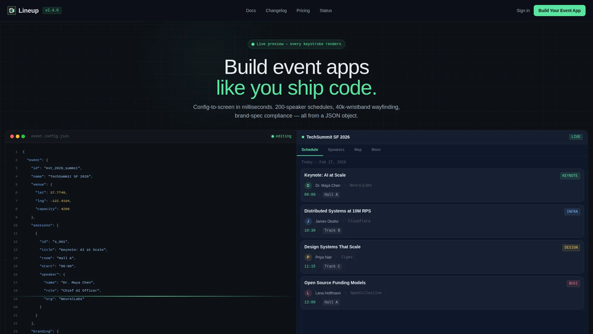
- A split-screen hero with a live JSON config panel and a rendered app preview side by side
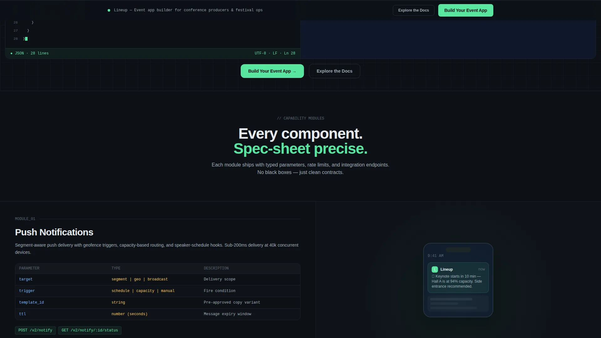
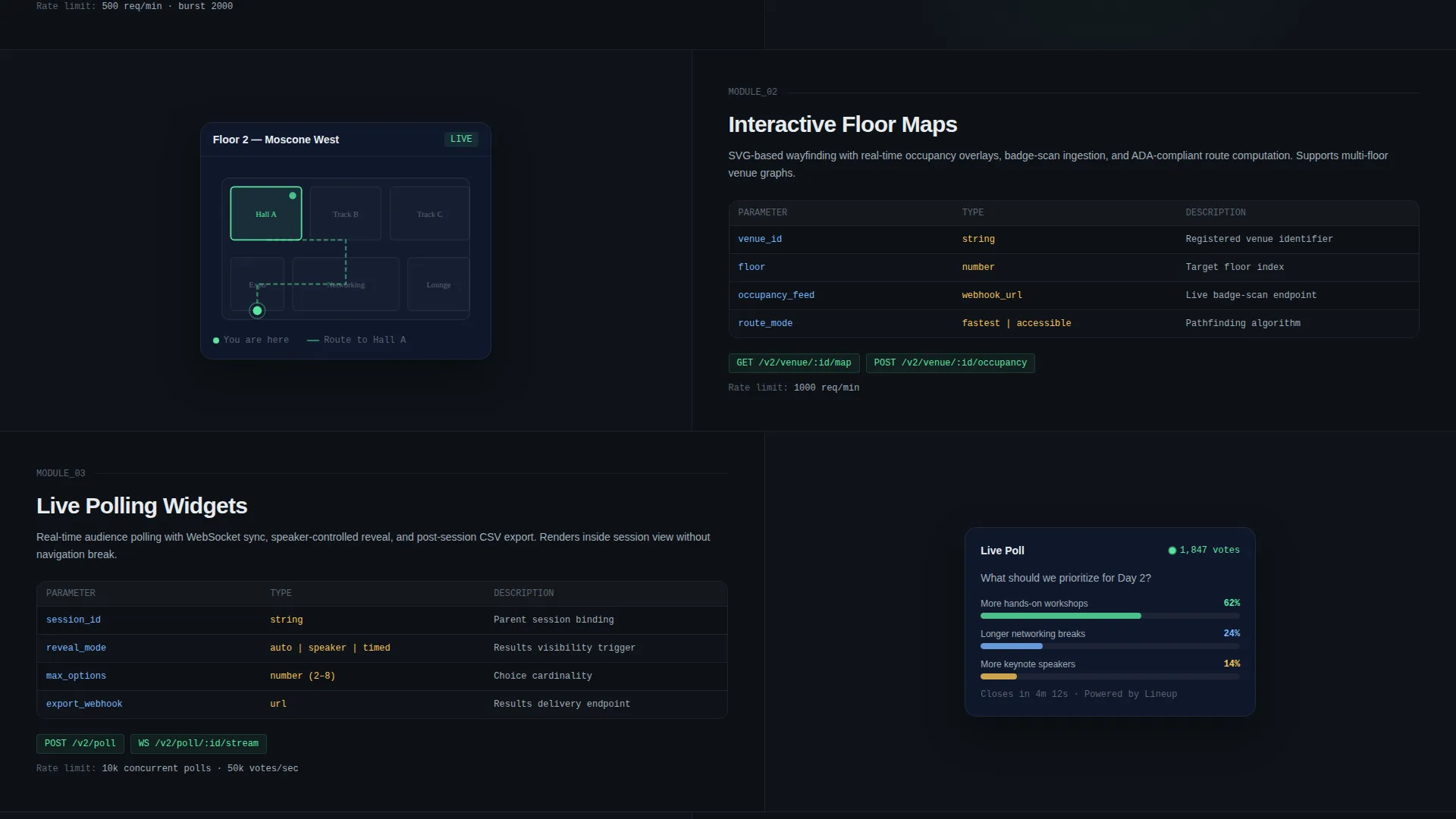
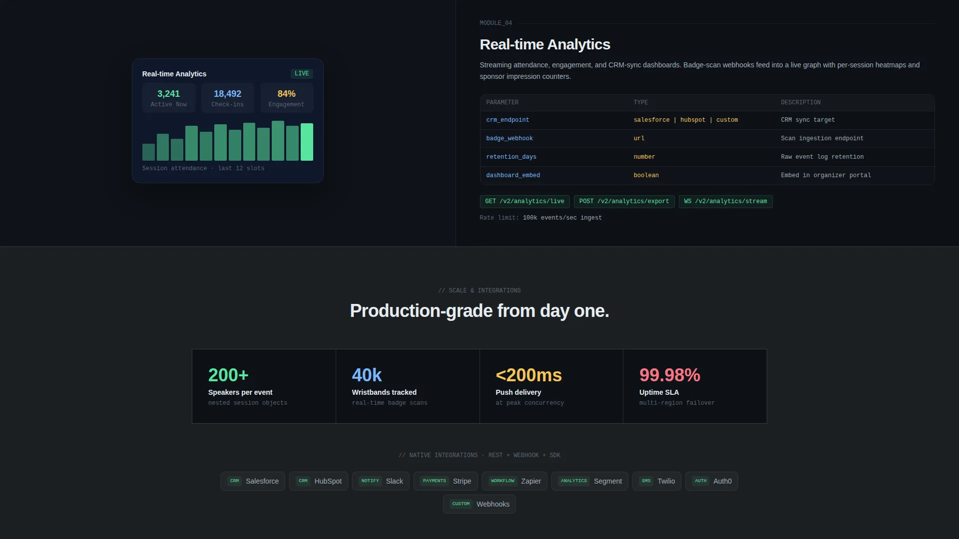
- Spec Sheet-style capability modules covering push notifications, floor maps, sponsor grids, polling widgets, and deeper integrations
- A sticky bottom bar with a three-field qualifying form that activates after the third section
Feature list
This template is built around a clear set of functional and visual capabilities drawn directly from the Lineup brief.
Split-Screen Code-to-App Hero
The header divides the viewport into two equal panels. The left panel shows a syntax-highlighted JSON configuration block with a blinking cursor mid-keystroke. The right panel instantly renders the resulting attendee schedule, complete with speaker avatars and room tags already populated.
Spec Sheet Capability Modules
Each scroll section presents a platform feature as a technical specification on the left, paired with a live user interface output on the right. This format escalates from surface-level customization to deep integrations like CRM sync, badge-scan webhooks, and real-time analytics dashboards.
Sticky Lead Generation Bar
A persistent bottom bar activates after the visitor passes the third section. It contains a three-field qualifying form: event type selector, expected attendee count range, and work email input. The primary call to action reads "Build Your Event App."
Developer-Track Conversion Path
A secondary call to action labeled "Explore the Docs" links to a public API reference page. This path captures developer-profile leads who convert through technical documentation rather than a traditional sales flow.
Electric Mint Interactive States
The single accent color, electric mint (#58E6A0), is reserved exclusively for interactive elements and live-data indicators. This restraint makes every active state and response signal immediately visible against the deep graphite and editor-dark backgrounds.
Component-by-Component Layout Architecture
The page is structured so each capability module snaps into place independently. This mirrors the platform's own component-driven build model and reinforces the product's core promise visually.
Page sections overview
| Section | Purpose |
|---|---|
| Split-screen hero | Show code-to-app causality instantly |
| Push notifications module | Demonstrate real-time messaging capability |
| Interactive floor maps | Display attendee wayfinding feature |
| Sponsor tile grid | Present monetization and sponsorship layout |
| Live polling widget | Show audience engagement tooling |
| CRM sync spec | Communicate deep integration depth |
| Badge-scan webhooks | Highlight event operations connectivity |
| Analytics dashboard spec | Prove real-time reporting capability |
| Sticky lead capture bar | Qualify and convert platform prospects |
Design & branding system
The Monochrome Steel color system drives every visual decision on this page. Color is treated as a functional signal rather than a decorative choice, which matches the precision expectations of a developer and enterprise audience.
- Deep graphite (#1B1F23) and editor-dark (#0D1117) anchor the background layers, creating the feel of a clean development environment
- Brushed chrome (#A0ADB8) handles secondary text, labels, parameter names, and structural borders throughout the spec modules
- Electric mint (#58E6A0) appears only on interactive states, live-data indicators, and the primary call-to-action element
Mobile & speed optimization
The split-screen layout is designed with responsive reflow in mind. On smaller viewports, the two-panel structure adapts so the code panel and the app preview remain legible and purposeful.
- The sticky bottom bar maintains its position and form structure across screen sizes
- Typography and spacing follow a tight grid that keeps the spec-sheet cadence readable without horizontal scrolling
How this template helps you convert
Lineup is built to move two distinct visitor types toward action. It does this by letting each visitor find their own proof point before they reach the form.
- Business buyers see the finished attendee app experience in the hero panel and trust the output quality before they read a single feature headline.
- Developer-profile visitors follow the Spec Sheet modules deeper into the page, find the "Explore the Docs" secondary path, and convert through technical credibility rather than a pitch.
Other information about this template
This template belongs to the Directory and Discovery theme family and uses a Split Screen (50/50) layout structure. The creative direction follows a Spec Sheet cadence, which is well-suited to platforms that need to communicate both product quality and technical depth on the same page.
- The header concept is classified as a Code Snippet format, making it distinct from illustration-led or photography-led hero treatments
- The template fits within the Technology category and the Mobile App subcategory, targeting the Event App Builder niche specifically
- The lead generation direction is primary, with the qualifying form designed to segment prospects by event type and scale before any sales contact
- The Intersection Match Score for this template configuration is 13, reflecting a tightly aligned combination of theme, layout, creative direction, and niche
Theme
Directory & Discovery
Creative direction
Spec Sheet
Color system
Monochrome Steel
Style
Split Screen (50/50)
Direction
Lead Generation
Page Sections
Split-screen Code-to-app Hero
Spec Sheet Capability Modules
Sticky Lead Generation Bar
Developer-track Conversion Path
Electric Mint Interactive States
Related questions
Who is the primary audience for this landing page template?
Can I adapt the JSON config panel content in the hero section?
What does the three-field lead form collect?
Is the 'Explore the Docs' link functional out of the box?
Does the sticky bottom bar appear immediately on page load?



